By John Wickham
As a person who likes a good chart, I am always open for suggestions that can make work better. This is why the use of Snakey would catch my eye to know if I could use it.
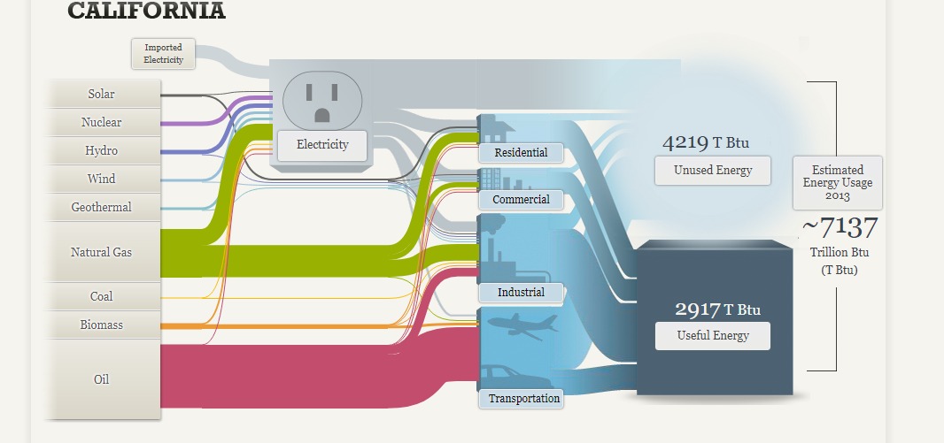
The chart above shows the information of the use of power that people from California use. You can see the huge amount of oil that people use in the largest state. There is the fact that there is only small string for Coal use, which is important to notice for coal supporters. The main source of worry is the small amount of power that is generated from alternative sources like wind, water, or solar. It worrys me.
The one complaint that I have is that this chart is very busy. It is hard to interpret data without taking some time to understand. You can get it, but it takes some effort.