With Sankey Visualizations being a technique that helps the user to displays flows within data, it is a very helpful tool when trying to string many different charts and diagrams regarding the same topic together.
While reading through the site talking about our energy system I noticed how many different pieces of information were available to me on just one of the pages. I did like how this site was formatted but there was one thing that I feel like could make the site too crowded.
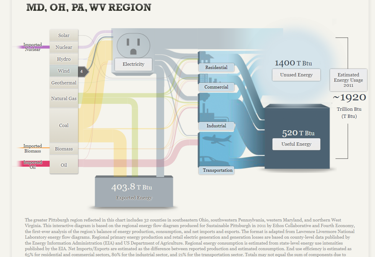
Within just this page from the complete site there are 17 different things that the reader can click on that reveal even more information to them. While I do understand that this is the information they are provide, I feel that separating it even more will help the reader not miss any points of information if they don’t click on every single tab per page.