Sankey Diagram is a visualization technique that allows the display of flows. Many experts argue that Sankey diagrams do a better job than pie charts, visualizing flows in their proportions. The things connected are called nodes and the connections are known as links. Sankey diagrams are also perfect for showing many-to-many mapping relationships.
They are very good at showing particular kinds of complex information:
- Energy flow
- Budget flow ( where the money came from and went to
- Number of people migrating from one country to another
- The flow of goods from one place to another
SANKEY VISUALIZATIONS – OUR ENERGY SYSTEM
A Sankey diagram was used to visualize the primary energy source supply directly to the residential, industrial, commercial, and transportation sectors in the USA. It also showed how electricity was generated from a list of primary sources.
The diagram appeared complex at first view but very with careful observation, it gives out detailed information.
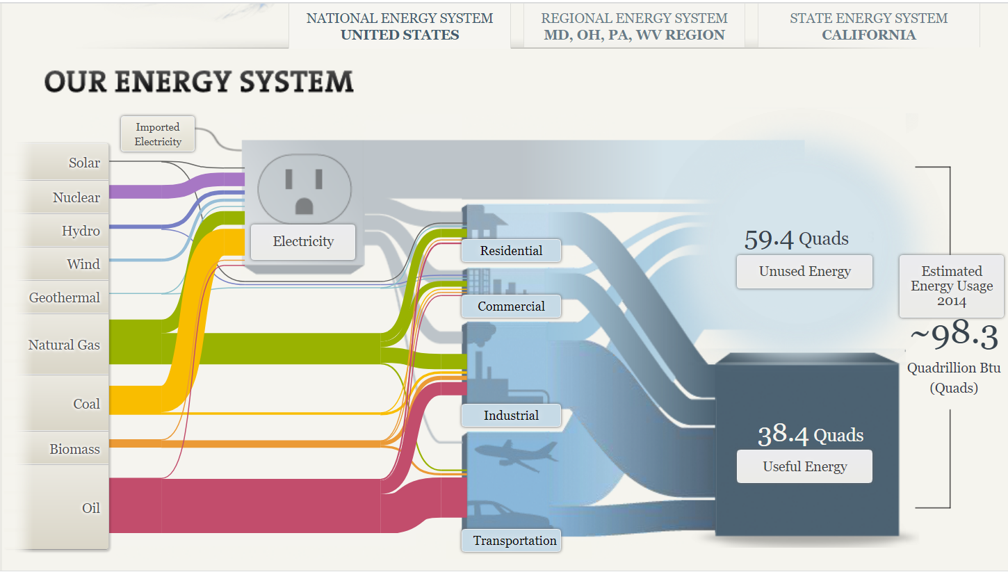
The Sankey diagram shows the primary sources of energy: solar, nuclear, hydro, wind, geothermal, natural gas, coal, biomass, and oil. The colored links show the flow of energy from these primary sources to their destinations: residential, commercial, industrial and transportation uses. The width of the links shows the proportion of energy flow to its primary source.
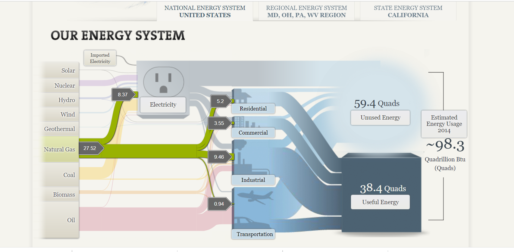
The visualization allows you to click on a primary “source of energy” to examine its “flow of energy.” It places the other categories in the rear and reduces the clutter of information. The use of labels also helps ascertain the value of the amount of energy flowing from the primary source to its destination.
Sankey diagrams can be very effective in displaying visual information about complex data. The caveat is to be very cautious of cluttering information due to its complexity.