By Nick Ligameri
According to www.ifu.com, a Sankey diagram is a “specific type of flow diagram used for visualization of material, cost or energy flows. They show energy or mass flows with arrows proportional to the flow quantity. They have directed arrows featuring flows in a process, production system or supply chain.” Given this definition, it is easy to understand why this visualization was chosen to represent the flow of energy within our country.
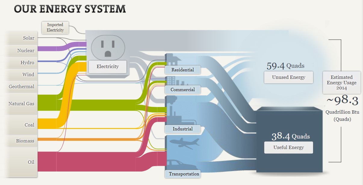
The above Sankey visualization does a wonderful job at taking a complex dataset and showing not only how much of each resource is used, but where it is used. At a glance, the visualization does seem a bit messy, but I like to think of it as organized chaos. What I like about this is that you can quickly see what resource we utilize the most and, more importantly, what industries have the most waste.
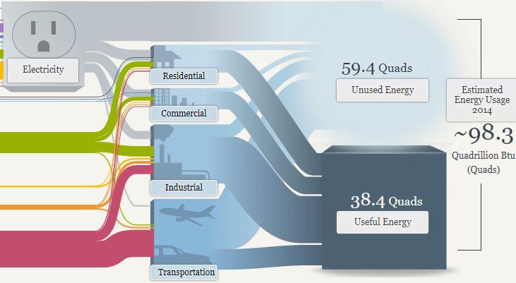
In the above image, you can see that the most waste is generated from electricity and the transportation industry. When you click on the Unused Energy button, it explains that the waste comes in the form of heat that is generated when converting energy into a different form of energy. It is striking that we produce more wasted energy than we consume. From this diagram, you can quickly determine the need to produce a more efficient energy source.

This website also shows two different energy systems besides the national system. My immediate thought was to compare these two systems. To do that, I had to click back and forth between each page. I think this tool would be even more powerful if the author could have provided an easier way to compare the two. This is even more important considering that California consumes roughly three times more energy than Maryland, Ohio, Pennsylvania, and West Virginia combined. I would want to highlight this somehow, possibly with some variation of a column or bar chart.
Overall, I feel this Sankey visualization does an effective job of communicating a complex story in a relatively simple way. The user interactions feel intuitive and lead the viewer along. This type of visualization seems like it would be difficult to learn how to build, but completely worth the effort.