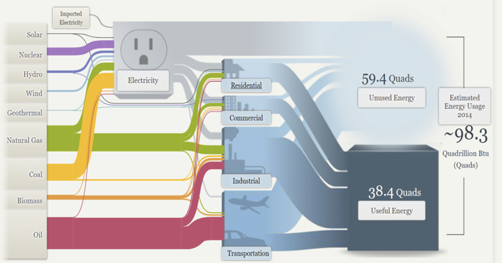
Sankey is a chart or a visualization that shows off the gradual progress of something. this type of chart is ideal for showing off the process of an event, the history of a certain topic, or the rise of a movement. It is a good way to show the continual progress of something in an interactive way.
This visualization is showing the audience how energy is used throughout the US.
The site has a tab that shows in great detail the nuances of the US energy system and all the intricate parts attached to it. For example, one of the visualizations shows off how much energy overall the US population consumes in one year.
Overall, Sankey Visualizations create an innovative and new way to present presentations. They give the audience a chance to dive into the subtopics of a subject and weave passageways of information. I believe that this is the kind of presentation that would be excellent for an audience that is eager to comprehend the complexities of a topic.