This Sankey Visualization is in interaction visualization that shows how our energy system works in the US and how how it is used throughout the company. This tool is a great way to display this type of information. Being that it is interactive, you are able to click your way through and learn about the Energy System.
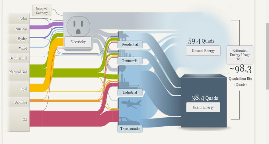
The column on the left side is interactive and shows information bases off of each tabs topic. Depending on which tab you click on, the information is unique that that tab and shows different numbers and links to the column in the middle. This shows which tabs down the left are connected to the tabs down the middle. While clicking through all the tabs, little blurbs pop up explaining each tab and the number in detail.
Sankey Visualizations are great tools to use to display this type of data such as how things work, and how subcategories of certain topics are linked to each other and all equate to one thing. Sankey Visualizations show how a topic’s information can relate to other topics that show the general idea of something. I think they are very easy and simple to follow. They are also not overwhelming to look at because there is information hidden in each tab with a link to explain the information in more detail.