After spending over 10 minutes wondering whether I like this blog and visualization as someone who cares about the environment, The website does seem confusing at first as it took a while to find the, sanity for our energy system. Honestly, it was great fun playing around with this blog as I loved clicking on the word text.
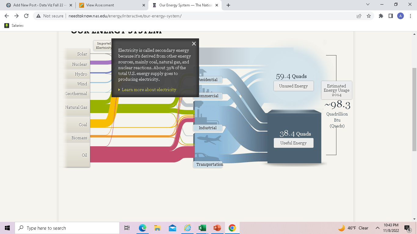
After clicking on the word text, it gives you more opinions to read. More about it, which was, honestly it was pretty entertaining and cool. I like how they used a surge protector, which was very creative. It did keep it interesting.
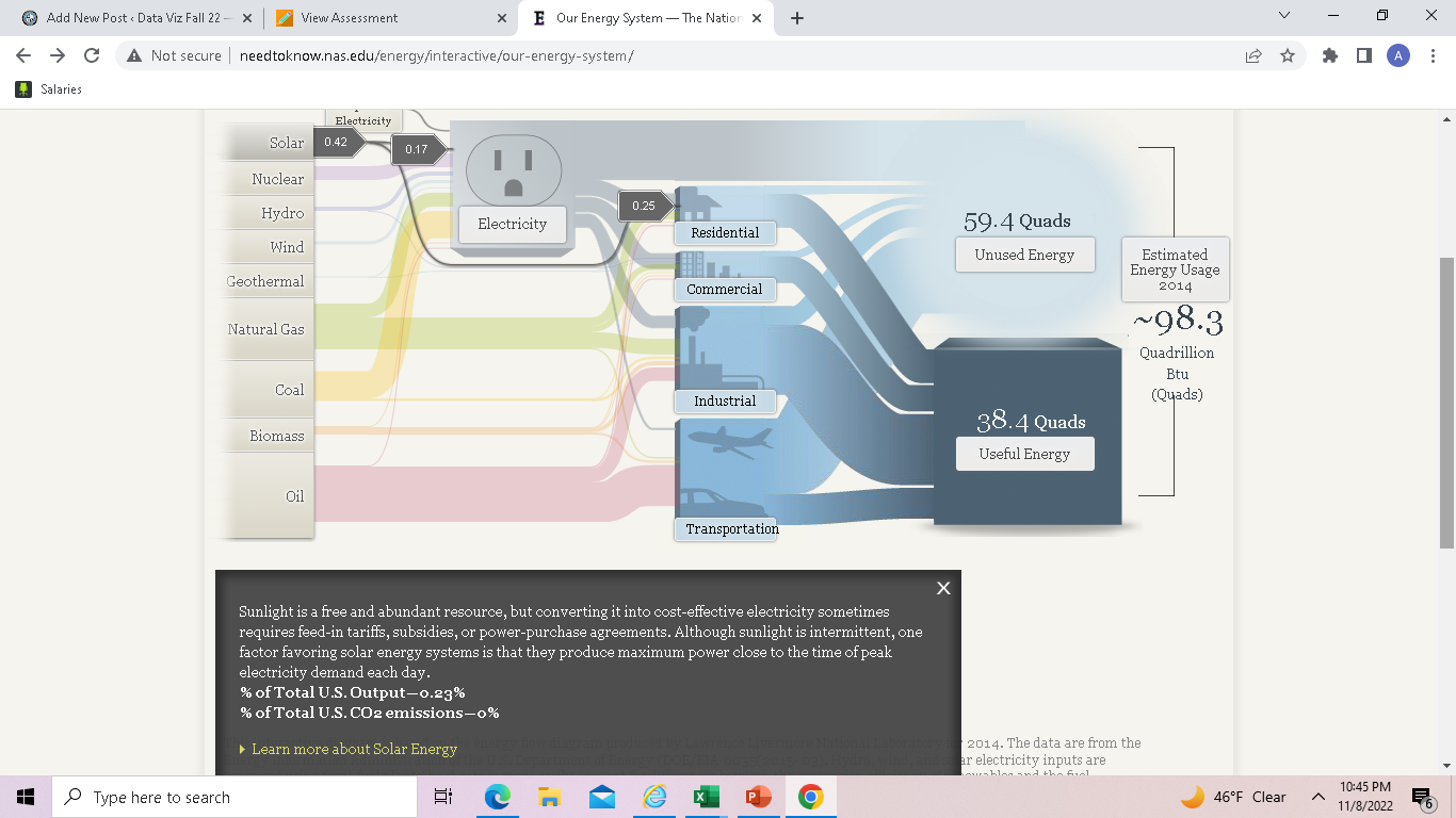
Then when I clicked on the solar, it was almost a circuit which was cool and very directive. Which I then thought, this site has put alot of effort into their website. I did enjoy this blog greatly.
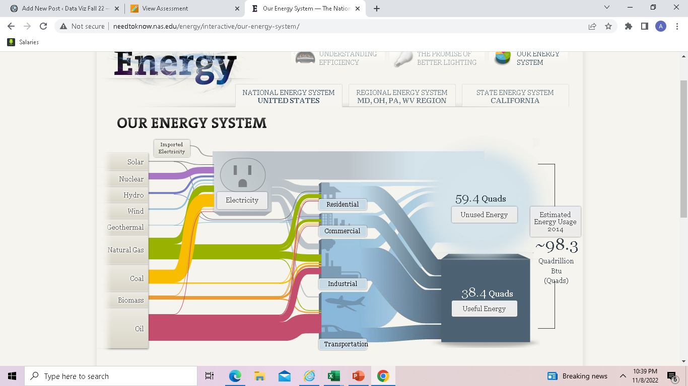
I think I would like to use a sankey visualization in my future projects as it helps show the flow of a project.