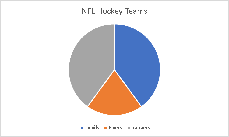
A pie chart is to summarize data almost a piece of a whole. As when the word pie reminds me of a circle as it will always need to equal 100%. Each slice of the pie is component of the whole.
I took a small poll amoung my friends on which teams they prefer. It was made of small poll group between three teams that were major in the New Jersey area and the poll was taken by 10 people. It has very visualizing pleasing as it doesnt look like it is missing . It is making up a parts of a whole where the whole is the Major NFL Hockey Teams in the area and it was split into three so the subparts.
I would sugguest using these types of charts if it is to display something like this. I also would like to also put different colors of the pie chart instead of the same color to defferentiate the different teams.