Benchmark Comparisons
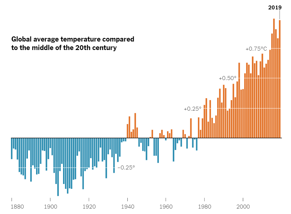
Here is a chart that uses a benchmark to show the varying global average temperatures. The benchmark is used along the x axis at 0 degrees Celsius. The blue lines represent the average temperature for that year, and it falls below the average global temperature of the middle 20th century. The orange lines represent the years with the average global temperature being above the average global temperature from the middle 20th century. As you can see, there is a general increase in global average temperature over the years. A benchmark is very effective here because it splits up the data into two groups. The years that fall below average, and the years that are above average. The trend of rising global temperatures is easily seen here, making this a very effective infographic.
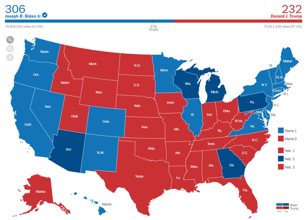
Here is another infographic that uses a benchmark in a different way. This is the 2020 presidential election map. The benchmark is shown above the map. It says “270 to win”. This means that 270 electoral college votes are needed in order to win the race. 270 is the benchmark. Joe Biden exceeded this benchmark, and Donald Trump failed to reach the benchmark. Therefore, Joe Biden won the election because he passed the benchmark. On the graph, you can see that Joe Biden passed the benchmark through color coding. Joe Biden is blue, and the blue line passes the benchmark of 270. This is a very effective infographic that uses a benchmark in a unique way. As shown by these two examples, there are many different ways to use benchmarks, and there are many different forms of benchmarks.
Benchmark Comparisons
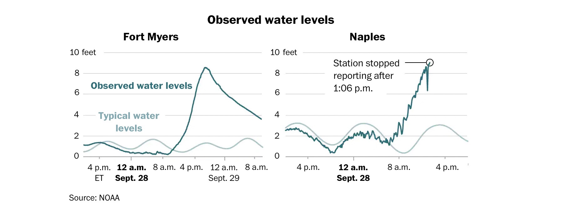
The Washington Post shared an article “Maps show the impacts of Hurricane Ian.” Within this article the author shows the comparison of two different cities in Florida that got affected by Hurricane Ian on the same day. The light blue lines show the normal water levels while the turquoise line is how the levels were during the hurricane. After 8a.m. in both graphs, the levels started increasing a huge amount. The only thing that is different is the way the turquoise line is. One is smoother while the other is rigid and bumpy.
Benchmark comparison
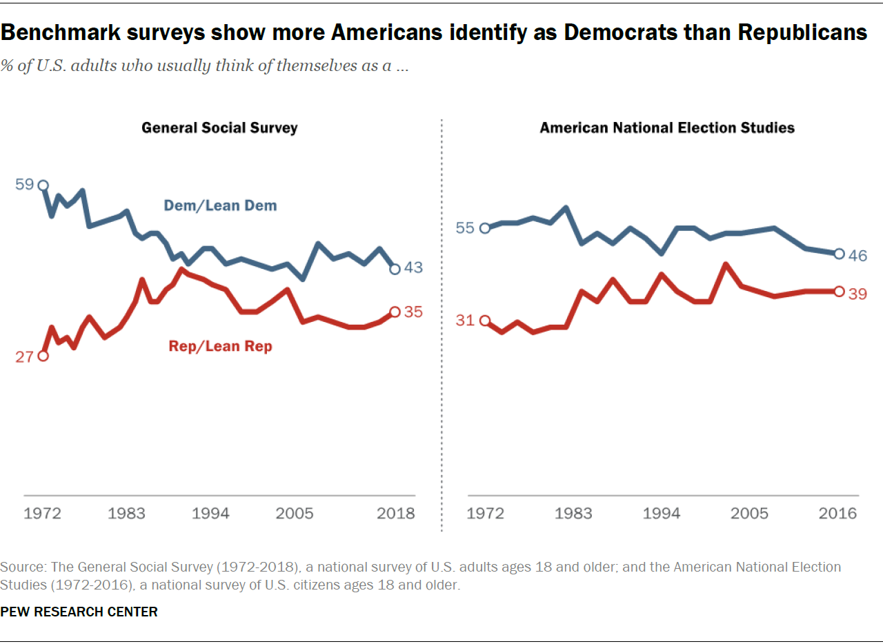
The graph I chose shows both general social surveys vs. American National election studies. This graph displayed one side with the general social survey, asking Americans on what side they may see themselves. On the other side of the graph, it showed actual American elections and what people were under. This uses the left side of the graph as a benchmark of what sides Americans say they are on vs. who they actually vote for.
Benchmark Comparisons
This blog explains the comparisons that I found The New York Times uses with their benchmark graphs. My comparison is based on the 2022 Presidential Election Results. News companies tend to use benchmark graphs to explain Presidential and political races. It shows the number needed to be elected, along with each state’s final vote. 2020 was a unique situation because there were multiple recounts for the final voting results, which is shown on the map graph below.
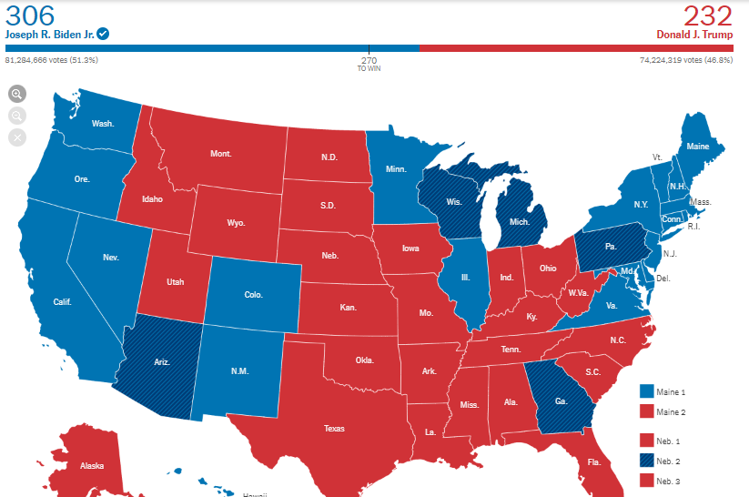
This benchmark represents 270 points needed for one of these competitors to win the overall election. Even with the recount of multiple states, multiple times, there was still a winner, which is our current President, Joe Biden. He was elected with 74 more points than former President Donald Trump.
Benchmark Comparisons
By Nick Ligameri
Today we are going to take a look at different ways you can use infographics to show comparisons to a benchmark. According to Google, benchmarking is when you “evaluate or check (something) by comparison with a standard.” There are many benefits and reasons to benchmark. According to bbgbroker.com, benchmarking is useful because it shows you how something stacks up against competitors, improves efficiency and effectiveness, allows you to track the progress of goals and objectives, and discover new growth opportunities. The results can be used to motivate staff and hold people accountable, boost the performance of sales, and improve the quality of products.
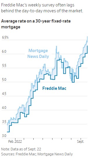
The first benchmark we are looking at is comparing Freddie Mac’s weekly mortgage rate survey compared to the actual daily mortgage rates. The Wall Street Journal utilizes line graphs to show the data. This infographic is powerful because you immediately see that Freddie Mac’s data always lags the actual mortgage rates. This is important because if you are in the market to buy a house, you want to have accurate mortgage rates. If you use old data that is up to a half percentage point off, that could lead to thousands of dollars difference in what you think you can afford compared to what you can afford.
The Wall Street Journal points out a few reasons that Freddie Mac’s data is lagging behind the actual data. One reason is that, right now, the housing market is extremely volatile. Historically, mortgage rates do not move as quickly as they are now. A weekly benchmark was usually a good measure of the market. Because the market is more volatile, there is a need for a more accurate benchmark. Another reason for the lag in data is that reported mortgage data is usually about a month behind what is happening. This is because it takes between thirty and forty-five days for a home purchase to close.
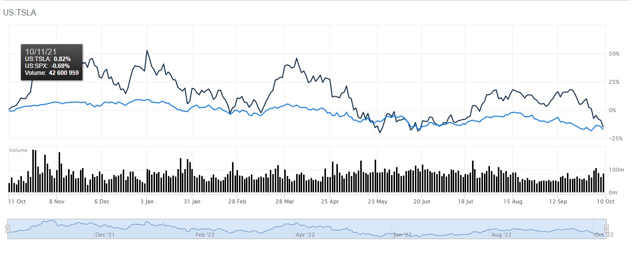
Another use of a line graph benchmark is this one that compares Tesla to the S&P 500. This is more straightforward. If you’re an investor who is looking to outperform the market, this is a useful tool. Using Barron’s comparison tool, you can see how different stocks compare to the index of your choice. You can change the range from the most recent day to all of the historical data available for the stocks you are comparing. This chart shows that, over the last year, Tesla has regularly performed better than the S&P500. Tesla may be a stock you would want to invest in.
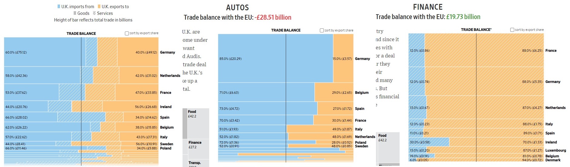
The next type of benchmark chart we will be looking at is a horizontal bar chart. This one is a bit different because instead of showing how something compares to a standard, it is showing parity between two different things: imports and exports. The “benchmark” here is the balance between the UK’s imports to the EU compared to its exports to the EU. A glance at the first chart shows that, overall, the UK imports more than it exports. A deeper dive shows how the UK imports and exports compare in different industries. The next graph shows that the UK heavily imports automobiles from different countries. The last chart shows that the UK provides a lot of financial services to the EU. The practical use of these graphs would be to show where the UK could improve its exports if it wishes to be less reliant on its neighboring countries.
There are many different ways to show a benchmark. The line chart is probably one of the most common in business. The horizontal bar chart shown here is a bit different from the norm and I liked how you can quickly understand what you are being shown. You can also gather a lot of information and make many different decisions based on how you break down the data. Hopefully, this helped show you some of the many uses of benchmark graphs.