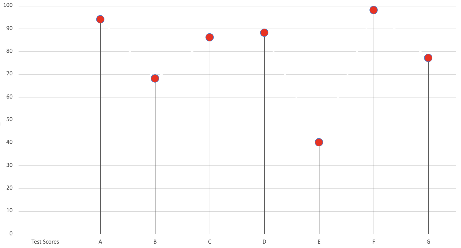
Lollipop Chart
Lollipop charts are a really simple and useful infographic to get basic information across. Here I made a lollipop chart using test scores for A, B, C, D, E, F and G. It is easy to follow and see the test score that each letter received. In my opinion, this graph is a very simply play on a normal bar graph just with a bit of added “fun” to make it less basic and square.
Lollipop Chart and When to Use It
When it comes to the decision on whether or not to use a lollipop chart or a regular bar chart there are some advantages that the lollipop graph has in it’s favor.
One of these advantages being that the columns of the lollipop chart are very skinny so when dealing with charts that use high value numbers it will make the chart more appealing to the reader compared to long thick bars.
This is an example of a lollipop chart used to represent the percentage of different streaming services used among the 34% of streaming viewers.
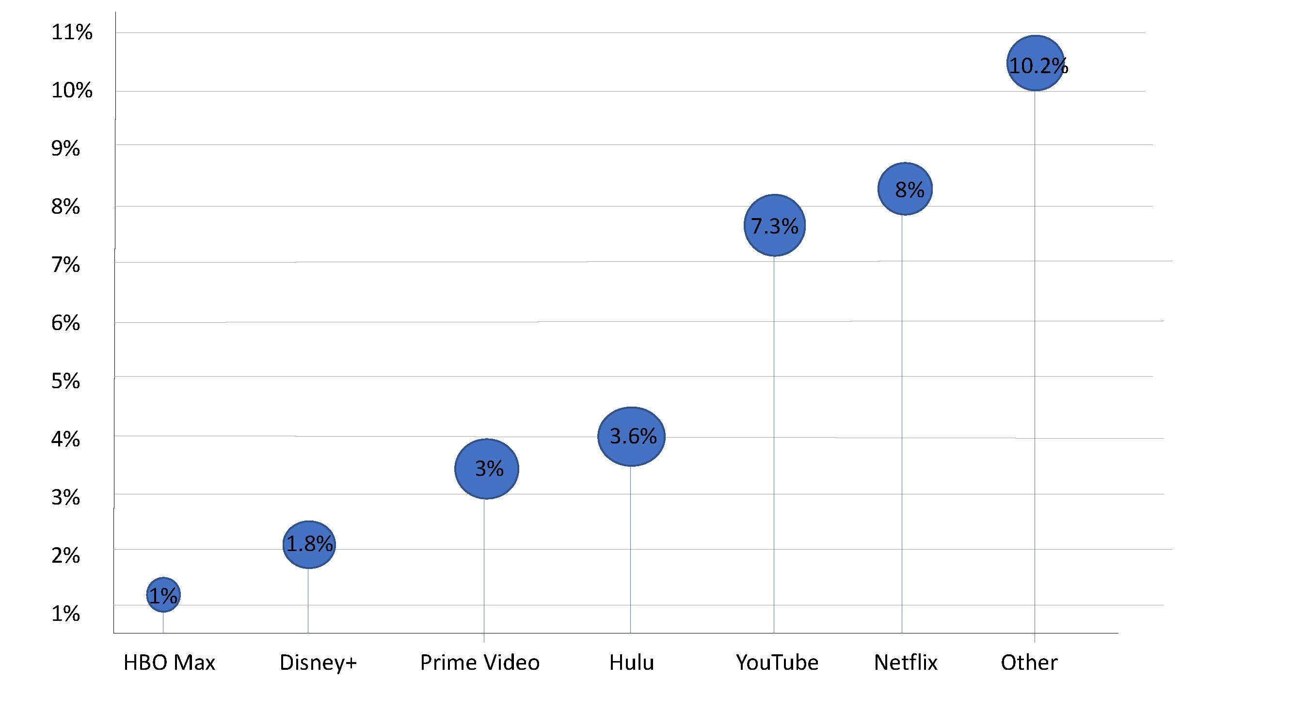
As you can see the stick of the lollipop chart takes up very little room and makes it easier to highlight the top of the lollipop that displays the exact percentages.
For more information on lollipop charts visit here.
Lolipop Chart
By Robert Fox
A lollipop chart is a variation of a column/bar chart. The bars you would normally encounter are instead replaced with a line and a dot at the end of said line. Lollipop charts serve the same purpose as bar charts however, and a simply a different visual. They still compare data values with one another.
When would it be best to utilize a lollipop chart instead of a bar chart?
Lollipop charts tend display data better when there is a large number of values that are close to one another, causing it to visually be hard to read as a bar graph. With a standard bar chart, the infographic would be to be mashed together, and thus making it hard to differentiate between two similar values. The lollipop chart makes these small differences easier to see, and it is also a more clear visualization.
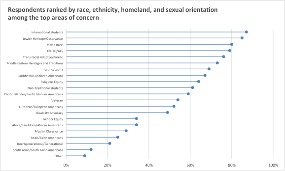
Here is an example of a lollipop chart based of data taken on the overall population percentage of student voters in the New York Area. Here we can see many data points of close value, it being in this format making it able to be understood.