Pie Charts
by Robert Fox
The pie chart that I chose to make depicts the method of learning students were most interested in in the United States, in the year 2021.
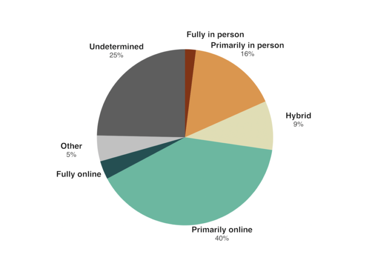
I believe this was a good example of data to use in a pie chart because it represents a part for the population out of the whole. In this specific example, the whole is the students who participated in this survey in the U.S and each part is filled with a certain percentage of those citizens based on how they entered said poverty.
As far as design choices I made for this chart, I chose to go with a bright with countered darker colors color in order to make the chart itself more eye catching to the audience. That and making sure each title in the figure had the data variable with it.
Pie Charts
By: Veronica Perkins
Pie charts are a form of data visualizations that can help represent data given to us. Pie charts are ideal when your data adds up to 100. I made a pie chart to help represent this:
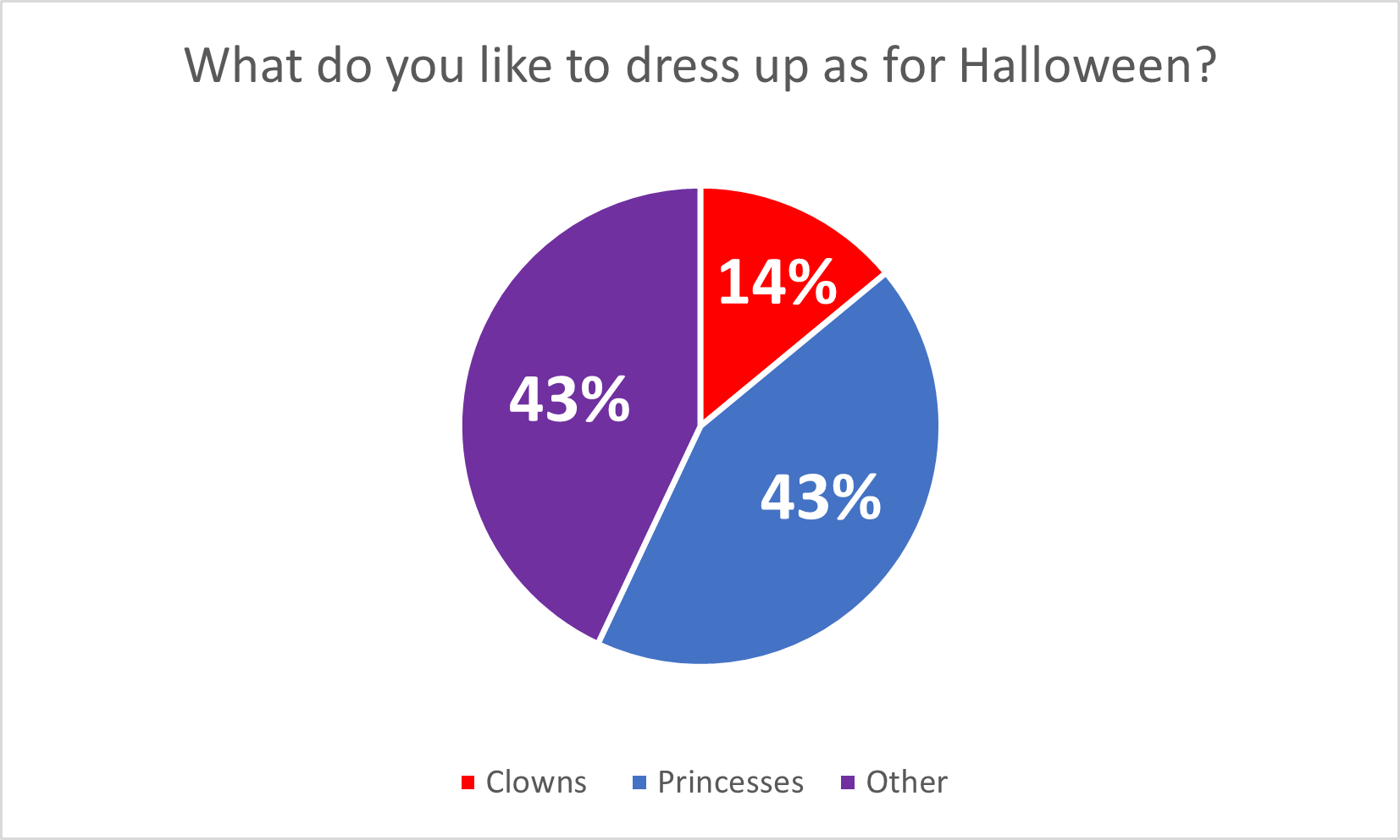
Pie charts are great for when you have multiple data points (that add up to 100%) because it allows the audience to see how the data is divided. In this case, the data I chose, represents what people want to be for Halloween and the data is completely made up. However, even though the data is made up completely, it still allows for the audience to see the data in a simpler way. I believe that this pie chart is a great version of data visualizations, but this data could also work on bar graphs as well. Here are a few tips for making pie charts: Be sure to vary each slice using different colors. Also adding data labels, such as numbers, can be a big help visually for the audience as well.
Happy creating! 🙂
Pie Chart
I decided to create a pie chart based on the types of pools within the U.S.
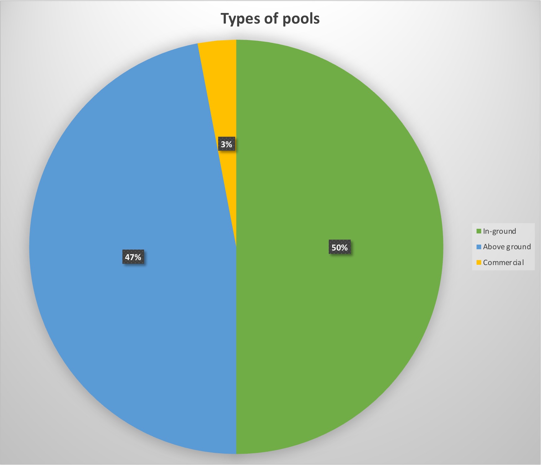
For my data, I decided to use data of the 10 million pools within the country to see what was America’s favorite set-up for their pool.
The reason this data is served best as a pie chart is the simple fact that percentages are perfect for pie charts. Not only do they look visually appealing, but they show exactly in visual terms what America prefers best, which looks split between above and in-ground pools. It’s a simple and visually pleasing way to show percentage data without being too complicated.
Pro-tips for creating a pie chart is to include the percentages within the graph. That way the reader does not have to search long for the data but instead focus on the graph data with ease.
Perfect Case Pie Chart

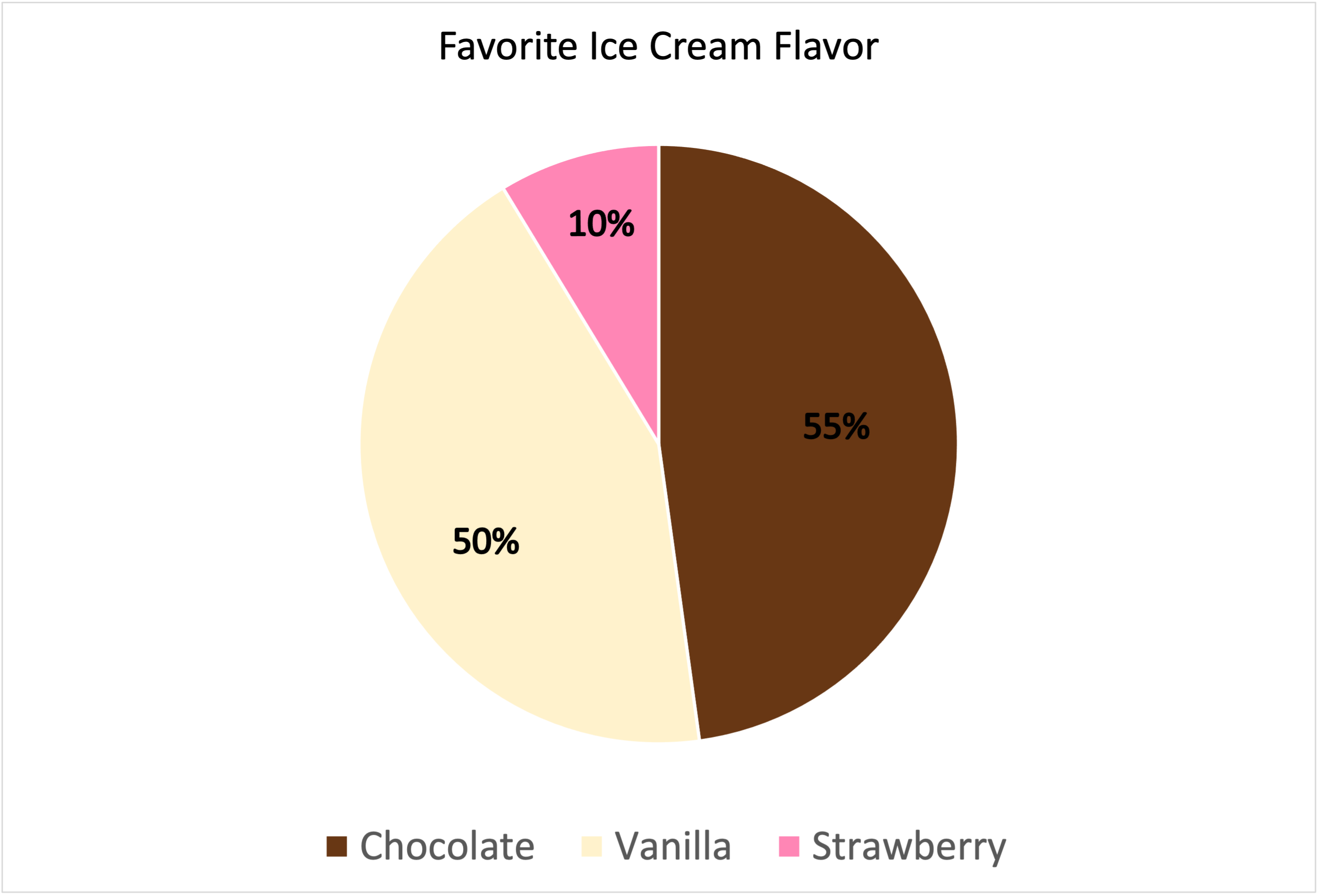
I decided to use “Favorite Ice Cream Flavors” as my data set for this Pie Chart.
Why is this a “Perfect Case”?
Pie Charts are appropriate for parts-to-whole relationship data. Percentages and proportional data are great for pie charts. Here, I am showing vanilla, chocolate, and strawberry flavors. These are the three most popular ice cream flavors. When you take a count of how many people like each flavor, this is the normal outcome. The majority likes chocolate and vanilla flavor. The least amount of people like strawberry. This is the perfect case because it is showing a proportionate amount of data with a percentage and it is simple yet effective. I chose those colors for obvious reasons, they match the flavor of ice cream!
—————————————————————————-
Data is based out of 115%.
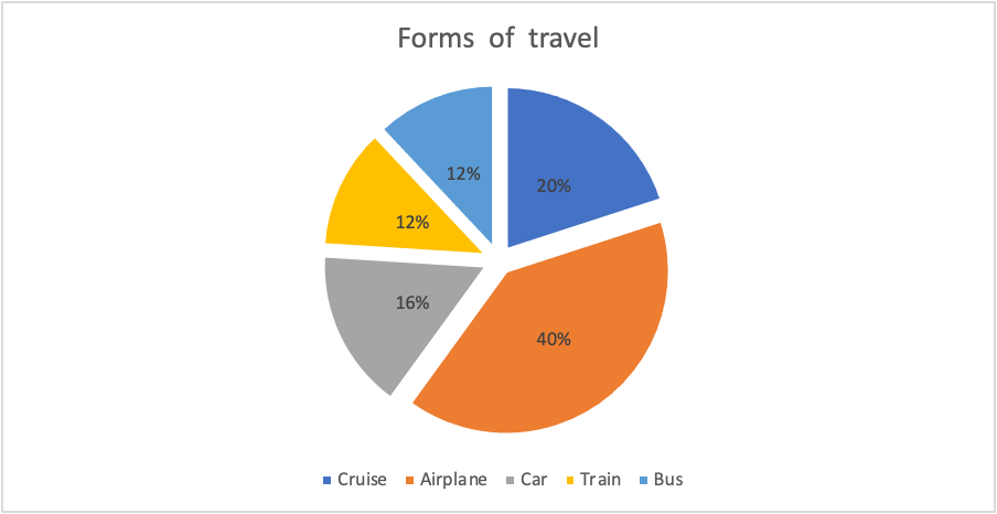
Piechart
For my data set I chose to show people’s favorite ways of traveling for vacation. I think using a pie for this because it visually breaks up the surveyed population into sections. Doing this allows for someone to easily see which sections were more in favor.
Pie Chart
The pie chart that I chose to make depicts the poverty level of people under the age of 18 in the United States in the year 2020.
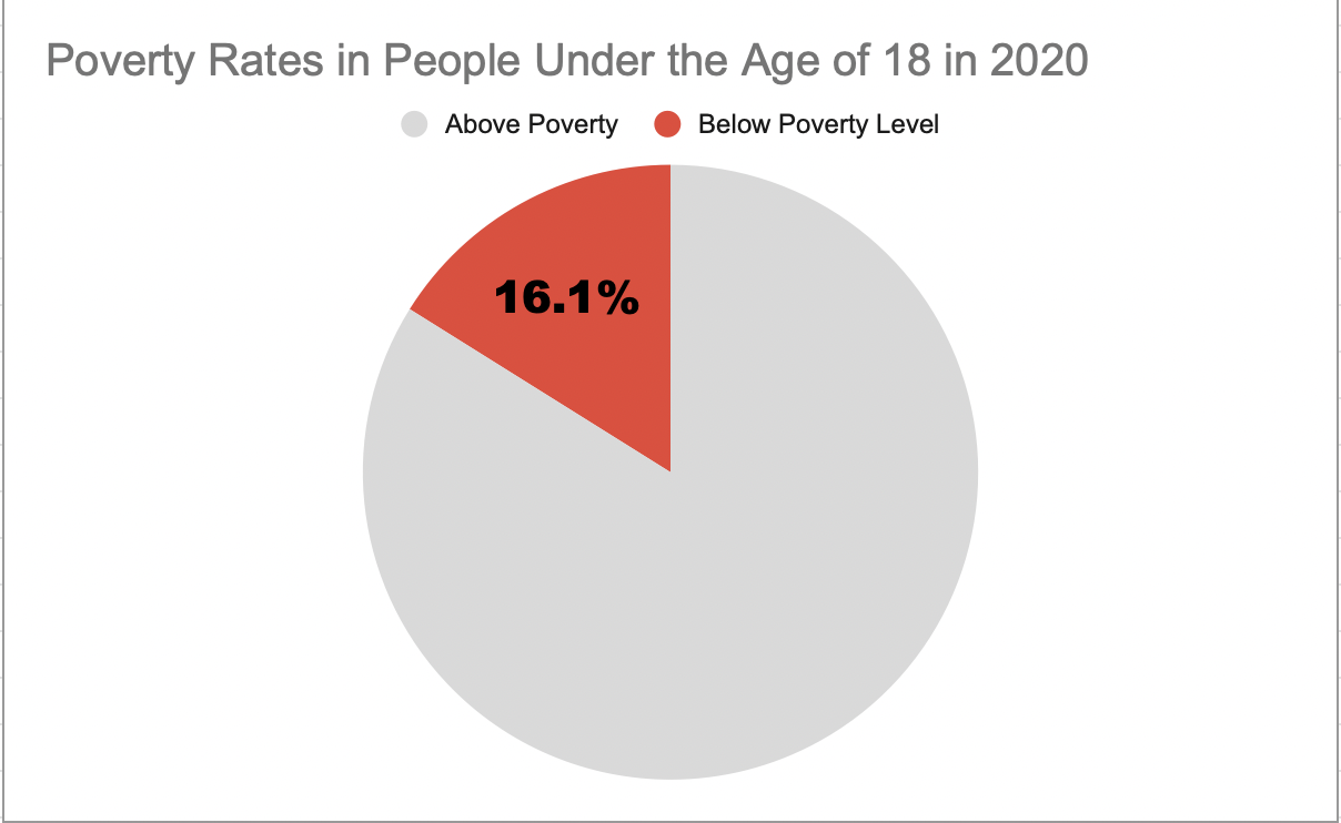
I believe this was a good example of data to use in a pie chart because it represents a part of a whole. Data like this I believe is perfect for pie charts. In this specific example, the whole is the US population under the age of 18 and the part is the percentage of those citizens who are under the poverty level.
This specific data I feel is best represented as a pie chart, however, the other data I found in the article I got this information from would have benefitted better from something like a line chart. That is because not only did this website tell me the percentage of minors under the poverty line, but it also told me that 2020 was the first time poverty rates have increased in the last 5 years. It would have been very beneficial to show the steady decline and sudden increase of poverty rates over the line chart. However, like I previously mentioned, for this specific data example I believe the pie chart was best.
As far as design choices I made for this chart, I chose to go with a bright color to highlight the important part of the chart. I also chose a muted grey color so the audience would focus more on the children in poverty. I also decided to only put the percentage of impoverished children to once again highlight the point of the chart.
This is the website I obtained my information from: https://www.census.gov/newsroom/stories/poverty-awareness-month.html
Abigail Moore
Pie Charts
Pie charts are great for displaying percentages or parts of a whole when it comes to data. Most likely, pie charts will be used when its based off of a percentage of 100. For example, I created a pie chart to present the household pets in New Jersey. Below you can see that of the households in New Jersey that have pets, we are looking at whether they have dogs, cats, or another kind of pet. Just by examining the chart we can see that the majority of households have some other kind of pet that is not a dog or cat. Then we see that the next biggest is dog, then cat.
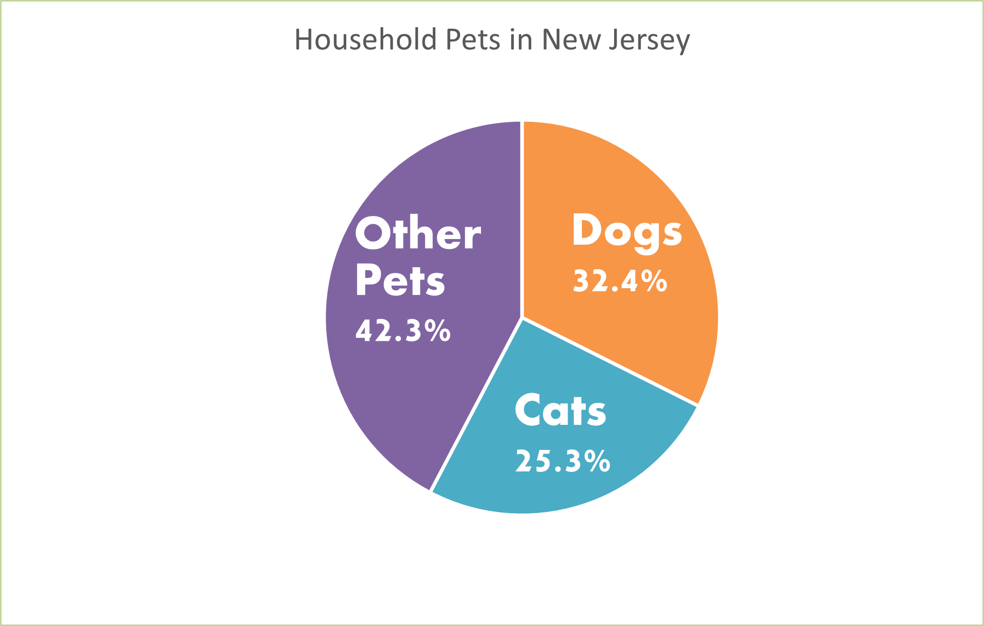
This information could also be displayed as a bar graph. We could have separate bars for each category but instead of using the percentages, we would use the real number of how many pets in each household rather than the percentage of each different pet in households. But since the numbers are very similar, I think that the pie chart is the best because it is showing percentages of each type of pet.
Pie charts are very easy to make on Microsoft Excel. You can make them unique by changing the color and style of them by making them 3d. You can add a legend and add the percentages to your chart as well. I like to add the percentages to my pie charts so your readers know what they are looking at and exactly what number is being displayed. Don’t forget when you create your pie charts to add titles and labels so your readers know what the pie chart is displaying.
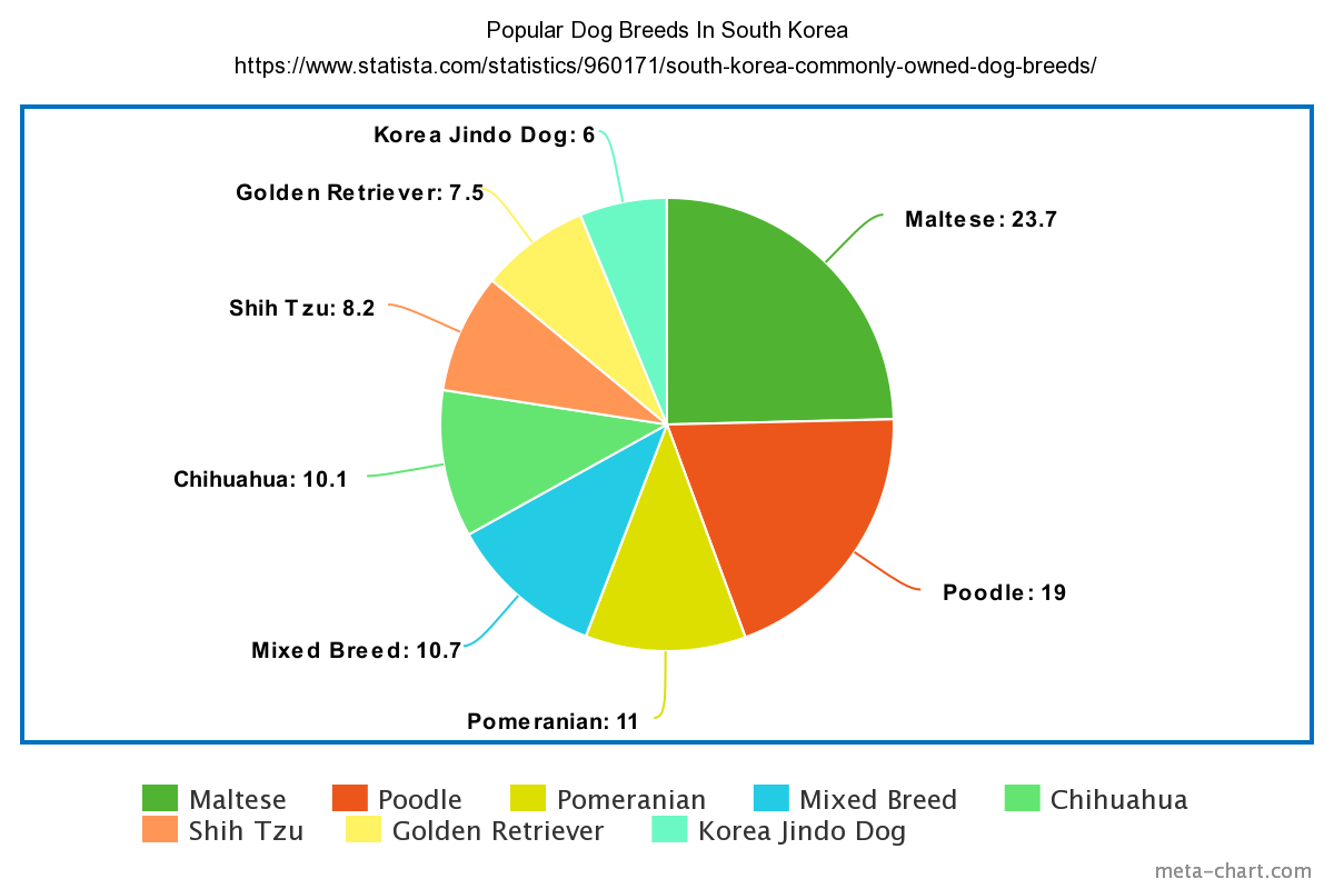
Pie Charts
I chose to display the Popular Dog Breeds in South Korea. I feel as though a pie chart is the best way to visualize this dataset. this is because of the ease that comes with working with pie charts. Pie charts are a type of data visualization that breaks down the slices as categories of their amount or percentage. This lets the consumer know which parts are heavier than others or vice versa. This is because more often than not there are categories close in similarity and very different. The separation in colors aids in what slices belong to each category
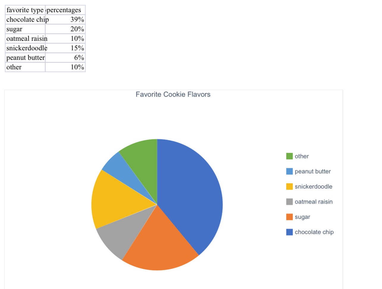
Blog Post 5- Pie Charts
Here is the pie chart that I created for a group of people’s favorite cookie type. I think a pie chart would be the best for this because it is measured in percentages. If we were measuring it by exact number of people, we could have used a different chart or graph.
Pie charts are very fast and easy to make. All you need for a perfect pie chart are some labels, color, percentages, and data!
(The percentages inside the pie chart will not upload onto this website, but it is on the excel document attached to my assignment on blackboard!)
SNL SCREENTIME STATS
By John Wickham
One of things that I do when I work on something is to try to put numbers into the things that I enjoy watching. For example, sometimes when I watch an episode of television is tracking to see how much screentime they have in an episode. This helps really show the importance of each cast member in the whole of show. However, until I was unsure of how to best display this data in a form to enjoy, until I read this chapter
The chart below shows the percentage of time each cast member was on screen in the very first episode of Saturday Night Live. The original cast (Laraine Newman, Jane Curtin, Dan Aykroyd, Garrett Morris, Chevy Chase, Gilda Radner, John Belushi and the short-term cast members George Coe and Michael O’Donoghue) was a boom in the 70’s comedy scene. Without them, both comedy and modern SNL would not exist to this day. However, it is hard to get a picture of the impact on the actual show.
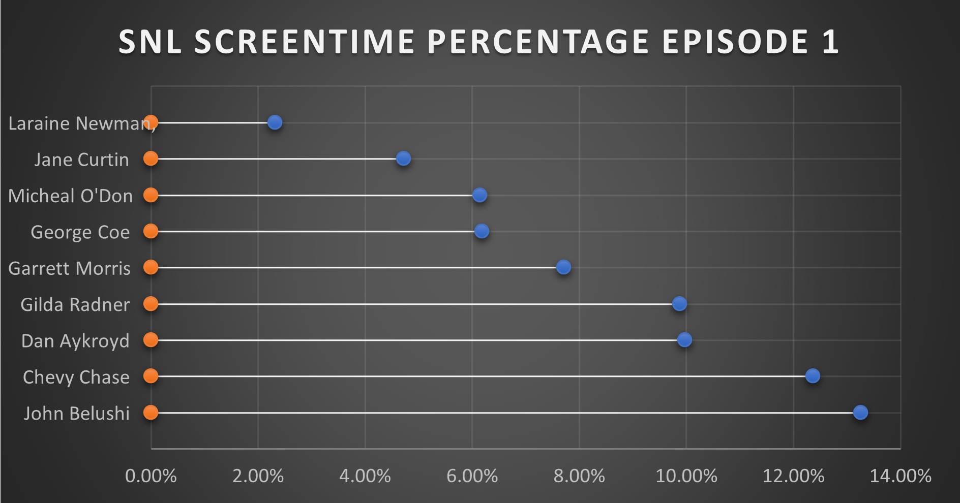
This is where this chart comes together in a quantitative fashion. From the data, you can see that John Belushi, Chevy Chase, Dan Aykroyd, and Gilda Radner where the frontrunners right away. Those would be the major stars on the show, and even in episode 1, the show had some faith in them. The other cast members had some work.
It is interesting that George Coe and Michael O’Donoghue (cast members who would be off the show in episode 5) had a decent amount of screen time in these first episode. Even more than long-term cast members Jane Curtin and Laraine Newman. It is a very interesting figure in the history of Saturday Night Live.
You can watch the first episode of Saturday Night Live on Peacock.