Using pie charts is beneficial for showing percentages that display the proportions of the data. Each section of the pie chart resembles a different piece of data. For my pie chart example, I decided to take the Metropolitan NHL Teams and researched their percentages of making it into the NHL playoffs. It is still early in the season, so the data I have researched changes weekly. My information is based on playoff chances as of Sunday, October 23rd, 2022. Using monkeypuck, I took the percentages of all the Metropolitan Division Teams, which can be found on the NHL’s official website.
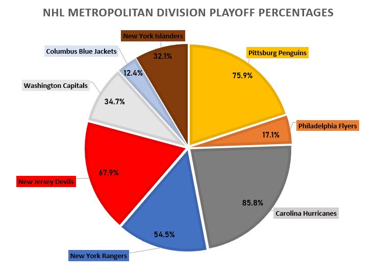
As I was making my pie chart, it was rather easy to display the numbers and data. I then realized, if I moved the data labels while they are outside of the pie chart, it would automatically draw a line to the corresponding data. I made each data label color match the corresponding team as well as each slot in the pie chart. For example, the Philadelphia Flyer’s team consists of black, orange, and white. As shown on the pie chart, you can see the Philadelphia Flyer’s slot is colored orange. I also related the colors of the other teams, to the boxes as well, which can be seen in my pie chart. I also changed the fonts and font sizes, along with adding text boxes for the percentages of each team, inside the pie chart. Specifically for the data set I used, the pie chart is the best way to display this data. Otherize, a bar graph could be used as well, but I do not think it is as visually appealing in this scenario. I believe this data is better served as a pie chart to visually see the different percentages of each team’s playoff odds.