Pie charts are a difficult tool to use because they require very specific scenarios to be the most applicable. For my perfect-use case I decided to display the contributions of countries to the UN budget, shown as a percentage.
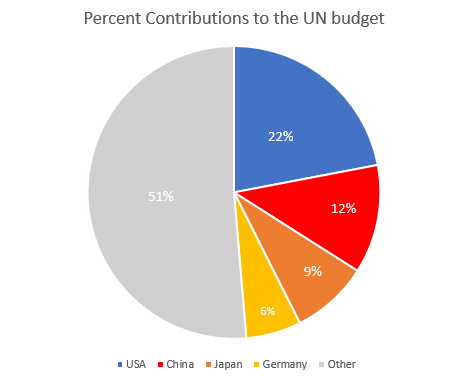
I think this is a perfect data set to use a pie chart because it’s simple and doesn’t have an excess of labels. This data set as it’s shown tells you that the US contributes almost one quarter of the total UN budget, and that the top four countries combined contribute nearly as much as the remaining 130 members combined. You may be able to add a fifth or sixth country to this pie chart, but then you lose the 50:50 narrative that is very easily read here.
Source: www.auswaertiges-amt.de/
-Jack Swenson