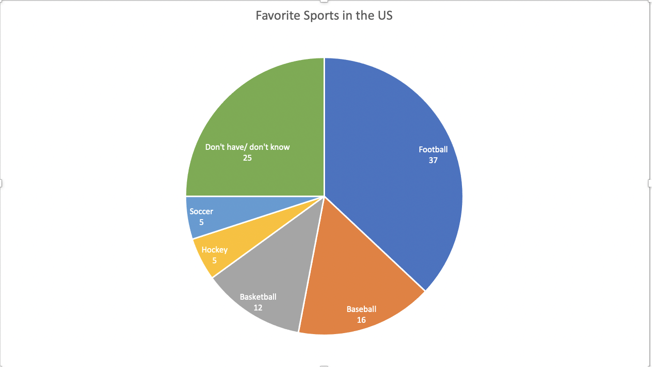
This data set is a perfect case for a pie chart. The percentages add up to 100. This means that all of the parts add up to a whole, which is a crucial part of a pie chart. A pie chart is also good to use here because there are only 6 categories. There is not too much going on and the chart does not look cluttered. It is very easy to read and the audience can easily compare the sizes of the slices to each other to tell which sport is more popular.
The data here is not served better as something other than a pie. A bar chart would work, but a pie chart is the most effective visualization for this data set.
I came across multiple design strategies to make this pie chart more appealing. First I color coded the different slices. This makes it easier to differentiate the slices from one another. Another thing I did was I put the category name and percentage in every slice of the pie. The percentage provides a more in depth look at the data. Also, adding the category name allowed me to take away the legend. This makes it easier for the reader to digest the information. They no longer have to glance at the legend, then to the chart, then back and forth. All of the information is in the pie chart.