A pie chart can be an exceptional tool when trying to display the totals out of 100% compared to other kinds of charts and graphs. When using a pie chart to break down complete totals it helps the viewer visualize the 100% since the whole pie is right there and they can see the portions of it cut out relative to the percentage.
This is an example pie chart I made which breaks down the weekly phone screen time usage between a handful of apps on my phone.
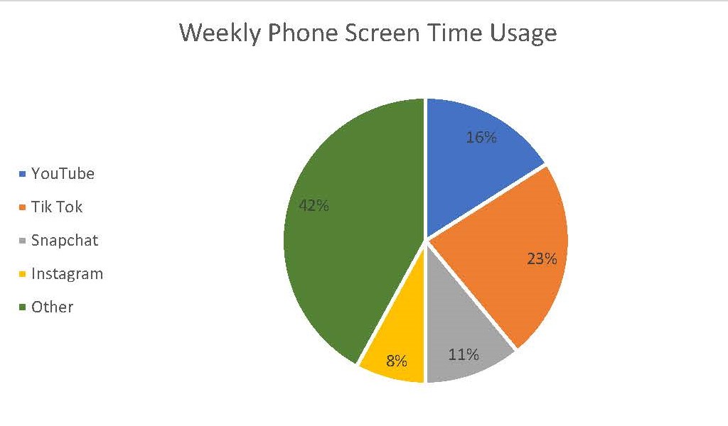
As one can see the slices very clearly show how 100% of a weeks worth of phone screen time can be broken up between these 5 subjects. One tip however for creating an effective pie chart is to limit yourself on how many slices or subjects are in the chart. If there starts to become too many then it makes it harder for the viewer to see each respective slice. In that situation than something like a bar graph will be more effective.
For more on the effectiveness of pie charts, click here.