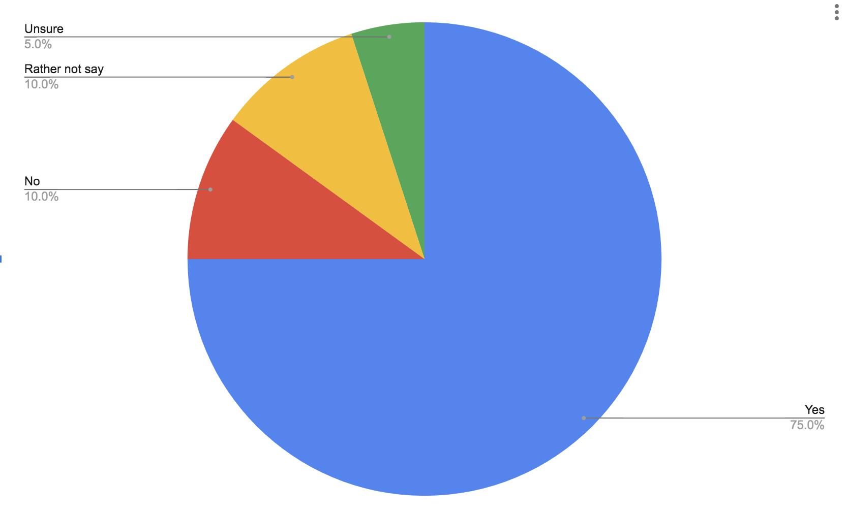
Part charts extremely easy to make and they can get the point of your data across very clearly. Pie charts tend to do better with a few categories rather than more because they can also become too busy very quick. Here is a pie chart to show data from a simple poll of whether people like ice cream or not.