By: Veronica Perkins
Pie charts are a form of data visualizations that can help represent data given to us. Pie charts are ideal when your data adds up to 100. I made a pie chart to help represent this:
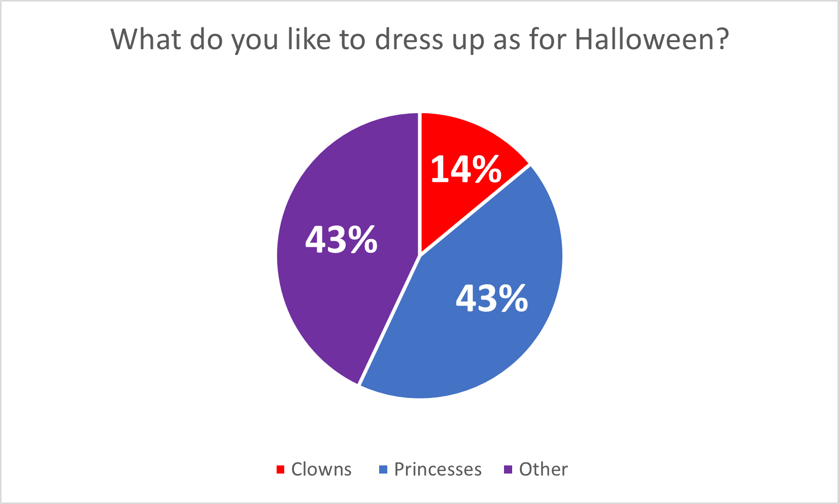
Pie charts are great for when you have multiple data points (that add up to 100%) because it allows the audience to see how the data is divided. In this case, the data I chose, represents what people want to be for Halloween and the data is completely made up. However, even though the data is made up completely, it still allows for the audience to see the data in a simpler way. I believe that this pie chart is a great version of data visualizations, but this data could also work on bar graphs as well. Here are a few tips for making pie charts: Be sure to vary each slice using different colors. Also adding data labels, such as numbers, can be a big help visually for the audience as well.
Happy creating! 🙂