By John Wickham
Pie charts are weirdly one of controversial bits of infographics scene. People say that they are very common in the space, but most people do not understand how to make. People make it hard to understand with problems such as not understanding the percentages or just having to many slices for the chart.
Pie charts are best used to show comparisons between small number of different categories (2-5 different sections) and when you want to highlight one specific piece of data.
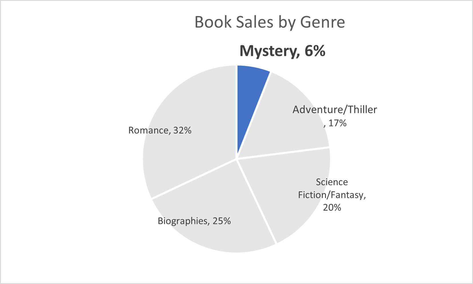
This pie chart above is about the sales of books within a group of genres. The main point I wanted to show was the low number of sales from the mystery genre. This highlights that more people should by mystery sections