A pie chart is a graphical representation technique that displays data in a circular-shaped graph. A pie chart best suits the parts-to-whole relationship for categorical or nominal or proportional data which sums up to a whole, mostly 100% or 1. Due to its unique display of data, it is better to not use so many data points in order to keep it simple and attractive. Often time, people use large amounts of data points which displays a crowded chart with many points of less significance making the chart not relatable or difficult to analyze.
make sense to show a parts-to-whole relationship for categorical or nominal data. The slices in the pie typically represent percentages of the total.
Pie charts should be considered when the data possesses the following,
- Few components
- No time representation
- Distinct parts
- Easy visualization

Figure 1.00 is a simple display of data on a pie chart. It has fewer data point and the total of the proportions sums up to 100%.
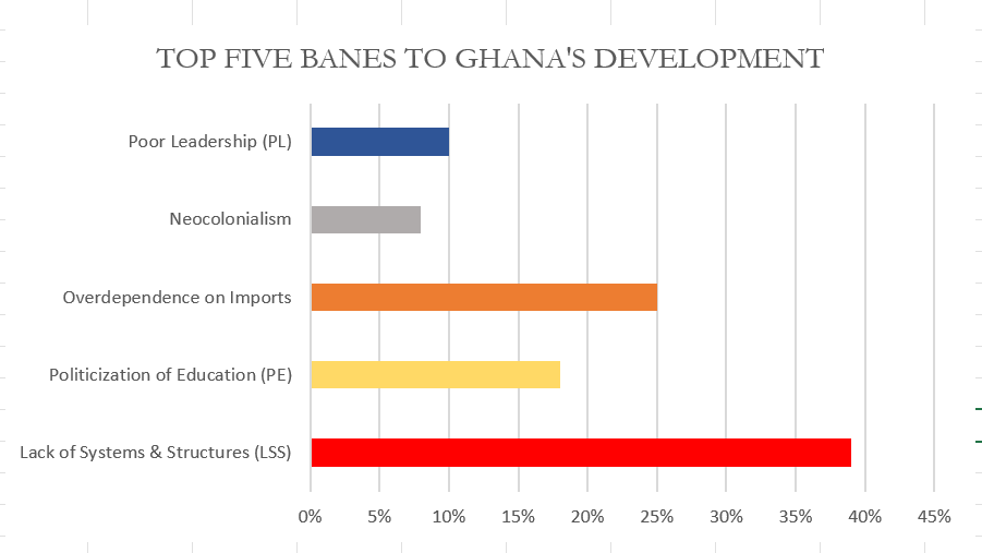
Though the data as presented in figure 1.00 can be presented in a column chart and would make sense just as the pie chart, I would still prefer the use of the pie as it is more engaging compared to a column chart. Figure 1.01 below show a column chart of the same data as in figure 1.00. Though simple, audience will naturally not be able to tell the proportions of each column or what the total is so in this case I will prefer to use the pie chart for much convenience and easy visualization.
There are some few design tips to consider when designing a pie chart and some of these are;
- Avoid using 3-D designs
- Use colors that match your data
- Avoid too many slices
- Use presentable fonts
- And many more…