The pie chart that I chose to make depicts the poverty level of people under the age of 18 in the United States in the year 2020.
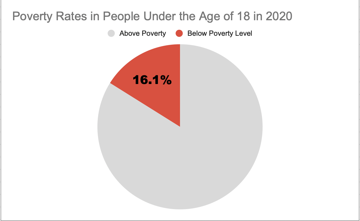
I believe this was a good example of data to use in a pie chart because it represents a part of a whole. Data like this I believe is perfect for pie charts. In this specific example, the whole is the US population under the age of 18 and the part is the percentage of those citizens who are under the poverty level.
This specific data I feel is best represented as a pie chart, however, the other data I found in the article I got this information from would have benefitted better from something like a line chart. That is because not only did this website tell me the percentage of minors under the poverty line, but it also told me that 2020 was the first time poverty rates have increased in the last 5 years. It would have been very beneficial to show the steady decline and sudden increase of poverty rates over the line chart. However, like I previously mentioned, for this specific data example I believe the pie chart was best.
As far as design choices I made for this chart, I chose to go with a bright color to highlight the important part of the chart. I also chose a muted grey color so the audience would focus more on the children in poverty. I also decided to only put the percentage of impoverished children to once again highlight the point of the chart.
This is the website I obtained my information from: https://www.census.gov/newsroom/stories/poverty-awareness-month.html
Abigail Moore