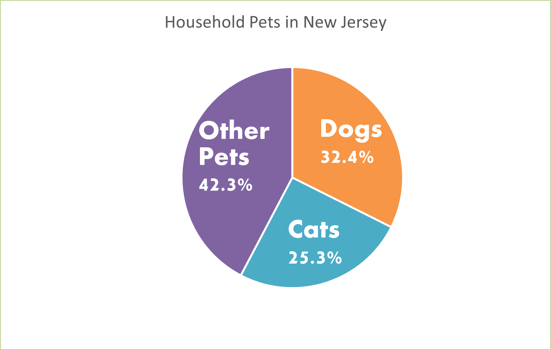
Pie charts are great for displaying percentages or parts of a whole when it comes to data. Most likely, pie charts will be used when its based off of a percentage of 100. For example, I created a pie chart to present the household pets in New Jersey. Below you can see that of the households in New Jersey that have pets, we are looking at whether they have dogs, cats, or another kind of pet. Just by examining the chart we can see that the majority of households have some other kind of pet that is not a dog or cat. Then we see that the next biggest is dog, then cat.
This information could also be displayed as a bar graph. We could have separate bars for each category but instead of using the percentages, we would use the real number of how many pets in each household rather than the percentage of each different pet in households. But since the numbers are very similar, I think that the pie chart is the best because it is showing percentages of each type of pet.
Pie charts are very easy to make on Microsoft Excel. You can make them unique by changing the color and style of them by making them 3d. You can add a legend and add the percentages to your chart as well. I like to add the percentages to my pie charts so your readers know what they are looking at and exactly what number is being displayed. Don’t forget when you create your pie charts to add titles and labels so your readers know what the pie chart is displaying.