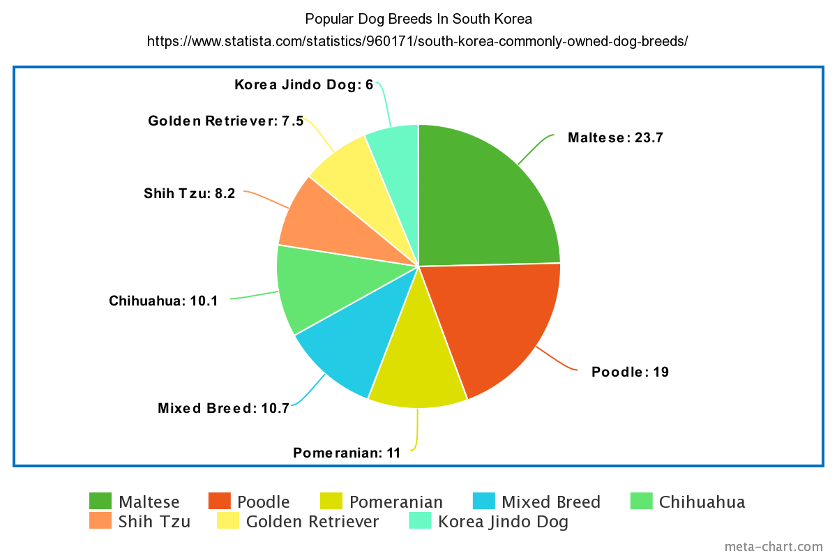
I chose to display the Popular Dog Breeds in South Korea. I feel as though a pie chart is the best way to visualize this dataset. this is because of the ease that comes with working with pie charts. Pie charts are a type of data visualization that breaks down the slices as categories of their amount or percentage. This lets the consumer know which parts are heavier than others or vice versa. This is because more often than not there are categories close in similarity and very different. The separation in colors aids in what slices belong to each category