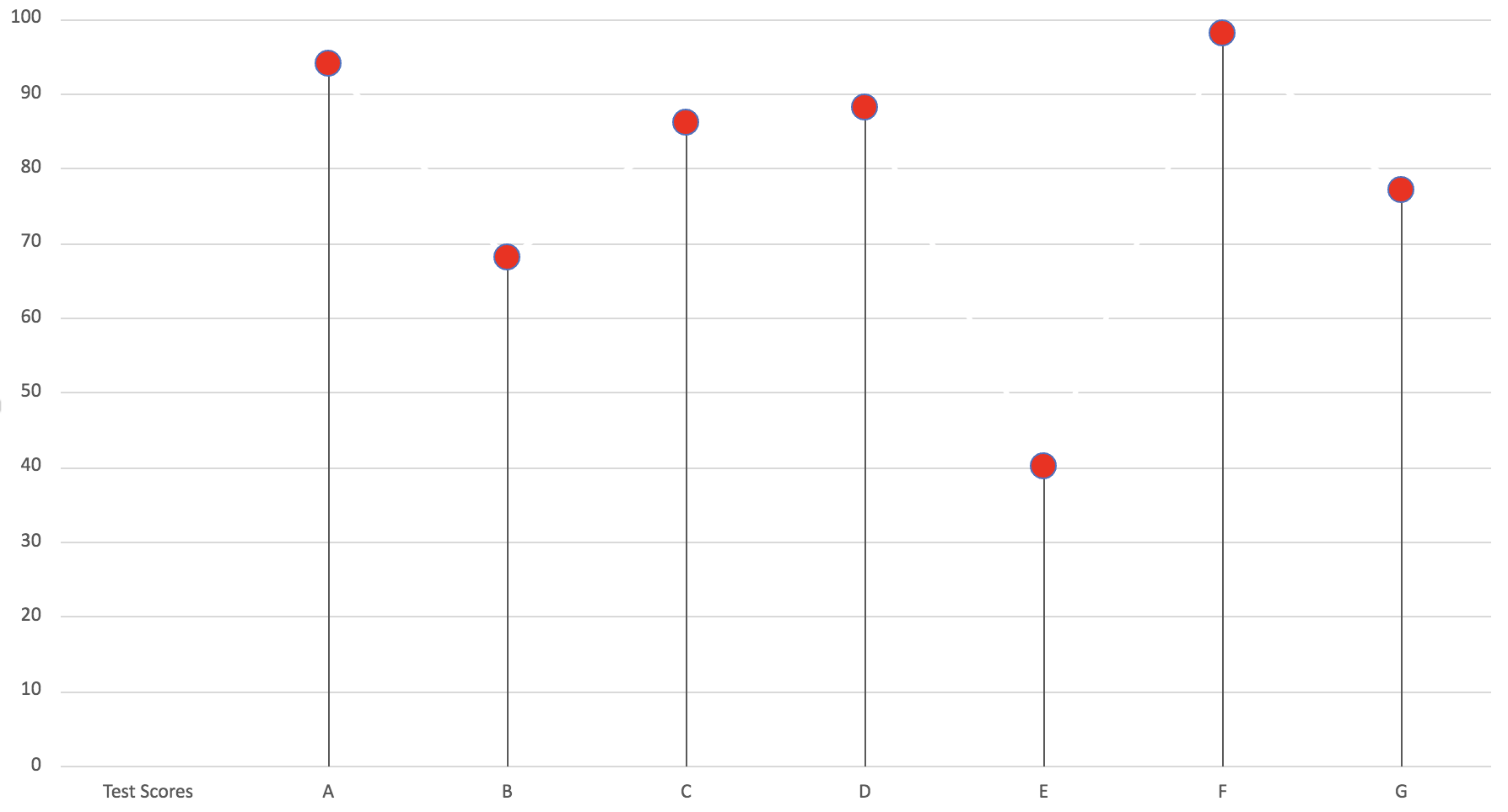
Lollipop charts are a really simple and useful infographic to get basic information across. Here I made a lollipop chart using test scores for A, B, C, D, E, F and G. It is easy to follow and see the test score that each letter received. In my opinion, this graph is a very simply play on a normal bar graph just with a bit of added “fun” to make it less basic and square.