When thinking about a lollipop , you tend to don’t think of a chart. Some people compare it to a bar graph, but it is slightly different as it a line and a dot, which gives it the lollipop shape. Not an actual bar and many people comment that there is no distinct different besides the shape. The chart is actually used to compare categorical data. I think it gives a different dimension and a fun way to show data.
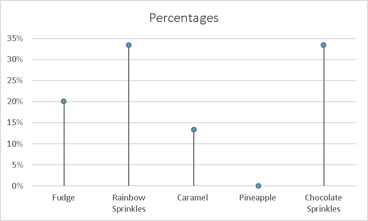
See below for the table I created for this table.
| Ice Cream Toppings | Percentages |
| Fudge | 20% |
| Rainbow Sprinkles | 33% |
| Caramel | 13% |
| Pineapple | 0% |
| Chocolate Sprinkles | 33% |
This was a fun in making. Will be using this type a graph again!
Hey there, I like what you did in your post by adding a table to go alongside the graph. It helps put the pieces of the puzzle together so to speak. I also think you chose an easy and good data set to use. Great job!