By Robert Fox
A lollipop chart is a variation of a column/bar chart. The bars you would normally encounter are instead replaced with a line and a dot at the end of said line. Lollipop charts serve the same purpose as bar charts however, and a simply a different visual. They still compare data values with one another.
When would it be best to utilize a lollipop chart instead of a bar chart?
Lollipop charts tend display data better when there is a large number of values that are close to one another, causing it to visually be hard to read as a bar graph. With a standard bar chart, the infographic would be to be mashed together, and thus making it hard to differentiate between two similar values. The lollipop chart makes these small differences easier to see, and it is also a more clear visualization.
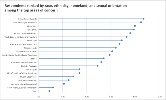
Here is an example of a lollipop chart based of data taken on the overall population percentage of student voters in the New York Area. Here we can see many data points of close value, it being in this format making it able to be understood.