What is it? What is it used for?

Lollipop charts are used to make comparisons between different items or categories. They are great for when you need to display trends over time. They have both x and y values. It is best to use when you have a large set of high numbers. This includes comparing big sales or percentages. It looks similar to a bar chart, but the lines are normally thinner and there are dots/circles on the end of the lines just like the candy. I would not advise to use lollipop charts when showing relationships. All in all, it is a super unique chart type to display your data in a fun way.
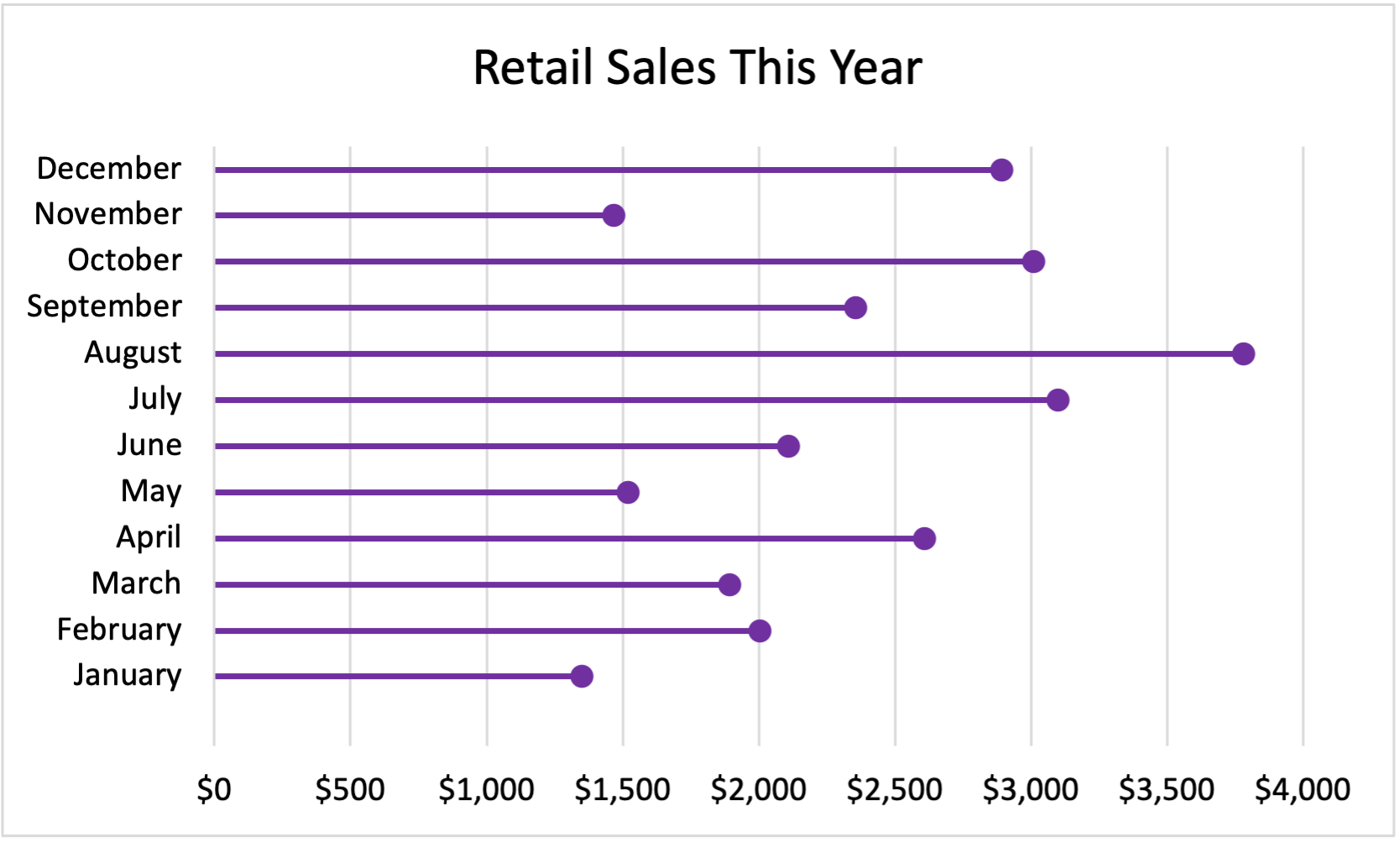
Here is my lollipop chart!
My Data:
January $1,350
February $2,003
March $1,894
April $2,609
May $1,521
June $2,109
July $3,100
August $3,780
September $2,356
October $3,009
November $1,467
December $2,891
Hi! I like the topic you chose to do your chart on! Since lollipop charts are used normally for high percentages or numbers, retail was a great choice! The graph is very neat and organized! I like how you chose to do it horizontally rather than vertically, next time I might try that!
Your lollipop chart looks great! It really shows that the month of August did the best in sales compared to the other months. You also explained the lollipop chart very clearly about what it will look like and what it is comparing. I also like that you included your data at the bottom so those that do not know how to read the lollipop chart can see where the numbers are coming from and see how they are displayed on the chart.
Hi I really enjoyed your explanation of what the lollipop chart was and how you displayed it. I was wondering, what retail company might this be?
You did a very nice job explaining when to use a lollipop chart. I agree when you said that they are great when you need to display trends over time. I think that the dots at the end of each line help show this. It gives the graph an aspect of a line graph which is also good at displaying trends over time. Your lollipop chart also looks very visually appealing, good job!