The above link to the infographic image
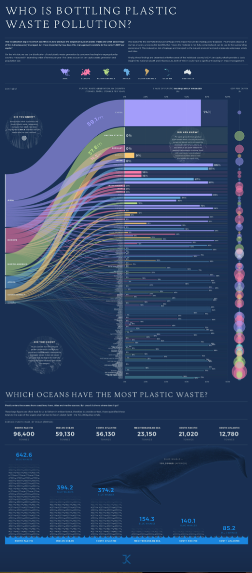
In our daily life how many plastic bottles of water, cold drinks or coffee cups are we using no one have any idea about how much plastic waste is thrown into the ocean worldwide. However, with the help of infographics, it is very easy to track that which country is doing more plastic waste pollution. This is the data based on the distribution of total plastic waste generation by continent. The purpose of this blog is to estimate the percentage of plastic waste that was inadequately disposed of. These types of graphics present complex information quickly and clearly. The infographic provides a great amount of complex information in a clear and precise picture of the current surface plastic mass by the ocean, measuring it in a creative way. In a bar graph, we can see plastic waste management for every country in a colored bar chart. The names of the countries that report 100% of all their plastic waste handled properly are highlighted in bold. In addition, the GDP of the country and efficient plastic waste management don’t always correspond as we can see by the irregular patterns shown in the infographic.
Reference
https://visme.co/blog/best-data-visualizations/