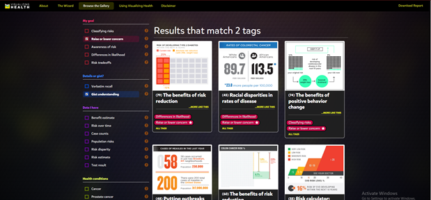
VizHealth is a collaborative project developed by the University of Michigan and the Robert Johnson Wood Foundation. This tool allows users to choose from 54 original data visualizations which have been tested through research amongst the general public. Utilizing The Wizard tool allows users to figure out what the primary goal for communicating the risk is and whether their audience needs to understand the basic idea or to remember exact risk numbers.
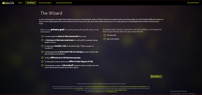
Figure 1. The Wizard tool from Visualizing Health.
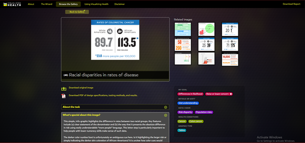
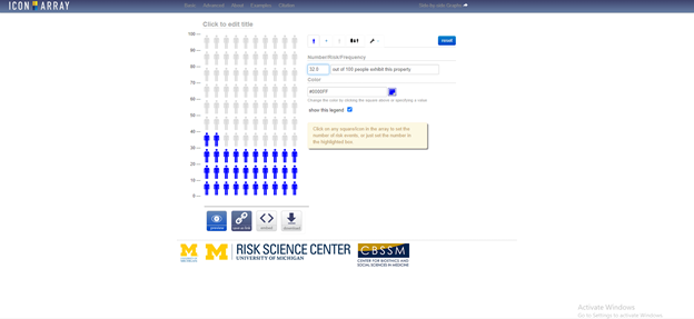
Based on the answer to these two questions, the tool will display graphics that best match your needs. These images can then be modified to fit your own data. You can also browse through the gallery according to specific tags to find the most effective visualization for you. This is a great tool that can be used by anyone from students to professionals as these graphics have already been tested and proven effective to convey information to the general public. There is also an external link to an Icon Array Generator provided by the University of Michigan Risk Science Center that users can utilize to create their own custom images.