Here, I pulled information from the World Health Organization’s (WHO) daily COVID-19 database as of December 2, 2020.
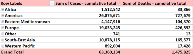
Here, I pulled information from the World Health Organization’s (WHO) daily COVID-19 database as of December 2, 2020.
What are Pivot Tables and why are they useful?
Pivot Tables are essentially reports that companies use for their own personal checks and balances. What sets them apart from statistical charts is the fact that they are very interactive. Instead of having a multitude of confusing formulas, you can have a very simple table where you can choose what variables you want to compare.
In my research, I found a lot of interesting ways to use Pivot Tables. This website was particularly helpful in simplifying what the tables are used for and how to construct one.
https://exceljet.net/excel-pivot-tables
According to https://www.criticaltosuccess.com/top-29-pivot-table-tips-for-consultants/ , The best use for pivot tables are for recording sales numbers. You can specify the time of year, a certain product, and a lot of other fields.
What is a pivot table?
A pivot table is a tool in Excel that allows users to interact with their large, raw dataset to gain a better understanding of specific topics within the dataset.
When is a pivot table useful?
Pivot tables are extremely useful when dealing with any dataset that contains a vast amount of variables. Additionally, they are useful in cases where you are looking to identify specific variables within the dataset and how they interact with other variables within the same dataset.
Examples of pivot tables:
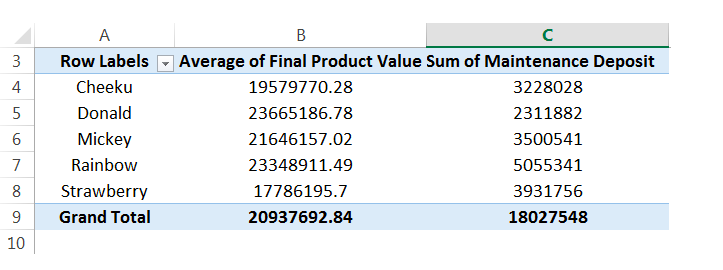
Pictured below is an example of a raw dataset which can be found here. While this is not the entire dataset you can begin to see that if this contained hundreds of rows this could be confusing to look at and would need to be formatted in a better way.
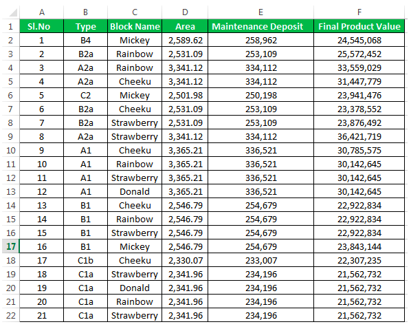
That is where the pivot table comes in! From the raw data we can then select specific variables to look at and compare to other variables in the same dataset. Below you see one example of a pivot table that was created using the raw dataset above. You see in this table only the block names, final average of product & sum of maintenance deposit are shown.
Pivot tables make it extremely easy to simplify your large and overwhelming data sets into clean and clear tables. Pivot tables can be used in almost any instance where there is statistical values being computed such as sums or averages.
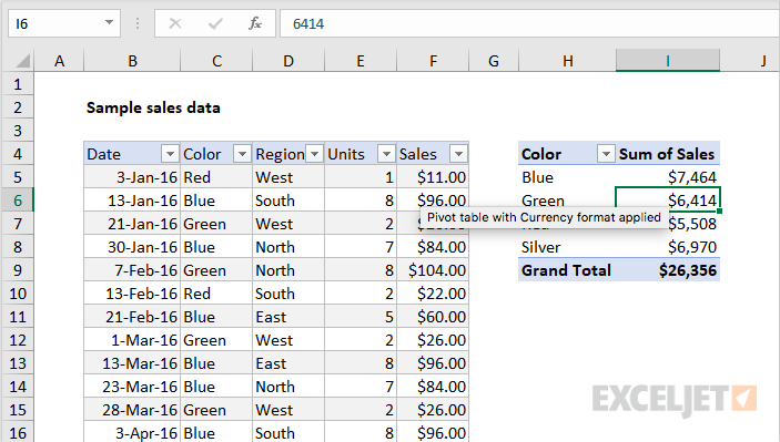
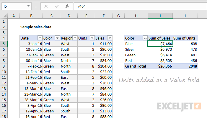
Pivot tables are a great feature in Excel that allows you to analyze large data sets very quickly. This short video gives a brief introduction on what they are and how they function.
Here are 3 different times a pivot table can be useful when analyzing data in the real world:
You have an endless list of sales data for various products as well as regions. You want to see which products have been bringing in the most money in each respective region but adding up the columns in Excel would take a lifetime. This is a perfect example in which a Pivot Table would come in handy.

It allows you to rearrange the data so that you can see sales by product and region in less than a minute. You also have the option of displaying the total sales by product as well as grand totals for each region.
2. Show product sales as percentages of total sales
You can also use Pivot Tables to display percentages along with the totals to see how various products are performing compared to each other.

3. Get an employee head count across departments
Pivot Tables in Excel allow you to quickly count rows that share something in common. You have a list of employees and their respective departments and need to figure out how many employees are in each department. A Pivot Table allows you to quickly summarize this information without having to do a manual count.
Pivot Tables are best described as summary tables because they display the most important information the researcher, company, or student is trying to represent. They are typically easy to create and are a very organized way to record numerical data. Below are a couple examples of how Pivot Tables are used.
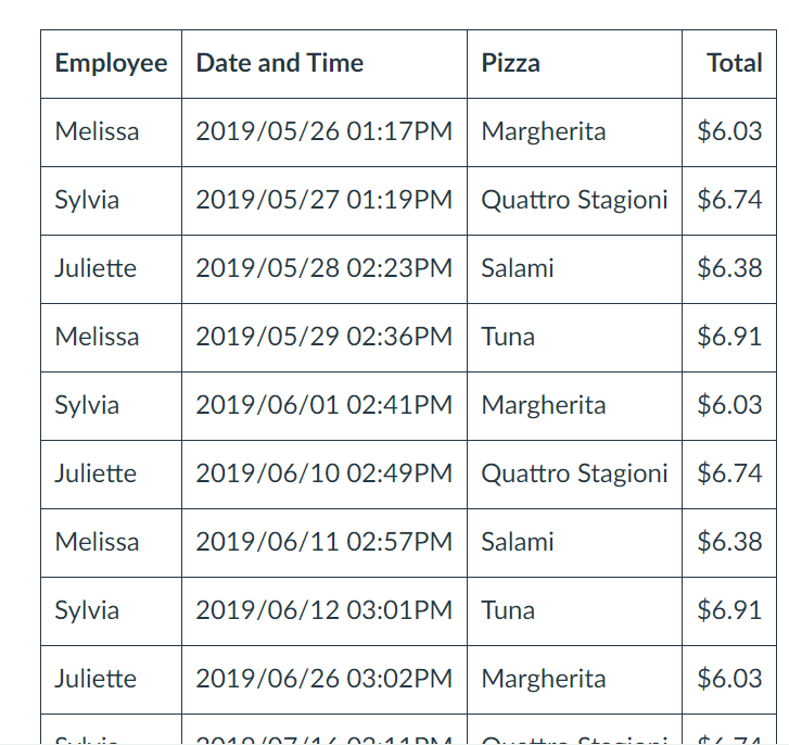
One way Pivot Tables can be helpful is when tracking receipts. As you can see, the table is very neat and organized. The data is laid out in such a way that is easy to read.
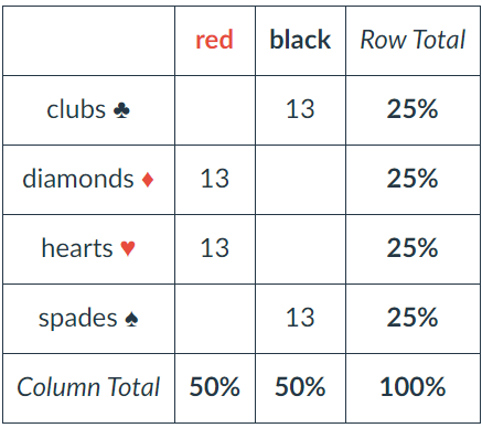
The deck of cards can be divided into symbols, numbers, and colors. From here, each column and row are totaled to make the information easier for the reader to understand.
There are many more examples out there such as insurance companies and restaurants. However, in all these examples Pivot Tables are always grouped items, records, and/or rows into categories and they count the number of items in each category.
I think pivot tables are one of the best ways to display data but get the least amount of attention. I say this because I both make and see them everywhere yet had no idea what they were actually called.

The table above is offering an example on food versus how much of one product was sold. This is an especially helpful layout when considering when to add or remove certain products from an itinerary. Being able to see by order or day what products are or aren’t selling is a great way to negate some costs.
Personally, I’m not in the business of needed to see what sells over what as I don’t own a restaurant or store of any kind but I imagine that this could be helpful even in situations that aren’t monetary. I have a large collection of makeup and I think this would be a great way to organize my collection to make sure I get use out of all products.