Categories
Data Visualization and Art Design lollipop chart

The Lollipop Chart

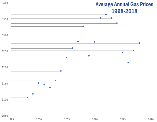
The lollipop chart is a variation of the traditional horizontal bar graph. It is used to rank categories, show trends over time or to compare categories. The lollipop chart eliminates most of the text show in a traditional horizontal bar graph, making it more approachable and minimalistic which allows readers to quickly gather information accurately.

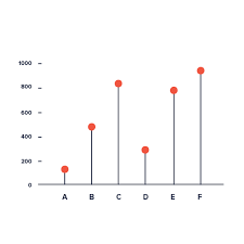
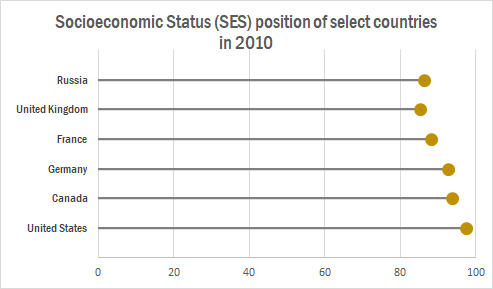
The chart below shows a lollipop graph created in Excel. It displays the Socioeconomic Status rankings of 6 major countries in 2010. The graph has minimal information and therefore is easy to read. The reader can quickly learn that the United States has the highest SES ranking while the UK has the lowest.

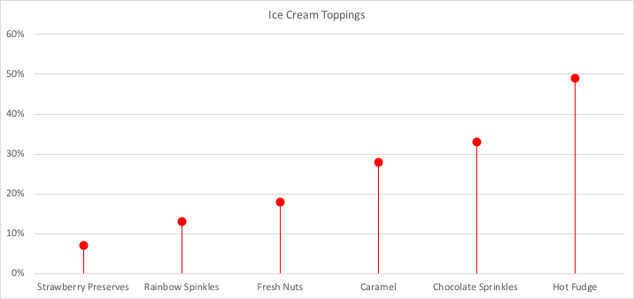
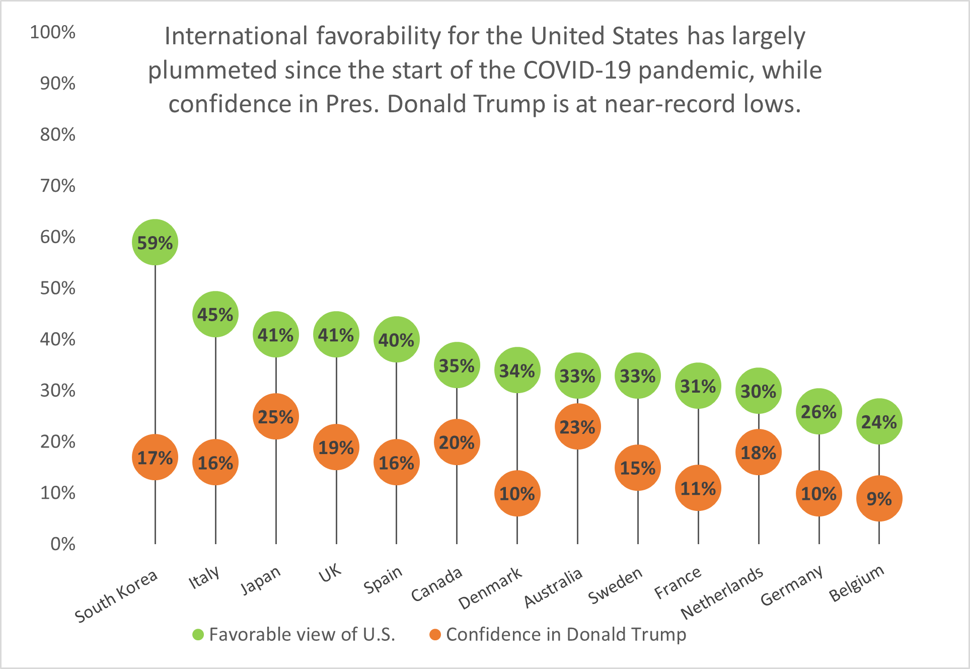
This type of chart can be used with any data that can be represented by a standard bar or column chart. It is especially useful when you have a large amount of categories to represent, making a bar graph too cluttered. Lollipop graphs can also be vertical like the one shown below taken from Visualbi. A vertical lollipop graph allows you to add labels inside the lollipop to easily highlight values. To learn more about lollipop graphs and how to create them click here.

Lollipop Chart in SAP Lumira Designer - Visual BI Solutions
https://visualbi.com/blogs/sap/sap-businessobjects/sap-lumira-designer/lollipop-chart-sap-lumira-designer/

Categories
Uncategorized

Lollipop Visualizations

I think Lollipop Graphs are really interesting and creative ways to show your data. The first interesting thing is that you can create them in one of two ways: Either through Scatter Plot Graphs or through Bar Charts.

Lollipop Graphs are very simple, yet they show you exactly what you need. and that’s their exact purpose.

In my Lollipop Graph, I chose a data set about popular ice cream toppings. I chose to show them in ascending order because I thought it looked a lot better. It is very minimalistic, but I believe it gets the point across.

While doing some more research, I found some more variation of Lollipop charts like the ‘Cleveland Dot Plot’, which has a shorter line and shows two subgroups. More of these examples can be found at https://www.data-to-viz.com/graph/lollipop.html.

Categories
Uncategorized

Lollipop Chart… Sort Of

So this week I completely failed at trying to make a lollipop chart. I refuse to be too hard on myself because at one point I had been sitting at my kitchen table for over two hours trying to follow the directions from the book. The image below is what I ended up with.

I’m truly not sure where I went wrong. The petty side of my personality is saying who even cares. It’s just a bar graph that’s harder to read than normal. But I know before 3:00 tomorrow I will be trying again. And again. And if I can’t get it right then I’m willing to take that L.

Below is what a lollipop graph… should probably look like. Frankly, I don’t think I’m too far off. I think I can get there. But this has officially passed 3-D bar graph as my least favorite way to display data.

policyviz.com

A live look at me trying to figure out how the hell to make a lollipop graph and why can’t I get mine to look like hers and where are these supposed tools that will help me build one online

Categories
Data Visualization and Art Examples Infographics

Lollipop Chart

It is no secret that a majority of the United States thinks poorly of President Donald Trump, especially given his handling of the ongoing COVID-19 pandemic among other issues. But what do the nation’s overseas allies think of him? A Pew Research report published on September 15, 2020 details how the United States’ image waned on the global stage since Trump took office, and the numbers are damning.

Source: Pew Research Center.

South Korea has the highest approval rating of the United States’ image out of thirteen nations surveyed, yet it holds little confidence in President Trump’s ability to lead the U.S. Fourteen points behind South Korea is Italy with a 45% approval rating, while Belgium holds the least favorable view of the United States and the lowest confidence in Trump.

Lollipop charts like this one are a visually-appealing alternative to column or bar charts because they cut down on the amount of space the chart ink takes up; instead, they focus on the data points themselves and showing how they rank among other categories.

Categories
Uncategorized

Lollipop Graphs!

What is a lollipop graph?

A lollipop graph is a visualization that is great for comparing up to three different types of data such as year to year or before, during and after. Typically, a lollipop graph can be used where a bar graph would be used and is often more visually appealing. Lollipop graphs are not ideal when you are using a dataset with stacked-bars or with data that has very similar end results. An example of this would be an experimental dataset with thousands of results ranging from 0.00 to 0.05. It would be extremely difficult for an audience to differentiate what exact values the bars are representing.

How to create a lollipop graph…

When looking for a dataset to create a lollipop graph with it is important that you choose one that is appropriately measured by a scatter plot, as this is used to create your final visualization. Keeping this in mind, I selected to create my visual using the average gas prices over the past twenty years, this dataset is pictured below.

After selecting a dataset I moved into Excel to begin creating my lollipop graph! First, you should translate your selected dataset into a table in Excel, as pictured below using my example dataset.

Once you have your dataset translated into an Excel table, you will insert a basic scatter plot graph to represent your data and make a few other formatting changes. These will include adding horizontal error bars, changing the error bars direction & altering the error amount. Once you have completed this your lollipop graph should look similar to the one I produced using my dataset below.

As you can see, a lollipop graph is a much more visually appealing when compared to a simple bar graph. While it may be a little more work to create, it can make a huge difference in what your audience takes away from your visualization.