So this week I completely failed at trying to make a lollipop chart. I refuse to be too hard on myself because at one point I had been sitting at my kitchen table for over two hours trying to follow the directions from the book. The image below is what I ended up with.
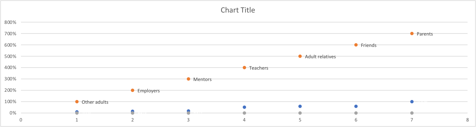
I’m truly not sure where I went wrong. The petty side of my personality is saying who even cares. It’s just a bar graph that’s harder to read than normal. But I know before 3:00 tomorrow I will be trying again. And again. And if I can’t get it right then I’m willing to take that L.
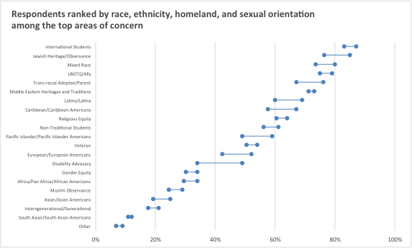
Below is what a lollipop graph… should probably look like. Frankly, I don’t think I’m too far off. I think I can get there. But this has officially passed 3-D bar graph as my least favorite way to display data.
A live look at me trying to figure out how the hell to make a lollipop graph and why can’t I get mine to look like hers and where are these supposed tools that will help me build one online