Categories
benchmark Data Visualization and Art data visualizations Infographics Uncategorized

Benchmark Comparisons

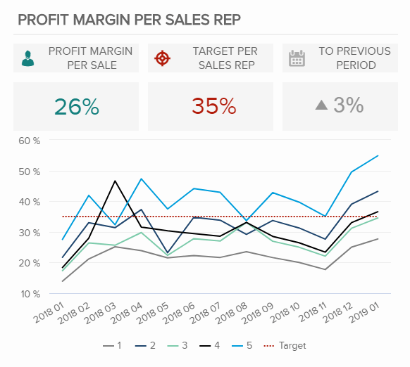
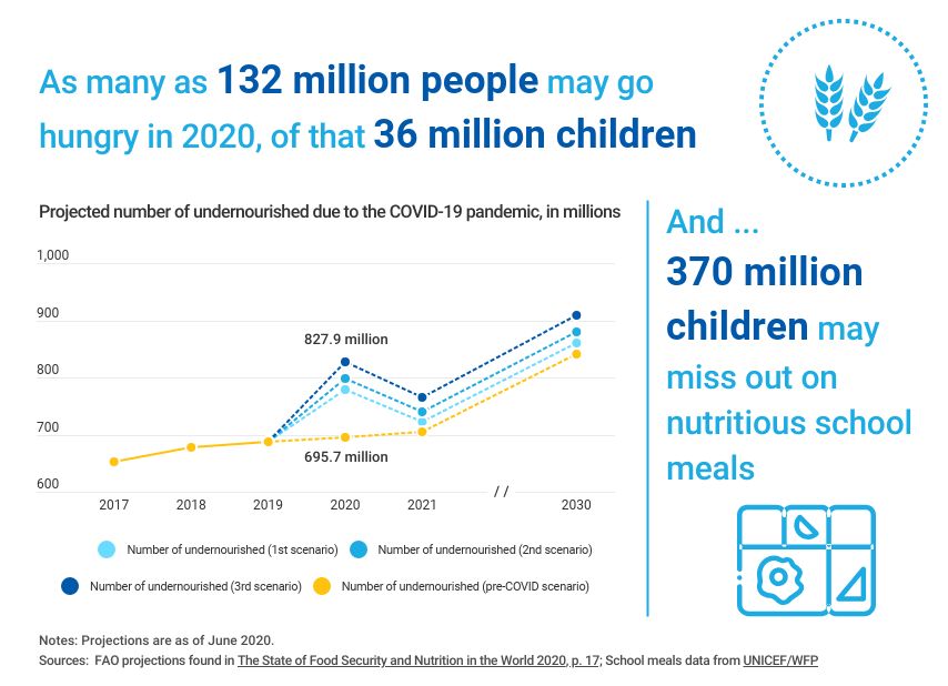
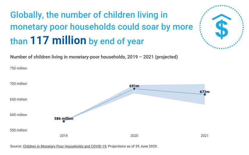
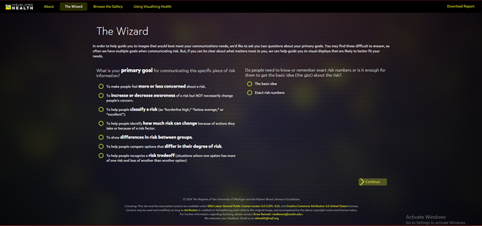
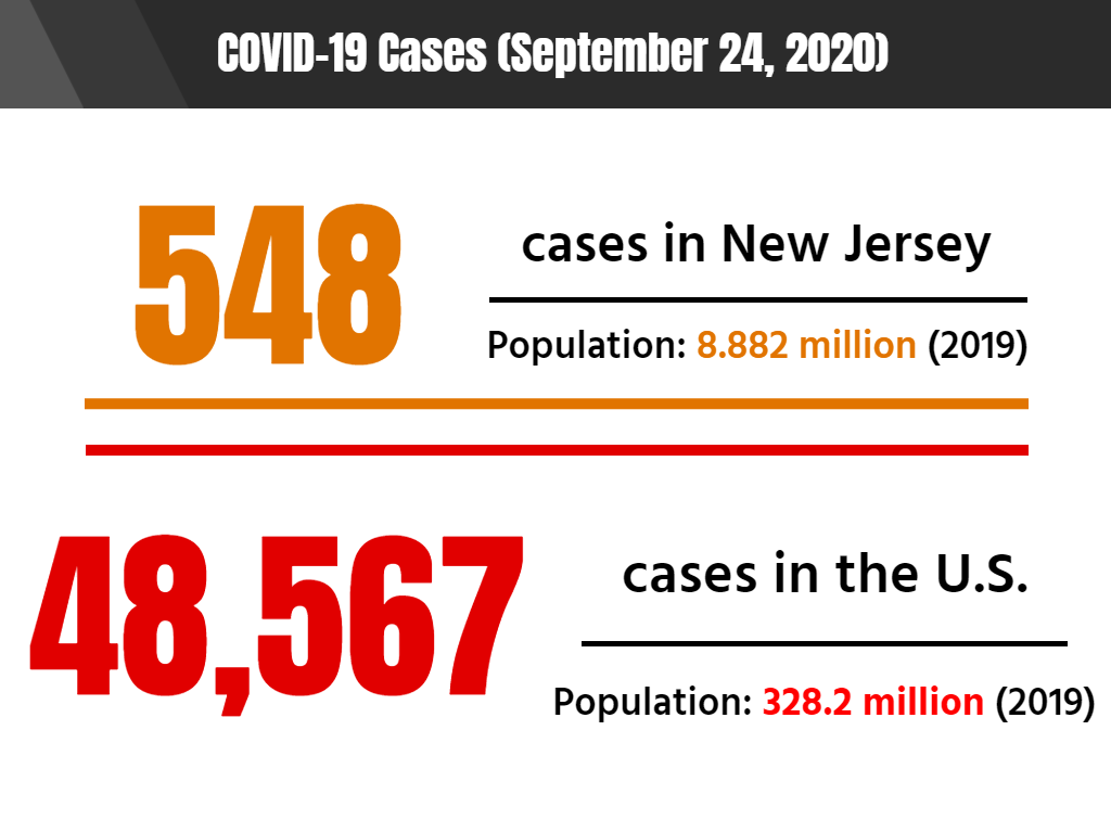
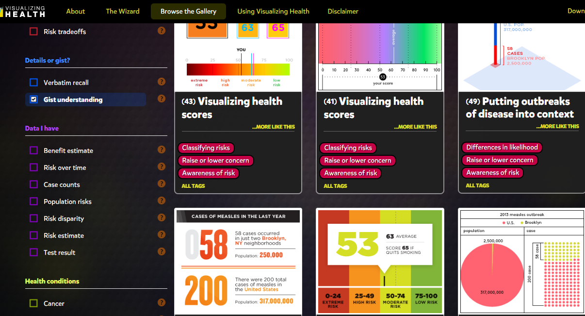
When looking at a comparison infographic, sometimes it’s difficult to determine the standard for comparing two or more things. One solution is to apply a benchmark to the chart, but there are many ways to go about it.

Benchmark comparisons in the news

As someone who has a professional interest in the natural sciences, it saddens me to look at the news and discover that not everyone in the United States trusts scientists to do the right thing. More often than not, the media cites misinformation and alleged government propaganda as sources for such distrust. However, I do sometimes wonder what opinion people from other countries have of scientists. Recently, I read a Pew Research Center report about the scientific community’s relationship to the general public, and I was surprised that people in countries like India and the Netherlands have far more trust in their nation’s scientists than the American public has in ours.

Source: Pew Research Center.

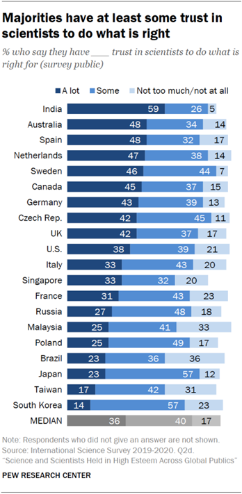
On the other end of the spectrum, I found myself wondering why nations like Japan and South Korea are skeptical of scientists. They are among the world’s leaders in technological advances, yet the people don’t seem to trust scientists to do the right thing. When compared to median values, the United States exceeds the benchmark, if only by a slight margin, which gives me hope that the vocal minority that distrusts scientists will one day see their error and learn to trust science.

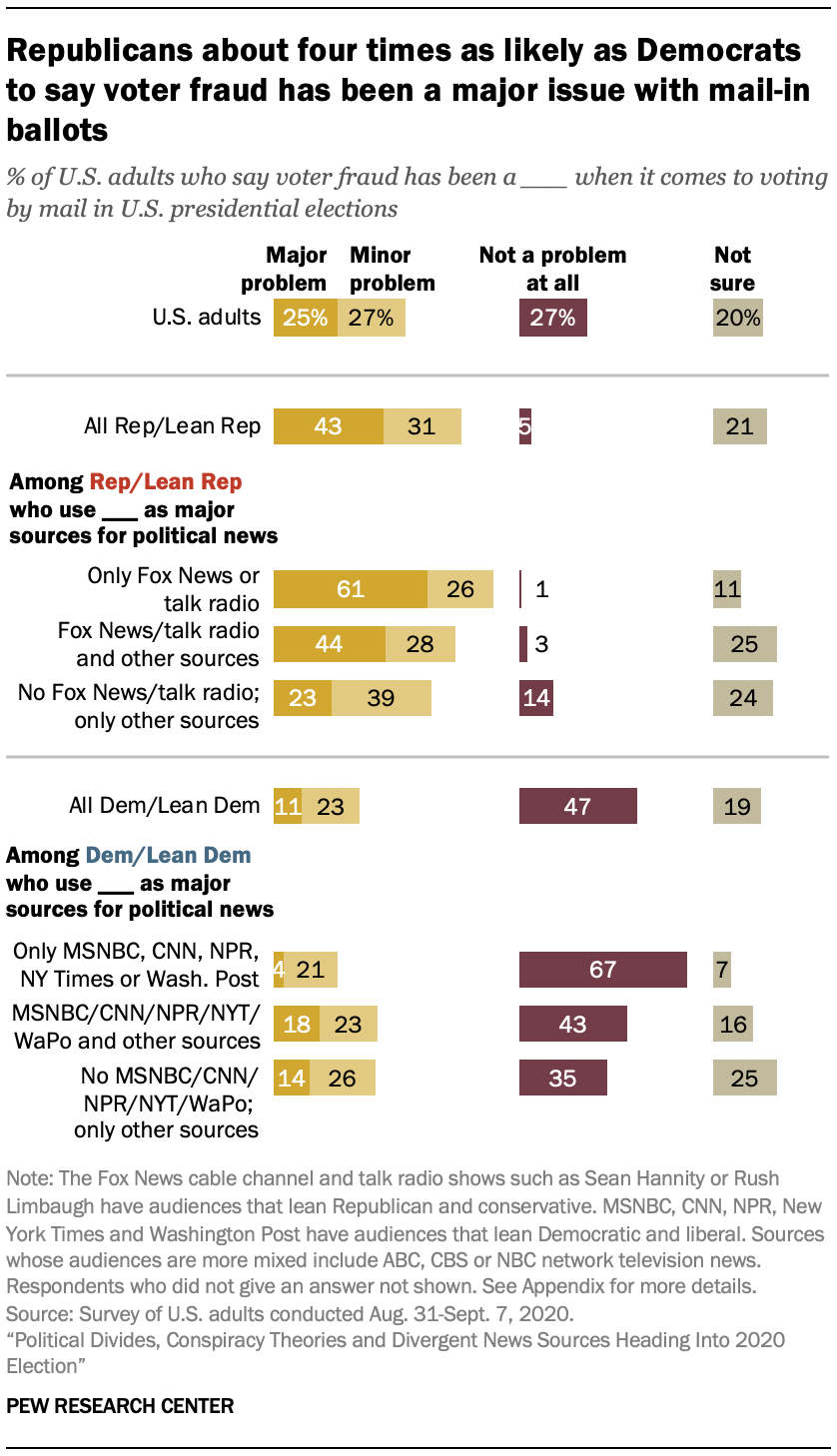
Another way of showing a benchmark is by comparing positive and negative values to determine favorable perspectives. With the United States presidential election fast approaching, the public is more divided than ever on whether or not this year’s elections will be run well. It is likely that a divide in partisan politics and factors like the current COVID-19 pandemic and ongoing police brutality protests are responsible for this immense discourse.

Source: Pew Research Center.

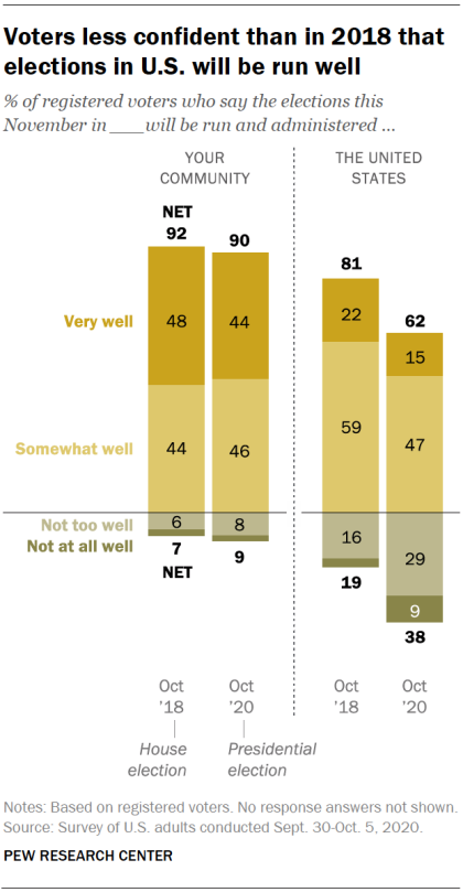
Based on Pew Research Center’s data, I estimate that conservative-leaning voters believe that the election will be handled well. On the other hand, liberal-leaning voters believe that this year’s election will run into a series of blunders or be subject to manipulative interference. As someone who wants to see Donald Trump and his alleged enablers voted out for the sake of the rest of the nation, I am hoping for the best but preparing for the worst.

What about comparisons related to topics I enjoy?

Even when I am not catching up on the news, I still enjoy looking at comparisons for the things I love. For example, I’ve been playing Square Enix’s Final Fantasy XIV Online (shorthand: “FFXIV”) for about a year, and have a strong interest in joining the small community of players who spend most of their time on high-end or difficult pieces of content. When a new piece of content comes out, one of the first places I go to look for information is FF Logs. Their tools analyze combat data and give players a sense of their overall performance and where they can improve. They also have statistical charts that show performance averages for each of the game’s 17 combat classes (jobs). For example, one of the most difficult “raid dungeons” currently in the game goes by the name of “Eden’s Verse: Refulgence.” (shorthand: “E8”). Raids in FFXIV typically have two modes of difficulty, normal and “savage,” with the exception of specially-themed “ultimate” raids. The community typically pays attention to statistics and ranking for savage raids. In the first few weeks of release, Eden’s Verse: Refulgence (Savage) (shorthand: E8S) proved to be a difficult challenge for most raid groups.

A box plot comparing the minimum, lower quartile, median, upper quartile, and maximum damage per second (DPS) for all 17 jobs in one of Final Fantasy XIV Online’s more difficult fights. Source: FF Logs.

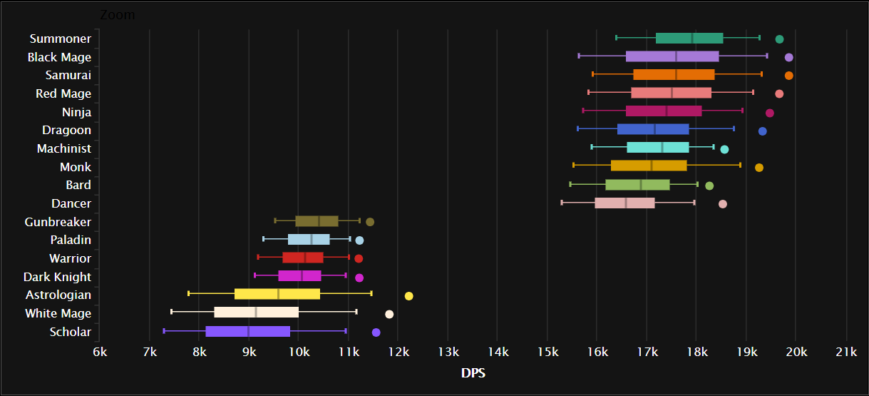
Combat jobs in FFXIV are divided into three major roles: tanks, healers, and damage per second (DPS). The box plot chart above shows an aggregate ranking for job performance in E8S over the course of two weeks across all percentiles. DPS jobs typically put out far greater damage than tanks or healers, with magic-based DPS jobs having the highest damage output. The only exception to that rule is the samurai job, which is typically described as being a selfish DPS job that brings little party support to a fight as it deals heavy hits at melee range.

Viewed from a different perspective– say, comparing the maximum and minimum percentiles for E8S damage– certain trends seem to appear among the 17 jobs, and it reflects in how well the player performs in the fight. The best players in the world generally fare much better and clear the raid faster than players who barely have a grasp of their jobs or exhibit poor performance.

A chart comparing the damage per second (DPS) output for E8S, in the maximum and minimum percentiles, across all 17 jobs in Final Fantasy XIV Online (job abbreviations are used). The jobs I play the most are highlighted in color. Source: FF Logs.

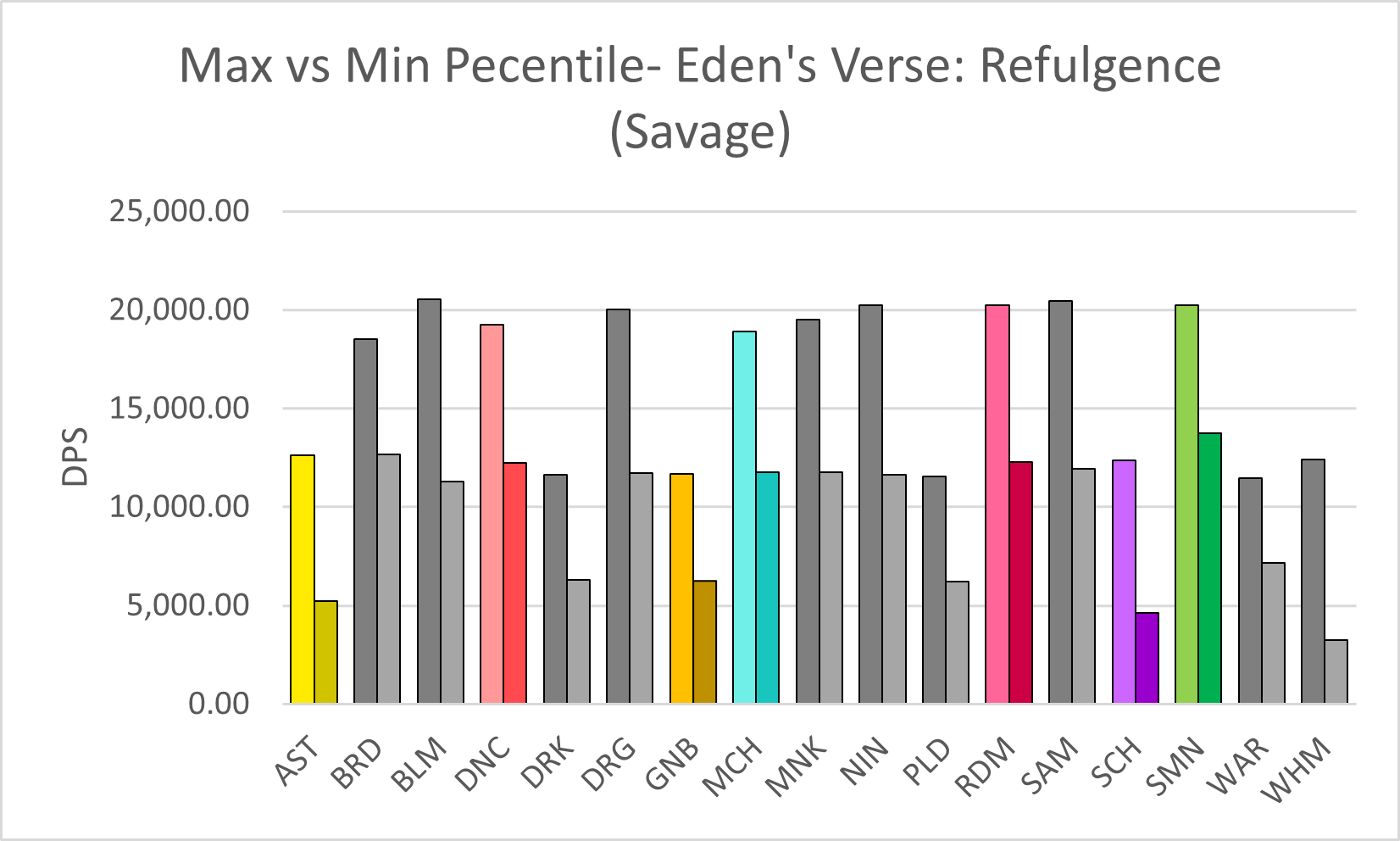
Compared to others who play the same jobs as me (color-highlighted in the chart above), I would say that I am somewhere between the two extremes. However, in the case of the job I play the most, red mage, I tend to lean toward the lower end of the spectrum. I recall running a four-person dungeon once with some of my friends a few months before the COVID-19 pandemic exploded. One of them, who went in with a tank job, had a third-party tool open to analyze everyone’s damage output in real-time (which is against the developer’s terms of service, but Square Enix doesn’t crack down on third-party tools if players don’t discuss them publicly in-game), and once the program crunched the numbers, he uploaded the data to FF Logs and sent me a link to the log over Discord. As I looked it over, he laughed in voice chat and likely shook his head at how low my damage output was. Another one of my friends, a healer who did significantly better than me, pointed out that at least I knew my spellcasting priority rotation as a red mage and the random black mage who got matched with our three-player party did less damage than me. I didn’t care that my damage output was sub-par, though. I was happy just to run content with my friends.

Categories
Uncategorized

Comparing Benchmarks

In business, benchmarking is used to measure a company’s success. If you can see a clear and present gap, you can figure out what to fix before things get out of hand. Companies can gain a competitive edge by studying their competitors and can have a fighting chance.

There are lots of different ways to represent a benchmark on a graph. Sometimes it’s as simple as making a line, other times you have to compare multiple things so one line won’t do.

How to add a line in Excel graph: average line, benchmark, etc.
In this example, we have a combo chart. this explains the many benchmarks that were set each month.

A benchmark is essential a goal for a company to set. You reach that goal by just passing the line. In my first example, you can see in June, the company set the benchmark very low and were able to pass it.

ICMM • Benchmarking Safety Data: Progress of ICMM company members (2018)
In this graph, we’re now counting two variables (Fatalities and Total Accidents)

In this graph, the company us representing the frequency for all of their fatalities. This is a benchmark that you would want to see decreasing.

Management Tools - Benchmarking | Bain & Company

Companies can use this data to show how well their products are doing. While the overall satisfaction is remaining constant, the company has seen a dramatic decrease in the usage of their product. This can tell a company that they need to make a change in their production.

https://www.bain.com/insights/management-tools-benchmarking/

https://www.icmm.com/safety-data-2018

Categories
benchmark data visualizations Design Diagrams

Benchmark Comparisons

Adding a benchmark to your visualization can enhance the story to a reader. A visual target allows readers to easily determine whether or not a goal has been met. Benchmarks can be in the form of a line, indicator dots, overlapping bars or combo charts. Depending on the needs of your visual, the best way to display a benchmark will vary. Here are some examples of different visualizations using benchmarks.

This take on a bullet graph uses a a benchmark line to compare how well different brands are doing relative to the brand’s previous performance. I think the use of a patterned filler to show that a company is not performing as well is unique. Especially for this data set, with only one company underperforming, this benchmark stands out.

https://www.brandwatch.com/blog/introducing-benchmark-the-visualization-for-better-insights/

This graph features a line at 0 as the benchmark with another line showing how far off from the benchmark they are. With the benchmark at 0 you can easily see whether or not you are underperforming.

https://ux.stackexchange.com/questions/28749/data-visualization-what-should-be-the-baseline-you-or-the-comparator-seri

This graph displays the benchmark comparison as a simple dashed line.

https://www.datapine.com/kpi-examples-and-templates/sales

Categories
Color Scheme data visualizations Design Examples Pie charts

Comparing numbers!

Data visualizations can be very effective when comparing two or more numbers. They are a great way to showcase data and to convey a story through numbers. But conveying a story efficiently through data visualizations is not as simple as putting together a quick graph in Excel. There are many ways in which data visualizations can actually distract readers from the message or leave them feeling confused; when used properly they can be a powerful tool that can enhance your data. The video below illustrates how certain aspects of design such as color, size and orientation can enhance your data visualizations.

https://vimeo.com/29684853

While researching data visualizations comparing numbers, I came across two examples that stood out to me. This first visualization illustrates a poorly designed bar graph that has been overly labelled.

data visualization design 5

The graph to the left is distracting and there are several components that are fighting for the readers attention compared to the graph on the right that is simple and straight to the point. In this case, a horizontal bar graph which allows the reader to quickly read the information from left to right is a better choice than the vertical bar graph. Simplifying the graph by taking away the gridlines as well as some of the axis labels helps to reduce some of the clutter in the first graph.

The graph below is another visualization that stood out to me.

data visualization design 4

When creating charts or graphs, people tend to feel the need to distinguish each category with different colors (I know that this is definitely something I do as well). Comparing these two charts side by side, you can see how using different shades of a single color can be more effective than using 5 different colors to differentiate categories; keep in mind to make sure the shades are not too similar. Adding extra “design” elements to the chart is also unnecessary at times such as the black border around the pie graph and the pattern in the “mediocre” slice. By taking away some of these “chart junk” elements, the graph becomes more simplified and can be interpreted quickly and efficiently.

Categories
data visualizations Uncategorized

Comparing Numbers

Data is all around us, in different shapes and forms, and sometimes it is hard to decipher. Using visuals to compare data can make all the difference in comprehension, as long as itself is clear and concise. I found a video from Visme that gives a few pointers and explanations on how to improve Data Storytelling.

I felt it was important to share this video because comparing numbers is not just bar graphs and digits, it is a way to get information out to viewers. It is a type of storytelling that uses minimum words but insinuating on a focal point that helps the reader understand clearly.

Tools

Online charts is a free website I found that is simple to use and can create a variety of charts and graphs in just a few minutes. It allows users to construct multiple types of charts and manipulate color, font, and data input.

Home page of Chart tools
Data input page
Finished Product

Users can download their graphs into different formats, such as, jpg. and pdf.

Covid-19 and Education

As I was looking through UNICEF’s website I noticed a separate link just for data and found some well-created infographics that are not only current and relevant but perfect examples of comparing numbers. Covid-19 has created devastation all over the globe and continues to do so today. Children around the world are feeling the impact due to the pandemic, not only home life but in their education. Below are a few infographics that I felt highlighted the five tips from the video above and accentuated their intended purpose while comparing numbers.

A well labeled graph comparing prior undernourished children to current and projected scenarios.

A representation of children affected by school closures due to Covid-19.
A projection graph comparing the possibility of economic decline due to the pandemic.

If you take a look at all three graphs you can easily read and understand the visualizations set forth. Each graph has a focal point which is portrayed using colors, patterns, and contrasting visuals. The graphs all are labeled properly with limited distraction, making them readable. All of these graphs read left to right following the rule of thumb of conventions, each comparison with a time line keeps the time line on the x-axis to avoid confusion. I think

Categories
Data Sets Data Visualization and Art Examples Infographics

Comparing Numbers

Data is everywhere. It’s been said ad nauseam, but advances in technology at scientific methodology have made it possible to collect and display data more efficiently. The major problem, however, is making sense of a set of data. Often, people ask, “What do these numbers mean,” especially when attempting to compare two or more numbers. Thankfully, data visualization makes it easier to comprehend the data and its message. The only problem is figuring out how to tell a story by comparing numbers using data visualization.

Prior to the emergence of the COVID-19 pandemic, I rarely pay attention to the political climate in the United States, opting instead to focus on my academics or escape to virtual worlds via computer gaming. Yet deep down, I’ve always wondered if others like me do pay attention to politics and other news topics, especially where a presidential election is concerned.

How interested have people been in previous elections?

Pulling data from Google Trends, I went ahead to see how interested Americans have been in previous elections since the year 2000. However, the data only goes as far back as 2004, since Google implemented search interest trend analysis around that time.

A chart depicting search interest for the U.S. presidential election since 2004. Source: Google Trends.

There are four significant peaks in search interest (shown in the chart above), and those spikes occurred in November of each general election year– 2004, 2008, 2012, and 2016– when the polls opened to the public on Election Day. In 2004, George W. Bush won his second term as President, though the search interest pales compared to 2016’s peak. That year, businessman Donald Trump ran for office and won the Electoral College vote to become the 45th president of the United States despite losing the popular vote to Hillary Clinton. Initially, in March of that year, Americans thought someone like him wouldn’t be able to secure the presidency. I recall seeing memes on the internet emerging around when he announced his candidacy but thought nothing else of it until he won the election. Based on the data from previous years, I can guess that search interest will spike again this year around Election Day. With issues such as COVID-19 and social unrest in the wake of George Floyd’s death at the hands of police officers, the search interest peak among U.S. voters will most likely dwarf that of 2016’s data.

When the search interest data is viewed another way, say on a map of the nation, it’s evident that some states had a stronger interest in election results than others.

A regional chart depicting election search interest by state. Source: Google Trends.

Some regions on the map, such as the District of Columbia and smaller states like New Jersey, do not have data labels tied to them due to graphing limitations in Excel. Still, Google Trends does show that the District of Columbia has the highest volume of interest when it comes to the presidential election. After that, New Jersey comes in second on a top-five comparison chart, followed by North Dakota, Maine, and Alaska.

The data provided by Google trends gives a general idea of how interested Americans are in general elections. But what do those numbers look like among demographics, and what do Americans look for in a candidate?

Breaking down election interest among demographics

Moving forward, I decided to pay a visit to the Pew Research Center’s website, which holds a repository of data trends for this year’s presidential election. The topics covered range from election-related social movements to hot-button issues such as COVID-19 and police reform.

One issue that Donald Trump has made a fuss about for the past four years is voter fraud, but it seems that more Americans are paying attention to those claims, especially where fraud resulting in Trump’s re-election is concerned. President Trump has allegedly made moves to attempt to block mail-in voting, a move that health experts say is more pandemic-friendly than in-person voting. Political analysts believe that if Americans are encouraged to vote by mail, the results could spell the end of Donald Trump’s presidency. Moreover, there is media documentation of President Trump crying foul on mail-in voting as a means of committing voter fraud.

Source: Pew Research Center

However, the Pew Research Center’s data shows that it’s mostly Republican voters who share President Trump’s sentiment about voter fraud. Democrats, on the other hand, do not seem to be concerned about the issue. Furthermore, the research shows that voter preference in news sources may influence political opinion. The disclaimer states that Republican voters tend to watch Fox News or listen to radio talk shows, while Democrats prefer to get their news from MSNBC and the New York Times.

Political divide based on news source is one matter facing the nation this election year, but influence from conspiracy theorists and foreign powers is quite another. Misinformation propagated by groups such as QAnon and Russian government-backed “troll farms” has led to confusion about the election, even paranoia, and cases of domestic terrorism.

Source: Pew Research Center

Roughly 47% of registered American voters have heard about QAnon. Among those who have heard o the conspiracy theory group, 40% of Republican-leaning voters believe that QAnon’s claims chalk up to being a good thing. On the other hand, 90% of Democratic-leaning voters believe that the misinformation QAnon spreads is bad for the country. Moreover, QAnon isn’t the only roadblock in getting clear-cut, unbiased information about the election. Since Donald Trump’s election, numerous reports have been published exposing negative influence on the United States’ affairs from global powers such as Russia. Many of those reports center on online “troll farms” funded and backed by the Kremlin. Their purpose is to flood social media sites such as Facebook with misleading information about Trump’s opponents in the hopes that their false claims would be shared by unsuspecting and uneducated users. Even worse, many Americans fear that hackers supported by foreign governments will alter the election results or create other forms of chaos that would impact the election.

Source: Pew Research Center

Two years ago, 67% of Americans in both parties believed that Russia would attempt to influence the U.S. elections in some capacity, with 50% of Republicans believing that Russia would interfere with the election compared to 80% of Democrats who expect it. The Pew Research Center asked the same question twice this year amid the COVID-19 pandemic, and the results show an increased concern in election interference by the Russians or other foreign countries. 75% of Americans reported in August that they are concerned that Russia would try to interfere with the election, likely in favor of Donald Trump; 62% of Republicans and 88% of Democrats said the chance of foreign interference occurring would be possible.

What surprised me the most was a report on Catholic voters. According to the Pew Research Center, Catholics in the United States are “split down the middle politically,” with 48% leaning toward Republican policy and 47% leaning toward the Democratic approach. Furthermore, Catholics are swing voters: in 2016, 52% of Catholics voted for Donald Trump versus 44% who voted for Hillary Clinton, while the percentage clocked in at 54% to 45% in favor of Barack Obama when he ran against John McCain in 2008.

Source: Pew Research Center

As someone who grew up in a Catholic household that often voted Republican, I can attest to how my parents’ beliefs shaped mine, at least until I arrived at an age where I decided to forge my fate. Once I became a registered voter, I turned my back on voting Republican vs. Democrat, opting to support independent candidates despite not knowing anything about politics. That was the case until this year when COVID-19 took the world by surprise and changed everything. Still, I carried on and shut politics out of my mind, once more focusing on my studies and learning more about the virus. Then a report came out exposing Donald Trump for covering up the seriousness of the pandemic. I had a feeling he was downplaying the issue to keep the American public from panicking. Still, the fact that he made moves to politicize the plague for his benefit infuriated me to no end. It was then that I knew that he had to go, for the sake of the nation’s health.

Conclusion

Data visualization can help voters make informed decisions on candidates and national issues and reflect trends in voting patterns. It is especially apparent in the partisan divide between Republican and Democrat voters today, though it doesn’t have to be that way. Regardless of your political beliefs, it is imperative to know that every voice counts, including yours. Now more than ever, the fate of the United States rests in her people’s hands. Whether you choose to go in-person to the polls or submit your ballot by mail…

Get out there and vote!

Categories
data visualizations Visualization Tools

Visualizing Health

VizHealth is a collaborative project developed by the University of Michigan and the Robert Johnson Wood Foundation. This tool allows users to choose from 54 original data visualizations which have been tested through research amongst the general public. Utilizing The Wizard tool allows users to figure out what the primary goal for communicating the risk is and whether their audience needs to understand the basic idea or to remember exact risk numbers.

Figure 1. The Wizard tool from Visualizing Health.

Based on the answer to these two questions, the tool will display graphics that best match your needs. These images can then be modified to fit your own data. You can also browse through the gallery according to specific tags to find the most effective visualization for you. This is a great tool that can be used by anyone from students to professionals as these graphics have already been tested and proven effective to convey information to the general public. There is also an external link to an Icon Array Generator provided by the University of Michigan Risk Science Center that users can utilize to create their own custom images.   

Figure 2. Gallery of 54 graphics that can be downloaded from Visualizing Health. Results shown for raise or lower concern and gist understanding tags.
Figure 3. Racial disparities in rates of disease visualization from Visualizing Health. Users can choose to download the original image or view the PDF file detailing design specs, testing methods and results for that specific image.


Fig. 4 External link to Icon Array Generator from the University of Michigan Risk Science Center.

Categories
Data Visualization and Art Design Infographics

Exploring VizHealth

When it comes to a person’s health, having the right data can make a world of difference. But sometimes it’s hard to make sense of the data when it isn’t condensed. What does it mean when the doctor says their patient’s blood pressure is X-over-Y? Will this medication do more harm than good? What should a patient to do reduce their risk factors?

This week, I paid a visit to Visualizing Health (VizHealth), a data visualization style guide specifically designed for communicating health data. Going into this project, my main concern was COVID-19, so I hoped that they had at least some content related to the coronavirus.

First Impressions

The home page for VizHealth.

When I arrived at the VizHealth home page, the first thing I noticed was the University of Michigan logo. I moved my mouse over it and the Robert Wood Johnson Foundation logo, but there were no links to either program. Other than that, the page itself had a simple design with a limited color palette and several key links.

About VizHealth

VizHealth results from a collaborative effort between the Robert Wood Johnson Foundation and the University of Michigan Center for Health Communications Research. Their goal is to better communicate data for a variety of health issues through numerous scientific studies. In turn, the VizHealth team hopes that the graphics they designed will provide inspiration to other health data visualization designers who want to tell a different story with their data.

At the top of the “About VizHealth” page, they include a brief video detailing their mission and methods:

At the core of the program is the data visualization wizard, where users answer a few questions to help them select the right graphic for what they want to convey to their audience. Then, there’s the visualization gallery, which contains a variety of graphics depicting different design concepts. Finally, VizHealth’s resources page includes a sample risk calculator and a short comic detailing two real-world applications of health visualization.

The Wizard (of VizHealth)

The first tool on the site is the Data Visualization wizard. Two questions greeted me when I opened the wizard: “What is your primary goal for communicating this specific piece of risk information?” and “Do people need to know or remember exact risk numbers or is it enough for them to get the basic idea (the gist) about the risk?”. Put in simpler terms, the wizard asked me for the purpose of my data and how much of said data I wish to convey to my audience.

For the first question, the wizard gives explanation tooltips for each choice to help users decide what story they want to tell with their data. For example, the second option details risk awareness, and they use a measles outbreak as their source. They also ask the user to consider if they meant to tell a different story; clicking the second option in the tooltip redirects them to another choice. Once I’ve made my selection, the site brought me to a confirmation page where I can continue onto the visualization gallery (discussed below) or change my answers.

Visualization Gallery

VizHealth’s visualization gallery holds 54 pieces of data visualization examples for users to browse, filter, and examine. Immediately, I found myself checking off filters to sort through the examples provided, though I was somewhat disappointed when I saw that there was no option to display COVID-19-related visualizations.

The design I chose pulled information from a 2014 measles statistic report. It compared annual measles cases reported from Brooklyn to nationwide measles cases.

Using this as a design template, I decided to pull monthly COVID-19 statistics for New Jersey and compared them to the national cases reported. As of September 24, COVID-19 cases are slightly increasing when compared to numbers from the previous month. One possible explanation for the increase could be attributed to Labor Day crowds and people disregarding CDC guidelines for social distancing and wearing masks.

This image is based on original research and designs from Visualizing Health, a collaborative project between the University of Michigan and the Robert Wood Johnson Foundation made publicly available via Creative Commons license. Our use of this image should not be considered an endorsement from Visualizing Health. For more information, visit www.vizhealth.org.

Resources from VizHealth

Finally, VizHealth provides a list of resources on how to use their content as well as some interactive tools. The first thing I saw was a comic depicting a diabetes researcher, Melanie, as a sort of data-visualization superhero with an illustrator fox sidekick. It was rather cheesy but it also showed how health visualization can help ordinary people better understand their risk factors.

The front cover of the “VizHealth Adventures” comic: http://www.vizhealth.org/using/adventures/

While on the subject of risk factors, VizHealth also has a risk factor calculator that users can interact with to determine what daily habits impact their health.

I had my father, a casual smoker at age 70, enter some answers into the calculator. He thought the design of the graphic was neat, but when I told him that it meant that he was 30% at risk of developing cardiovascular disease, he simply said to me, “Well, there’s a 70% chance I won’t get cardiovascular disease.” Needless to say, I insisted that he consult a doctor about his risk factors, specifically his smoking habits.

My father’s results from entering information into the VizHealth risk calculator.

VizHealth also provides a link to an icon array generator (depicted below) that users can interact with.

Conclusion

Looking around VizHealth and pulling inspiration from the visualizations provided was a fun activity, but I think the program can truly benefit from including more issues such as mental health and COVID-19. Even more so, it would also be interesting to see more interactive tools added to the site, like a free-to-use template generator. If there are any other health issues that arise, I’ll be sure to use VizHealth to learn more.

Categories
data visualizations Uncategorized

Visualizing Health

An interactive website that helps pair visuals to medical information thus making it easier to communicate with patients. The website itself is well organized and is easy to navigate; The University of Michigan also lays out its goals and objectives for the website on the home page.

As I navigated through the website, I found a tab labeled “The Wizard” which asks two questions to help guide users toward an image that helps display the information they want to transmit.

Once past the questions on “The Wizard” then the site guides you to a page that displays multiple colorful images to the right and down the left-hand side is a widget that a user can elaborate more on what they are looking to create.

The generator was for Icon array, which transferred you to another website. On the page, ironarry.com, there were a few questions listed that help generates an icon graph, like posters seen in a doctor’s office. The generator also had options of changing the icon on the chart, male, female, etc.

Being a new user to this website, I decided to try out the calculator, it asked a few simple questions and within seconds I had an easy-to-read visual before my eyes. I was honestly surprised by how simple the chart was to read and I think it is a wonderful tool for people like myself who are usually confused by all the charts and analyze from a doctor’s office.

Overall, I think this website could be helpful to not just medical professionals or patients but to those who are trying to understand and grasp the concept of visual data. I feel like it explains and shows how each type of graph can portray specific knowledge and be used to target consumers in a simple and understandable form. I think what helped me tie in how well visualization can help the brain compute data was manipulating the data on the graphs and seeing it come to life, so to speak, in graph form. Even using the calculator, I was able to insert data I did not quite understand and receive an image that got straight to the point with little to no confusion.