Categories
data visualizations Visualization Tools

COMPARING NUMBERS

https://exceloffthegrid.com/the-ultimate-guide-to-slopegraphs-in-excel/

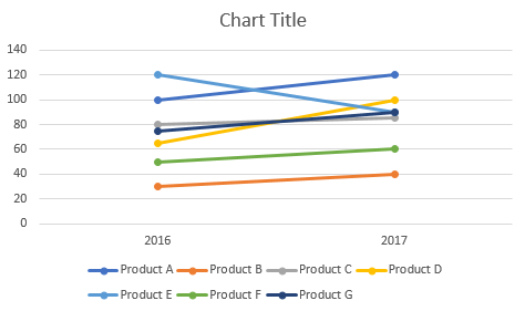
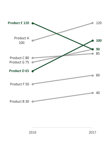
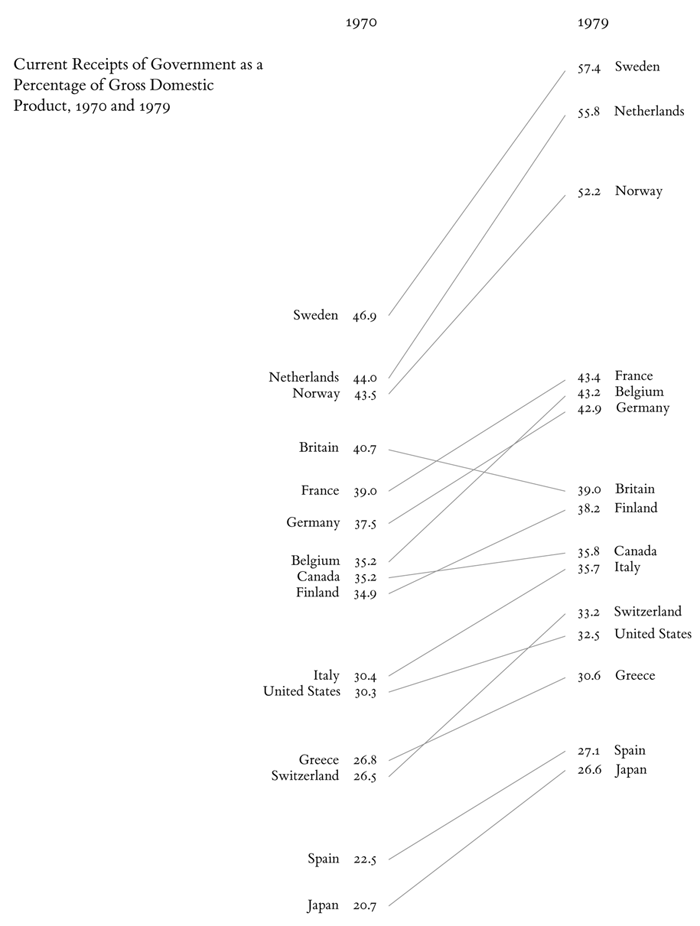
One amazing tools we can use when comparing 2 numbers is a slope Graph.
https://exceloffthegrid.com/the-ultimate-guide-to-slopegraphs-in-excel/

The Slopegraph, not to be confused with a “Slope Graph”, are very good at highlightingthe story of how just one category decreased when other categories increased.
https://www.visme.co/bar-graph-maker/

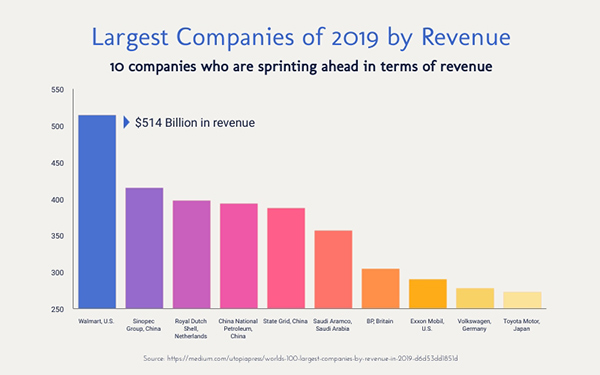
The thing about bar graphs and people, is that, even though humans are good at detecting length, making bar graphs advantageous. But they lack the nuianssce that is sometime neccesarry to make the story behind the data clearer.

The concept behind this data tool was first developed by Edward Tufte, an American Statistician.

https://washingtonmonthly.com/magazine/mayjune-2011/the-information-sage/

He is also the author of The Visual Display of Quantitative Information.

As Tufte notes in his book, this type of chart is useful for seeing:

  • the hierarchy of the countries in both 1970 and 1979 [the order of the countries]
  • the specific numbers associated with each country in each of those years [the data value next to their names]
  • how each country’s numbers changed over time [each country’s slope]
  • how each country’s rate of change compares to the other countries’ rates of change [the slopes compared with one another]
  • any notable deviations in the general trend

https://charliepark.org/slopegraphs/

Here is an Example of his original concept, directly from his book
Categories
Color Scheme data visualizations Design Examples Pie charts

Comparing numbers!

Data visualizations can be very effective when comparing two or more numbers. They are a great way to showcase data and to convey a story through numbers. But conveying a story efficiently through data visualizations is not as simple as putting together a quick graph in Excel. There are many ways in which data visualizations can actually distract readers from the message or leave them feeling confused; when used properly they can be a powerful tool that can enhance your data. The video below illustrates how certain aspects of design such as color, size and orientation can enhance your data visualizations.

https://vimeo.com/29684853

While researching data visualizations comparing numbers, I came across two examples that stood out to me. This first visualization illustrates a poorly designed bar graph that has been overly labelled.

data visualization design 5

The graph to the left is distracting and there are several components that are fighting for the readers attention compared to the graph on the right that is simple and straight to the point. In this case, a horizontal bar graph which allows the reader to quickly read the information from left to right is a better choice than the vertical bar graph. Simplifying the graph by taking away the gridlines as well as some of the axis labels helps to reduce some of the clutter in the first graph.

The graph below is another visualization that stood out to me.

data visualization design 4

When creating charts or graphs, people tend to feel the need to distinguish each category with different colors (I know that this is definitely something I do as well). Comparing these two charts side by side, you can see how using different shades of a single color can be more effective than using 5 different colors to differentiate categories; keep in mind to make sure the shades are not too similar. Adding extra “design” elements to the chart is also unnecessary at times such as the black border around the pie graph and the pattern in the “mediocre” slice. By taking away some of these “chart junk” elements, the graph becomes more simplified and can be interpreted quickly and efficiently.

Categories
Data Sets

Renewable Energy in the US

A Brief Introduction

Given my background in Sustainability, I chose to explore the trends of energy production and consumption in the United States. Energy in the United States is an interesting topic as, due to its sheer size and geographic diversity, the United States has the potential to utilize a wide variety of renewable energy sources. Information regarding the production and consumption of energy in the US has been cataloged by the Energy Information Administration (EIA) ever since it was founded in 1974. In addition to providing the raw data, the EIA also publishes a wide variety of reports and infographics that can serve as excellent resources when designing your own graphics. Despite the EIA’s usefulness, I found that University of Michigan has put together a fact sheet that can serve as a much better introduction to the topic for those who are not already familiar with the Energy field. It is this fact sheet that I will be highlighting and discussing in the following sections of this post.

Michigan Fact Sheet

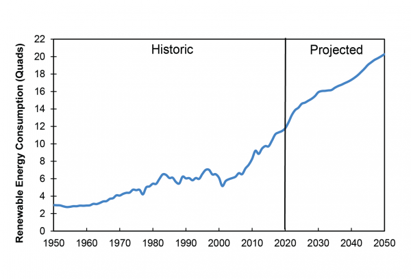
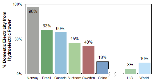
Drawing from the EIA’s statistics and other sources, the Michigan fact sheet has put together a number of graphics that make it easy to compare the energy production of all types of renewable energy sources. Below are examples of the two main types of data comparisons that the fact sheet displays, changes over time and differences between countries.

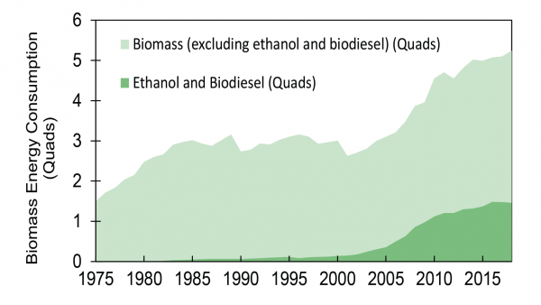
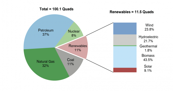
These graphs help translate the raw data presented by the EIA into something that is easier to understand at a glance. They are perfect for displaying simple, overarching trends for their respective fields, but their simplicity makes them ill-suited for handling data with many facets. This is where the following graphics excel.

The field of energy production can be quite complex when accounting for all the various ways of generating energy and the scale at which that energy is generated/utilized. These graphics help the viewer understand this fact by visually differentiating between the individual sub-categories of a much larger piece of data.

Categories
data visualizations Uncategorized

Comparing Numbers

Data is all around us, in different shapes and forms, and sometimes it is hard to decipher. Using visuals to compare data can make all the difference in comprehension, as long as itself is clear and concise. I found a video from Visme that gives a few pointers and explanations on how to improve Data Storytelling.

I felt it was important to share this video because comparing numbers is not just bar graphs and digits, it is a way to get information out to viewers. It is a type of storytelling that uses minimum words but insinuating on a focal point that helps the reader understand clearly.

Tools

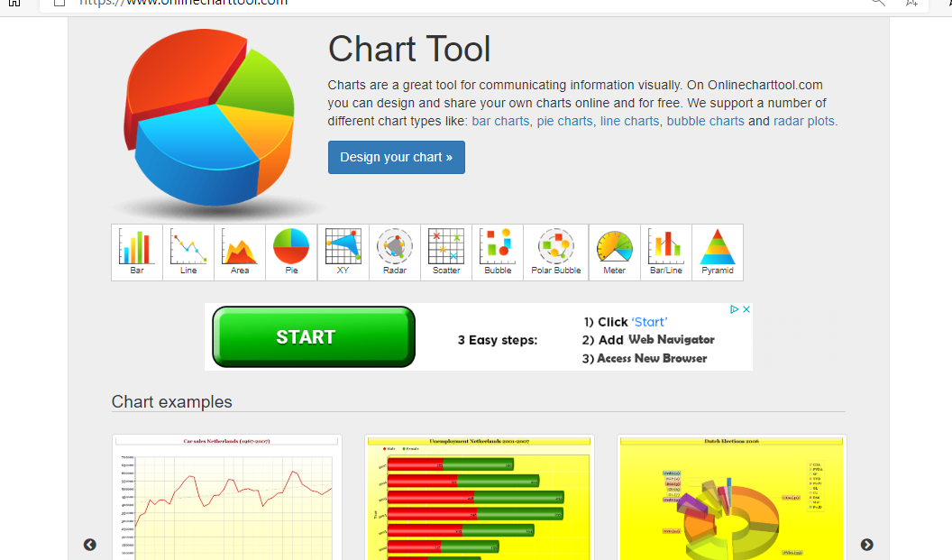
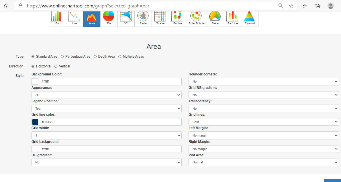
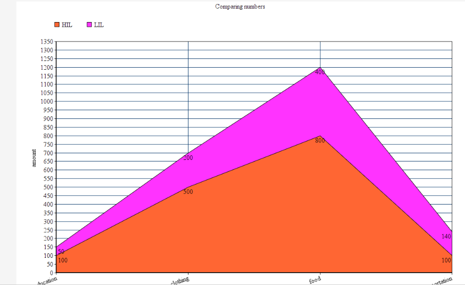
Online charts is a free website I found that is simple to use and can create a variety of charts and graphs in just a few minutes. It allows users to construct multiple types of charts and manipulate color, font, and data input.

Home page of Chart tools
Data input page
Finished Product

Users can download their graphs into different formats, such as, jpg. and pdf.

Covid-19 and Education

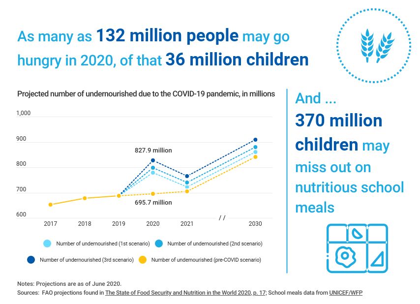
As I was looking through UNICEF’s website I noticed a separate link just for data and found some well-created infographics that are not only current and relevant but perfect examples of comparing numbers. Covid-19 has created devastation all over the globe and continues to do so today. Children around the world are feeling the impact due to the pandemic, not only home life but in their education. Below are a few infographics that I felt highlighted the five tips from the video above and accentuated their intended purpose while comparing numbers.

A well labeled graph comparing prior undernourished children to current and projected scenarios.

A representation of children affected by school closures due to Covid-19.
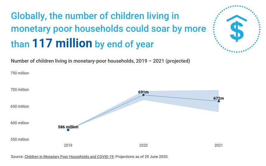
A projection graph comparing the possibility of economic decline due to the pandemic.

If you take a look at all three graphs you can easily read and understand the visualizations set forth. Each graph has a focal point which is portrayed using colors, patterns, and contrasting visuals. The graphs all are labeled properly with limited distraction, making them readable. All of these graphs read left to right following the rule of thumb of conventions, each comparison with a time line keeps the time line on the x-axis to avoid confusion. I think