Categories
Uncategorized

Lollipop Graphs!

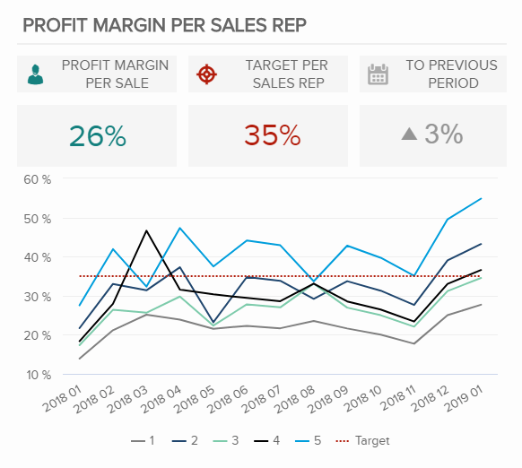
What is a lollipop graph?

A lollipop graph is a visualization that is great for comparing up to three different types of data such as year to year or before, during and after. Typically, a lollipop graph can be used where a bar graph would be used and is often more visually appealing. Lollipop graphs are not ideal when you are using a dataset with stacked-bars or with data that has very similar end results. An example of this would be an experimental dataset with thousands of results ranging from 0.00 to 0.05. It would be extremely difficult for an audience to differentiate what exact values the bars are representing.

How to create a lollipop graph…

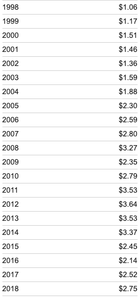
When looking for a dataset to create a lollipop graph with it is important that you choose one that is appropriately measured by a scatter plot, as this is used to create your final visualization. Keeping this in mind, I selected to create my visual using the average gas prices over the past twenty years, this dataset is pictured below.

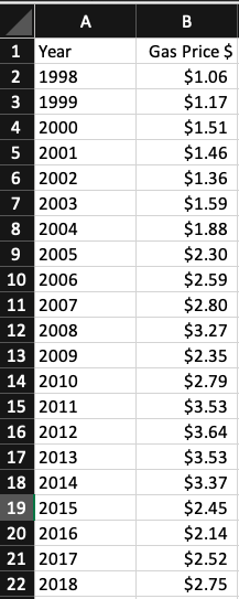
After selecting a dataset I moved into Excel to begin creating my lollipop graph! First, you should translate your selected dataset into a table in Excel, as pictured below using my example dataset.

Once you have your dataset translated into an Excel table, you will insert a basic scatter plot graph to represent your data and make a few other formatting changes. These will include adding horizontal error bars, changing the error bars direction & altering the error amount. Once you have completed this your lollipop graph should look similar to the one I produced using my dataset below.

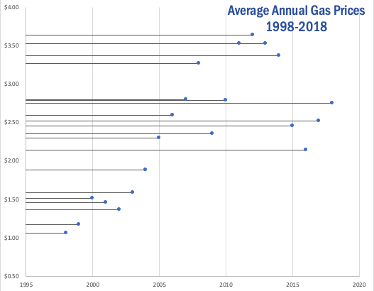
As you can see, a lollipop graph is a much more visually appealing when compared to a simple bar graph. While it may be a little more work to create, it can make a huge difference in what your audience takes away from your visualization.

Categories
Uncategorized

Infographics

WHAT IS AN INFOGRAPHIC?

Infographics are an amazing way of being able to visualize and communicate information to people in a couple of fun images and visuals. They are great marketing tools and they will take the attention of your audience much quicker than a simple power point. With an infographic comes pictures, graphs, data-based visualizations and a very minimal amount of text that sums up the point you are trying to get across. It is also very important to know and to be as clear as possible so that your audience can understand what you are trying to show them.

KNOW YOUR AUDIENCE

Always know who your audience is! It is important to make sure that you are able to communicate clearly and find ways to connect with them through the information given in your infographic. 

SHOW MORE, TELL LESS

I think that it is best to show your audience your information instead of telling them. In other words, put in a data-based visual like a graph or a pie chart and show them how the numbers corelate with your given topic. Amy Balliet suggested in Smashing magazine, “Every once in a while, turn off the text layer and see whether the infographic still makes sense. If there isn’t any data viz, or if a bunch of pictures are missing context, then you are doing too much telling and not enough showing.” If you are able to remove a piece of text from your infographic, and your visuals make sense on their own you are on the path of having an effective end product. 

THE PRESENTATION OF YOUR INFOGRAPHIC

From viewing many different kinds of infographics most of them are created vertically rather than horizontally. With that downward-like layout, you should have clear transitions. Having good transitions both on your infographic as well as when you are presenting gives your audience a brief moment to let them know that you are going on to something else. Good transitions in your presentations also help your audience see the connection and relationship between one idea to the next. 

Reference: https://www.smashingmagazine.com/2011/10/the-dos-and-donts-of-infographic-design/

Categories
Infographics

Tools for Making Infographics Cool!

Ashley Morales

September 20, 2020

Why are Infographics Important?

Most people look at infographics without actually knowing that they are and how much they have actually been beneficial to us. Little did we know that ever graph or pie chart or even an advertisement was an example of an infographic. They are a quick and easy way to get the point across to the reader without confusing them or spitting a whole bunch of information at them.

There are a whole bunch of cool tools and websites that can help make your infographics exciting and will help draw attention to your readers.

Here is a list of some of those tools:

  • Visme, which is actually a multi purpose site that allows you to make presentations, infographics, advertisements and much more.
  • Easel.ly, on the other hand, can be used strictly for infographics. They have different templates that cater to different types of audiences and themes that you can choose from.
  • PiktoChart is really good if you need some quick graphs or charts done.

Other tips for infographics:

  • Always make sure to make it clear for all types of readers and listeners.
  • Make it simple. The whole purpose of infographics are to make hard information and graphs easy to understand.
  • It is okay to have black spaces! The point is to make it visually easy to look at. If you have way too much going it could easily distract those with short attention spans.
  • Grab their attention. Similar to an essay, you are. going to have to hook the readers in, usually with a title or some kind of visual
Categories
Uncategorized

BENCHMARK

Beginning, I was confused about benchmark and benchmarking. I read concept of benchmarking in a lot of different field.

I choose this website to introduce with you that relate to technology field.

However, I see the difference of benchmark and benchmarking

Benchmarks are reference points or measurements used for comparison, usually with the connotation that the benchmark is a ‘good’ standard against which comparison can be made. Benchmarking is a process of finding good practice and of learning from others”

https://www.jisc.ac.uk/guides/benchmarking/what-is-benchmarking#:~:text=Benchmarks%20and%20benchmarking%3A%20definitions&text=Benchmarks%20are%20reference%20points%20or,and%20of%20learning%20from%20others

https://www.jisc.ac.uk/guides/benchmarking/what-is-benchmarking#:~:text=Benchmarks%20and%20benchmarking%3A%20definitions&text=Benchmarks%20are%20reference%20points%20or,and%20of%20learning%20from%20others
Categories
benchmark

Benchmark Comparisons

Benchmark data is information collected from industry sources to determine how other firms achieve their high levels of performance. Benchmarks are everywhere. The link that is attached talks about benchmarks and provides a great amount of information on them.

Benchmarks can be great for:

  1. Share your success with clients, grant-makers, regulators, and your Board of Trustees
  2. Feed your performance and quality improvement system
  3. Get folks talking!
  4. Set goals and acknowledge high performance

Here is an example of data from Amazon. This is Amazon’s net revenue from 2004 to 2019. The progression of their company is being shown here.

example 1

This is another example of a benchmark. This is comparing the response time and web page response time between Amazon, Apple, BestBuy, and Newegg. You can see that the webpage response time is highest for all of them. Overall, Amazon had the highest response time and Newegg had the highest webpage response time.

example 2

Lastly, this is a benchmark comparing Brower’s. Below they are comparing Edge, Chrome, Firefox and Opera. The highest number is the best therefore, Chrome is the best browser.

example 3
Categories
benchmark

Benchmark Comparisons

One of the most common forms of benchmarking is done by utilizing a line graph. The illustrator can choose many different ways to set a benchmark on a line graph either by plotting a point, plotting multiple points, or using a color scheme to represent when the benchmark is reached. Benchmarks are often added as a line to the graph, trending with the businesses’ projections over time.

https://www.sec.gov/Archives/edgar/data/6769/000095012310046150/h72229ke425.htm

Businesses can use benchmarks to help measure the attractiveness of their company by how they are introducing themselves on certain platforms. For example, the following graph shows how certain companies’ websites are attracting customers with effective design psychology.

https://www.eyequant.com/industry-benchmarking-2020/

Companies can use this type of data to maintain the success that they have achieved in the past and to see where they are capable of improving for the future. It is important for companies to look at the benchmarks of other companies so that they may know where to look for marketing strategies that bring in and maintain customers.

Categories
Uncategorized

Comparing Benchmarks

In business, benchmarking is used to measure a company’s success. If you can see a clear and present gap, you can figure out what to fix before things get out of hand. Companies can gain a competitive edge by studying their competitors and can have a fighting chance.

There are lots of different ways to represent a benchmark on a graph. Sometimes it’s as simple as making a line, other times you have to compare multiple things so one line won’t do.

How to add a line in Excel graph: average line, benchmark, etc.
In this example, we have a combo chart. this explains the many benchmarks that were set each month.

A benchmark is essential a goal for a company to set. You reach that goal by just passing the line. In my first example, you can see in June, the company set the benchmark very low and were able to pass it.

ICMM • Benchmarking Safety Data: Progress of ICMM company members (2018)
In this graph, we’re now counting two variables (Fatalities and Total Accidents)

In this graph, the company us representing the frequency for all of their fatalities. This is a benchmark that you would want to see decreasing.

Management Tools - Benchmarking | Bain & Company

Companies can use this data to show how well their products are doing. While the overall satisfaction is remaining constant, the company has seen a dramatic decrease in the usage of their product. This can tell a company that they need to make a change in their production.

https://www.bain.com/insights/management-tools-benchmarking/

https://www.icmm.com/safety-data-2018

Categories
Uncategorized

Benchmarks In Media

The graph above (via nytimes.com) displays several major natural disasters and alongside them, the amount of money required to get things back to a normal state.

The graph below (also via nytimes.com) displays the importance and reasoning behind flattening the curve of COVID cases. In this graph, the benchmark is the healthcare system capacity.

Categories
Uncategorized

Benchmark or Target Data Examples

From what I understand from the textbook, benchmarks look at a actual data, and compare them to a target data. The target data does not need to be actualised necessarily. It canbe theoretical. In this case, the best example of this to me are the cases of Covid-19, theoretical impact versus the actual impact.

the ‘benchmarks ‘ are coloured.

Notice how the cases in India are compared to possible cases that may occur depending on the responses.

Also the big concept thrown around at the start of the virus’ spread was the “flatten the curve” rhetoric. This lead to many cases of comparing ideal scenarios to the actual cases and data that were being collected.

Example of ideal curve behaviour
Example of cases being put on a similar trend-line in comparison to the target curves.
Categories
benchmark data visualizations Design Diagrams

Benchmark Comparisons

Adding a benchmark to your visualization can enhance the story to a reader. A visual target allows readers to easily determine whether or not a goal has been met. Benchmarks can be in the form of a line, indicator dots, overlapping bars or combo charts. Depending on the needs of your visual, the best way to display a benchmark will vary. Here are some examples of different visualizations using benchmarks.

This take on a bullet graph uses a a benchmark line to compare how well different brands are doing relative to the brand’s previous performance. I think the use of a patterned filler to show that a company is not performing as well is unique. Especially for this data set, with only one company underperforming, this benchmark stands out.

https://www.brandwatch.com/blog/introducing-benchmark-the-visualization-for-better-insights/

This graph features a line at 0 as the benchmark with another line showing how far off from the benchmark they are. With the benchmark at 0 you can easily see whether or not you are underperforming.

https://ux.stackexchange.com/questions/28749/data-visualization-what-should-be-the-baseline-you-or-the-comparator-seri

This graph displays the benchmark comparison as a simple dashed line.

https://www.datapine.com/kpi-examples-and-templates/sales