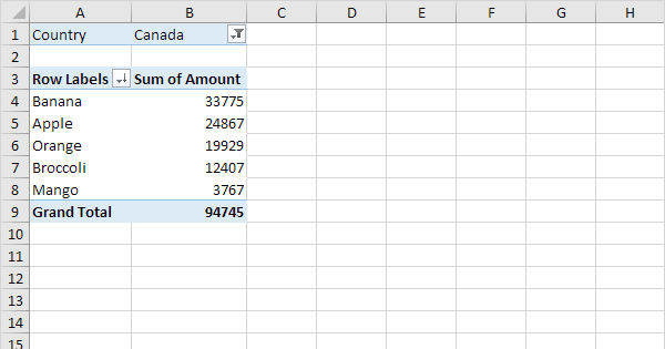
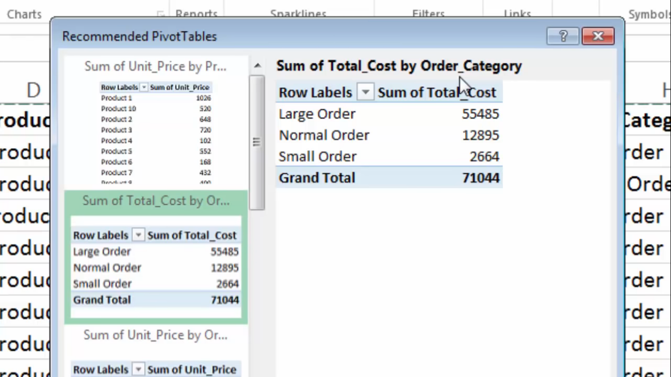
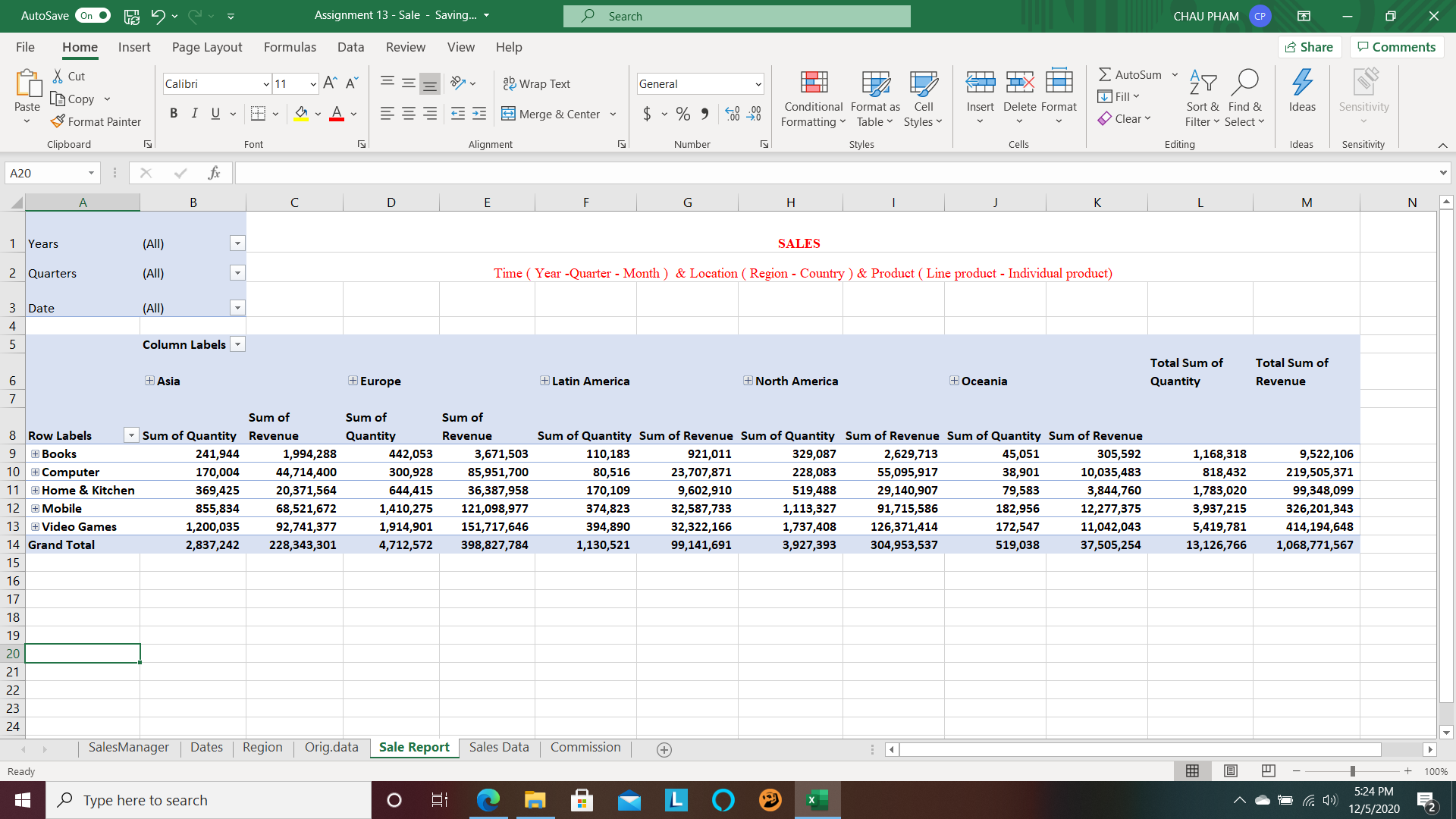
A pivot table is a great way to show the summary of your data. It is really useful if you have information or data that can be put and interpreted by groups or sums of groups.
Pivot tables allow large information that is in excel to be simplified. A lot of people shy away from excel ,like myself, because the information can look and seem very. overwhelming. Putting the information into a pivot table allows simplicity.
The data to the left is shortened and simplified into the pivot table that is shown to the right and it set up into groups by states.
Pivot tables are an easy way to track trends. For example, the image above shows a trend by state of clothing items sold. You can do a pivot table for just about anything but I think it makes the most sense to do it for large data only.
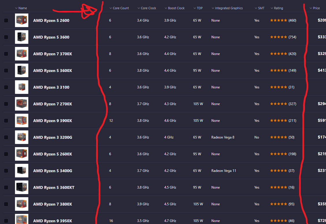
Before realising what pivot table were, I would call them the ‘ranking’ tables, or ‘focusing lists’ or something similar because not only do pivot table allow you to see a list of of data across, easily, they also allow you to order the data you want to look at by whatever column (or even row sometimes) that you want, in other words they let you Pivot the information.
The example above is a website to order Computer parts which I believe incorporate a pivot table in order to help customers home-in on a product that they want to use. If you search for a CPU, for a example, the pivot tables are different then when you search for keyboards, or Storage memory. If you want to pivot the table by price you can click price, if you want to look at the ‘core count’ you may pivot the table that way.
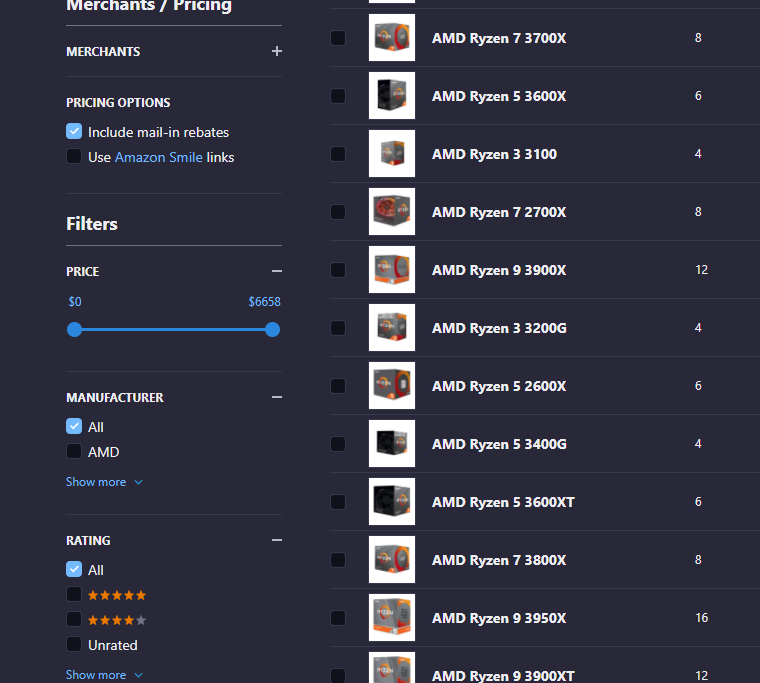
There are more tables and filters on the side to help you focus the data even further, combining the pivot table with other tools such as sliders.
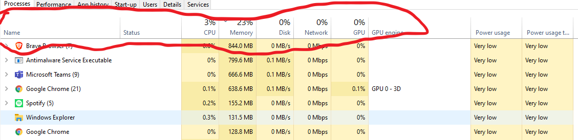
One more Pivot table I was able to find is one I look at every other day by pressing CTRL + SHIFT + ESC on my keyboard in Windows 10.
This pivot table allows you to view your computer application activity and you program activity. You can look at the headers and focus or pivot the data. If you want to see how much memory a program is using click that header, if you want to see how much ‘network’ a program is using you can look at that. Or order by power usage.
This is very helpful considering if your computer is running slowly, you can figure out what apps are misbehaving and stop them.
The Excel tutoring site EXCELJET describes pivot tables as, “one of the most powerful and useful features in Excel”. These interactive tables allow users to breakdown large data sheets into more manageable pieces that can focus on specific areas of the data. EXCELJET offers a quick and easy tutorial that breaks down each step needed to create an amazing pivot table.
My Personal Experiences
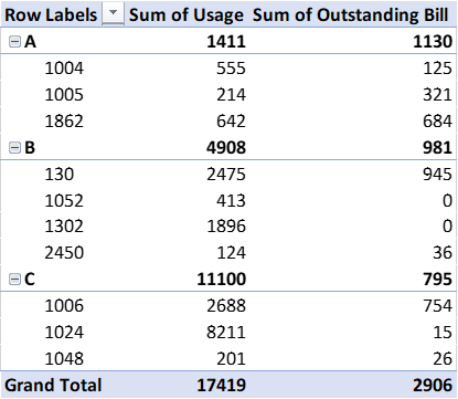
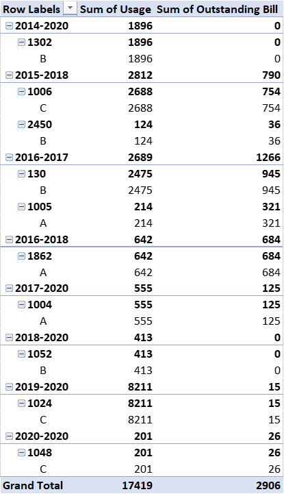
I was lucky enough to have used pivot tables before as part of an internship with a utilities company. They tables were a huge help when we needed to categorize and sort through large amounts of customer data.
The table above is just a small sample of the type of data we would have to work with and they would often include thousands of customers. Pivot Tables allowed us to quickly organize this data into whatever form we needed. Whether that was….
by the type of services they used,
the length of the time that they were customers,
or to quickly find certain accounts for auditing purposes.
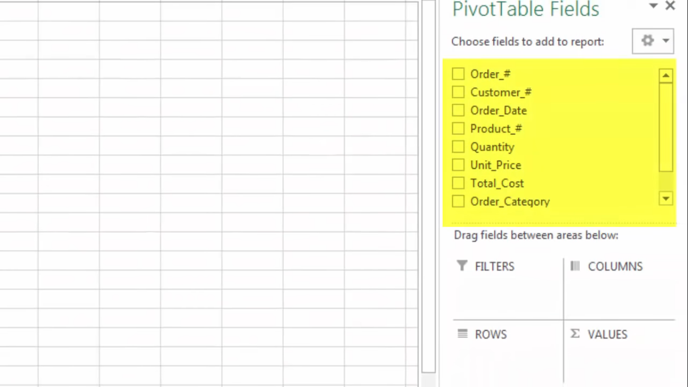
A pivot table shows statistics like averages and sums with various fields that summarize data. I came across a youtube video that explains what a pivot table is, what it contains, and how to make one. The first screenshot, it shows a pivot table and some of the fields the person decided was the best fir for their data.
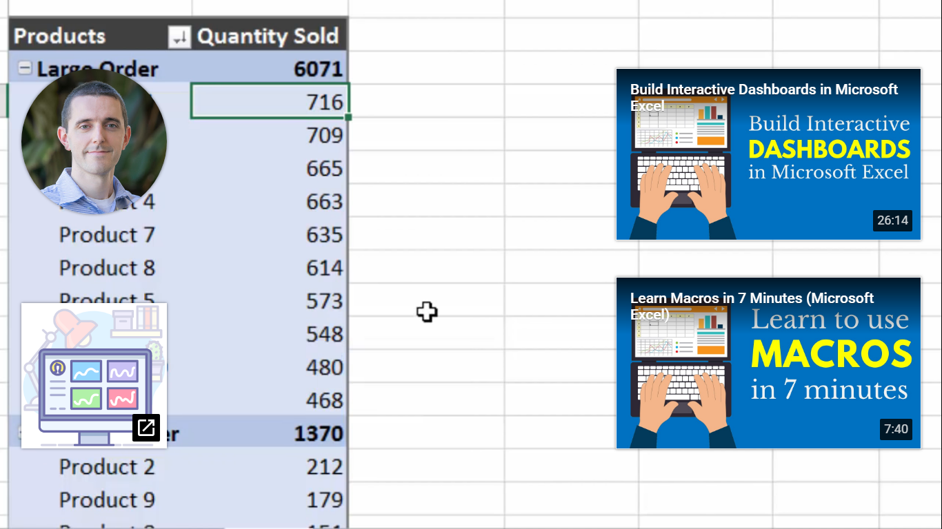
Here the speaker mentioned how pivot tables show summaries. You can enter calculations to excel and it will calculate the formula for you and continue to add the numbers that come after. Next, the speaker shows how you can choose the type of pivot table for your data. They are also recommendations on how to display your data. The next slide just shows how you can sort fields to columns, rows etc. Here I wanted to show the end result but I could not figure out how to take the YouTube icons for other videos out. The speaker color-coded the table so it would be easier for us to read. He also changed labels to “products” and “quantity sold” so readers would understand what the values represent. I found these example and tables easy to use because it is labeled and it is color-coded which helps people look at the table easier. I also find it easy that we do not have to manually plug-in formulas or each number we want to represent. We can highlight the whole row for the formula to apply.
A pivot table is a tool in Excel that allows users to interact with their large, raw dataset to gain a better understanding of specific topics within the dataset.
When is a pivot table useful?
Pivot tables are extremely useful when dealing with any dataset that contains a vast amount of variables. Additionally, they are useful in cases where you are looking to identify specific variables within the dataset and how they interact with other variables within the same dataset.
Examples of pivot tables:
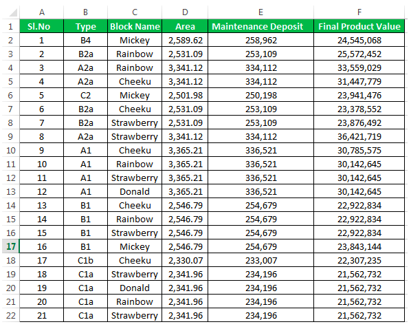
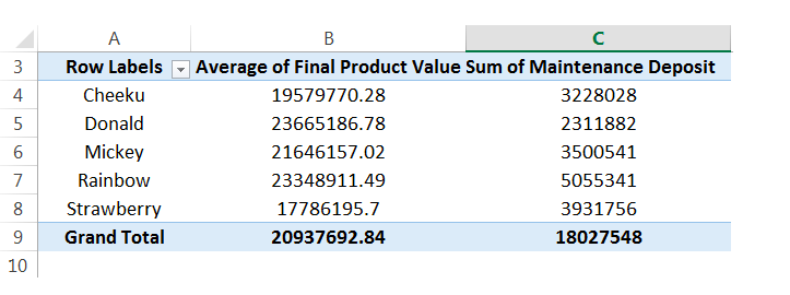
Pictured below is an example of a raw dataset which can be found here. While this is not the entire dataset you can begin to see that if this contained hundreds of rows this could be confusing to look at and would need to be formatted in a better way.
That is where the pivot table comes in! From the raw data we can then select specific variables to look at and compare to other variables in the same dataset. Below you see one example of a pivot table that was created using the raw dataset above. You see in this table only the block names, final average of product & sum of maintenance deposit are shown.
Pivot tables make it extremely easy to simplify your large and overwhelming data sets into clean and clear tables. Pivot tables can be used in almost any instance where there is statistical values being computed such as sums or averages.
Pivot tables are a great feature in Excel that allows you to analyze large data sets very quickly. This short video gives a brief introduction on what they are and how they function.
Here are 3 different times a pivot table can be useful when analyzing data in the real world:
Compare sales totals for different products across regions
You have an endless list of sales data for various products as well as regions. You want to see which products have been bringing in the most money in each respective region but adding up the columns in Excel would take a lifetime. This is a perfect example in which a Pivot Table would come in handy.
It allows you to rearrange the data so that you can see sales by product and region in less than a minute. You also have the option of displaying the total sales by product as well as grand totals for each region.
2. Show product sales as percentages of total sales
You can also use Pivot Tables to display percentages along with the totals to see how various products are performing compared to each other.
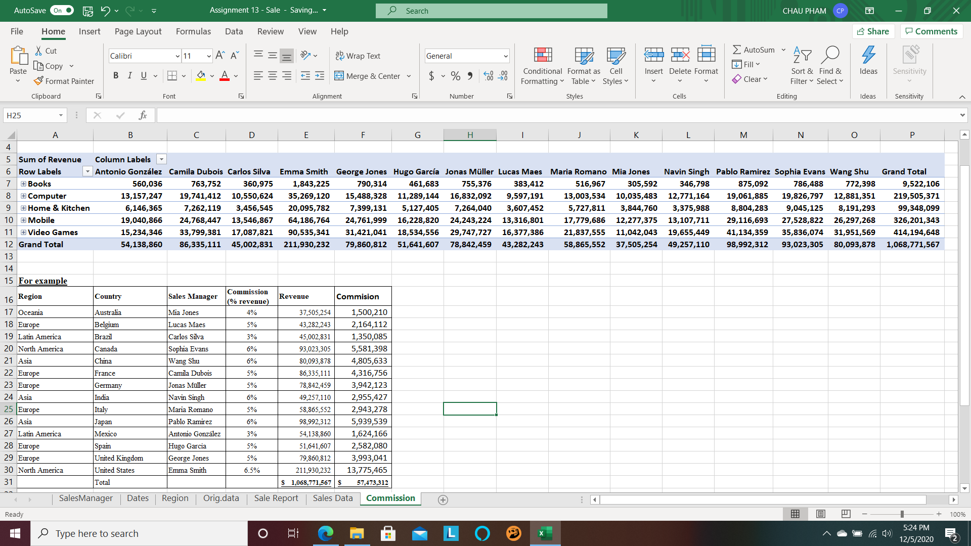
3. Get an employee head count across departments
Pivot Tables in Excel allow you to quickly count rows that share something in common. You have a list of employees and their respective departments and need to figure out how many employees are in each department. A Pivot Table allows you to quickly summarize this information without having to do a manual count.
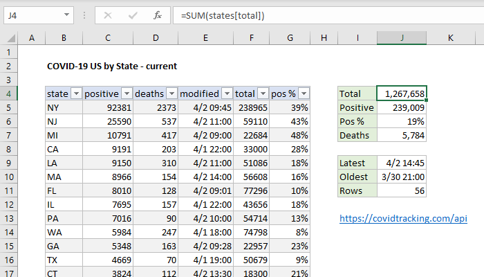
If you have an abundance of information in diffrent catagories that you need to show. Then the pivot table is the way to go. A PivotTable is a powerful tool to calculate, summarize, and analyze data that lets you see comparisons, patterns, and trends in your data. One perfect case to use a pivot table is the data from the Corona Virus. With Covid-19 affecting so many people around the world, the statstics are huge and can be confusing. Luckily, a pivot table can easily express this data as seen in the example below!
“Interactivity is necessary when we have a lot of data to cut through”. Pivot table is a powerful tool that Microsoft Excel introduce with us to conduct data base on the expectation of user. Pivot table can support us make reports with relevant and faithful presentation in the workplace. It also helps us in other field with useful numbers.
Pivot Tables are best described as summary tables because they display the most important information the researcher, company, or student is trying to represent. They are typically easy to create and are a very organized way to record numerical data. Below are a couple examples of how Pivot Tables are used.
https://www.lumeer.io/pivot-table-complete-guide/
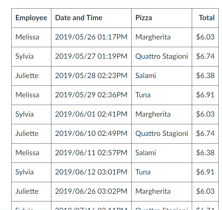
One way Pivot Tables can be helpful is when tracking receipts. As you can see, the table is very neat and organized. The data is laid out in such a way that is easy to read.
https://www.lumeer.io/pivot-table-complete-guide/
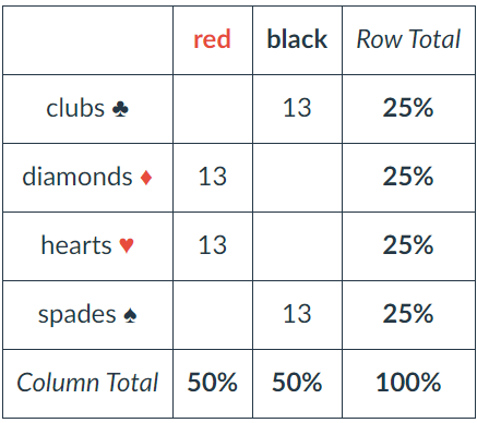
The deck of cards can be divided into symbols, numbers, and colors. From here, each column and row are totaled to make the information easier for the reader to understand.
Conclusion
There are many more examples out there such as insurance companies and restaurants. However, in all these examples Pivot Tables are always grouped items, records, and/or rows into categories and they count the number of items in each category.
I think pivot tables are one of the best ways to display data but get the least amount of attention. I say this because I both make and see them everywhere yet had no idea what they were actually called.
The table above is offering an example on food versus how much of one product was sold. This is an especially helpful layout when considering when to add or remove certain products from an itinerary. Being able to see by order or day what products are or aren’t selling is a great way to negate some costs.
Personally, I’m not in the business of needed to see what sells over what as I don’t own a restaurant or store of any kind but I imagine that this could be helpful even in situations that aren’t monetary. I have a large collection of makeup and I think this would be a great way to organize my collection to make sure I get use out of all products.