Categories
data visualizations Uncategorized

Visualizing Health

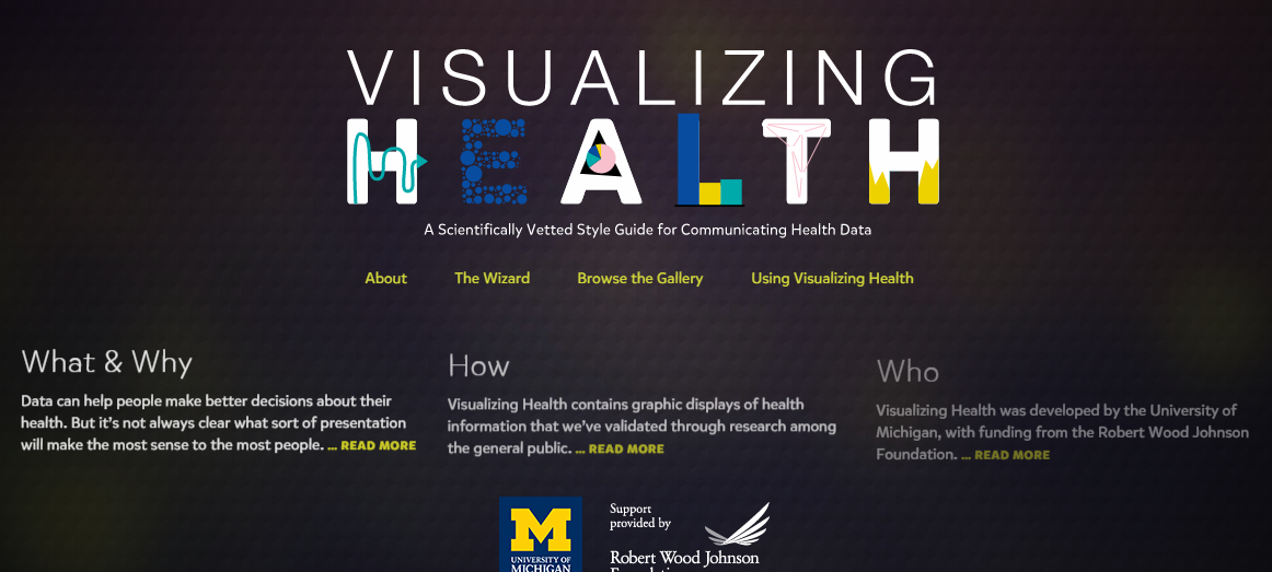
An interactive website that helps pair visuals to medical information thus making it easier to communicate with patients. The website itself is well organized and is easy to navigate; The University of Michigan also lays out its goals and objectives for the website on the home page.

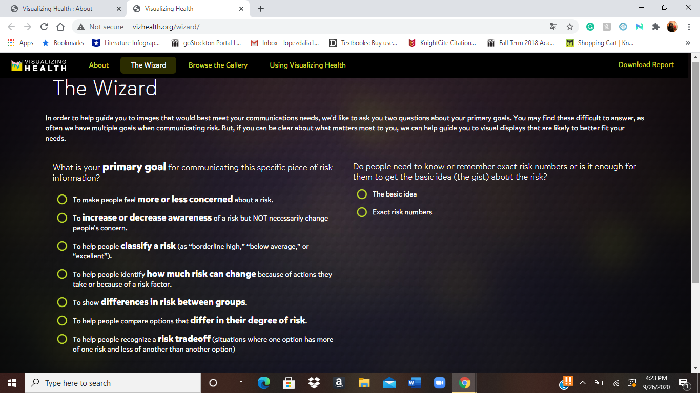
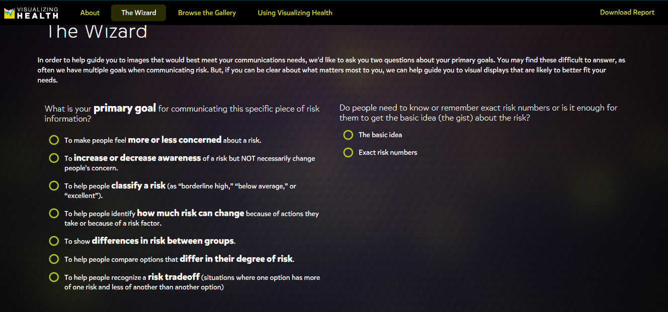
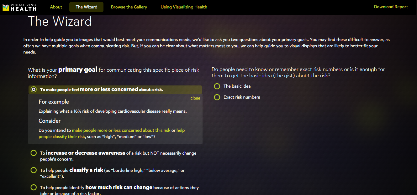
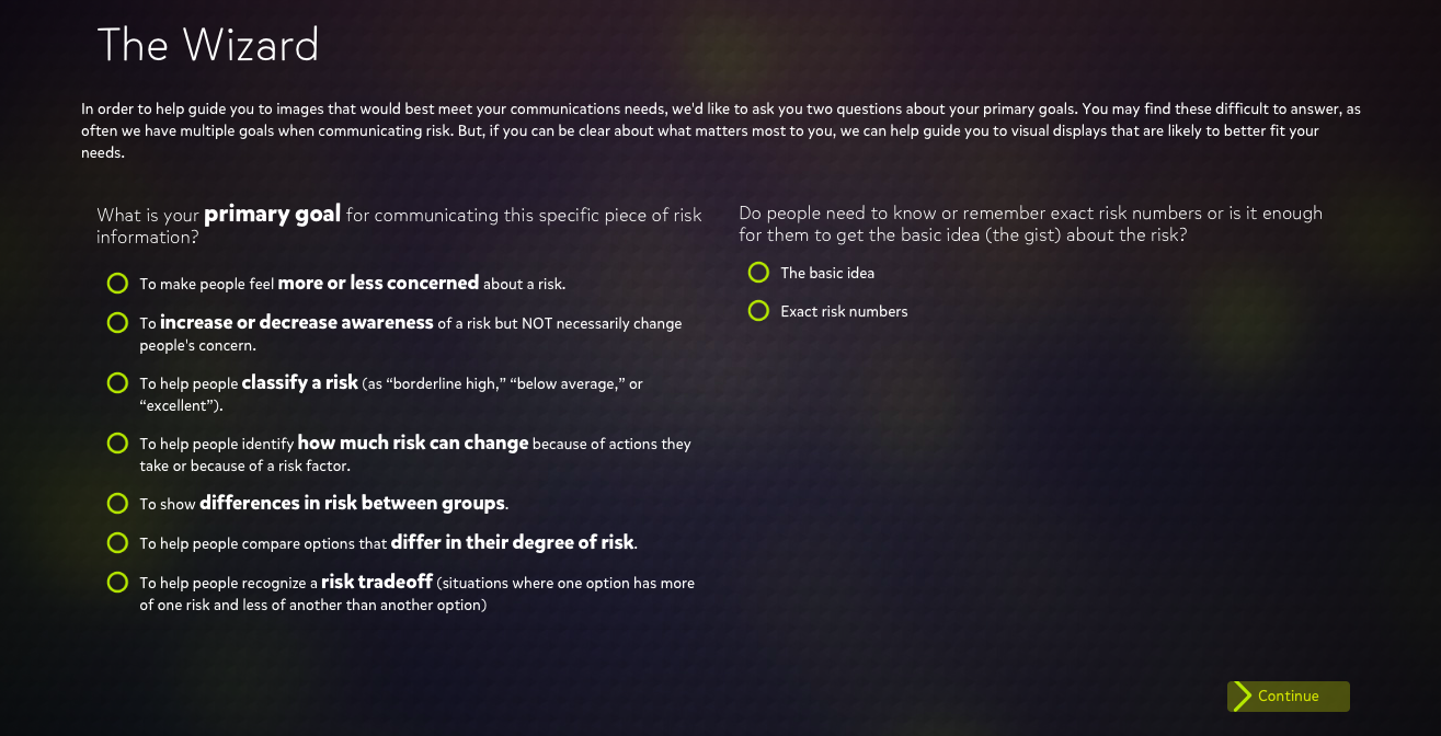
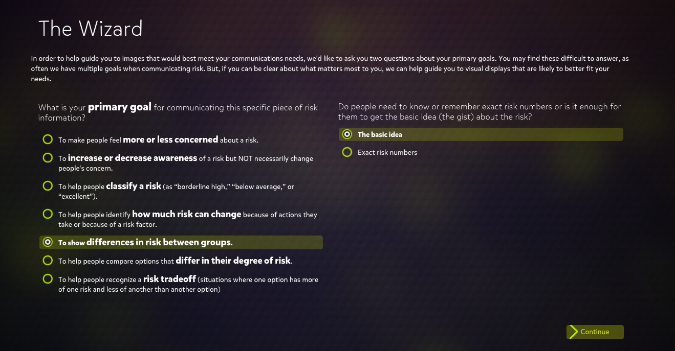
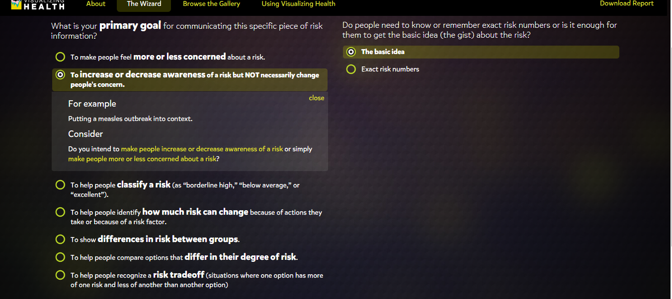
As I navigated through the website, I found a tab labeled “The Wizard” which asks two questions to help guide users toward an image that helps display the information they want to transmit.

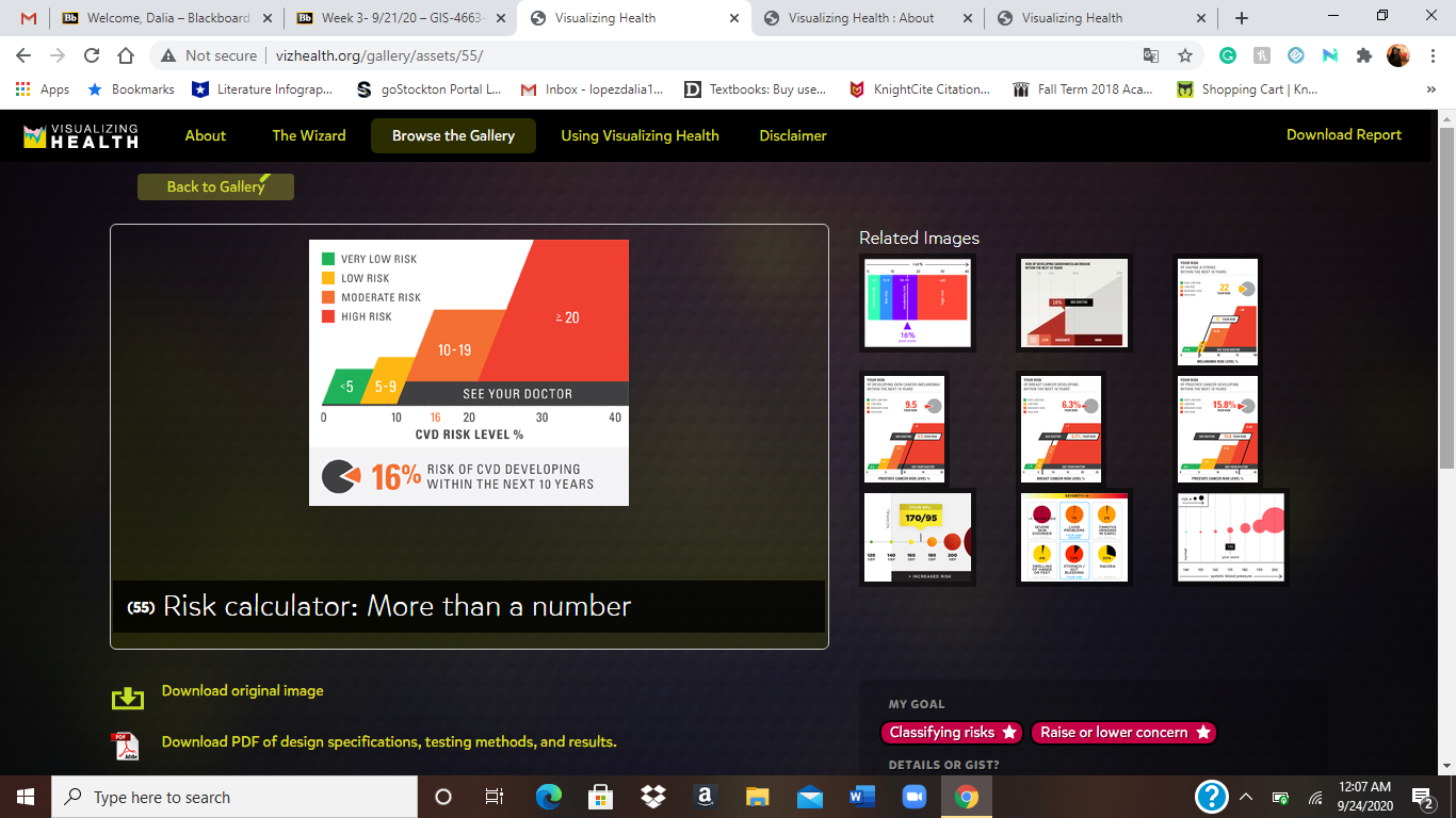
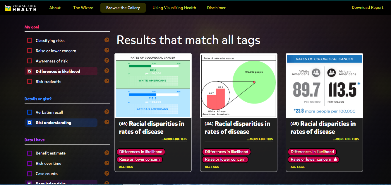
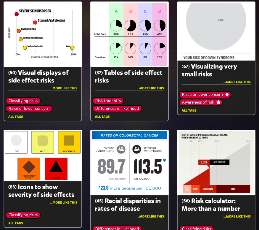
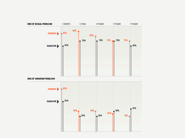
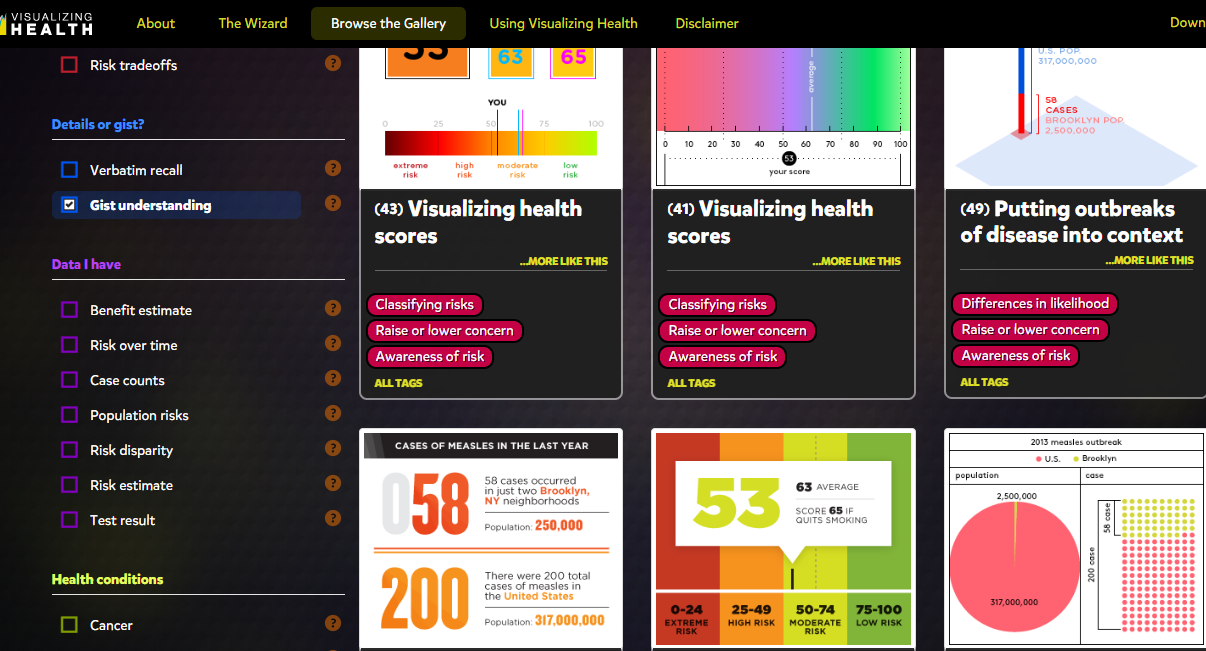
Once past the questions on “The Wizard” then the site guides you to a page that displays multiple colorful images to the right and down the left-hand side is a widget that a user can elaborate more on what they are looking to create.

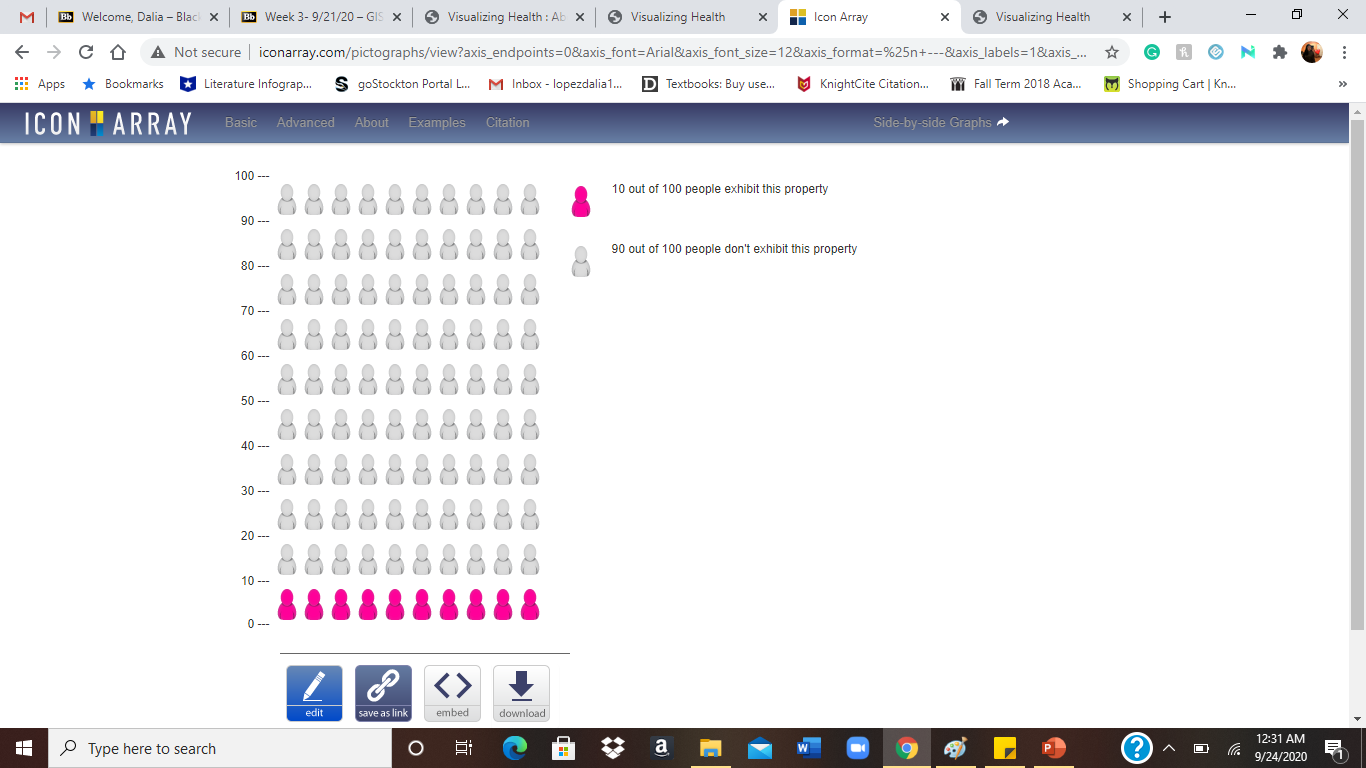
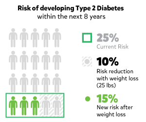
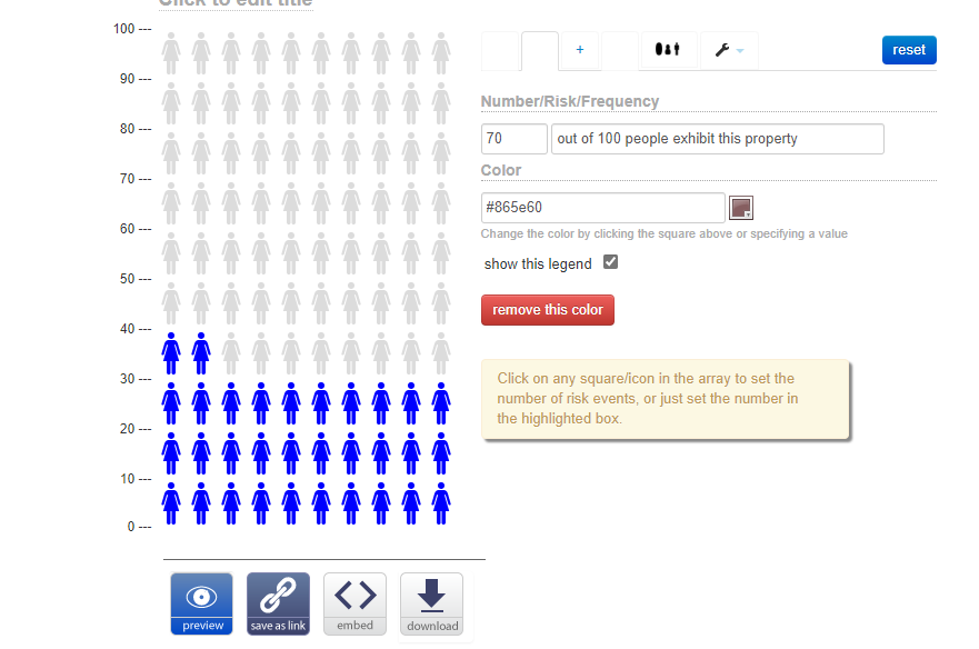
The generator was for Icon array, which transferred you to another website. On the page, ironarry.com, there were a few questions listed that help generates an icon graph, like posters seen in a doctor’s office. The generator also had options of changing the icon on the chart, male, female, etc.

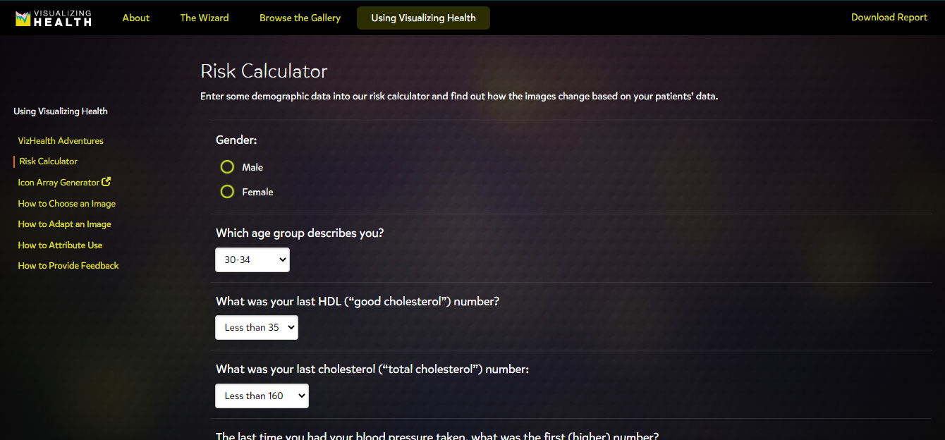
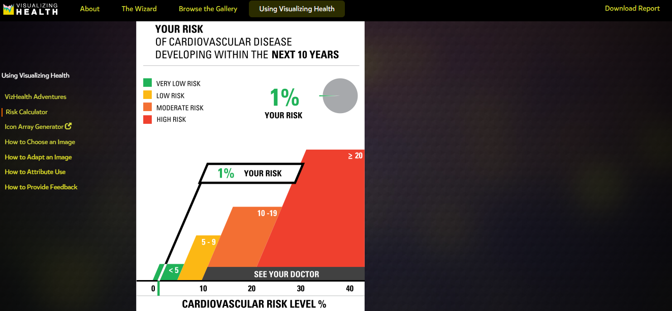
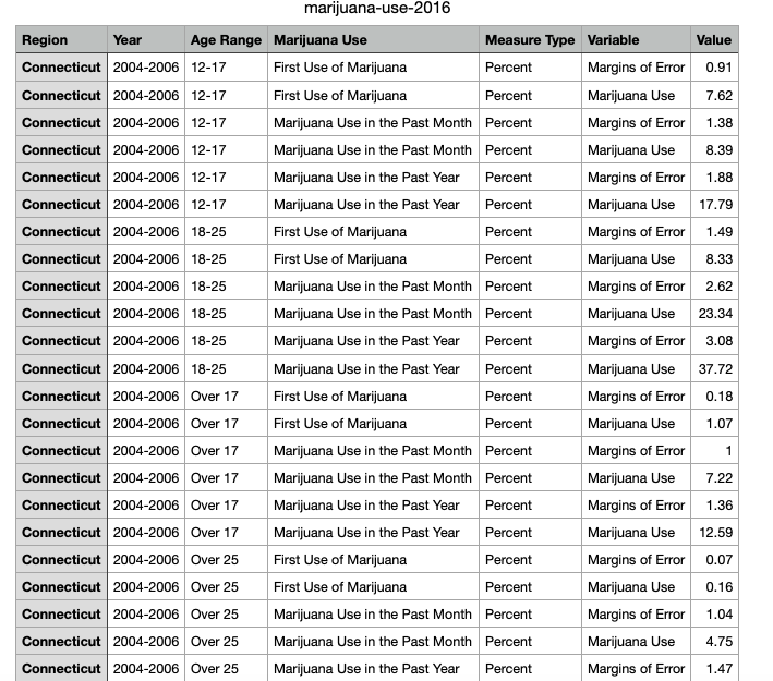
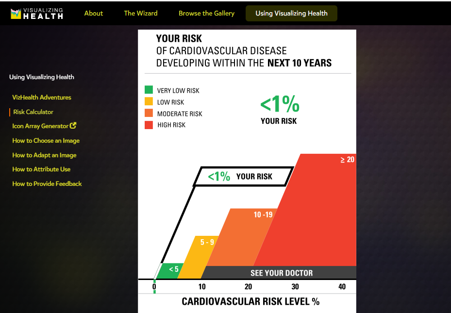
Being a new user to this website, I decided to try out the calculator, it asked a few simple questions and within seconds I had an easy-to-read visual before my eyes. I was honestly surprised by how simple the chart was to read and I think it is a wonderful tool for people like myself who are usually confused by all the charts and analyze from a doctor’s office.

Overall, I think this website could be helpful to not just medical professionals or patients but to those who are trying to understand and grasp the concept of visual data. I feel like it explains and shows how each type of graph can portray specific knowledge and be used to target consumers in a simple and understandable form. I think what helped me tie in how well visualization can help the brain compute data was manipulating the data on the graphs and seeing it come to life, so to speak, in graph form. Even using the calculator, I was able to insert data I did not quite understand and receive an image that got straight to the point with little to no confusion.

Categories
Uncategorized

Vizhealth

Vizhealth is a website created to help view/explain/visualize health risks and overall help us make decisions over our health. While looking through the website it takes you through steps to get to the visualization that best fits your needs. It shows you various styles of visualization according to questions they ask you (primary goal – awareness, classify risk, differences in risk between groups, degree of risk, and lastly whether the type of visualization basic idea or exact risk number). They also provide a fun comic, risk calculator, and a generator to help view population risks with icons.

The creators of this website have a wizard tool that helps you find the right visual display for you to understand certain health information. This basically helps narrow down the display option to one that fits any need you have.
For the wizard at first, I tried the options “To help people classify a risk (as”borderline high,” “below average,” or “excellent.”). and “exact risk numbers” This is one fo the visualizations that popped up for my needs. It shows you the different risk levels and then shows you where you are at. It provides the number for you and you just look for it on the risk levels. For most visuals, it gives you options to download a pdf of the design specifications, testing methods, and results.
This is an example of the Generator that helps visualize risk population with icons. I typed in 10 out of 100 people exhibit this property. This highlighted the amount of people that the sentence was about. In gray was the people that didn’t exhibited the property.
Categories
Data Visualization and Art

Visualizing Health

Figure 1

Visualizing Health

: is a unique way to transfer medical data about health conditions into charts, graphs, and diagrams that are easily understandable by a broad audience. It enables someone to better understand their health risk, uses icons to represent side effects, and benefits of reducing risk.

Figure 2: The Wizard

Figure 2: The Wizard is an interesting tool for visualizing health. It’s used to assist individuals in carefully choosing their primary goals when it comes to their health. For example, an individual who smokes a lot might want to know what are their chances is of getting a heart attack, stroke, or lung cancer.

Figure 3

Figure 3: By clicking on the goal, it then displays examples of the risks or racial disparities and it asks for a reason for choosing the goal. This is a great way for individuals who are uncertain about the right steps that are needed to reducing their health risks. The Wizard breaks down complicated medical questions and conversations about health risks into simple questions that the individual can understand through visualizing.

Figure 4

Visualizing Health provides various charts for different goals such as increasing or decreasing awareness, risk reduction, differences in age groups, or race. Each chart breaks down percentages and numbers and only highlights the important data so that the audience can understand the information. It also allows the individual to select different data, the type of graph he/she would like to see the data on, different health conditions, or the type of details that he/she would like to know about a certain health condition.

Figure 5: The Risk Calculator

Figure 5: The Risk Calculator is a good way to get an estimate on someone’s risk of a heart attack, stroke, and other serious health conditions. It should be noted that the Risk Calculator is not 100% accurate, but it does give the individual an idea of their condition, which would prompt the individual to visit his/her doctor.

Figure 6: My results using the Risk Calculator on Visualizing Health

Figure 6: My Risk Calculator results indicates that I am 1% at risk for cardiovascular disease and suggests that I “see your doctor”. This provides an excellent opportunity for me to speak to my doctor about reducing my risks on my next visit.

Categories
Uncategorized

Vizhealth

Vizhealth is a unique way of creating a certain style of data visualizations for healthcare and health data. With that, it is also a great source to help anyone that learning about data visualizations in any job. I had a very pleasant experience going through the website and I loved how everything was organized on the pages. The neatness and amount of information throughout the entire website caught my attention.

The Wizard, being one of my favorite tools that I explored, is a helpful way for healthcare providers to focus on how they would like to present their data to a patient or boss. The Wizard tries to analyze your goal and then gives you many results to choose from.

I noticed that Vizhealth has a lot of different links and hyperlinks that point to other web pages, web sites, graphics, visuals, files and even e-mail addresses. The ones that I came across definitely helped me understand certain data and words that I was not familiar with. The colors that were used throughout the website as well were also appealing. The colors blended together and there were just enough.

Visuals

The Gallery had a plethora of different kinds of data visualizations that presented great information on how you can rearrange your numbers and data in a colorful and fun way. These are just a couple of examples that I found effective and interesting to look at.

Vizhealth also had an entire page about how they choose their visuals to go onto their site, giving a brief description of their process. I think that this is something good to have on a website like this one so viewers can see how each visualization is picked to be shown.

I think that I would recommend this website for someone who is learning about data visualizations because it gives great resources as well as helpful tips to guide you in the right direction of analyzing your numbers. My overall experience was a good one and I continued to learn new things.

Categories
Uncategorized

Visualizing Health; A Reflection.

Visualizing Health offers a wonderful tool to assist you in selecting the appropriate visualization for your dataset. Upon entering the website, you are greeted by the homepage pictured below.

Once on the homepage navigate to “The Wizard” tab, highlighted in green in the photo above. You will then be brought to a new page that asks you to further explain what your primary goal is for your visualization & exactly how much knowledge your audience should take away from your visualization.

If someone is looking to create a visualization for the differences in risk for two medical conditions over time, they may select the highlighted options in the photo above. Selected is, “to show differences in risk between groups” as the two different medical conditions (sexual & urinating problems) are measured in individuals who had reconstructive surgery and those who choose radiation. It is not crucial for people to understand exact figures, just that one may have a better effect then the other. This is why “the basic idea” is selected.

Shown above is one of the numerous visualizations that “The Wizard” recommended for the data set. As you can see, this visualization is clear & direct in communicating that for sexual problems, surgery was a better overall choice for patients. For the case of urinating problems, surgery also appears to be the better overall choice although it could be questionable as a longer term solution.

Visualizing Health is a wonderful website to explore if you find yourself wondering if there is a better way to depict your data. Taking the time to look through this website will offer any user insight into what clean & concise visualizations look like. Keeping this website on hand could be the difference between creating an average visualization, and a perfect one!

Categories
Uncategorized

Visualizing Health

Visualizing Health is a handy website that helps you create infographics regarding health. In addition, it provides people with a simple way to retain information about their health. For example, instead of a long paragraph that one may have to read, this website combines important information and portrays it in images.

Visualizing Health also has a handy tool called “The Wizard”. By asking two questions, the Wizard helps you narrow down your communication goals and your primary needs. This then filters out infographics that best suit your needs.

Questions that the wizard asks you are in the photo above.

After completing my questions and letting the wizard do its work, one eye catching inforgraphic that it found for me was this one.

This image was a product of me choosing option of “increasing the awarness of a risk by a lifestyle change” and the topic i chose was “diabetes.

All together, Visualizing Health is a handy website that provides information in eye catching images. Most importantly, if focuses on the health of people by educating them and on how they can make themselves better.

Categories
Uncategorized

STANLEY CUP: 2020

Presented in: Infographics

via moneypuck.com
via cbssports.com
Categories
Infographics

Tools For Infographics

By Thamina Akther

One of the best tools for quick and easy infographics I have found so far is Canva Basic and Canva Pro. Canva Basic is a free subscription with over free 100+ design types, along with thousands of free templates, free photos, fonts, and storage. On the other hand, Canva Pro is a $9.95/month subscription, which comes with 450k+ premium templates, 1000 GB storage, background remover, premium stock images, logos and many more.

Canva Infographic Example

Personally, I have been using this tool for over 6 months now to operate various social media accounts for one of the student organizations. Through this tool, I have created various infographics, IG stories, posts, and flyers just in a matter of a few minutes. And, the best part about this tool is that it can be found in the Apple app store and can be used through the phone. Hence, this is a super easy but satisfactory tool for Infographics. Below I also provided a design I created for Earth Day to post on student organizations IG posts.

Here is the link for Canva Basic and Canva Pro https://www.canva.com/q/pro/?v=2&utm_source=google_sem&utm_medium=cpc&utm_campaign=REV_US_EN_CanvaPro_Branded_Tier1_Core_EM&utm_term=REV_US_EN_CanvaPro_Branded_Tier1_Canva_EM&gclsrc=aw.ds&&gclid=EAIaIQobChMImLftiYj96wIViYnICh13lg8uEAAYASAAEgLxWfD_BwE&gclsrc=aw.ds

Categories
data visualizations

Examples of Insightful Data Visualizations

I chose this topic to see what type of cool infographics were already out there that could offer us more of a conscious state to the world around us. I’ve been a scientist for a while now, and I noticed that my curiosity with the facts only grows as time goes on.

U.S. Intelligence Funding. Courtesy of the NSA’s biggest whistleblower, Edward Snowden.

That’s a lot of money right? Imagine being in control of that amount of money and the only thing you chose to do with it was to spy on people. Notice how one specific area of spending is “Data Processing and Exploitation”. This is surreal when you think about how much of that money could go towards building communities instead of selling them things or watching them burn so they can mount a response. Terror attacks are to blame for a lot of this.

The world is increasingly dangerous, so I’m on the fence about government surveillance, but does it really take this amount of spending to get done on a yearly basis? Are we spending this much to analyze holes in people’s backyards without their consent? Are we watching people through walls from outer space using thermal vision? How much is actually going on in the world to require this? The money seems to speak for itself, as it usually does, which is the scary part. The U.S. intelligence budget has also increased every year. Yikes. Stranger danger. https://www.dni.gov/index.php/what-we-do/ic-budget

Mass Shootings. Loose motives.

Now, when you look at this graph compared to the last one you may think, “Oh yeah, that money was worth it.” There seems to be a really vile trend growing in America where American citizens are just straight up losing control of their mind and committing hideous acts of violence on their fellow man or woman. These are events that took place at complete random, where the shooter was most likely dealing with inner demons, and reached a deadly level of rage/depression where they could take out their vengeance on complete strangers.

Although these figures are always in the news for people to see, they only seem to be getting worse with most people’s only response being more guns or no guns. These figures also pale in comparison to the total homicide data. I feel that we need to switch the focus to addressing more foundational issues like parenting, bullying (physical/cyber/social), self-destructive tendencies, and mental illness. People are losing their identities more than ever, and shelling up as a defense maneuver. What we’ve come to know is that silence is deadly. Especially, when it comes to not talking about the real issues. https://www.cato.org/blog/are-mass-shootings-becoming-more-frequent

Categories
Infographics

Datasets, An Overview

What is a Dataset?

“A collection of related sets of information that is composed of separate elements but can be manipulated as a unit by a computer.”

~Oxford Languages

The following video provides insightful knowledge into what a dataset is along with several concrete examples.

Finding Datasets Using Scientific Research:

Upon navigating to the Connecticut Data Collaborative website & downloading the “Marijuana Use” CSV, you will be shown results to a study conducted to determine the usage of marijuana in individuals aged twelve years and older. Upon first glance this may seem like an overwhelming amount of information. Fret not, there are actually many different possible datasets within this study! Below you will see there is also a sample of the data included in this study.

  1. Location: Where would you like your dataset to take place? For this example your options would be Connecticut, Eastern Region, North Central Region, Northeast, Northwestern Region, South Central Region, Southwest Region & United States.
  2. Time: Over what time span would you like your data set to take place? The possibilities within this example would be 2004 through 2006, 2006 through 2008, 2008 through 2010, 2010 through 2012, 2012 through 2014 & 2014 through 2016. You could also choose to measure a span of four years (such as 2006 through 2010) or even the entire span of the study (2004 through 2016).
  3. Age: How old do you want the participants in your observed dataset to be? Possibilities within this example are 12 to 17, 18 to 25, over 17 & over 25.

It is important to understand how to select the appropriate dataset(s) from scientific research as if you do not, it is likely that you will select a dataset that is not the best suited for your topic at hand. Always be sure to have a clear and concise understanding of what it is you would like to present to you target audience.