Here, I pulled information from the World Health Organization’s (WHO) daily COVID-19 database as of December 2, 2020.
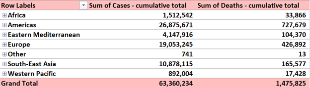
Here, I pulled information from the World Health Organization’s (WHO) daily COVID-19 database as of December 2, 2020.
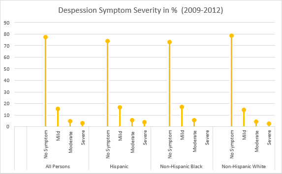
This week we all created lollipop charts. While looking online for different explanations on how to make a lollipop chart, I came across a really easy one. It did not explain the steps clearly towards the end but I figured it out with the textbook for the last few steps. Compared to the textbook this website: excelk.com went straight to the end product in a few steps.
A lollipop chart is just like a bar graph, but easier to follow when you need to display a large number of values and when those values are high. This type of chart is also more appealing to look at.
For my data set, I was looking through the CDC website and came across Depression in the US Household Population. They had graphs displaying the percentage of symptoms persons of ages 12+ with depression. I picked to use race and ethnicity as my x-axis vs gender, and ages. But also the PDF form which included the data set.
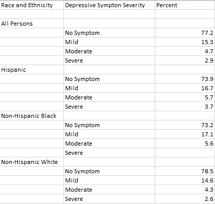
I will say this lollipop graph was pretty easy to make thanks to the website I used. The only problem I came across is trying to change the colors on each of the x-axes ( I wanted no symptom, mild, moderate, and severe on the graph to have their own color to better distinguish the severities.) I also wanted to add data labels, but I could not figure out how to.
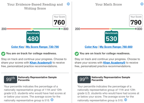
When looking for data visualizations with benchmarks I expected various graphs that had to do with scores. There is a score that you are expected to achieve, and they mark it either on a scale or display it on charts/graphs.

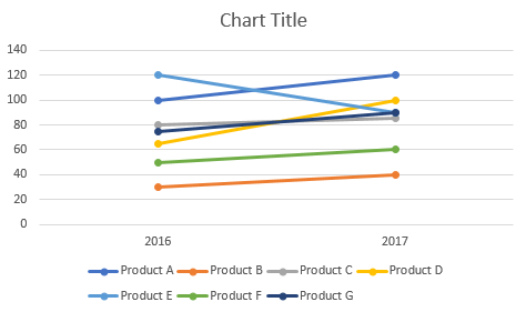
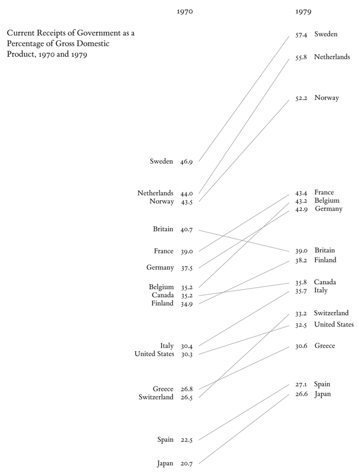
One amazing tools we can use when comparing 2 numbers is a slope Graph.
The Slopegraph, not to be confused with a “Slope Graph”, are very good at highlightingthe story of how just one category decreased when other categories increased.
The thing about bar graphs and people, is that, even though humans are good at detecting length, making bar graphs advantageous. But they lack the nuianssce that is sometime neccesarry to make the story behind the data clearer.
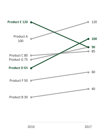
The concept behind this data tool was first developed by Edward Tufte, an American Statistician.

He is also the author of The Visual Display of Quantitative Information.
As Tufte notes in his book, this type of chart is useful for seeing:
https://charliepark.org/slopegraphs/
Here is an Example of his original concept, directly from his book
A clean & concise visualization is critical for your audience’s understanding of what your selected topic may be. Without this, your audience is likely to struggle with the content presented to them as they will not grasp the important topics you had hoped they would. When designing a visual that involves comparing numbers, it is crucial that you only include what is most important for your topic at hand. This is because if you overload your visual with too much information, your audience will become overwhelmed and leave your presentation feeling more confused about the topic, and this is exactly what we should attempt to avoid.
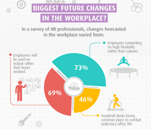
As you can see in the above visual, there is one main point being conveyed to the audience with three measured categories. The main point of this visual is to show what the future of workplaces may adapt to become. Each one of the three measured categories is given a specific color that all of its data is highlighted in. This does wonders for your audience’s understanding! This is because your audience can quickly identify that the red 69% of the doughnut is portraying that employees could be paid based on their performance rather than hours worked as commonly seen today. As you can see, this visual is very effective in communicating only the data it needs to and contains no extra information or frills that could grab the audience’s attention away from the main points.
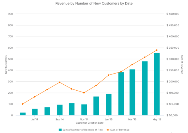
Seen above is a vertical bar-graph that depicts the revenue of new customers for a company over a specific time span. As seen in the legended below the x-axis, the blue vertical bars represent the number of new customers and the orange trend line represents the revenue generated from these new customers. With this visual we can clearly see that this company had a large uptake in new customers from before March of 2015 until May of 2015. We can also see that this company did not have nearly as many customers in September of 2014 but they still generated more income off of these customers then they did in November of 2014. This visual is very easy to understand upon first glance and does not leave room for your audience to have many questions about what this data is portraying. This is exactly what you should be aiming for when creating your own visuals comparing numbers.
Above is a short three minute video explaining exactly what data visualization is and why it is crucial in everyday life. This video highlights how a data visualization should be constructed and how these visualizations can benefit more than just the person that created them.
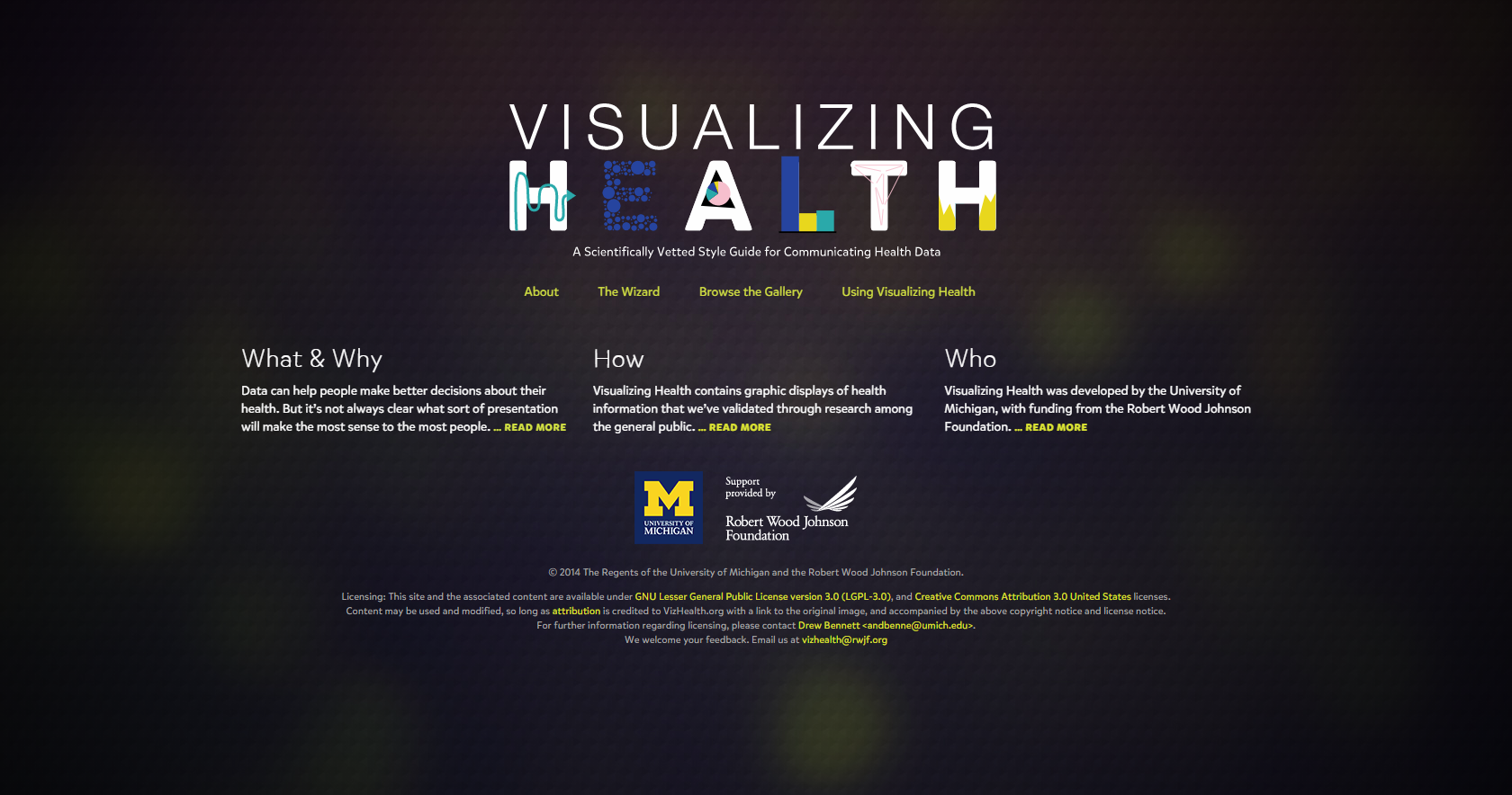
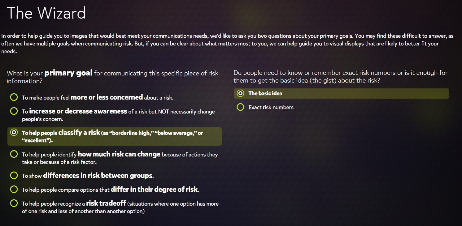
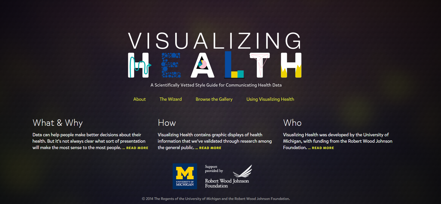
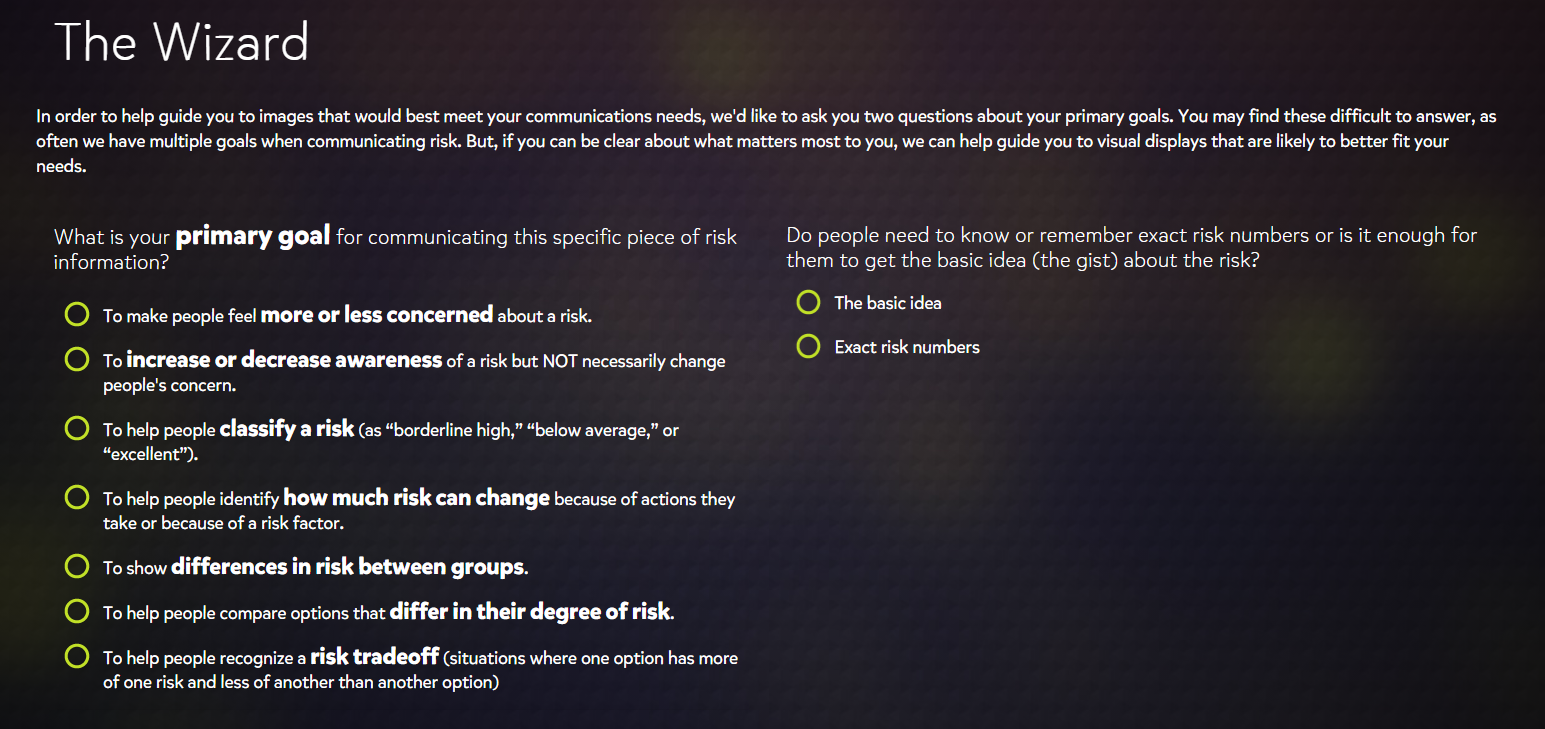
VizHealth is a collaborative project developed by the University of Michigan and the Robert Johnson Wood Foundation. This tool allows users to choose from 54 original data visualizations which have been tested through research amongst the general public. Utilizing The Wizard tool allows users to figure out what the primary goal for communicating the risk is and whether their audience needs to understand the basic idea or to remember exact risk numbers.
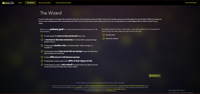
Figure 1. The Wizard tool from Visualizing Health.
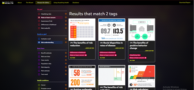
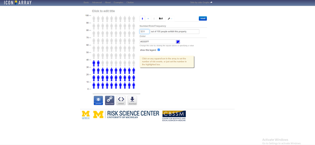
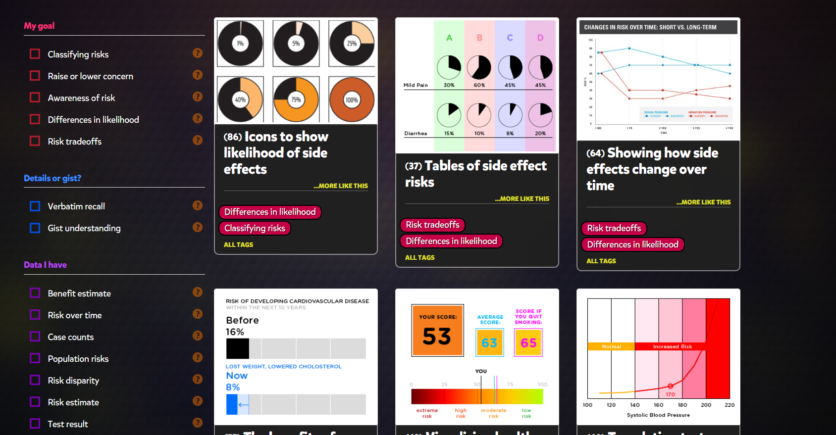
Based on the answer to these two questions, the tool will display graphics that best match your needs. These images can then be modified to fit your own data. You can also browse through the gallery according to specific tags to find the most effective visualization for you. This is a great tool that can be used by anyone from students to professionals as these graphics have already been tested and proven effective to convey information to the general public. There is also an external link to an Icon Array Generator provided by the University of Michigan Risk Science Center that users can utilize to create their own custom images.
September 27th 2020 by Erika Kacprykowski
The Visualizing Health Website is a great tool to use as it is very easy to navigate. This website allows you to create infographics regarding health as well as a way to learn information about their health. There are four sections: About, The Wizard, Browse the Gallery, and Using Visualizing Health.
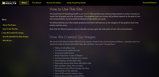
The About page is an introduction to the site. This section explains how to use Visualizing Health, some background to how they created their images, as well as who they are. I found this to be a great tool because it is important to understand where the information is coming from and if they are a reliable tool to use.
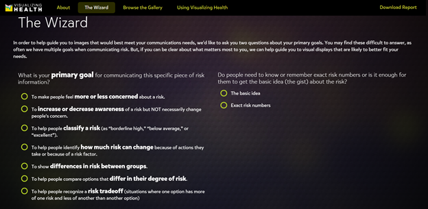
The second section of this website is The Wizard which allows you to search for specific infographic designs based on two questions. These include your primary goals and whether you want it to be general or specific. Once you select a goal, they even give you an example as well as a point to consider. This feature truly helps you understand the difference between the various goals and allows you to make the best choice in order to fit your own individual needs.
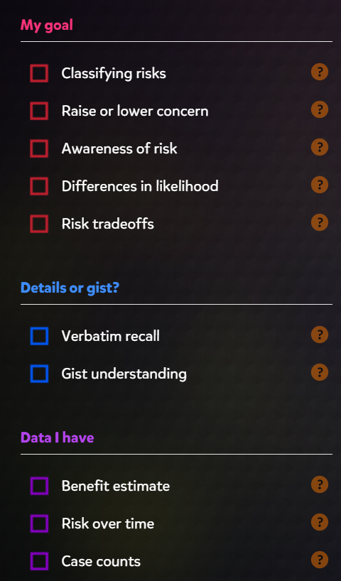
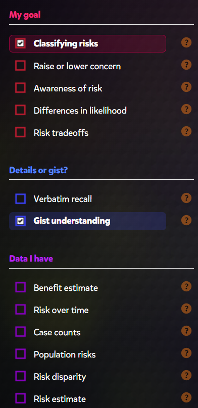
The gallery contains hundreds of charts and graphs based on your goals, wants, and needs. On the left hand side, you have the ability to filter your searches through there. These options include “My goal”, “Details or gist”, “Data I have”, “Health conditions”, and “Graphic type”. This section displays many different styles of graphics according on your own specific goals.
The last section of the website is a how-to page. There are options on the left side (see picture above) which explain how to select the correct image and how to adapt that image as well. This is a great addition for those who are beginners and would like some more help.
This is a great tool for any and all health professionals, including myself. The ability to filter and sort through hundreds of data visualizations is super helpful. It is amazing that there is now a site geared more towards a specific audience. There is a ton of information out there on the internet and it can be difficult to navigate. Visualizing Health seems like a great site I can see myself using.
When I first opened Visualizing Health homepage, I noticed the title graphic and the yellow text. The title isn’t overall complicated and easy to read. Looking closer, I realized that all the yellow text are links to other pages of the site, licenses, and emails. All are clickable links that a person can use to get information from and help recognize what they can click on.
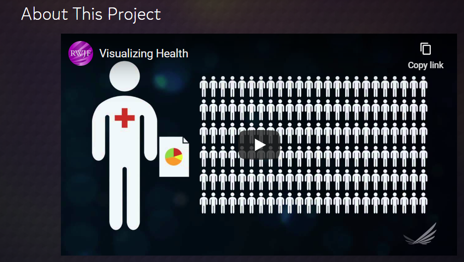
Finding information about the project was very easy and they even added a video that helps explain their goals, how they put the wizard together and how was involved with the project.
The wizard was, to me, fun to use. It started out with 2 two questions, what is your primary goal of the infographic and how specific you want it to be. This is great because it help narrow down your choices and makes jumping into making an infographic less overwhelming. Starting small and specific is best and then you can always work up.
It then brought you to the gallery with samples of graphic based on the specifications that you chose. On the right hand side (screenshot on left) shows a menu with the same parameters that you were giving at first, with yours selected. Below your first options are more specific sections you can chose to help narrow down the type of graphic you need. It can help cater to the type of data you are working with, rather than have a general graphic. You can also select the type of graph you wanted, whether it was a bar graph, table, icon, or pie chart, etc. Using the Wizard was really straight forward and easy to navigate.
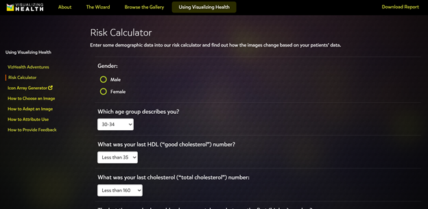
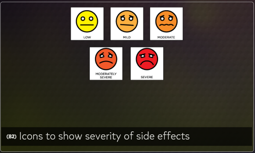
The site also gives tips on how to create icons, use images, and assess risks for the infographic. This site seems especially helpful to people in a medical field or people/companies that want to spread awareness about diseases or other health risks.
This week I had the pleasure of exploring VizHealth.org, a data visualization site for the medical field run by the University of Michigan. My initial impressions on the site were mixed at best, as I was not sure how useful a site categorizing visualizations specific to the medical field would be to other areas. I am happy to say that this impression was completely untrue and I will most likely use VizHealth as a reference for any future infographic projects.
VizHealth serves as a database detailing a wide variety of infographic examples and their potential uses. The two main features of the site are its gallery of infographic examples and, more importantly, a search wizard for finding infographic designs. Given the wide range of designs and searchable tags the site presents, they thankfully provide a simple but concise guide on how to navigate the site and attribute any of designs for your own use.
Serving as the main attraction of the site, the VizHealth wizard is an easy to use tool that allows you to quickly search for specific infographic designs based on a variety of criteria.
When I first viewed the wizard, I was surprised at how simplified the search criteria were. The eight primary goals were easy to understand while also being as non-specific as possible so that you could apply them other datasets that were not medical related.
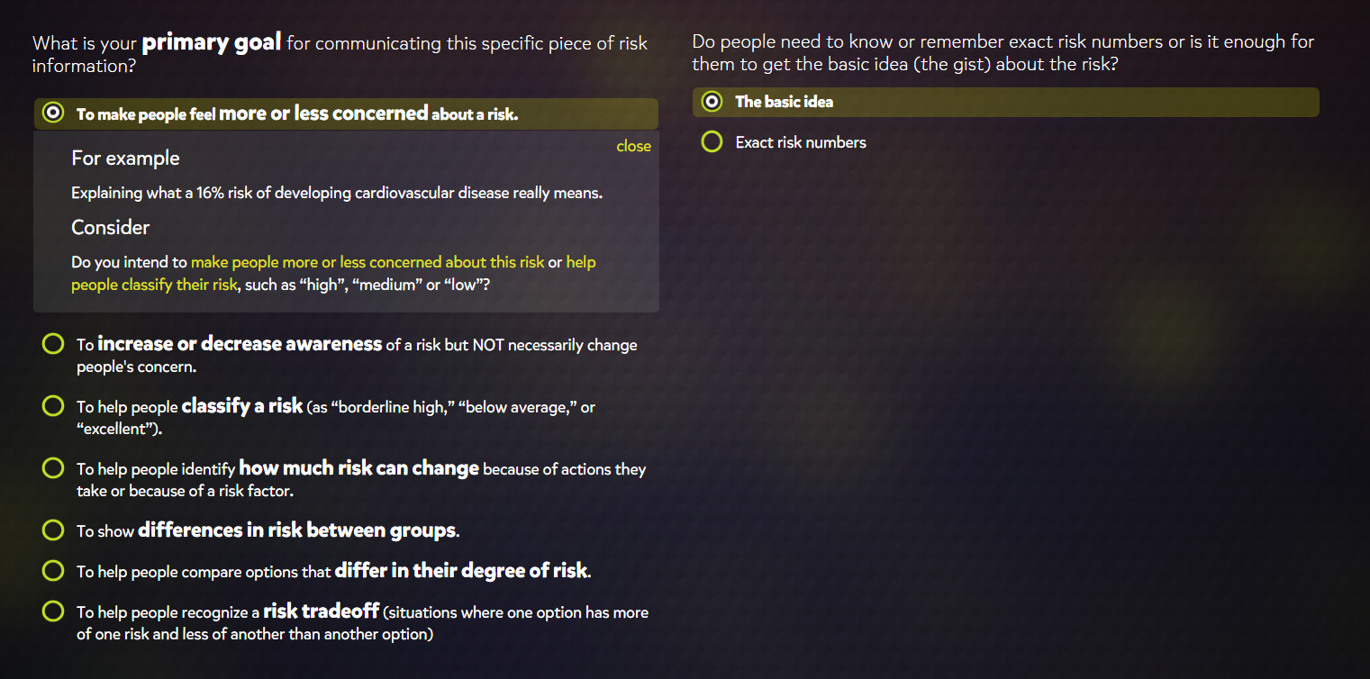
Selecting a graphic style also provided a short example of how the described graphic would be used and poses several questions that might help you confirm whether or not you choose the correct category. I found this to be a very useful addition as I had difficulty fully understanding the difference between the second and third to last options on the list. The filters for exact numbers and basic concepts were also useful features for determining graphic styles based on whether the graphic is meant for the general public or a more professional audience.
While I found the Wizard to be helpful overall if you are looking to design an infographic, I was much more interested in the actual graphics browser that accompanies it. This browser displayed about 50 different styles of graphics that all feel under the purpose categories that the Wizard describes. While there were quite a few styles that I was familiar with, there were also significant number that were new to me or that I had never really considered to be infographics.
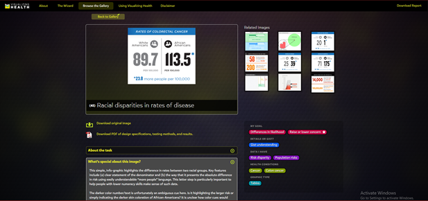
For example, we all have most likely seen this table at a doctor’s office and I had never realized it might be considered an appropriate way of displaying data. A variety of the presented graphics directly address this issue of determining if a graphic is appropriate for conveying certain types of data and the impacts they have had historically.
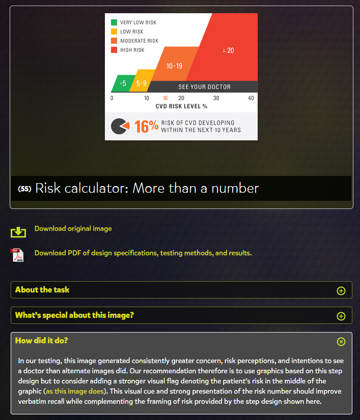
The “How did it do?” tab is the perfect addition to the site, as it allowed me to learn more about how well these different styles performed and any issues that arose from their use.
Overall, VizHealth seems to be perfect tool to get a wide-scale idea of the various styles of infographics that have been used in the past and provides fantastic information on how effective each is at their prescribed role. The Wizard is a great jumping off point for designing infographics when you are unsure of what kinds of visualizations are appropriate for your data set. I will definitely be using this site as a resource for when I have to
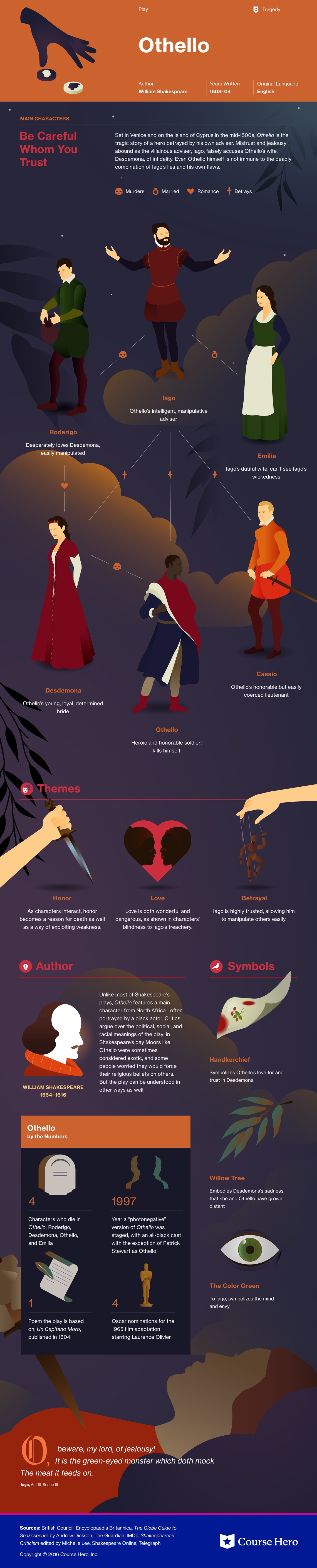
Course Hero is a website that provides students various study resources like study guides and textbooks, and their solutions. The one I am specifically going to talk about it their literature infographics. This resource helps students learn about a story’s characters, plot, themes, and more in a visual way. (I will insert an example they provide of a play named “Othello”). Depending on the type of story, the infographics have various information it will provide the reader with. They create colorful infographics with the theme of the story and draw out characters, shapes, and more to grab the reader’s attention. The website also goes into detail with what happens in the chapters, they describe the characters and how they change over time if you click “view study guide for this book”. I would recommend this resource for people who are struggling with understanding a book they are reading.