Categories
Uncategorized

Vizhealth

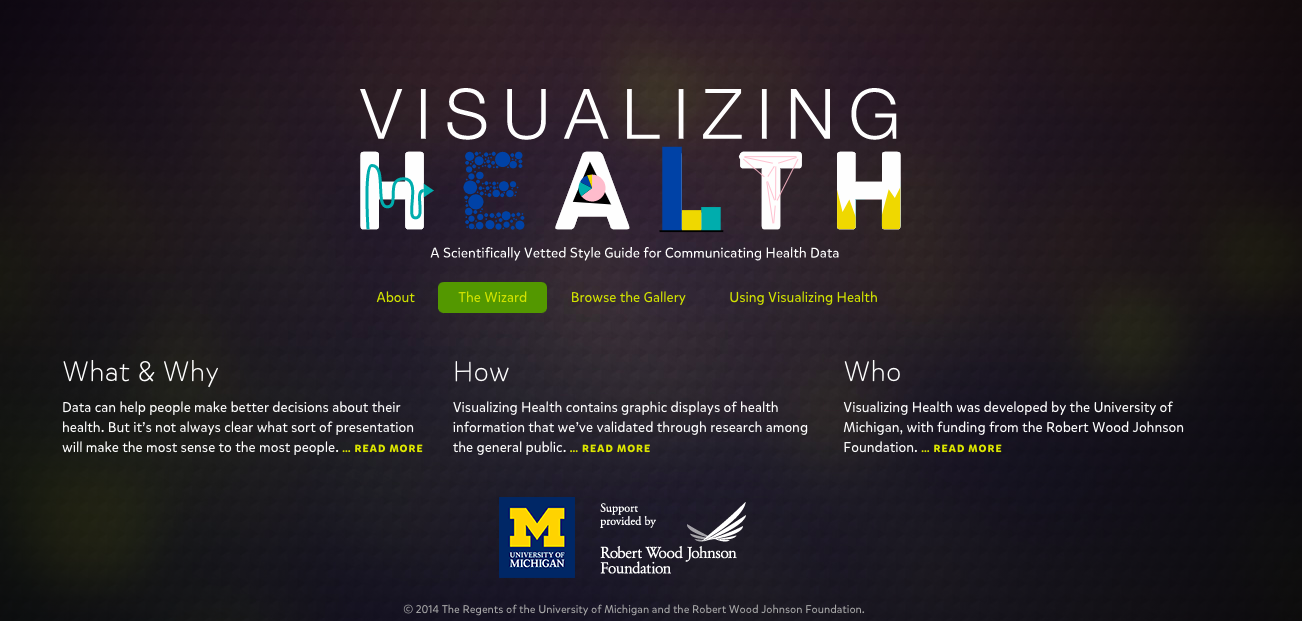
Vizhealth is a unique way of creating a certain style of data visualizations for healthcare and health data. With that, it is also a great source to help anyone that learning about data visualizations in any job. I had a very pleasant experience going through the website and I loved how everything was organized on the pages. The neatness and amount of information throughout the entire website caught my attention.

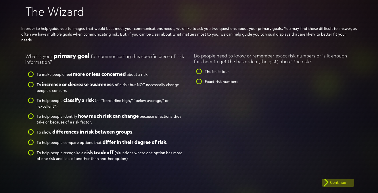
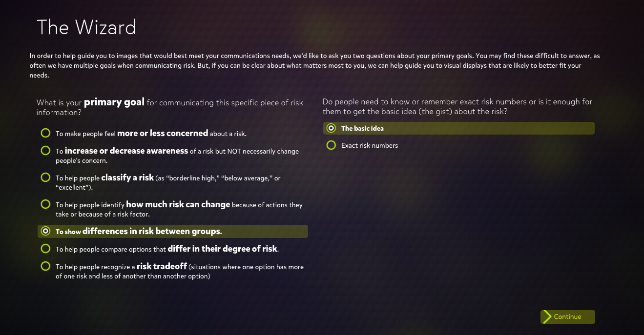
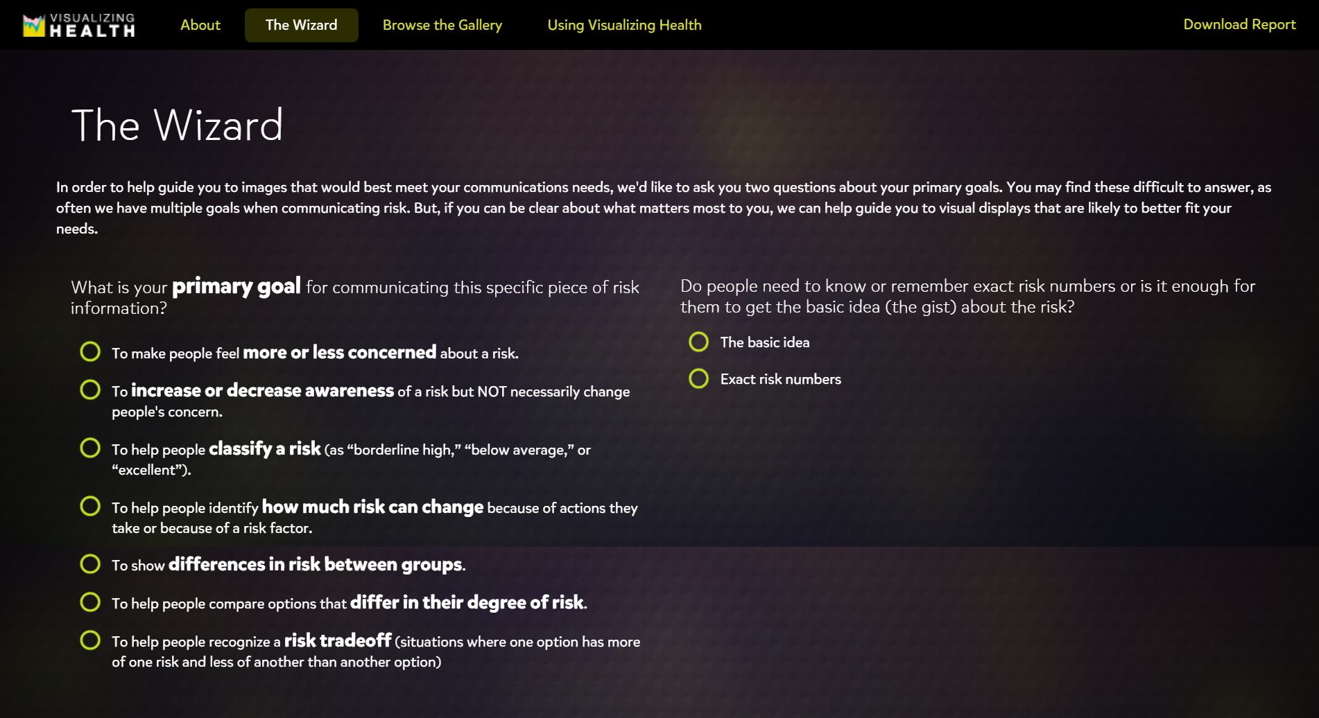
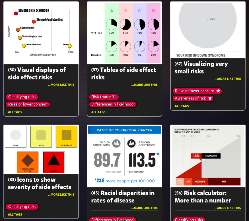
The Wizard, being one of my favorite tools that I explored, is a helpful way for healthcare providers to focus on how they would like to present their data to a patient or boss. The Wizard tries to analyze your goal and then gives you many results to choose from.

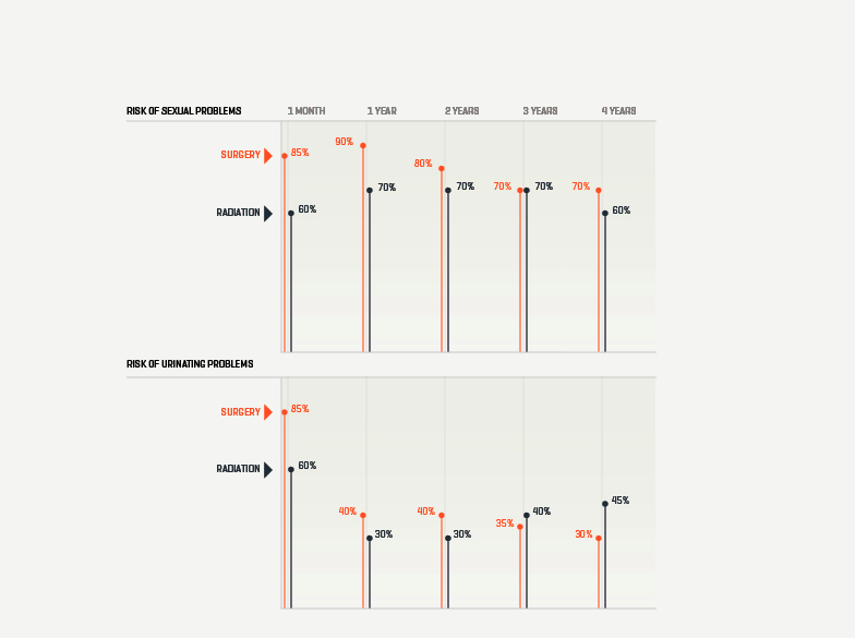
I noticed that Vizhealth has a lot of different links and hyperlinks that point to other web pages, web sites, graphics, visuals, files and even e-mail addresses. The ones that I came across definitely helped me understand certain data and words that I was not familiar with. The colors that were used throughout the website as well were also appealing. The colors blended together and there were just enough.

Visuals

The Gallery had a plethora of different kinds of data visualizations that presented great information on how you can rearrange your numbers and data in a colorful and fun way. These are just a couple of examples that I found effective and interesting to look at.

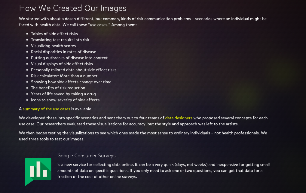
Vizhealth also had an entire page about how they choose their visuals to go onto their site, giving a brief description of their process. I think that this is something good to have on a website like this one so viewers can see how each visualization is picked to be shown.

I think that I would recommend this website for someone who is learning about data visualizations because it gives great resources as well as helpful tips to guide you in the right direction of analyzing your numbers. My overall experience was a good one and I continued to learn new things.

Categories
Uncategorized

Visualizing Health; A Reflection.

Visualizing Health offers a wonderful tool to assist you in selecting the appropriate visualization for your dataset. Upon entering the website, you are greeted by the homepage pictured below.

Once on the homepage navigate to “The Wizard” tab, highlighted in green in the photo above. You will then be brought to a new page that asks you to further explain what your primary goal is for your visualization & exactly how much knowledge your audience should take away from your visualization.

If someone is looking to create a visualization for the differences in risk for two medical conditions over time, they may select the highlighted options in the photo above. Selected is, “to show differences in risk between groups” as the two different medical conditions (sexual & urinating problems) are measured in individuals who had reconstructive surgery and those who choose radiation. It is not crucial for people to understand exact figures, just that one may have a better effect then the other. This is why “the basic idea” is selected.

Shown above is one of the numerous visualizations that “The Wizard” recommended for the data set. As you can see, this visualization is clear & direct in communicating that for sexual problems, surgery was a better overall choice for patients. For the case of urinating problems, surgery also appears to be the better overall choice although it could be questionable as a longer term solution.

Visualizing Health is a wonderful website to explore if you find yourself wondering if there is a better way to depict your data. Taking the time to look through this website will offer any user insight into what clean & concise visualizations look like. Keeping this website on hand could be the difference between creating an average visualization, and a perfect one!

Categories
Uncategorized

Visualizing Health

Visualizing Health is a handy website that helps you create infographics regarding health. In addition, it provides people with a simple way to retain information about their health. For example, instead of a long paragraph that one may have to read, this website combines important information and portrays it in images.

Visualizing Health also has a handy tool called “The Wizard”. By asking two questions, the Wizard helps you narrow down your communication goals and your primary needs. This then filters out infographics that best suit your needs.

Questions that the wizard asks you are in the photo above.

After completing my questions and letting the wizard do its work, one eye catching inforgraphic that it found for me was this one.

This image was a product of me choosing option of “increasing the awarness of a risk by a lifestyle change” and the topic i chose was “diabetes.

All together, Visualizing Health is a handy website that provides information in eye catching images. Most importantly, if focuses on the health of people by educating them and on how they can make themselves better.

Categories
Uncategorized

STANLEY CUP: 2020

Presented in: Infographics

via moneypuck.com
via cbssports.com
Categories
Uncategorized

8 Base Layers of the National Map

Hello, everyone. I would like to share an infographic of eight base layers of National Map despite the lack of knowledge to thoroughly understand it.

I got it on the website of USGS Science for a changing world https://www.usgs.gov/media/images/8-base-layers-national-map

Details

Image Dimenensions : 372×536

Date Taken: January 2012 ( Approx)

Location Taken: US

Photographer: Sexton, Pamela Ann

Thank you!

Categories
Uncategorized

Designing Effective Infographics

How to present data without losing your reader’s attention!

Summary: “Information graphics translate data into a visual medium that is easy to understand and engaging. Integrated visuals with text and pictures that strengthen each other are the goal, but hard to achieve.” -Lexie Kane (2018)

Click “Summary” to access the website.

  • Honest Information-
    • The information included in your infographic needs to be accurate and sourced.
    • Make sure you have extra links to your data as well as popular sources.
    • This will give the viewer more reason to use your information.
  • Minimalism is Key-
    • Keep your infographic design simple.
    • Use about 3-5 colors that compliment each other.
    • Make sure your words don’t crowd the data.
    • You essentially want your infographic to show your data in a professional way but also be able to have a 5 year old understand it.
  • Interactivity-
    • Having an interactive infographic is a great way to get your viewer involved with your presentation.
    • Sliding objects and adding preferences to the information they want to see automatically keeps the viewer invested.
    • Being able to narrow down what data they want to see is very important. It combines all 3 of these examples into one!

Here’s a website with some good examples of…

“Interactive Infographics”

https://www.columnfivemedia.com/101-fantastic-interactive-infographics-youll-love
Click the Link to open the website.
Categories
Uncategorized

Examples of Insightful Data Visualizations.

Data visualizations are a colorful and creative way to present data. It allows you to organize data in a way that’s both compelling and easy to digest. Data visualizations can be animated, colorful, use images, metaphors, and can save you time. They also can explain a process, stimulate imagination, present data in a pretty way, tell a story, and be educational. It is important to choose the best visual for your data and its purpose. It is crucial that your data is understandable. Keeping your visual as simple as possible is the best way to do that. Some examples of data visualizations are charts, tables, maps, graphs, infographics and dashboards.

Categories
Uncategorized

Comparison of tools infographics.

Google charts is a simple and easily navigated site. This site is free to all users. Google charts is specialized in chart infographics such as bar graphs, line graphs, and pie charts. Unlike piktohart there is not much room for creativity with very simple formats.

Piktohart is a complex platform with various different additives. In comparison to Google it is free to the public. To upgrade your use of the site upgrades and in website purchases are available. This website specializes in New and innovative infographics. This site gives you a second mind by giving inspiration of different ideas.

Categories
Uncategorized

Pete Test

this is a test

Categories
Infographics Uncategorized

Infographics: 5 Tools For Beginners

September 20, 2020 by Erika Kacprzykowski


Infographics are used by educators, researchers, students, and others looking to visually communicate with their audience. They are engaging visuals which come in many different shapes and sizes and are used daily in healthcare, classroom settings, etc. There are a number of guides and apps that can be used to effectively create the perfect infographic. Here’s a list of 5 great tools you can use today:

  1. Canva Canva is a free graphic design and video app used by thousands to edit images and create infographics. With this app you can download infographics right from the app or you also have the ability to create them yourself. Canva also has over 60 million downloadable images as well as the ability to create team templates and hundreds of designs to choose from. Apple store rating: 4.9 stars
  2. Piktochart Piktochart is a web based tool used to easily create infographics using ready to go templates. This is another free application and can be great for beginners who are just learning how to create infographics. Similar to Canva, you have the ability to collaborate with teams as well as integrate charts, photos, and icons.
  3. Easel.ly Easel.ly is another web based application which comes with hundreds of free templates to create your own personalized infographic. With the ability to insert your own photos and artwork, the possibilities are endless. There is a huge range of charts, graphs, and images to choose from. Options such as timelines, reports, and even resumes are included in this free membership.
  4. Cool Infographics: Effective Communication with Data Visualization and Design by Randy Krum If you are looking for a book to read in your free time, this one by Randy Krum might be worth looking into. With a rating of 4 out of 5 stars on Amazon, Krum reviews the importance of infographics as well as beginner tips on how to create the most effective visualization. Ranging anywhere from $20-$35, this might be worth the purchase if you are looking to expand your knowledge on infographics. https://www.amazon.com/Cool-Infographics-Effective-Communication-Visualization/dp/1118582306
  5. Video Guides- How to Make an Infographic in 5 Steps Video guides such as this one are free on Youtube and can be great for those who do not know where to start. This one by Venngage can be found on Youtube or on Venngage.com and is helpful for the audience in determining what should go into their infographic.

To Sum It Up..

Infographics are very useful in displaying data through a variety of different charts, graphs, images, and texts. They should be engaging and exciting and easily read. Thanks to technology and books, infographic templates, tips, and tricks are more accessible than every before. These tools listed above can help you whether you are a beginner and have little to no experience with creating infographics or even the advanced user who has plenty of experience.