Categories
Uncategorized

How To Translate Significant Data Into Your Work

Before we begin, ask yourself these 5 Questions…

  1. Who is your audience?
  2. What is the question they want answered?
  3. What answer am I giving them?
  4. How will I transfer this information to them?
  5. Will they have a follow-up question the need answered?

After answering these questions, you must then create your infographic. In an article on tableau.com, we find 5 new ways to convey our information in an effective way.

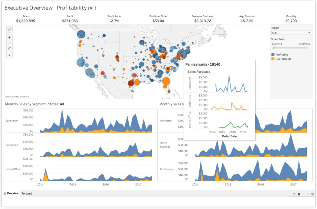
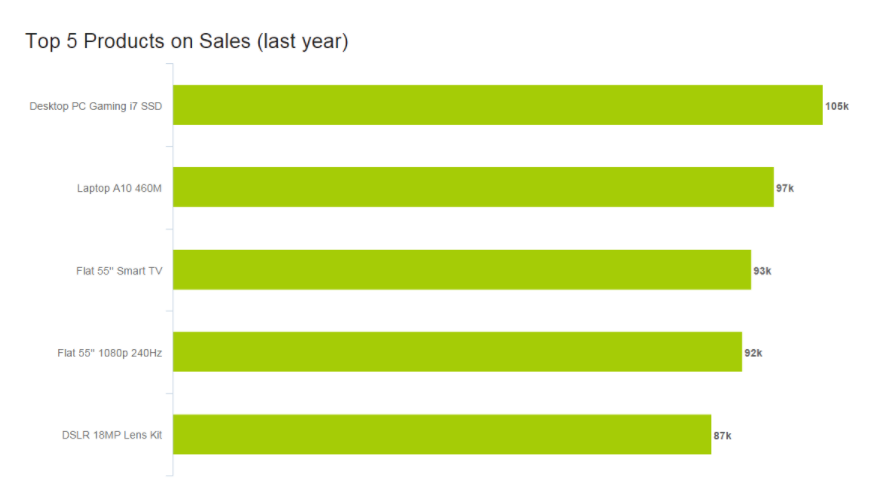
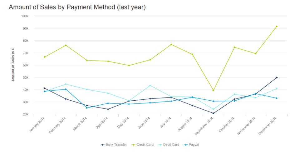
Number 1: The Right Charts and Graphs are Key.

Bar Graphs, Pie Charts, Histograms, etc., we need a physical representation of our data. By showing these, our reader can get a good sense of why the data is significant.

Number 2: Predictable Patterns.

We love to see patterns and symmetry in everything we do. Visually, it makes everything look clean and neat. It also helps us understand the data better. An extra long column or a outlier on a chart can show us the abnormalities in our data.

Number 3: Clear Color Cues.

Just like patterns and symmetry, colors have an effect of the human brain too. Some colors may be to harsh like neon yellow. Some colors maybe be too drab and dull like gray. But when you have colors that catch your eye, data can become visually pleasing.

Number 4: Use Familiar Shapes and Designs for Simplicity

If I were to show you the outline of a house, you would know it’s a house. By making your data easy to understand, you’re doing everyone a favor. Simplicity is key when making and Infographic.

Number 5: Everything You Do Is Intentional.

Every placement of an image and every passage you right is done for a specific reason. You should be accurate and not withhold any information, but you should also be concise. Make your data visually pleasing and minimal, but don’t make it boring. These are very vague restrictions, but they also give you a lot of room to be creative.

Find even more presentation tips and tricks at Tableau.Com!

Categories
Uncategorized

Comparing numbers

Some images for relaxing!

Thank you!

Categories
Uncategorized

Tools that Help Construct Visualizations that Compare Numbers

There are so many tools to help you create visualizations but a lot of them are kind of animated, which is fine but sometimes you need something that is going to help you bring out some data that needs to be shown. There is a software that could be used on your desktop, mobile device or even online.

Tableau is good for all types of graphs, scatterplots, line graphs. You name it and you can literally make it happen. They even have diagrams that you can choose from like the map of the country or even the whole world. Let’s say you need to compare cases of COVID between New Jersey and Florida, you would be able to show the hotspots in both regions.

In the image shown is an example of how you can use the maps in different ways. You can keep track of trends and even combine different types of charts, graphs, diagrams to bring together a full visualization of data.

Categories
Uncategorized

Visualizing Numbers

I think it can be pretty easy to forget how much millions and billions actually are.

This can be thought of in several ways. A billion pounds of water will weigh more than a million. A billion pounds of anything is too much, and a billion of anything is a hoard of resources.

NowThisNews via youtube.com

End World Hunger 11 Billion Dollars
Jeff Bezos 72.8 Billion Dollars
Warren Buffet 75.6 Billion Dollars
Bill Gates 80.6 Billion Dollars
Me 11.23$ an Hour
IISD.com, Worlds Billionaire Club (as of 2017).

The next time you think of defending Jeff Bezos, remember that you and him are not alike. You are closer to poverty than you ever will be to being a billionaire.

This is one million in numerical terms

1,000,000

This is one billion in numerical terms

1,000,000,000

This is how much Jeff Bezos is worth (as of 2017)

$72,800,000,000

This is how much a teacher makes on average in New Jersey (as of 2019)

$58,000

“It is possible to have too much of a good thing”

Aesop

facTofusion.com, Jeff Bezos rising net worth
Categories
Uncategorized

-COMPARING NUMBERS-

Insightful data visualizations can be used to compare numbers. These data visualizations can portray data in various different ways that will compare numbers. Line charts can be used to present data and show how data is similar or different. This kind of chart tends to be easier to view as long as there are not too many lines on the chart. Lastly, line charts are a good way to compare numbers because they show trends, accelerations or decelerations. Horizontal bar graphs can be a good way to present and compare numbers. They provide a nice visual and as long as the data is in order, they are perfect for comparing.

Horizontal Bar Graph
Line Chart
Categories
Uncategorized

Comparing Numbers

An interesting comparison I found is the separation of years in schooling.

It’s a basic table, but what it fails to represents is that in the UK, you may finished “secondary education” by year 10 or 11. Whilst in the US you are required to do 12 years no matter what. An interesting comparison none the less.

Here is some data comparing schooling days, hours, and time of by select countries.

Perhaps you want to look at survey data and compare that, well be wary of certain tricks that are used!

This may not be interesting, or pretty, but it is very insightful. You’ll notice that the numbers show that male and female audiences separately, preferred Carlo’s shop. As a whole, however, Sophia’s is preferred.

I believe this is very insightful because it looks into a paradox of statistics looking at numbers, known as:

Simpson’s Paradox

This precious little paradox shows that when comparing numbers, it is not always a good idea to take them at face value. There may be factors accidentally, or intentionally ignored when delivering a study. Of course, the boring solution to a case like the one above is to have equal data sets for each group for a proper comparison!

What if you legitimately have an unbalanced data set, that you cannot balance? Then you simply cannot properly compare the data sets. You must change the data.

A funny little presentation by Glen Bell, an Australian data governance specialist, explain how to not represent data.

sources

https://towardsdatascience.com/simpsons-paradox-how-to-prove-two-opposite-arguments-using-one-dataset-1c9c917f5ff9

https://ncee.org/2018/02/statistic-of-the-month-how-much-time-do-students-spend-in-school/
Categories
data visualizations Uncategorized

Comparing Numbers

Data is all around us, in different shapes and forms, and sometimes it is hard to decipher. Using visuals to compare data can make all the difference in comprehension, as long as itself is clear and concise. I found a video from Visme that gives a few pointers and explanations on how to improve Data Storytelling.

I felt it was important to share this video because comparing numbers is not just bar graphs and digits, it is a way to get information out to viewers. It is a type of storytelling that uses minimum words but insinuating on a focal point that helps the reader understand clearly.

Tools

Online charts is a free website I found that is simple to use and can create a variety of charts and graphs in just a few minutes. It allows users to construct multiple types of charts and manipulate color, font, and data input.

Home page of Chart tools
Data input page
Finished Product

Users can download their graphs into different formats, such as, jpg. and pdf.

Covid-19 and Education

As I was looking through UNICEF’s website I noticed a separate link just for data and found some well-created infographics that are not only current and relevant but perfect examples of comparing numbers. Covid-19 has created devastation all over the globe and continues to do so today. Children around the world are feeling the impact due to the pandemic, not only home life but in their education. Below are a few infographics that I felt highlighted the five tips from the video above and accentuated their intended purpose while comparing numbers.

A well labeled graph comparing prior undernourished children to current and projected scenarios.

A representation of children affected by school closures due to Covid-19.
A projection graph comparing the possibility of economic decline due to the pandemic.

If you take a look at all three graphs you can easily read and understand the visualizations set forth. Each graph has a focal point which is portrayed using colors, patterns, and contrasting visuals. The graphs all are labeled properly with limited distraction, making them readable. All of these graphs read left to right following the rule of thumb of conventions, each comparison with a time line keeps the time line on the x-axis to avoid confusion. I think

Categories
Uncategorized

My Experience with Visualizing Health.

This week i had the opportunity to visit Michigan University’s Visualizing Health site and here how it went!

So this is the home screen, i must say i was a fan of the coor scheme and well is the font choice and graphics. All of those factors came together to make a very inviting home page
From the previous screen I clicked the “About” tab and i was brought to this page where i was met with a very engaging video
As the video began to explain the “wizard” i began to realize just how useful of a tool it must be for scientist and health officials during this pandemic.

All in all, I had a very informative time going through the site!

Categories
Uncategorized

Comparing 2 different situatons

Below is a neat infographic regarding the concern of global warming. As global warming continues to rise each year, the effects that it takes on our planet shows more and more. However, this infographic compares a world where leaders take action to prevent global warming. But it also has another world if nothing is done about it. In the left is the world where nothing is done about climate change. It highlights key devasting effects that could occur on planet earth. On the right side is a world where we taking action on climate change. It shows how there is still hope in defeating this ongoing issue. There are also key points in this inforgraphic that highlights the effects of climate change in the coral triangle.

Categories
Uncategorized

Data Visualizations Tools

Excel is one of the most useful tools for creating Data Visualizations