There are numerous uses for Pie charts, especially as conveyors of information. When trying to present some any kind of data that is relative to a whole, this is the graph you would use. While it may depend on what kind of data you are trying to get across, I think these are easy to make, the technical parts can be time consuming if you aren’t great at creating them.
|My Pie Chart|
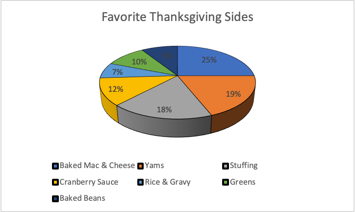
I chose to convey this type of information, but I believe that any kind of graph would have gotten the information I wanted to convey. It’s just a simple 3D bar graph made using excel. The types of foods went into one cell, while the percentages went into the other. After inserting the type of pie chart you want, from there the labeling, and other technical things lookovers, and there you have a pie chart. =]
Pie charts are one of the easiest ways to represent your data. Some people seem to like using these charts and including them in their data stories. Others can’t stand them for a multitude of reasons.
I am a personal fan of pie charts when they are done correctly. In cases of 2 or 3 pieces of data, a pie chart can show you how each of their values differ in proportion to the size of their slice. But when you have 5 or more values, the chart can become crammed and you cannot accurately visualize the data.
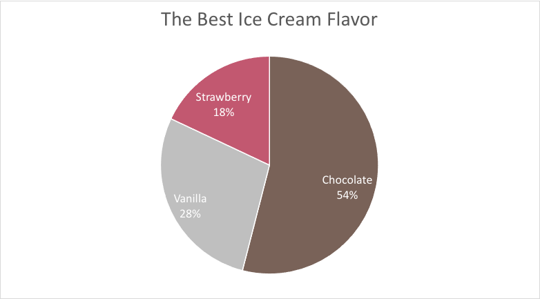
In this example, the values are easily identified and even have the values within their slices. This is a great way to show the significance of a number.
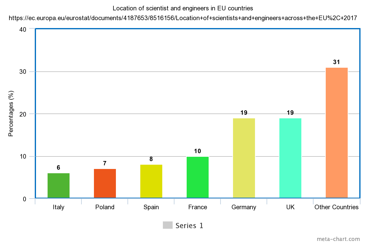
In this example, it’s a lot harder to see each of the data sets. Sure, the slices are labeled. But things are beginning to get cluttered and overwhelming. A simple bar chart would be much better to show these ratios.
The assignment is to make a good argument for the “perfect use” of a pie-chart. I have found just that
I children’s book, sold in the UK.
A children’s maths book or activity book is probably the only perfect case. Children love look at shapes, and colourful objects, and the illogicality of the pie-chart is the same at any age and any stage of the growing mind
To be Frank, I don’t believe perfect’ case exists, if we define ‘perfect’ as ‘A pie chart would be the best choice, over any other graphical or visual method’. Nevertheless, for the sake of the assignment, I will give an example of acceptable use for a pie chart.
In this example. The slices of the pie is used to give a general size difference to represent the number of the numbers. As we have seen in the ‘bad infographics’ section of the course, too many entries makes pie charts cluttered and pointless. Nevertheless, take a look at this bar chart version of this pie-chart.
Made using the meta chart tool
In this case you wouldn’t keep the percentages, you would use the actual figures each percentages is representing. But the point I want to make is that, that is the entire point of a pie chart: to oversimplify or trivialise the information. Humans do two things poorly: Percentage mathematics and intuitively understanding angle measurement, The pie chart combines two things we are bad and yet these are widely used. The bar graph, however, gets the job done just fine.
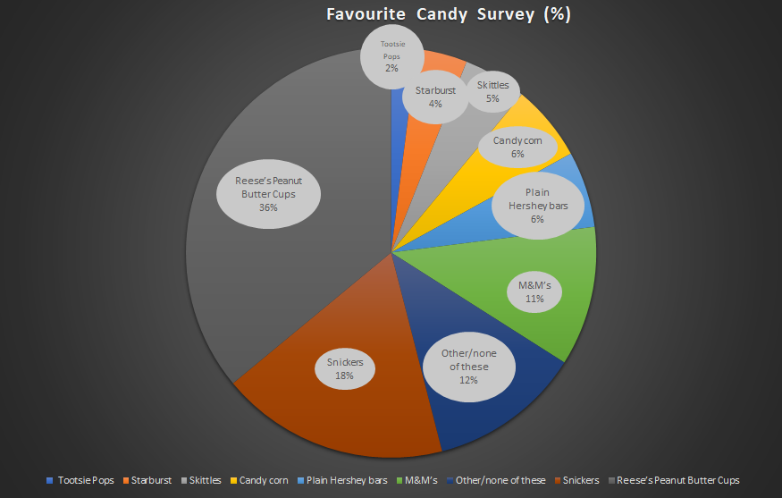
For the purpose of the assignment, I chose to use data from a favourite candy bar survey for a pie chart.
As a general rule I keep the elements of a Pie chart below 10. I keep the background a darker colour so that my eyes focus on the pie or wheel, and I keep the colours semi-simple. Keep the labels on the pie chart and the icons labels at the bottom, or the icon legend, is optional, but helps keep reference, even if it is redundant.
In the survey they claim it was taken by over 1100 people. So they took the number an changed it into a percentage. So but if you don’t know that, the percentage is meaningless. God forbid someone assumes a worldwide candy survey. Which would ruin the data considering Chocolate in the UK taste very different, in my opinion.
With that said, pie charts are pleasing to look at. And these days, the general population care more about aesthetics than useful, meaningful information. Here’s an amusing presentation simply titled ‘Pie charts are Evil’ done by Glen Bell, A data governance specialist in Australia.
For the purpose of this assignment I reached out to my university preceptors in both Applied maths and physics, all of them proudly or derisively asserted they have never seen or used pie charts in their entire professional career. This further inspired this section of my blog.
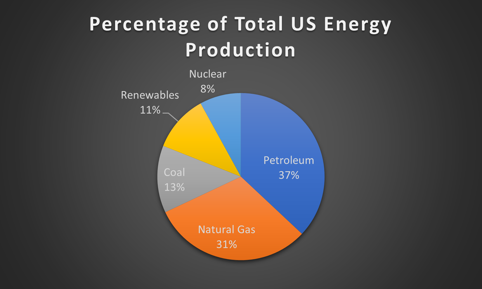
Pie charts are very simplistic charts that can neatly display data that describes various parts of a whole. A properly designed pie chart should….
Always add up to 100%
Display its slices in an easily understandable manner, such as by ordering them greatest to least in the clockwise direction.
Avoid displaying too many categories, as it can crowd the graph.
Never include any 3-D features, a simple 2-D pie chart is more than capable of getting its information across without the added visual noise of 3-D effects.
Ideally include a readable legend within the graph itself that also includes the percentages/figures from the data.
In order to display what a proper pie chart should look like, I used data from the Energy Information Administration on the make up of US energy production in 2018 by source.
A Pie Chart is a type of graph that displays data in a circular graph. They display the percentage of total. The pieces of the graph are proportional to the fraction of the whole in each category. Each slice of the pie is relative to the size of that category in the group as a whole. The entire pie represents 100 percent of a whole, while the pie slices represent portions of the whole.
Pie Charts are a great way to represent part to whole data, like an actual piece of pie. They are best to use when you are dealing with data that adds up to 100% .
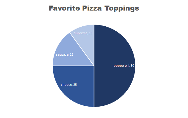
This is an example of a pie chart that I created displaying people’s favorite pizza toppings. Each slice represents a part of the whole, which is 100%.
Some things to note about pie charts
It is best to keep pie charts on the simpler side
Too much data can be distracting and messy
NEVER use 3D pie charts
Always remove the legend – the viewers eyes will be focusing on too many different things
Too many colors on a pie chart can be puzzling
Here is a link to the website that I found these tips on perfecting your pie chart.
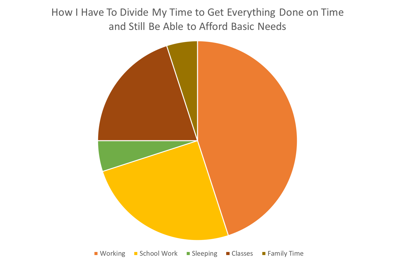
So with the semester starting to speed up it’s no surprise to literally anyone that I’m starting to fray around the edges a little bit. I don’t handle stress well, what can I say. Anyway, I thought this pie chart would be a good way for me to easily display how my time has to get broken up in order to live. See below.
I think this is definitely the best way to display this data. I wanted to emphasize how much time work takes out of my life. I think it worked. I also think that it’s best to use a pie chart when trying to show a large difference between several things.
If you want effectively communicate data visualization in which ” part-to-whole data is represented in binned quantitative values”, let’s use pie charts
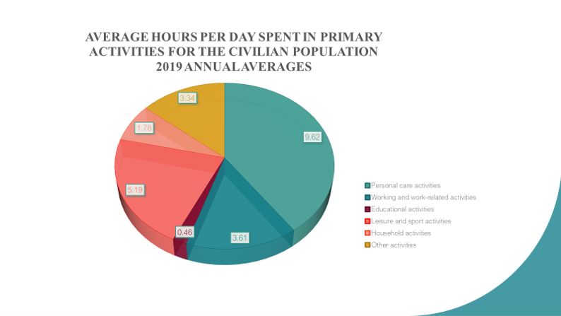
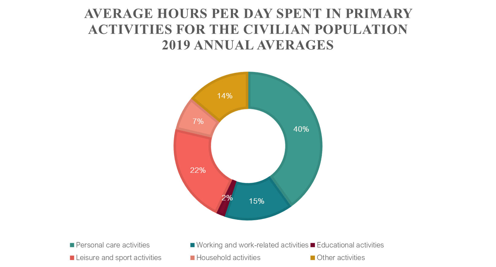
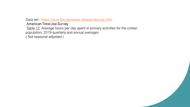
I introduce 2 pie charts to display average hours per day spent in primary activities for civilian population, 2019 annual averages that refer to person 15 years old and over. For more data details, please visit the website https://www.bls.gov/news.release/atus.toc.htm. American Time Use Survey Summary and tables are available.
Other charts can displays data correctly , but is is less effective to express its relative between data and part-to-whole data as pie charts
It is not so difficult for us to create these charts with a little computer skill.
Simply put, pie charts are best to use when you are trying to compare parts of a whole. They do not show changes over time. A simple organized pie chart can show lots information that can be read easily. A pie chart is a circular graph that is broken down into segments. These segments represent each category’s contribution to display parts of a whole. Therefore, if the data you have does not follow this, then you should use a diffrent type of graph.
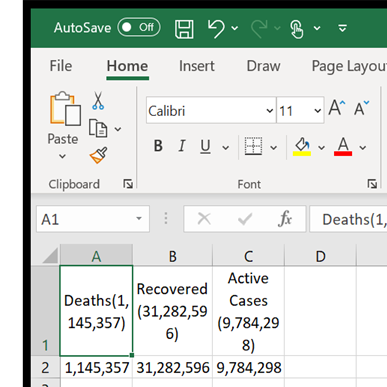
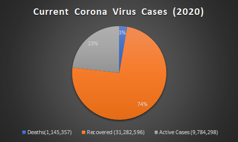
In my case, i decided to use current corona virus cases around the world. In the data i found, it has the total amount of cases, deaths resulting from the virus and the recovered. Below is a example of how i layed out my data in excel.
And from there, it is as simple as going to the insert tab and inserting a 2D pie chart.
The result is a easy to read pie chart that shows your data effectivly. From there you can go crazy with colors but dont forget to label your data and create a title for the data you are trying to represent!
Pie charts are a very interesting visualization as they cause some uproar for being invaluable and basic. Even with this belief, there will always be a great case for using a pie chart! In this blog you will explore one of these examples to better understand when you should and should not use a pie chart.
Example:
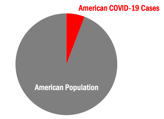
Today, we will explore a case that is perfect to visualize in a pie chart. This case is, coronavirus (COVID-19) cases in the United States versus the United States population. As you can already see, our pie chart will have two slices. A very important rule for pie charts is to stick with four or less slices per visual. This allows your audience to better understand what you are showing them.
Step One:
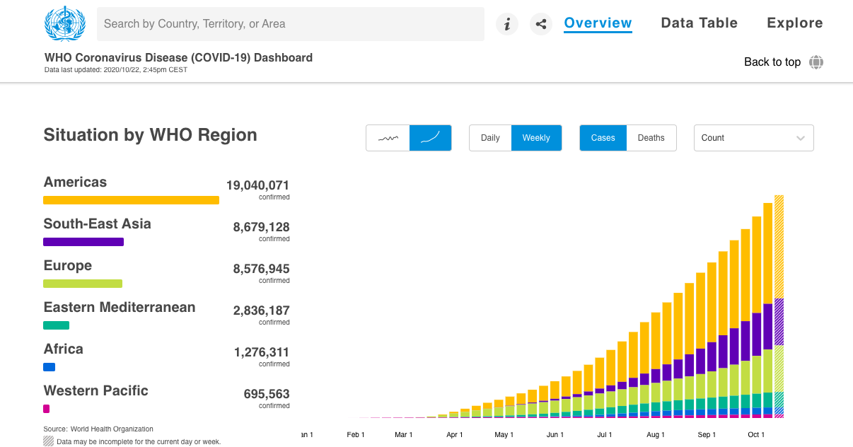
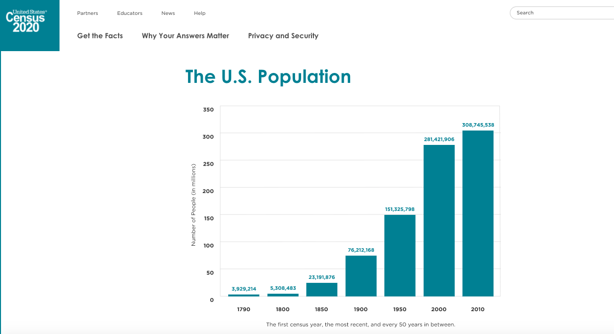
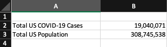
The first step in creating your pie chart is to collect your applicable data. Here I used the World Health Organization’s Coronavirus Disease Dashboard & the United States Census population data from 2010. Both of these resources are pictured below.
Americas cases (19,040,071) data was used in creating this pie chart example. United States 2010 population (308,745,538) data was used in creating this pie chart example.
Step Two:
The second step in creating your pie chart is to construct your data in Excel. Pictured below is what the data table in Excel was for this pie chart example.
Step Three:
The third & final step in creating your pie chart visualization is to simply insert a pie chart visual & format your pie chart exactly how you’d like it. Remember, your audience craves something that is clean, clear & concise with it’s information. Do not clutter your pie chart with excess data causing it to have too many slices. Also consider highlighting your “important” data with color and making the other data a neutral color (like grey). An example of this can be seen below in the pictured final product of the United States COVID-19 cases example pie chart.
Wrapping It Up:
Remember, in order to have an effective visual you must only include the needed data and nothing more. A pie chart is a visualization that is best suited for simple datasets where complex datasets may need more then four slices and this is a no-go for pie charts! Allow color to help you highlight specific key details easier to your audience. I’m certain you noticed your eyes peeking at the red slice for COVID-19 U.S. cases in the above pie chart before the grey slice for U.S. population. This was exactly what I had intended the red to do, grab your attention! Using this information you will now understand how to create an effective pie chart visualization!
Pie charts are used to compare categorical data and when done right they are extremely effective. They compare parts to a whole and are visually easy to understand. Below I came up with a perfect case to use a pie chart.
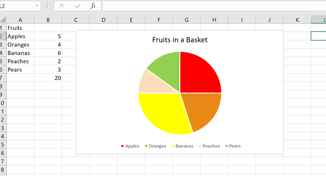
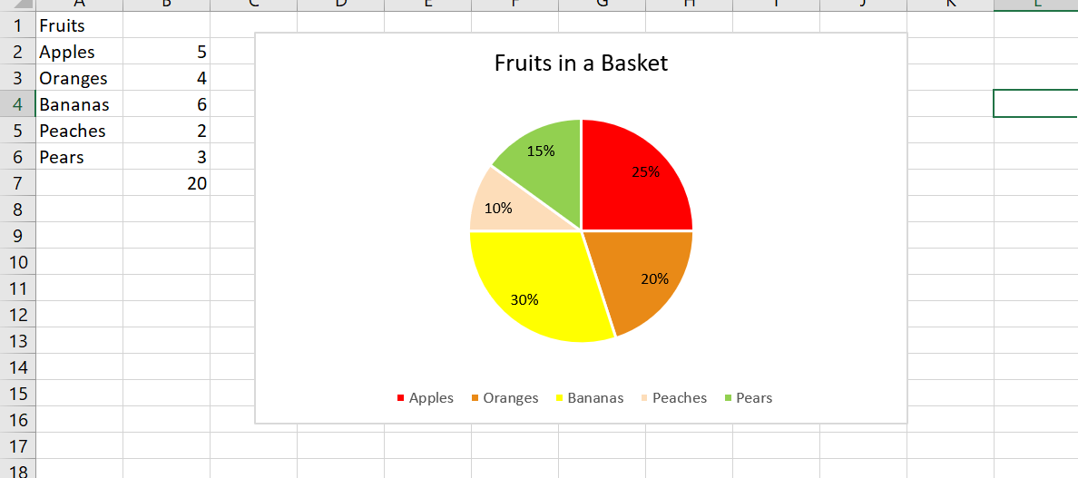
Let’s pretend you have a basket of 20 total fruits. You have five different kinds of fruits: apples, oranges, bananas, peaches, and pears. You want to find out the percentages of each fruit. A pie chart would be perfect for this because it compares a part to the whole.
Pie Chart without data labels Pie Chart with labels
I included chart one and chart two to show the difference between no data labels and displayed data labels. Notice how without the percentages it is still easy to decipher that bananas make up the largest percentage in the basket. While the data labels help, they are not always necessary.
In this example, the pie chart is the most effective choice. I could have used a bar graph, but when trying to find the percentages of each fruit, it is best to use a parts of the whole chart. It is clear that peaches make up the least amount of the basket and bananas occur the most.
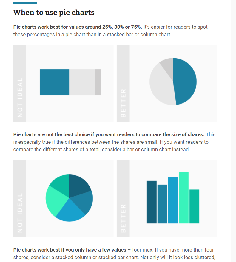
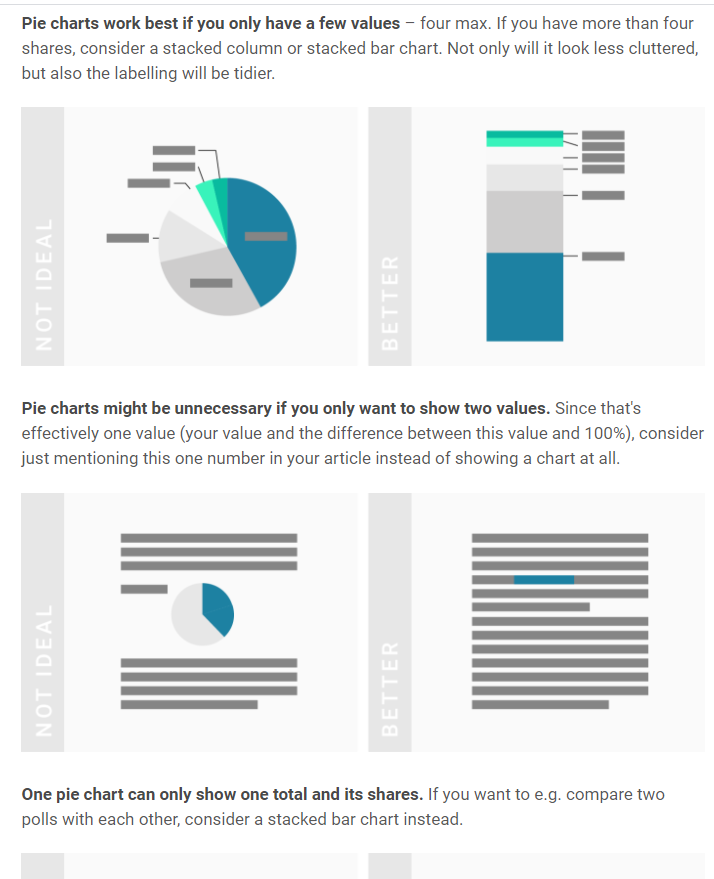
In addition, pie charts should only have around 5 categories and all data should add up to 100. Too many categories can look overwhelming and too cluttered. If the information given is not a part of a whole, this will confuse the reader. Check out https://visage.co/data-visualization-101-pie-charts/
It can be confusing how to know when to use a bar chart or pie chart but when trying to show percentages, it is the most effective and sensible choice. A bar chart can work, however visually looking at a circle and different sections is a better representation of the data. The circle represents the whole, or 100% while the sections represent parts or percentages of that whole. Bar charts do not do this.
Below are some screenshots of a helpful website which explains when to use pie charts.
Pie charts are an extremely effective visualization that are used to find a percentage of a whole. The pie chart must equal 100 and are used for small amounts of categorical data. In the example shared, there were only five different fruits and the goal was to find the percentage of each fruit in the basket which is why this graph was the perfect visualization to use.