Categories
Uncategorized

Our Energy System

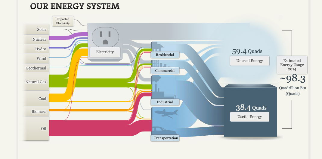
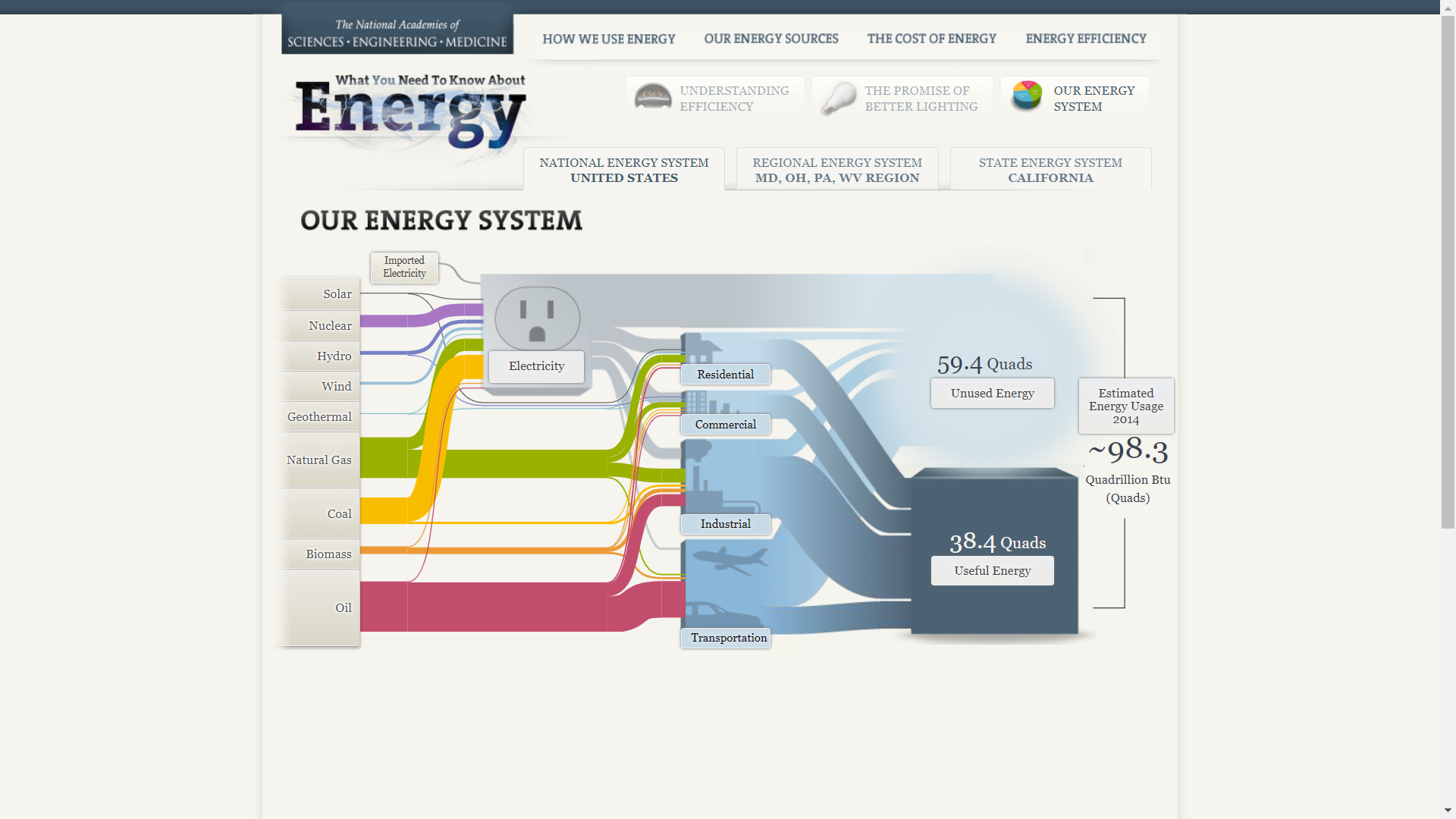
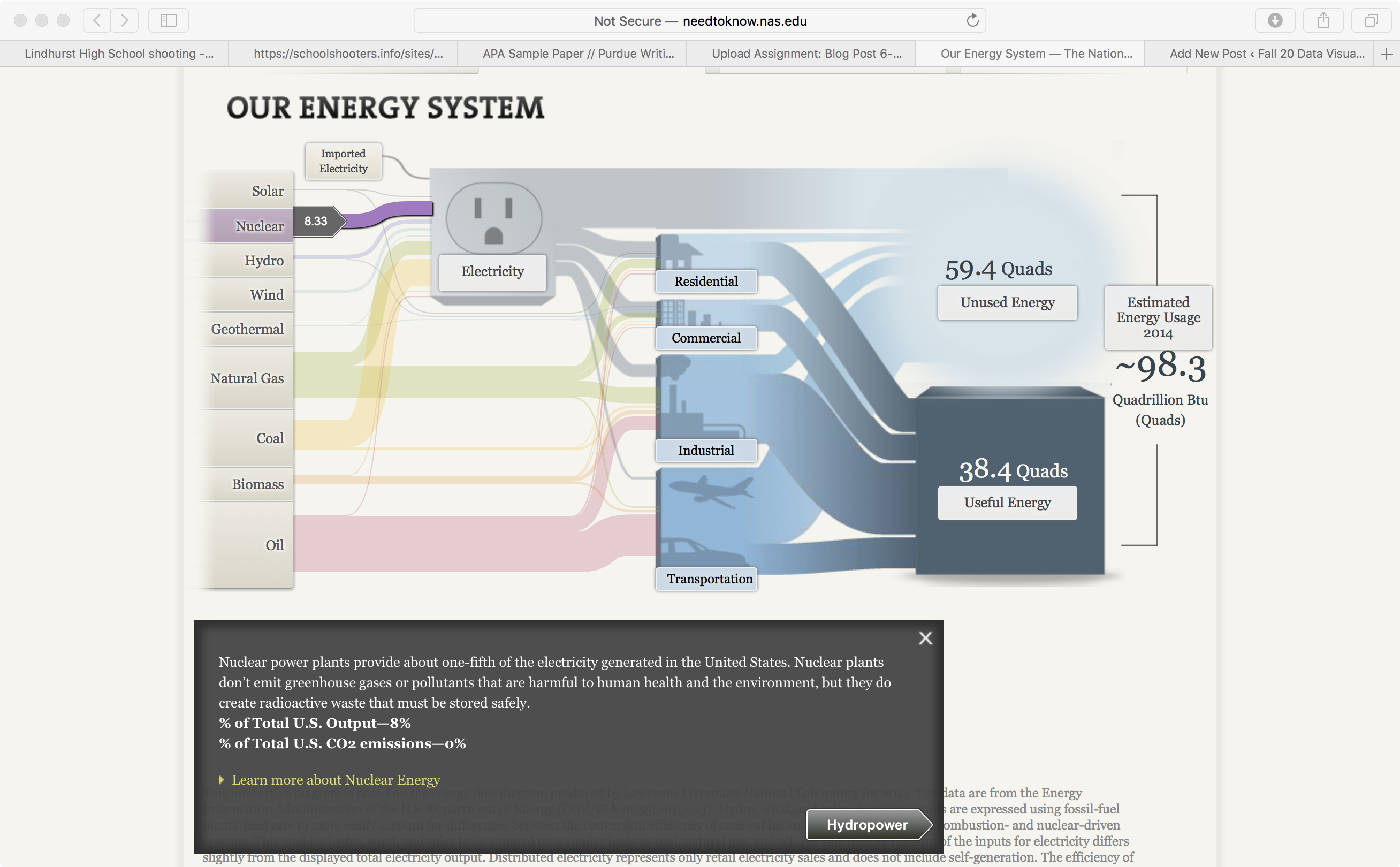
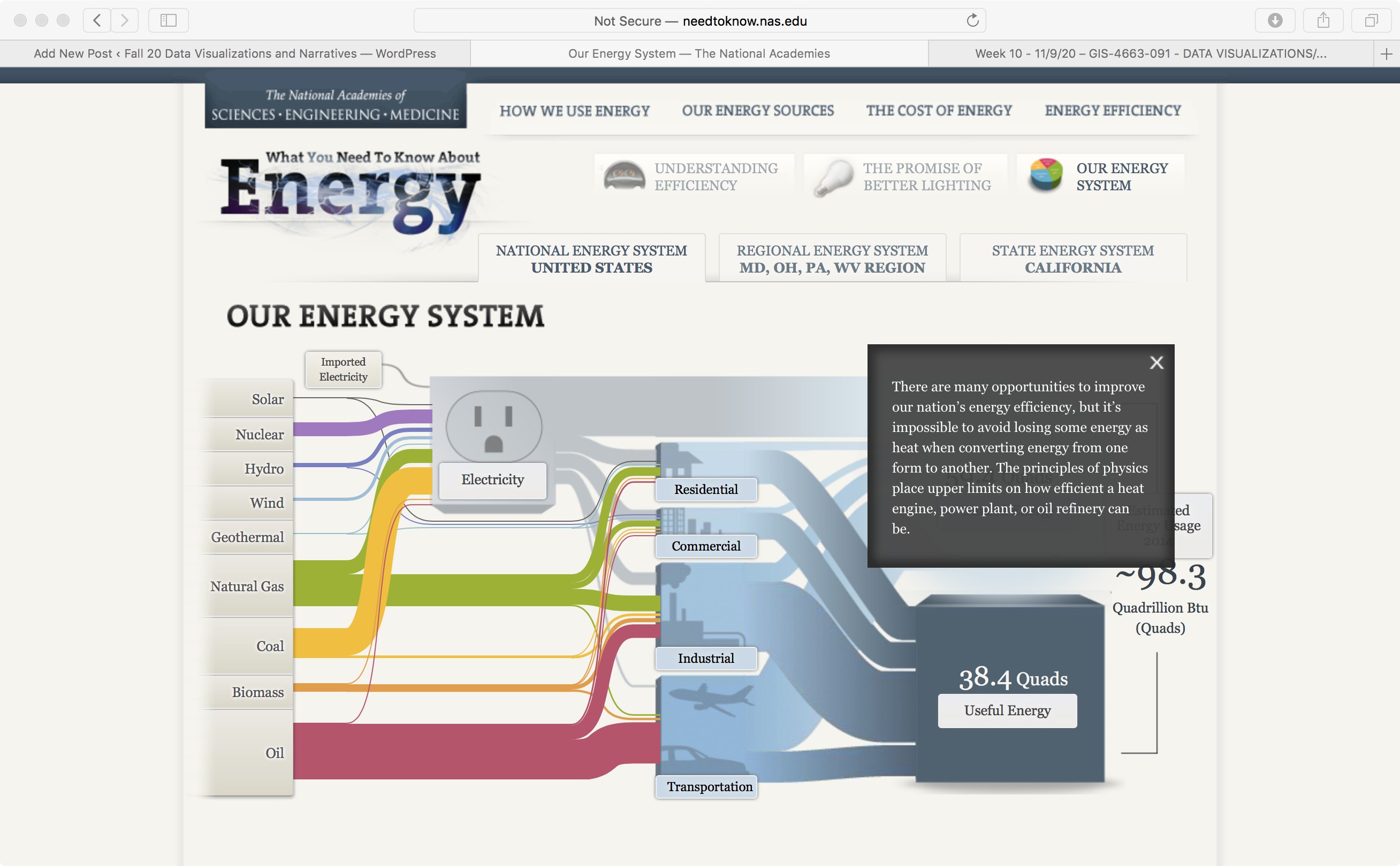
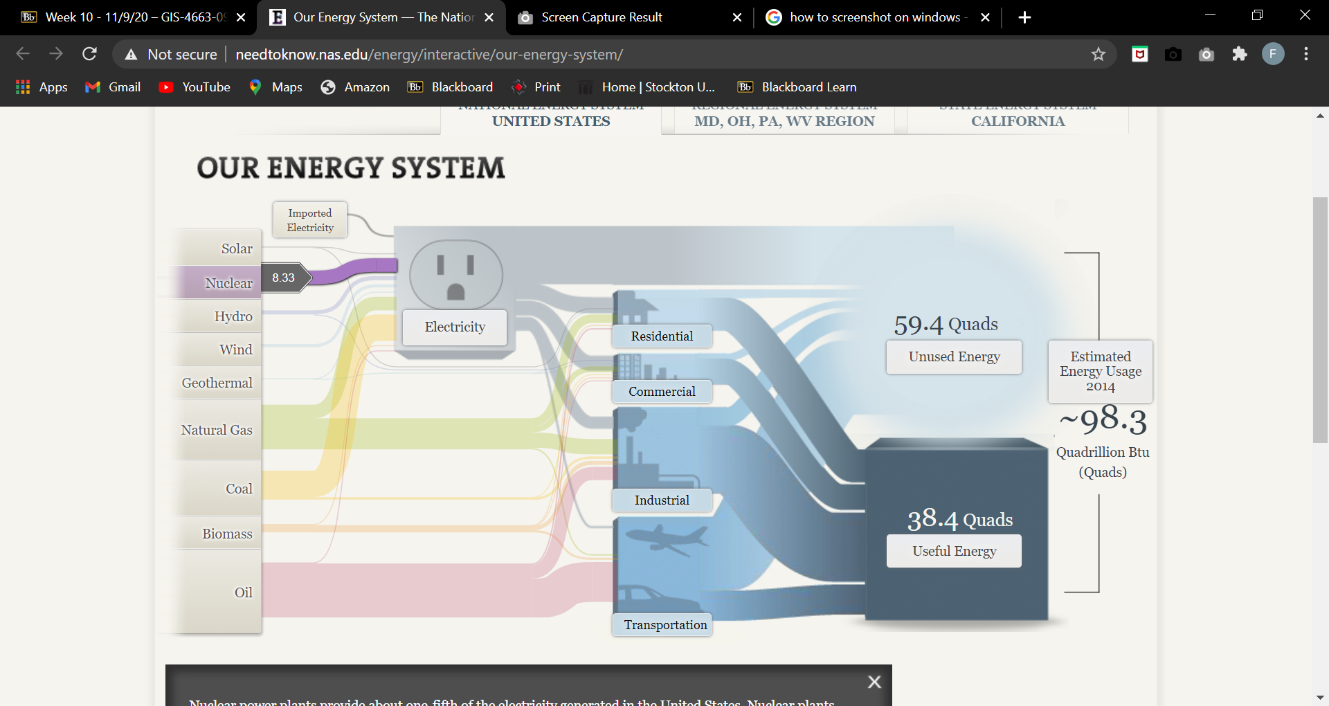
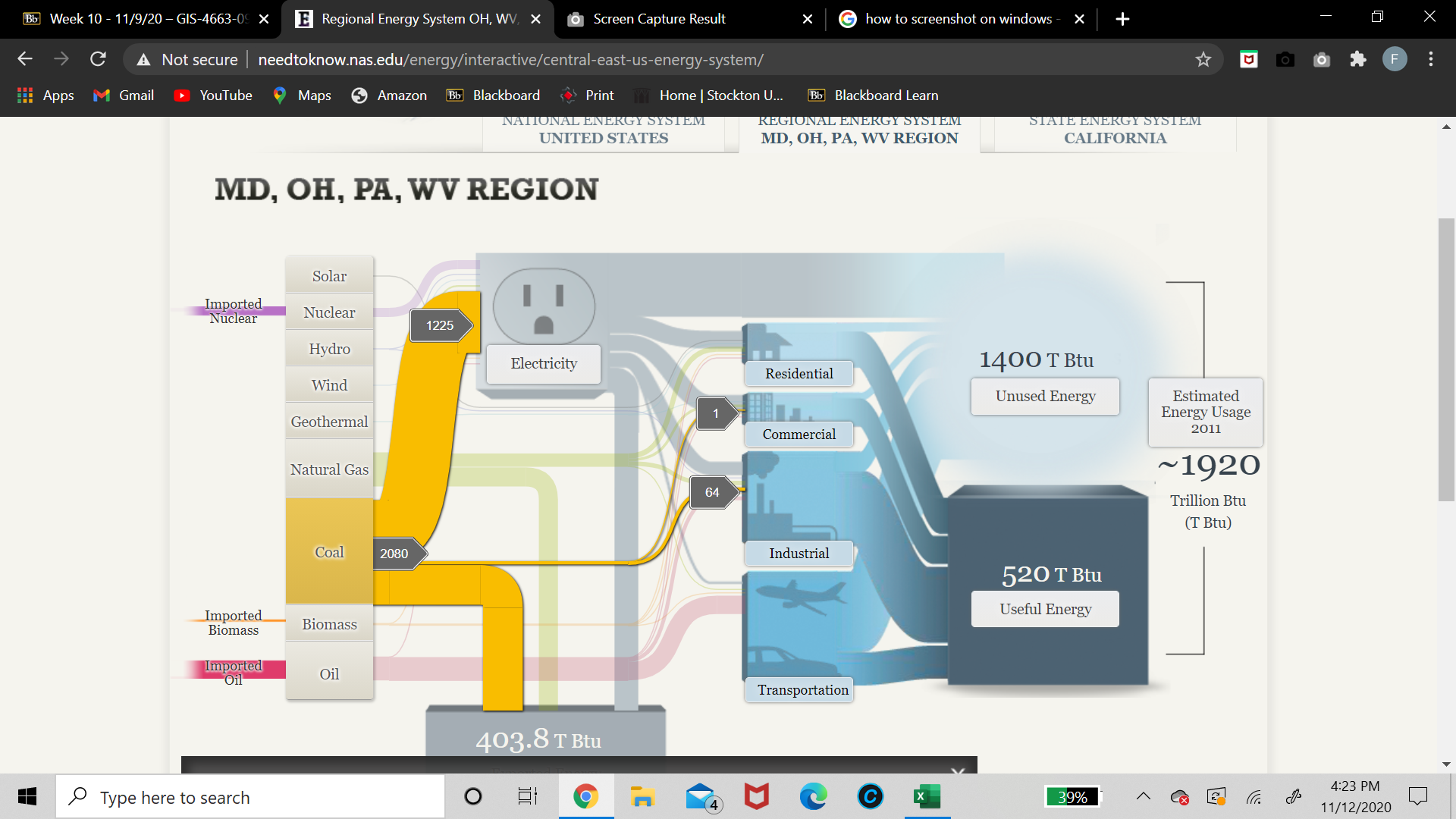
This week I had the pleasure of looking into the inner workings of the US energy system through the National Academies of Science, Engineering, and Medicine. Their approach to visualizing US energy production through the use of a SANKEY graph, pictured below, was very unique but fitting at the same time.

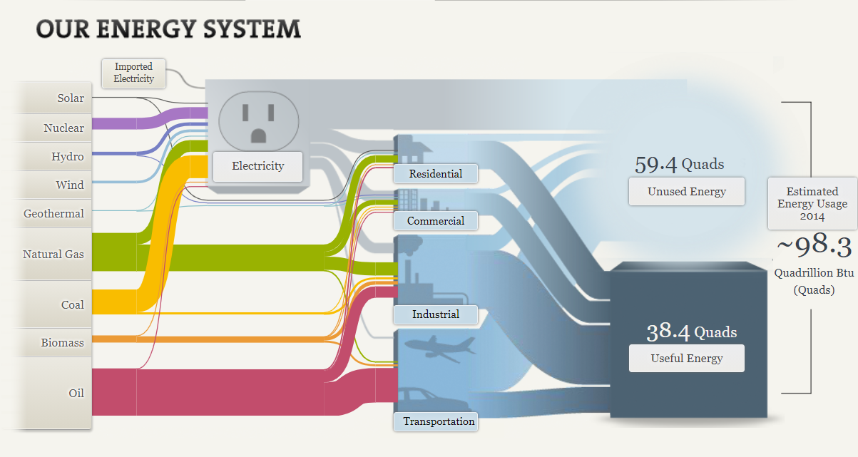
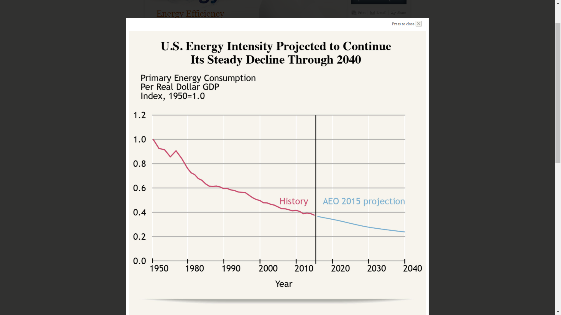
The beginning phase of the graphic already does a lot to convey the basic functions of the energy grid and the its various aspects. The flow from source to energy use is very natural and lends itself well to establishing the fact that the generated energy has to be moved through various stages before reaching its intended destination. When combined with the useful and unused energy figures, it establishes that there is some inefficiency in our current electrical grid that will lead to energy losses during transmission and that our current generation sources are not as efficient as we might believe.

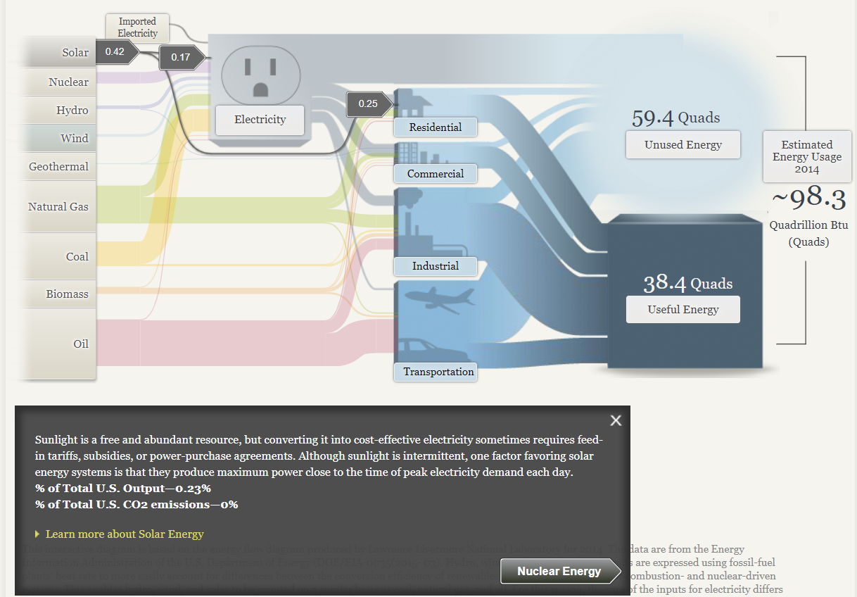
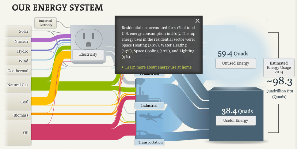
The option to expand the tabs on the left to access more information is useful as well. It helps keep the main space of the graph from becoming too cluttered with information. The breakdown of where the energy goes in terms of electricity and other uses is cool too, as it helps show off the fact that not all energy produced in the US is directly used for electricity generation. Some may be used for industrial process or for other applications like heating for homes an businesses in the case of oil and natural gas.

Overall I found the SANKEY graphic very fitting for this kind of information, but I can see it having very limited usefulness anywhere else. It seems like it would only be a good fit at describing processes that flow naturally from one step to the next.

Categories
Uncategorized

SANKEY

This website is an excellent tool for those collecting data that concerns the U.S. primary energy sources. You are greeted by a bar graph visualization portraying the “start” button for the visualization but also some insightful information about the energy usage in 2014. While this is not a lot of information to start with, it is enough to entice the audience to delving into the presentation further.

Once you begin the presentation you are greeted by the following visualization pictured below!

The above visualization contains a lot of information to say the least! The very first thing I notice about this visualization are the colors. Pictured above you see the colorful “cords” on the left hand side of the visualization, and blue tubes on the left. The colors in this visual do wonders to help the audience interpret each individual topic. However, this visual would not be very useful in a presentation where the presenter did not wish to explain this visual. This is because the audience will need some context of where to look on the visualization and why for the presentation. Each topic on this visualization is also a link to a different screen containing data and visualizations concerning the topic selected.

For this blog post, I choose to delve into “residential” energy use. As seen above, a small pop-up appears containing a more information on residential energy use within the U.S. How crazy is it that the residential energy use accounted for 21% of the total amount of U.S. energy usage!?

Once navigating to view more information about U.S. residential energy usage, I found this pie chart visualization. In 2015, the largest contributor to U.S. residential energy usage was space heating (27.3%) followed by water heating (13.1%). Space cooling (11.8%) came in third and was followed by multiple other factors that contribute 8% of less. I do think this visual was effective in communicating what it needs to. However, I do feel that the colors distract from each individual topic. I think this would be more effective to use the pie chart to point to one colored factor (such as space heating) and leave the other factors in a grey/ neutral tone.

Categories
Uncategorized

Energy in United States of America

The website of the National Academic of Sciences, Engineering, and Medicine. The source data is provided by Energy Information Administration of the U.S. Department of Energy and from its reports and studies.

Within my limited time, I tried to look for some knowledge about our energy system, as well as how the authors can tell us by visualization in 4 main parts

  • How we use energy
  • Our energy source
  • The cost of energy
  • Energy efficiency
  1. How we use energy

Among four economic sectors of residential, commercial, transportation, and industry; I consider ” Home & Work” that include about 40% of the energy consumed in the United States in 2015. Instead of carefully read information, it is easy for me to understand how much useful energy is in our life along full data by visualization with the pie chart. The data chart also shows the comparation of different way of consumptions in 2015. I will be more interesting to know the demand trend of different types of consumption with the line chart.

2. Our energy source

Of course, this part I am very consider. I want to know what on the hand of U.S. Energy system and its capability. Also, I like the way the authors express the direct and indirectly supply from energy sources to consumptions.

It is happy to hope we have enough affordable energy in the future. I love U.S government, because they love their people. They always take care us from how to reserve to supply enough energy for our life and every fields in U.S. They know how to invest to exploit nature energy sources in long time due to decline in other limited energy sources, as well as to look for the solution to limit the waste of energy in the process of production, supply, and consumption. On the other hand, if we significantly dependent on the energy source of other country, we can lost some favorited points in our competitive advantage position. The photograph helps me to have this pride emotion.

3. The cost of energy

We need to consider the cost of energy, but I did not see any charts and photograph yet.

4. Energy efficiency

We hope the stable energy in future, but how to ensure and solve the problem. If increasing supply can make our headache, why we don’t think about reducing its demand by its efficiency? The authors of the website pointed out that “the demand for energy has not been growing as rapidly as the economy, resulting in significant drop in what is called energy intense

The above chart shows U.S. Energy Intensity Projected to continue its steady decline through 2040. The chart author used was the right chart for the right data to effectively communicate with us about an important consideration in our country.

Now, for the issue of energy in United States of America, the government expect the contribute from fields of technology, economic benefit, research, as well as government mandate and others.

Thank you. `

Reference

The National Academic of Sciences, Engineering, and Medicine. (2020). What You Need to Know about Energy . Retrieved from http://needtoknow.nas.edu/energy/

Categories
Uncategorized

SANKEY or SNAKEY, which is how I read it first

So off the bat I imagined I was in for a somewhat dull interactive, because how could you possibly top a website called snakey, even though I had no idea what it was about.

I was pleasantly surprised! Mostly because I have a vague and slightly threatening interest in nuclear chemistry (threatening in the sense that I’ve read a lot of books on the subject and vague because come on… there’s a lot to know and I’m a neuroscience student with a full time job. I’m busy). In the technical sense, I’m fully aware of the problems nuclear energy has and can cause (hi, Chernobyl, Three Mile Island, and Fukushima) and that it isn’t exactly the lowest cost form of renewable energy but I was excited nonetheless.

Please ignore the open tabs. I take a behavioral analysis class and my individual project is a behavioral profile on school shooters.

Naturally the first place I went to was the nuclear energy system tab. As previously mentioned I knew that it isn’t a super popular form of energy but I was surprised to see that the data had gone up from the Three Mile Island incident back in 1979. The thing about nuclear energy (other than the extreme danger to those around a reactor if something goes wrong, or the massive amounts of radioactive isotopes that spread through the air and ecosystem in the event of an explosion) is the safe storing of radioactive waste. Uranium has a half life of 4.5 billion years and even then it only gets broken down into radian-226. Uranium waste is highly radioactive and notoriously difficult to store, so it makes sense that it isn’t the most popular form of energy.

Now, for the design.

This website still feels like it’s in a beta version. I’m not a wiz with coding or anything but just by looking at it and comparing it with other websites that have been beta’d (Instagram, Twitter and Facebook all were beta at one point) it just feels outdated. I checked to see the copyright year, just in case this website was out of date but it wasn’t. It just looks old. I find the use of clunky graphic and text boxes to be unappealing visually. Having your data pop up in front of your graphic kind of defeats the purpose.

Categories
Uncategorized

Our Energy System

The Sankey Energy Visualization was good way to express energy consumption data to an audience. But it is more involved and requires a bit more effort in order to understand what is going on. The basic set up of the cables going to each industry such as commercial, residential, industrial, and transportation do a look a bit messy but require some focus to follow to each catagory. Below is a picture of the basic set up of this interactive visualalzation.

However, once understood, the Sankey Energy Visualization becomes a great source of information. One thing i did find intresting was that the entire nation relies on nuclear energy for electricty. I found this out by clicking on the nuclear energy tab. One thing that was not suprising was that regional energy system of MA, OH, PA and WV relies on coal for their main soure of electricity. This wasnt to suprising as these regions are dominated by coal. Below is a screen shot of how i found that out

All togther The Sankey Energy Visualization is a great interactive data visualization as long as you take a couple minutes to nagivate through it and understand it fully!

Categories
Uncategorized

mmm Pie…

So this week we were asked to come up with a perfect case for the use of a pie chart. So…….

I had some questions:

  1. What is a pie chart exactly?
  2. What are Pie charts Good for?

To answer my first question i started doing some research, it turns out that The pie chart has been around for over 200 years. It was first invented in 1801 by Scottish writer on political economy William Playfair (1759-1823), nowadays known as the inventor of statistical graphs. At the time Playfair believed “making an appeal to the eye when proportion and magnitude are concerned, is the best and readiest method of conveying a distinct idea” and the pie chart and bar chart were born. Some people believe that he also invented the line chart, but that story is better left for another time.

https://infogram.com/blog/the-infamous-pie-chart-history-pros-cons-and-best-practices/

Pro and Cons

The problem with Pie charts has a lot to do with our physiology. we as human beings are good at telling the difference between lengths but not so much when it comes to comparing angular differences. Meaning that compared to say a bar graph pie charts are not as efficient at getting their points across due to the extra time it takes for interpretation. as well as the need for more chart elements like clear labels to aid with quick interpretation of the graph.

However if you want to visualize pieces of a whole then a pie chart is your best choice. So for this assignment I decided I was going to breakdown a product i use often and turn its respect constituents into data points for a pie chart that i will post shorty.

Coconut Oil

The product I chose to to break down for my data is coconut oil. I’ve always know that coconut oil had many health benefits. But hypocritical to that notion, I’ve never really know what was in it? I use coconut oil as a moisturizer so I’m going to focus on the fatty content.

A quick google search for ” fatty composition of coconut oil” gave me this :

Coconut oil is made up of 7 know fatty acids plus one unknow acid

  1. Caprylic-7%
  2. Deconoic-8%
  3. Lauric-48%
  4. Myristic-16%
  5. Palmitic-9.5%
  6. Oleic-6.5%
  7. Other -5%

So I plugged those numbers into excel and this is what i got as my data table

Fatty acid Compositon of coconut oil
Acid Percentage
Capryilic 7.0%
Decnoic 8.0%
Lauric 48.0%
Myristic 16.0%
Palmitic 9.5%
Oleic 6.5%
OTHER 5.0%

Then i turned those lovely points into a pie chart.

Interesting enough Lauric acid had the biggest portion of coconut oil’s fatty acid of composition, coming in at 48%!

Due to the fact that im more interested in how each component compares to the whole i believe this is a better option for a visual even when compared to the beloved bar graph.

This was a very fun activity and I look forward to doing more like it for my individual project.

Categories
Uncategorized

Lollipop charts

Lollipop charts are perfect to use in similar situations that a bar graph would be used. Lollipop charts are great for comparing different sets of data in a category. This is especially a good chart for showing data with large number values: a long tall “lollipop” can help emphasize the data. It gets the name “lollipop” from its bars with circles at the end that mimic a lollipop. The biggest con of lollipop charts is the circle which can be hard to tell the exact value its marking.

The below chart I found on google is a great example when to use a lollipop chart. The data is all in the higher percentages with emphasizes the old age retirement of the government officials. The chart also projects the long term increase compared to the current 2012. Since the circles land right on the lines the graph values are easy to read.

Categories
Uncategorized

Pie Chart

Pie charts are really good at displaying data in a simple form. They are easy to look at and they are not overwhelming with data. They are meant to be simple and are amazing at displaying part-to-whole data.

This chart took me no more than 5 minutes to make and I think it’s pretty self explanatory. I think the different kind of eating habits for women. The data set is just made up but I did it just as an example to show how simple it can look. I also changed the colors so that it’s easier to identify the different sections. I think it is so easy to read and it is visually appealing to the eyes.

Categories
Uncategorized

Pie Chart

Pie charts are best used when depicting parts of a whole in data sets. I made this chart below to show the data I found on the American Veterinary site. This data is perfect because it shows the percentages of different pets owned in the United states. The different pet categories are the parts of a whole pet ownership in the united states. The different parts add up to a 100% perfectly because it is the whole ownership broken down. https://www.avma.org/resources-tools/reports-statistics/us-pet-ownership-statistics

See the source image

The above example (found on google) is a perfect example of when to use a pie chart. This chart depicts the grades from a whole class broken into the different letter grades. This is a perfect way to see what percentage of the class did well and how many did not . This may help a teacher determine if a test was difficult for students.

Categories
Uncategorized

Lovely Lollipops

This week we were asked to create a lollipop chart and then blog about our experience.

First things First, what the heck is it?

The Lollipop chart is way of taking a column graph/ chart and making it less visually overwhelming. I dont know about you but my visual appetite is big, so the simpler the better, especially when conveying a non-artistic message is you “point”.

while working on previous assignments we strived for simplicity by simply deleting the elements of the chart that were not helpful in getting our point across.

we deleted tick marks, lightened grid lines and even removed an axis line. so, what Left?

All that ink making up each bar. Some research has shown that this “ink-friendly design impacts readability and leads to faster response times and greater accuracy

Date Calls
1-May 877
2-May 794
3-May 833
4-May 708
5-May 587
6-May 667
7-May 515
8-May 842
9-May 896
10-May 632

To make my own i started with 10 simple data entries then i inserted a clustered column chart.

The hardest part for me was those darn grid lines, so after my 25th time of reading the instructions i finally got it.

This was the hardest chart to figure out how to make but the easiest once to figure out how, it is a pretty straight forward data visual.