Pivot Tables are best described as summary tables because they display the most important information the researcher, company, or student is trying to represent. They are typically easy to create and are a very organized way to record numerical data. Below are a couple examples of how Pivot Tables are used.
https://www.lumeer.io/pivot-table-complete-guide/
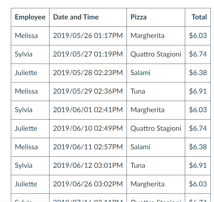
One way Pivot Tables can be helpful is when tracking receipts. As you can see, the table is very neat and organized. The data is laid out in such a way that is easy to read.
https://www.lumeer.io/pivot-table-complete-guide/
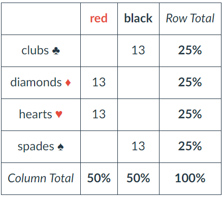
The deck of cards can be divided into symbols, numbers, and colors. From here, each column and row are totaled to make the information easier for the reader to understand.
Conclusion
There are many more examples out there such as insurance companies and restaurants. However, in all these examples Pivot Tables are always grouped items, records, and/or rows into categories and they count the number of items in each category.
I think pivot tables are one of the best ways to display data but get the least amount of attention. I say this because I both make and see them everywhere yet had no idea what they were actually called.
The table above is offering an example on food versus how much of one product was sold. This is an especially helpful layout when considering when to add or remove certain products from an itinerary. Being able to see by order or day what products are or aren’t selling is a great way to negate some costs.
Personally, I’m not in the business of needed to see what sells over what as I don’t own a restaurant or store of any kind but I imagine that this could be helpful even in situations that aren’t monetary. I have a large collection of makeup and I think this would be a great way to organize my collection to make sure I get use out of all products.
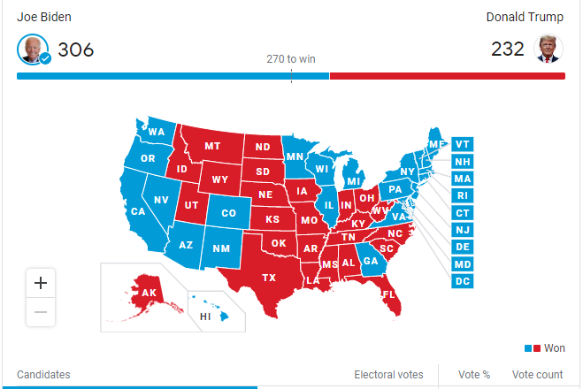
Comparing numbers is another form of collecting data in order to support the outcome of a debatable topic. For example with the 2020 presidential election, each state compared numbers in not only the votes given to each candidate but also how the electoral college could factor in the results of the election.
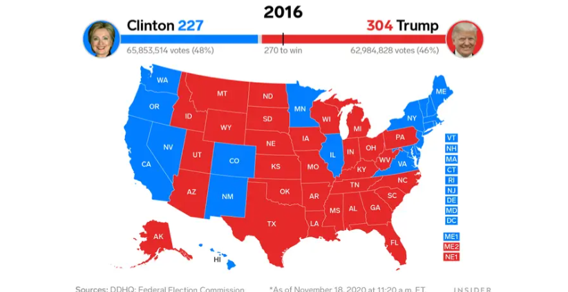
News stations even compared numbers in regards to the 2016 and 2020 election.
While comparing numbers is useful in data collection it does not supply you with all factors behind situations. In research you should compare numbers as well as other methods of research.
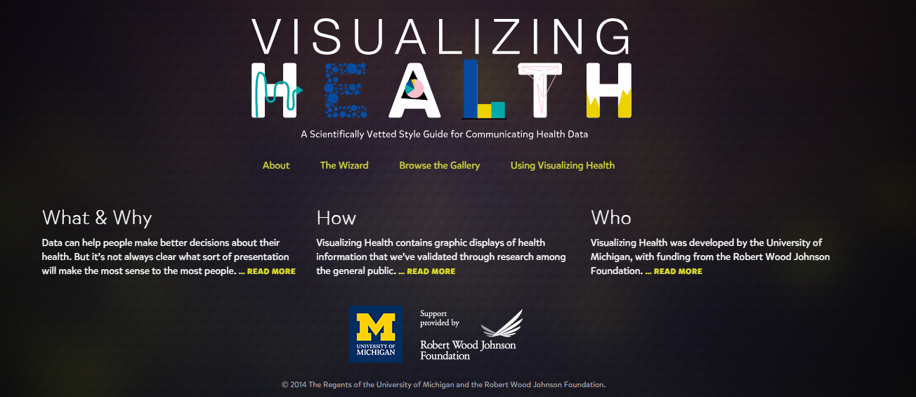
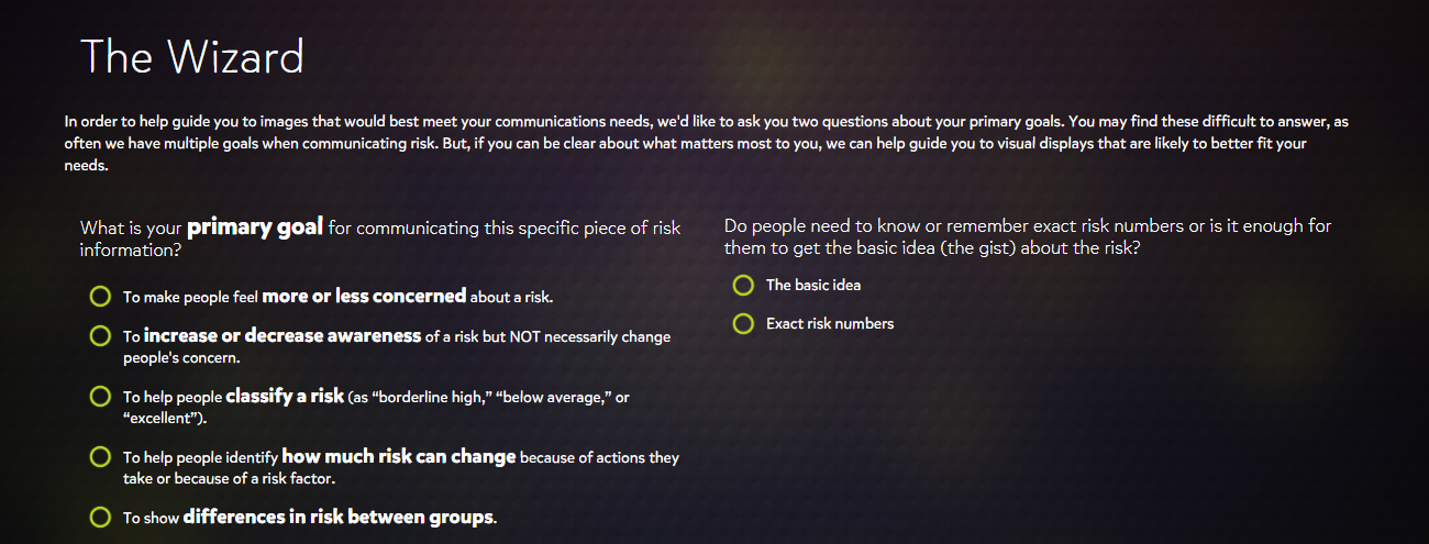
Visualizing Health is a very valuable website and is useful for making health infographics. This website categorizes visualizing health and makes it easier for consumers to navigate through, as well as provides users with visuals that can be easily understood.
This website also features a unique searching tool called “The Wizard” that helps you narrow down your search within the sight.
Personally, for me, with the help of the Wizard, I found out information about my own health that I can stay informed on. In detail this website provided me with simple visuals that made it easy to understand.
I will Start of by saying I am very biased toward this style as a STEM major. I this style of info-graphic is reminiscent of of wiring and circuitry.
The fact that you can expand more information by clicking on any certain ‘wire’ and have it highlighted is beautiful and brilliant engineering. in my opinion that is the goal and the utmost peak of an info-graphic or a data story: to be visually engaging and, to educate.
The amount of thought, ingenuity, and information is astounding. Almost no wasted space while not being overly complex and cluttered.The data story and flow is awesome. Even the dial is interactive.
There is also sources and contact info IN THE SLIDES rather than crammed at the end in a sources page. Which in fine for academic purposes, but realistically you should give credit in the same breath as the when you give the information, especially in this day and age.
Note the ‘Source Material’ tab Notice the ‘About’ link, and various other information.Engaging quiz, definition tabs for people who may not know certain words, academic press link. More and more useful information.
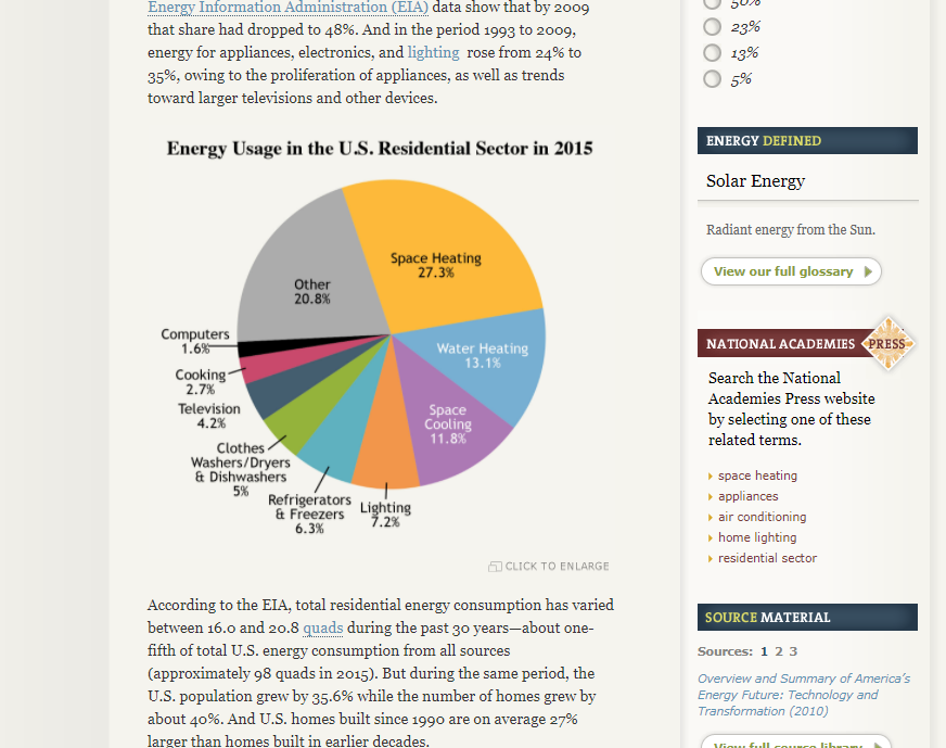
A critique I do have is that, even though it’s only one, they used a pie-chart. There are more beneficial ways of relaying this information, but it’s not as bad as most cases and only used as a comparison. You can completely ignore this pie-chart and you would have not missed out on the information so it does it’s purpose of looking pretty, at least.
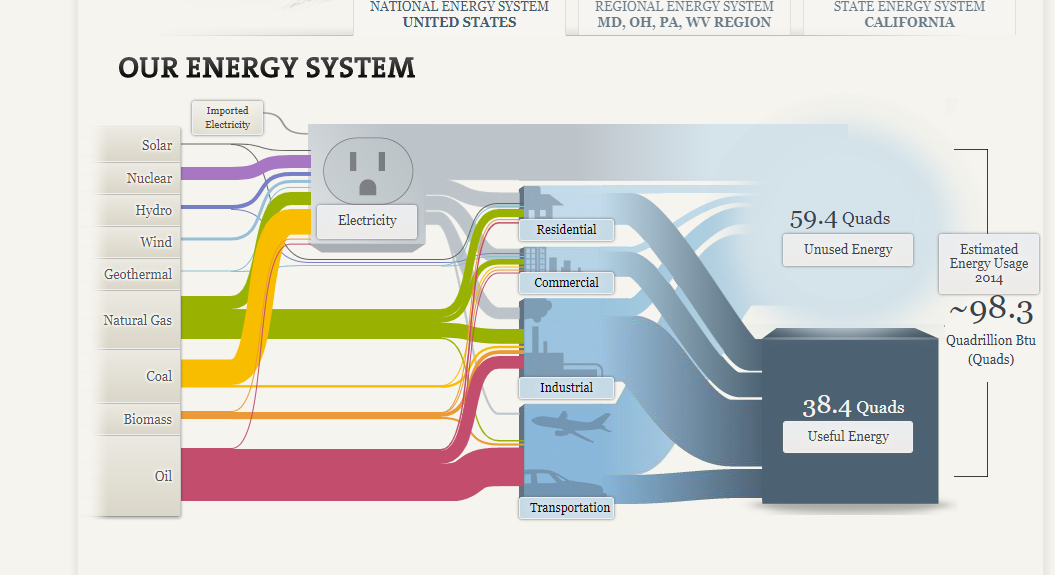
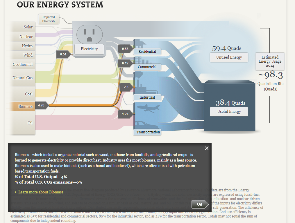
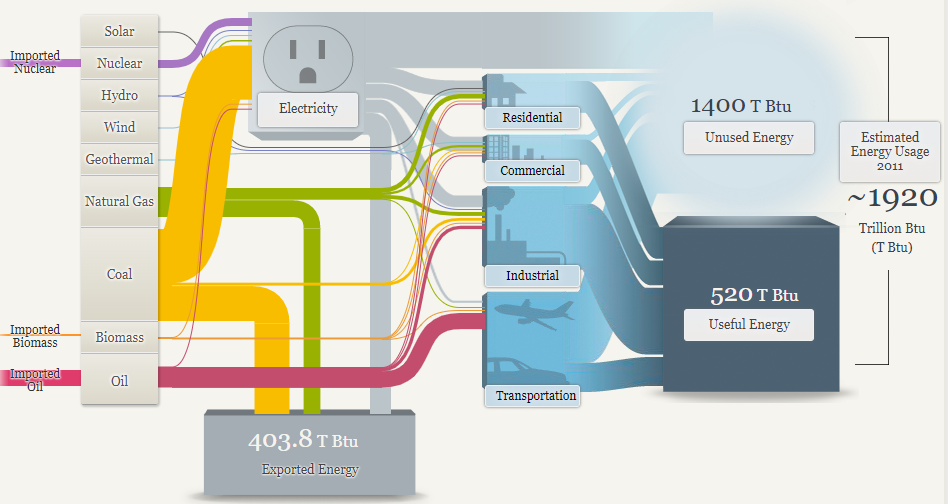
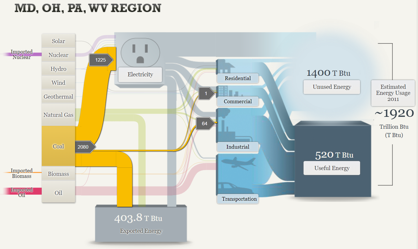
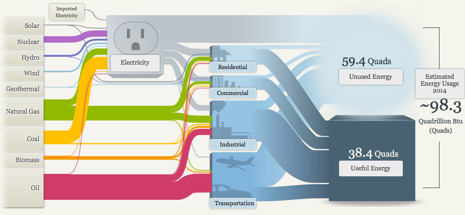
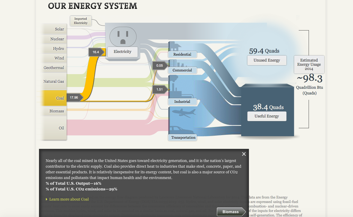
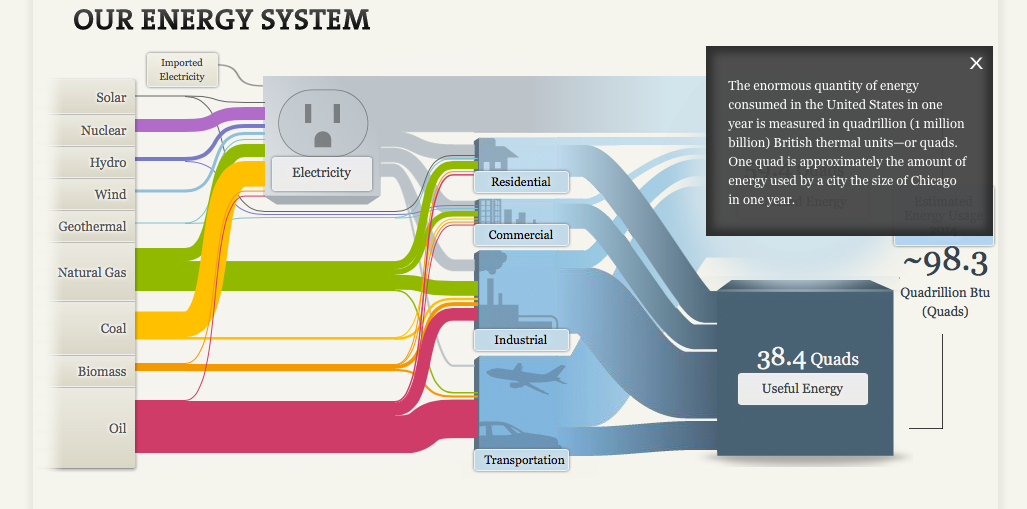
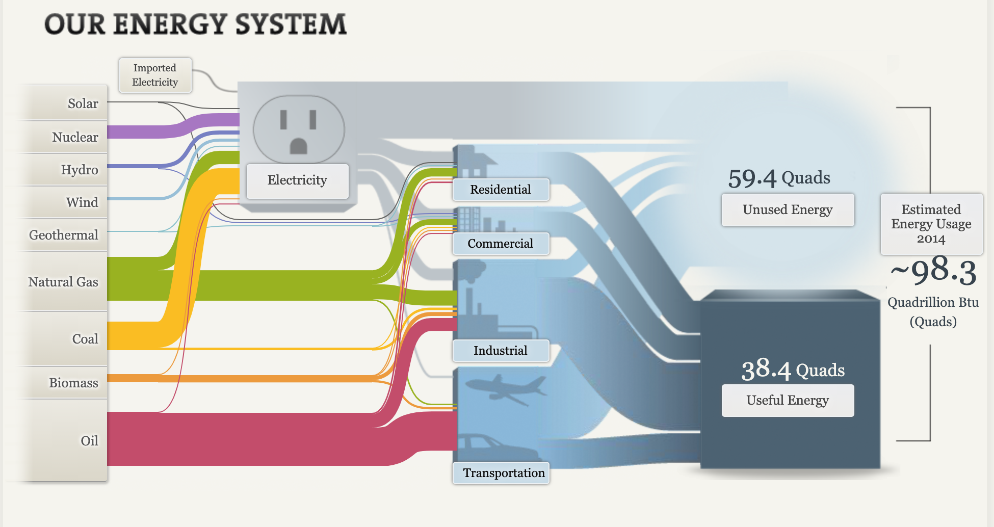
The above Visual was a really great way to show the different energy sources in the United States and their uses. It was interesting to learn the energy sources in a further depth, the diagram was interactive and very useful. The most interesting fact I found was that, “Coal dominates the region’s energy flow, representing more than half its total energy supply, the greatest contributor to electric power production.” I was unaware and thought oil was a greater contributor in the United States.
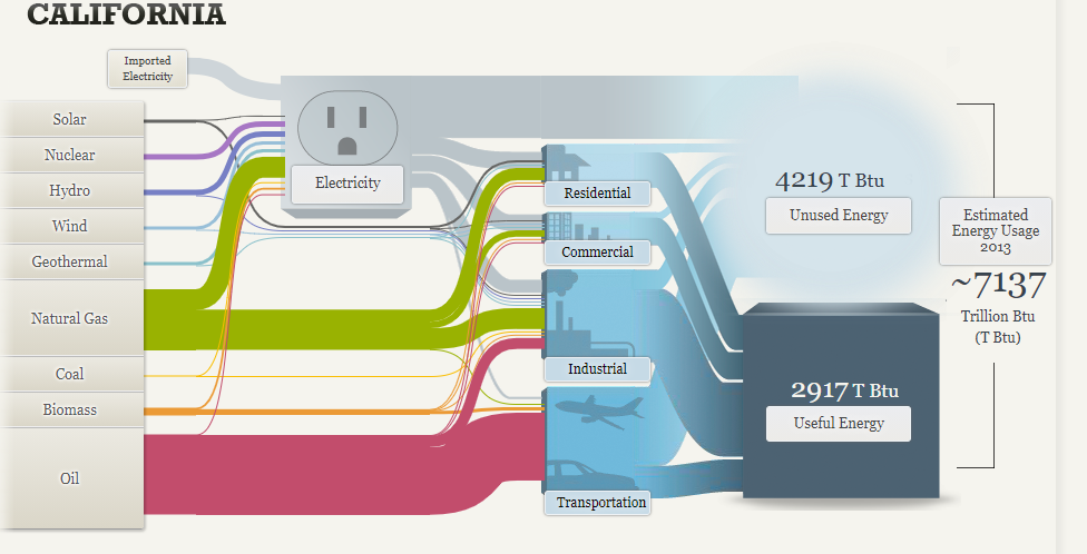
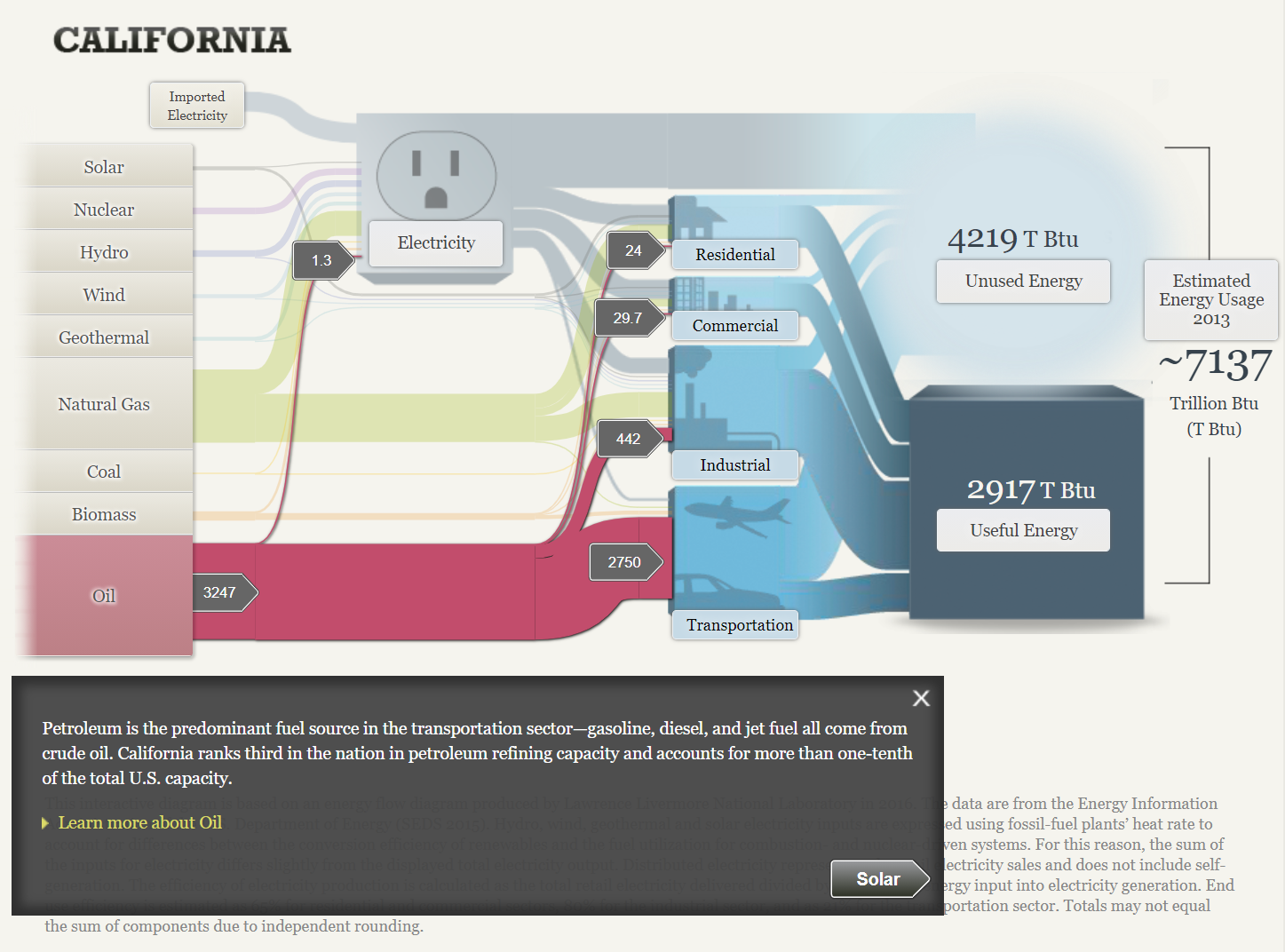
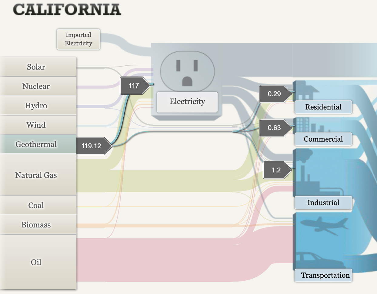
The united states estimated Energy usage was about 1920 trillion Btu which is a extremely large amount but the fact that California is 7137 trillion Btu alone is astronomical. Oil is a much larger source in California then coal, which is interesting.
Overall, the site was very interesting and informative. It surprised me with many facts I was unaware of.
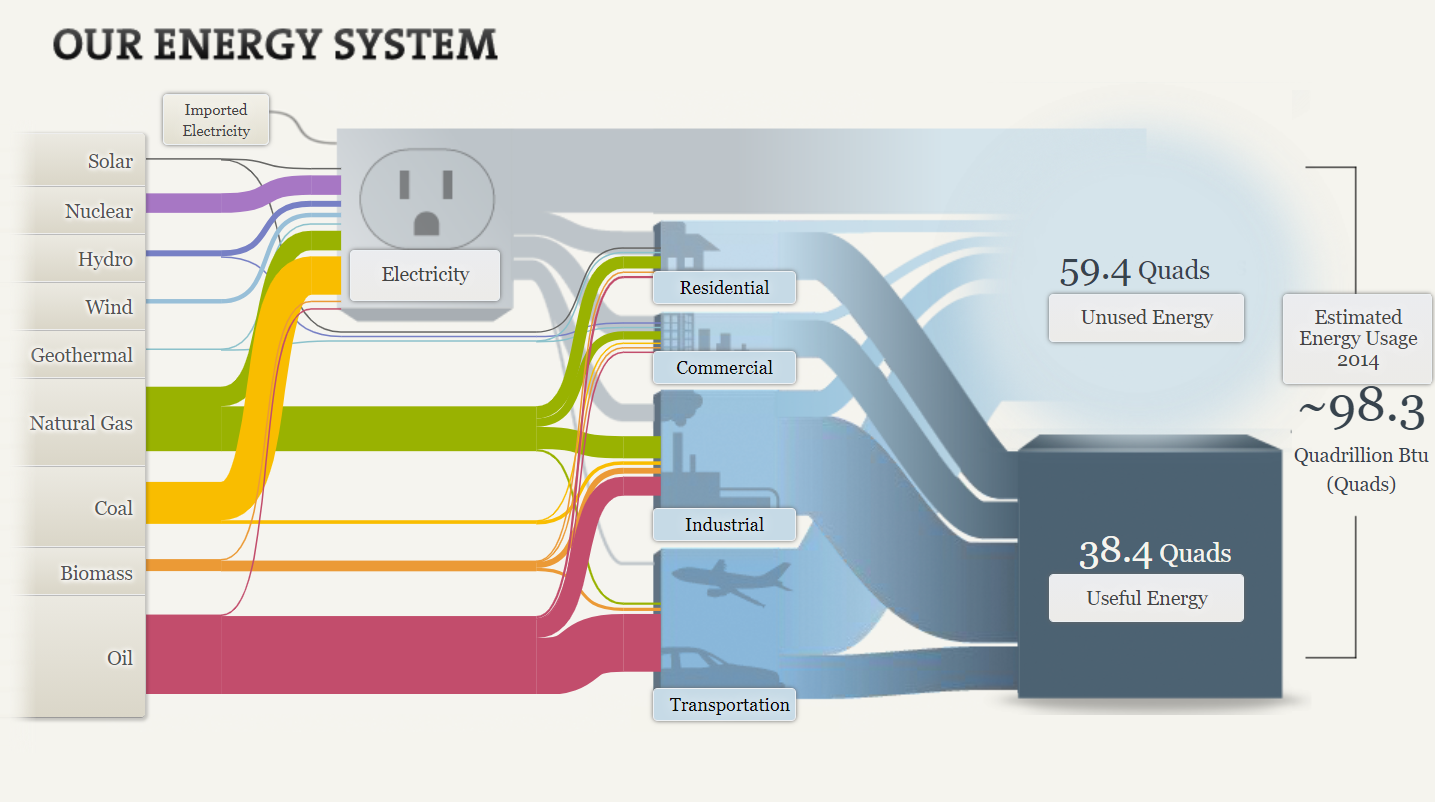
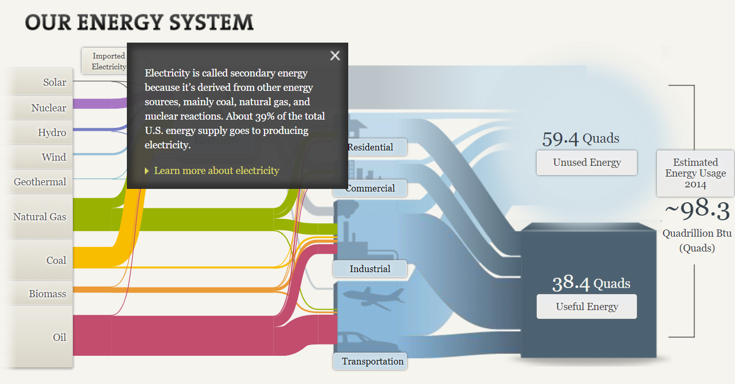
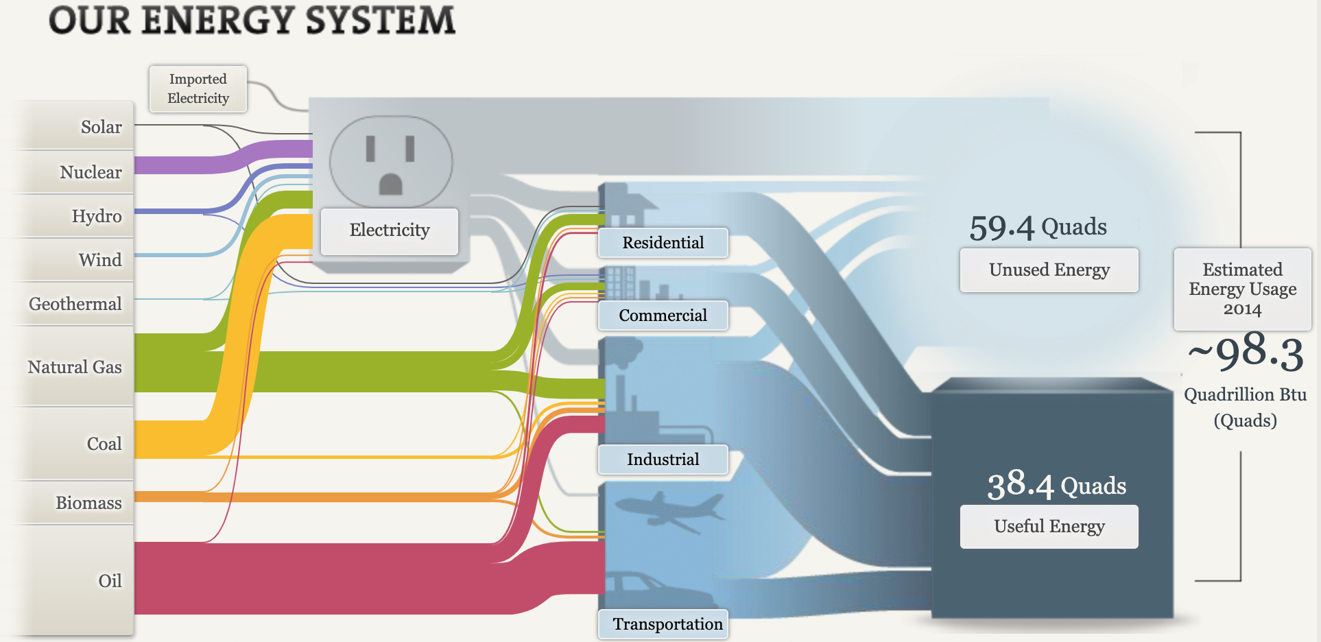
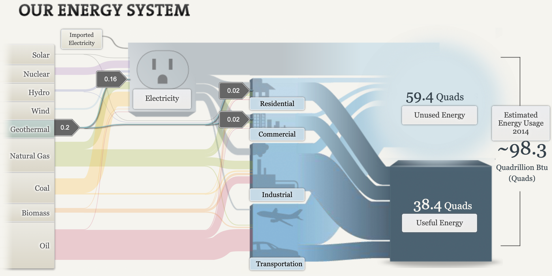
The Sankey website provides visuals to educate viewers on our energy systems. This website begins by displaying the flow of energy in the U.S. through interactive visuals. I clicked on the tab “Our energy system,” to see the overview and layout of information provided. Below, is an interactive chart that is displayed on the Sankey website. It shows how much of each type of energy is used, providing details upon clicking each link. Oil is the most common energy source. This visual can be easier then reading a piece of text, because it shows exactly where things go. The colors may help trigger the memory and draw the viewer in.
I clicked on “electricity.” As you can see below, a text box pops up, providing information that they want you to know regarding electricity. From this text box we can gather than electricity is secondary energy that is derived from other energy sources. This website gives you the ability to click on any word displayed below, following a textbox, that will provide you with more information about it. I really liked this tool and thought it was a fun and interactive way to retain information.
Below are two other tabs on the Sankey site that provide information about our energy system based on location. As you can see, in MD, OH, PA and WV region, coal is the most popular energy source. In California, oil is the most popular energy source.
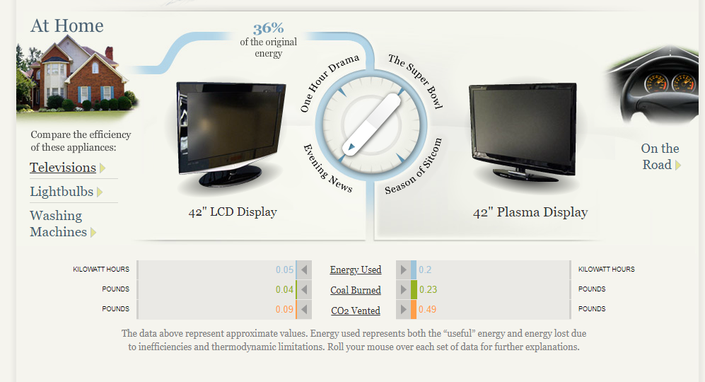
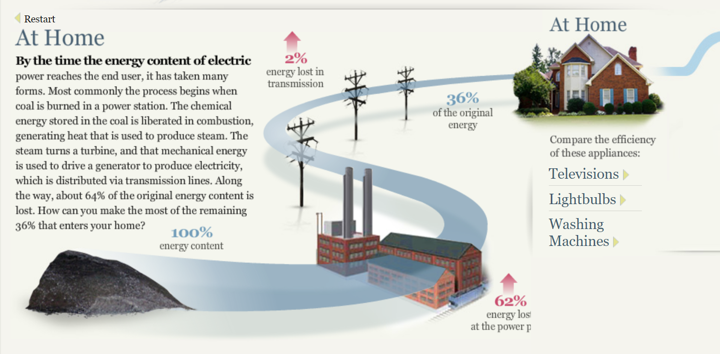
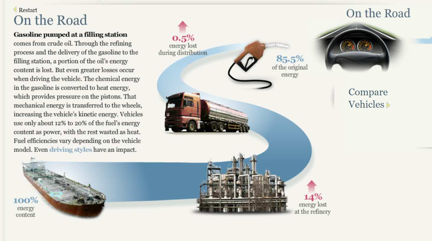
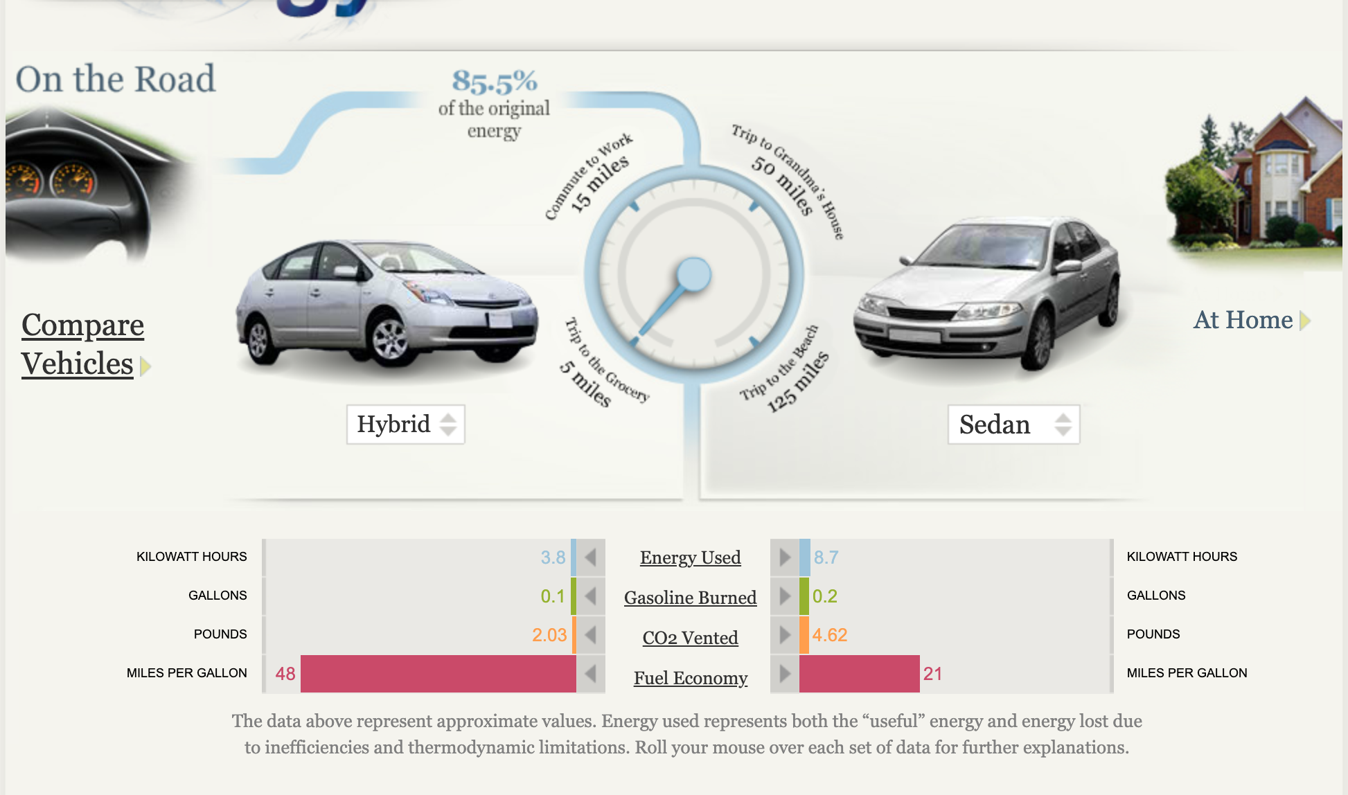
After further exploration of this site, I found visuals displaying information regarding energy at home and energy on the road. Pictures and visuals definitely drew me in, making it easier to process what is being explained.
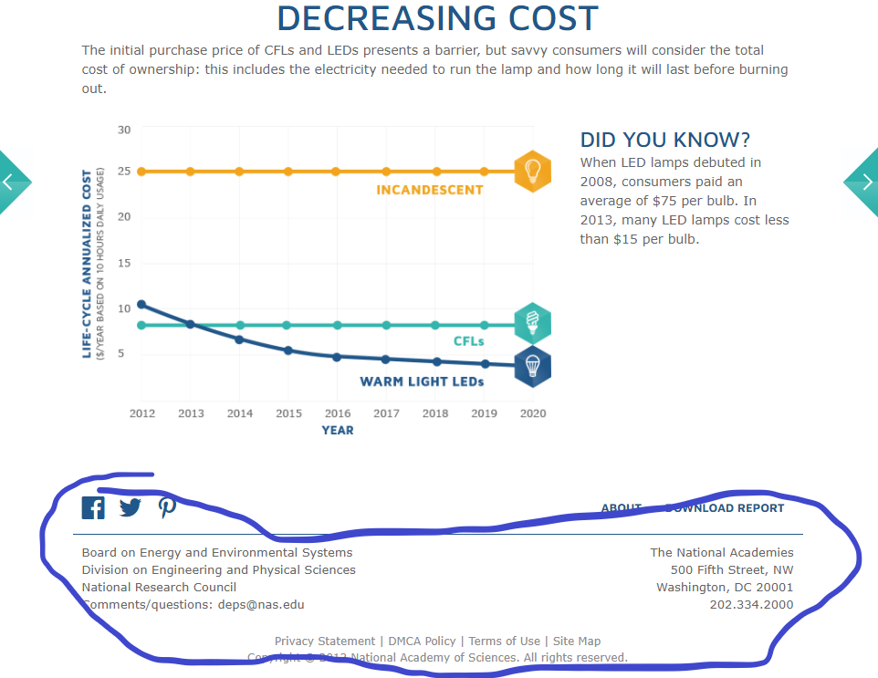
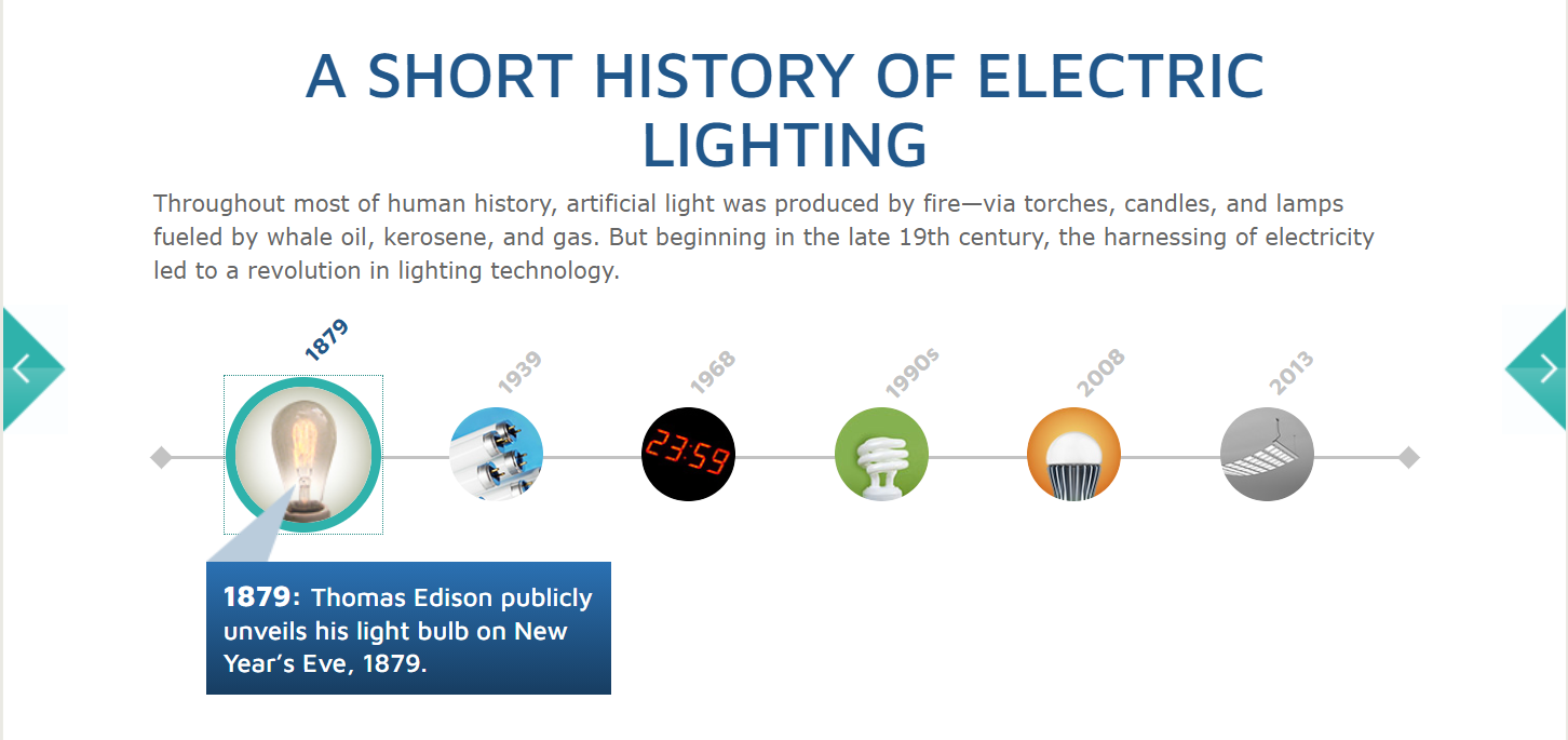
Lastly, I learned about the history of electric lighting. This is an interactive timeline, providing a picture, date, and facts. I find interactive charts and timelines to be very fun. They help you remember what you are reading.
Overall, I thought Sankey was a fun, interactive site, teaching about our energy system in a way that was very visual. This site provided information about the uses, costs, sources, and efficiency of our energy system. I really like the way this data was displayed.
I really enjoyed this website. The interactivity alone was awesome, paired with the interesting data. The energy chart was really to navigate and understand.
Each of the colors represented the forms of energy really well and puts a lot of our energy production into perspective. As you can see, Oil (In Red) is represented as the largest because it’s one of our main forms of producing energy for transportation.
Clicking on each stream will give you facts about the energy you’re interested I researching and it will then conduct you to the next part in which this certain material is used in the energy making process. In this specific instance, coal is mainly used to produce electricity.
This site was very informative for me, I had actually never taken the time out to look at how our energy is distributed, nor what actual sources we use.
The photo above shows an overview of our energy system, I think this was a great visual, I loved how I was able to interface with it.
One thing that really caught my attention was geothermal, seeing this caused me to do more research on the subject. Although the US uses a small amount of this form, the State of California uses much more of Geothermal as a whole .
Overall, I loved the visualizations, I think that one improvement that I would’ve made sure that even the simplest mind could understand what the numbers meant. Other than that I think it was very informative, and left an impression on me to want to learn more about energy in the United States.
My initial reaction to this visualization is that it looked kind of boring but then I actually started to play around with it and it was super simple to navigate. It is formulated just like a website and they made each section of the homepage really easy to read and it wasn’t overwhelming.
When you first click start you get redirected to another animation which is the one below
It was an interactive animation and each part of the animation puts a different data set up for the respective category. Aside from the data. set, they give a description on the data which I thought was pretty cool!
The next part of the presentation was where they compared homes and vehicles. I thought it was really nice to see the side by side comparisons of the cars.
The back to back bar graph in the bottom is a really easy way to share the facts about each car and it is really clean. There isn’t too much information on the side but it is also the perfect amount of information to get the point across clearly and affectively.
Lastly, I thought it was a great idea to put the side “advertisement” shown below. It’s an easy and smart way to get the attention of the audience to explore the rest of the page. Overall, I thought it was a super easy page to navigate and it definitely catches the audiences attention from the beginning to the end.