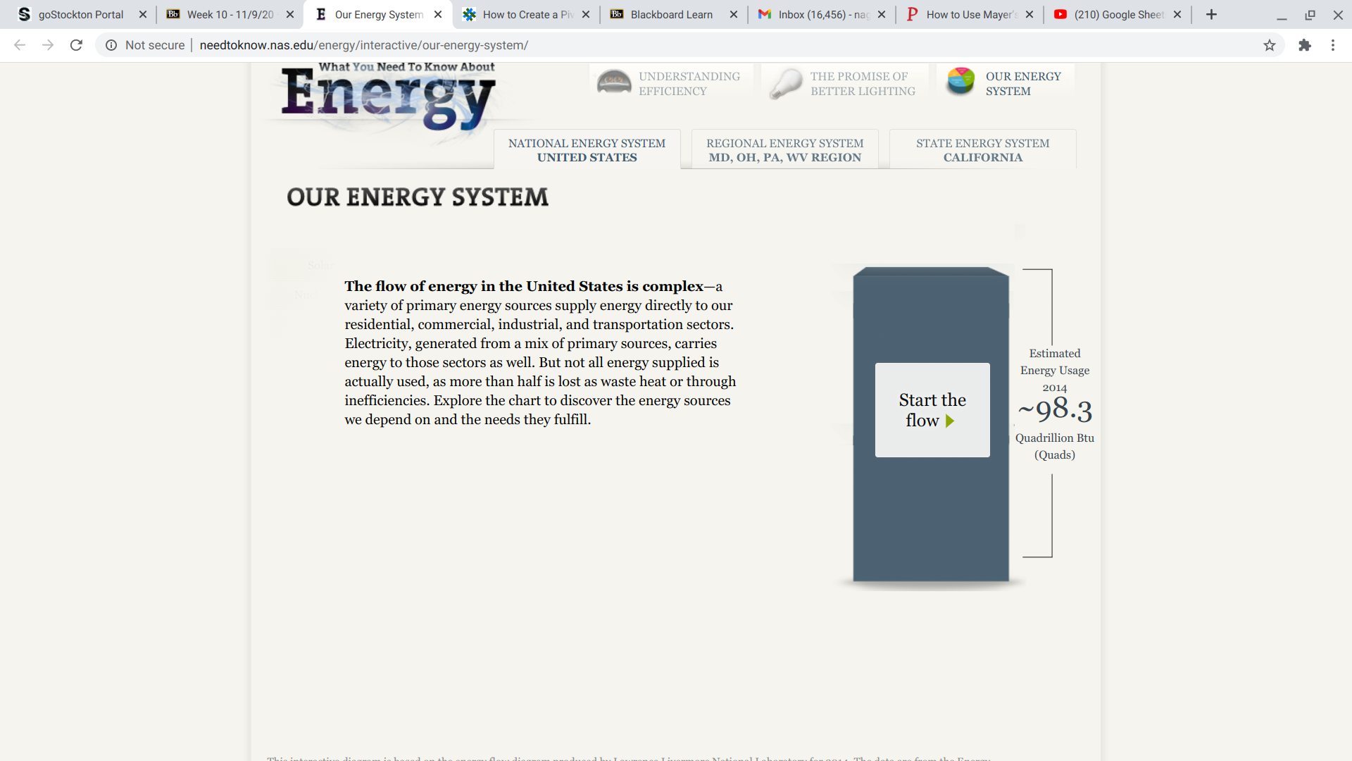
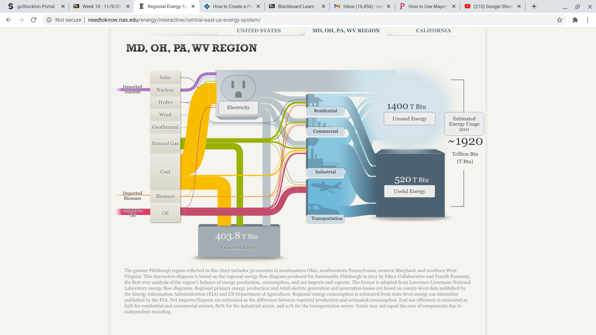
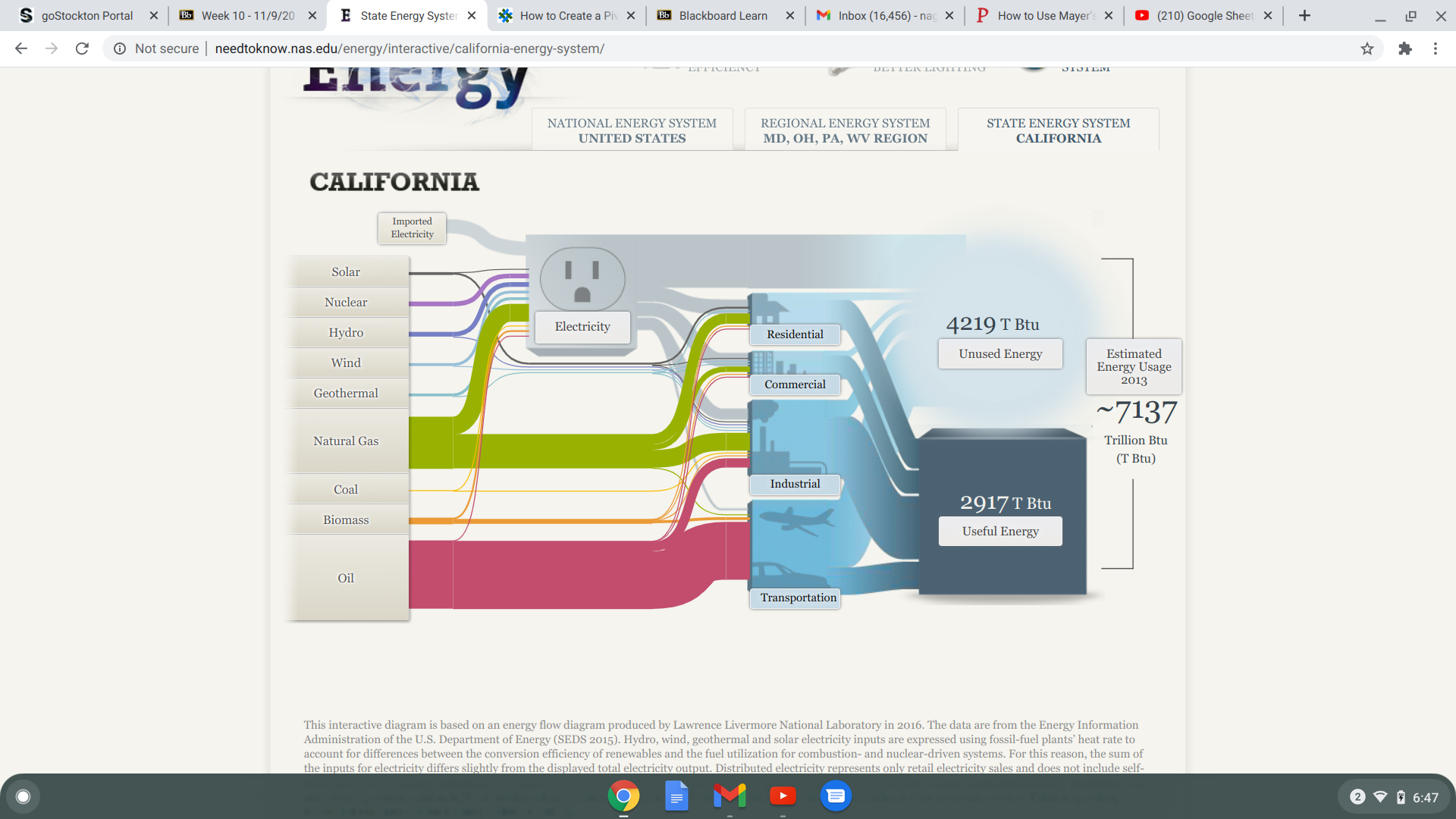
Data visualization helps people get a better grasp of what the data truly entails. Infographics can supply data of demographics, age, sex ect. In the 2020 presidential election this data visualization was most popular in seeing who won the electoral votes based on each state.
Data sets utilize specifying information. In this example, each state is broken down by political party.
Their are many different data processors that can help you organize your data. A couple examples would be Microsoft excel and Tableau.
Pivot tables are one of the most easiest and the most powerful tool on excel. If you have a lot of data and want a sufficient way of organizing it pivot tables are the way to go. Pivot tables gives you the option to break down data by categories or even sub categories.
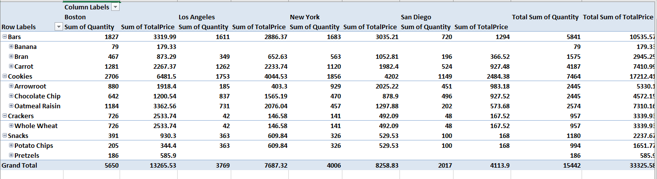
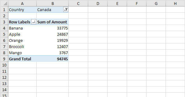
This is an example of a pivot table that categories its data with different demographics. In this chart specifically, they compare prices and profit of grocery items in each state.
Pivot tables are one of the many ways in organizing data. And, I believe that it is a vital organizational method used in specific data collection.
a pivot table is a summary of a larger set of data. Its packaged in a chart & filtered, which makes it easier to pinpoint the data that’s relevant to what you are looking for.Pivot tables are used to summarize, sort, reorganize, group, count, total or average data stored in a database. Which is very helpful in a lot of jobs where you have to deal with large sets of data.The biggest setback with pivot tables is that they are difficult to make although newer versions of Excel make it pretty easy, by recommending that which pivot tables would fit into your needs.
Pivot Tables are essentially reports that companies use for their own personal checks and balances. What sets them apart from statistical charts is the fact that they are very interactive. Instead of having a multitude of confusing formulas, you can have a very simple table where you can choose what variables you want to compare.
In my research, I found a lot of interesting ways to use Pivot Tables. This website was particularly helpful in simplifying what the tables are used for and how to construct one.
A pivot table is a great way to show the summary of your data. It is really useful if you have information or data that can be put and interpreted by groups or sums of groups.
Pivot tables allow large information that is in excel to be simplified. A lot of people shy away from excel ,like myself, because the information can look and seem very. overwhelming. Putting the information into a pivot table allows simplicity.
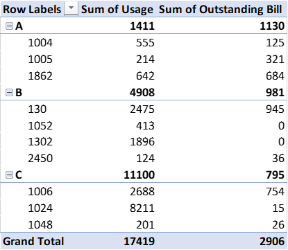
The data to the left is shortened and simplified into the pivot table that is shown to the right and it set up into groups by states.
Pivot tables are an easy way to track trends. For example, the image above shows a trend by state of clothing items sold. You can do a pivot table for just about anything but I think it makes the most sense to do it for large data only.
Before realising what pivot table were, I would call them the ‘ranking’ tables, or ‘focusing lists’ or something similar because not only do pivot table allow you to see a list of of data across, easily, they also allow you to order the data you want to look at by whatever column (or even row sometimes) that you want, in other words they let you Pivot the information.
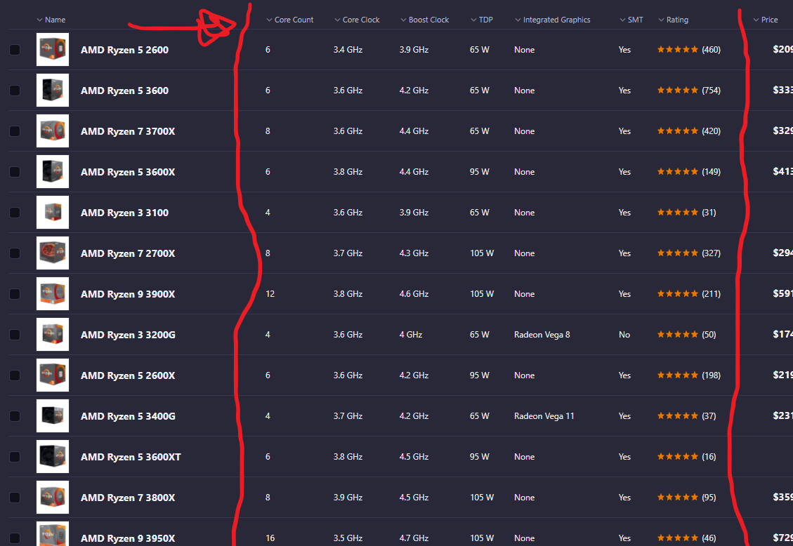
The example above is a website to order Computer parts which I believe incorporate a pivot table in order to help customers home-in on a product that they want to use. If you search for a CPU, for a example, the pivot tables are different then when you search for keyboards, or Storage memory. If you want to pivot the table by price you can click price, if you want to look at the ‘core count’ you may pivot the table that way.
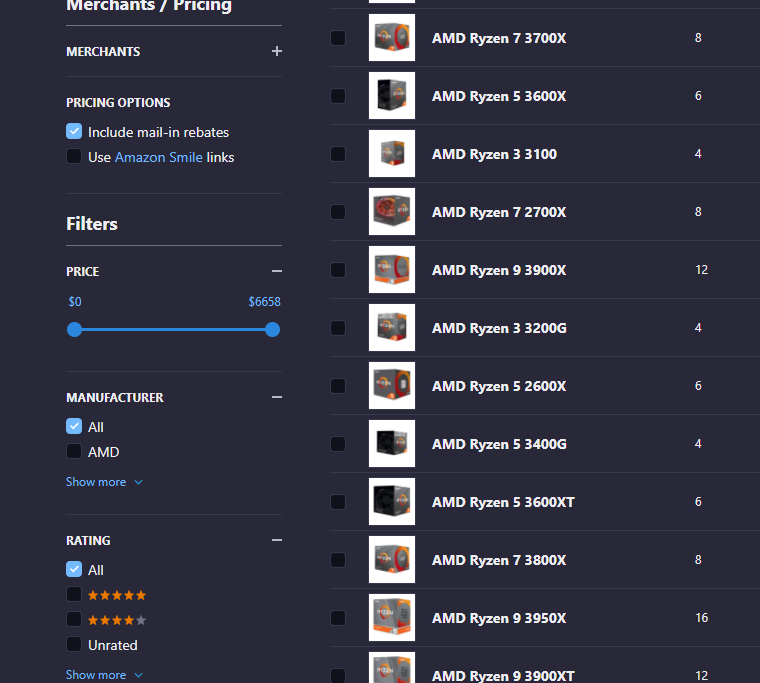
There are more tables and filters on the side to help you focus the data even further, combining the pivot table with other tools such as sliders.
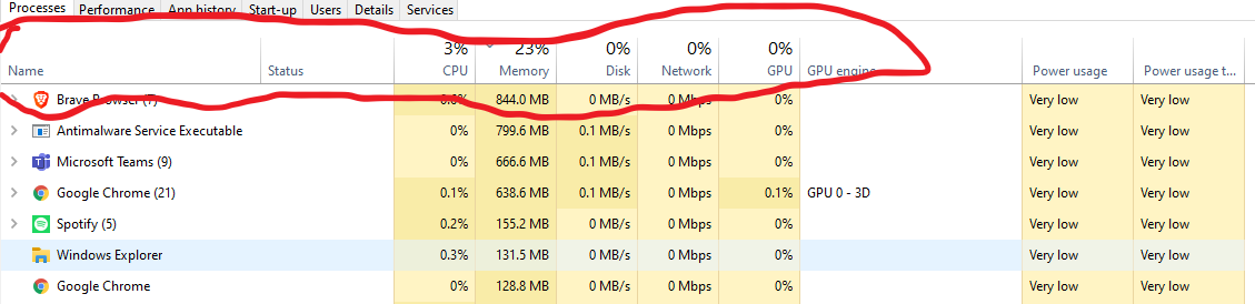
One more Pivot table I was able to find is one I look at every other day by pressing CTRL + SHIFT + ESC on my keyboard in Windows 10.
This pivot table allows you to view your computer application activity and you program activity. You can look at the headers and focus or pivot the data. If you want to see how much memory a program is using click that header, if you want to see how much ‘network’ a program is using you can look at that. Or order by power usage.
This is very helpful considering if your computer is running slowly, you can figure out what apps are misbehaving and stop them.
A pivot table is a tool in Excel that allows users to interact with their large, raw dataset to gain a better understanding of specific topics within the dataset.
When is a pivot table useful?
Pivot tables are extremely useful when dealing with any dataset that contains a vast amount of variables. Additionally, they are useful in cases where you are looking to identify specific variables within the dataset and how they interact with other variables within the same dataset.
Examples of pivot tables:
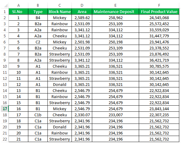
Pictured below is an example of a raw dataset which can be found here. While this is not the entire dataset you can begin to see that if this contained hundreds of rows this could be confusing to look at and would need to be formatted in a better way.
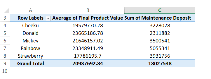
That is where the pivot table comes in! From the raw data we can then select specific variables to look at and compare to other variables in the same dataset. Below you see one example of a pivot table that was created using the raw dataset above. You see in this table only the block names, final average of product & sum of maintenance deposit are shown.
Pivot tables make it extremely easy to simplify your large and overwhelming data sets into clean and clear tables. Pivot tables can be used in almost any instance where there is statistical values being computed such as sums or averages.
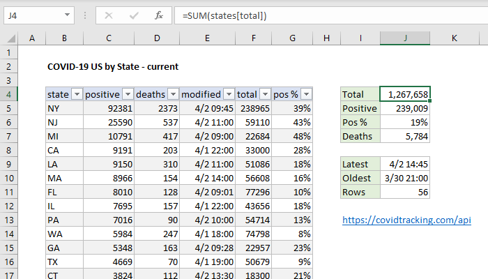
If you have an abundance of information in diffrent catagories that you need to show. Then the pivot table is the way to go. A PivotTable is a powerful tool to calculate, summarize, and analyze data that lets you see comparisons, patterns, and trends in your data. One perfect case to use a pivot table is the data from the Corona Virus. With Covid-19 affecting so many people around the world, the statstics are huge and can be confusing. Luckily, a pivot table can easily express this data as seen in the example below!
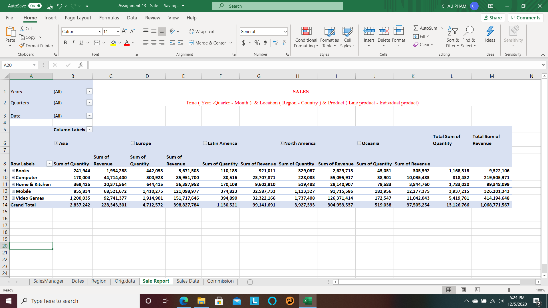
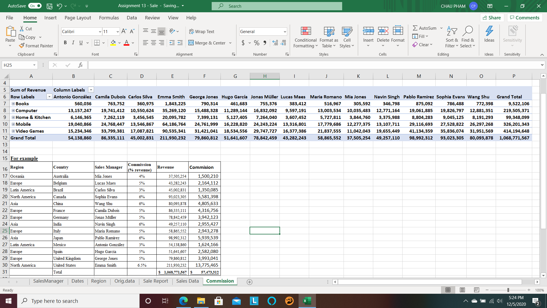
“Interactivity is necessary when we have a lot of data to cut through”. Pivot table is a powerful tool that Microsoft Excel introduce with us to conduct data base on the expectation of user. Pivot table can support us make reports with relevant and faithful presentation in the workplace. It also helps us in other field with useful numbers.