Categories
Data Visualization and Art Sankey Diagrams

Energy Usage in the US

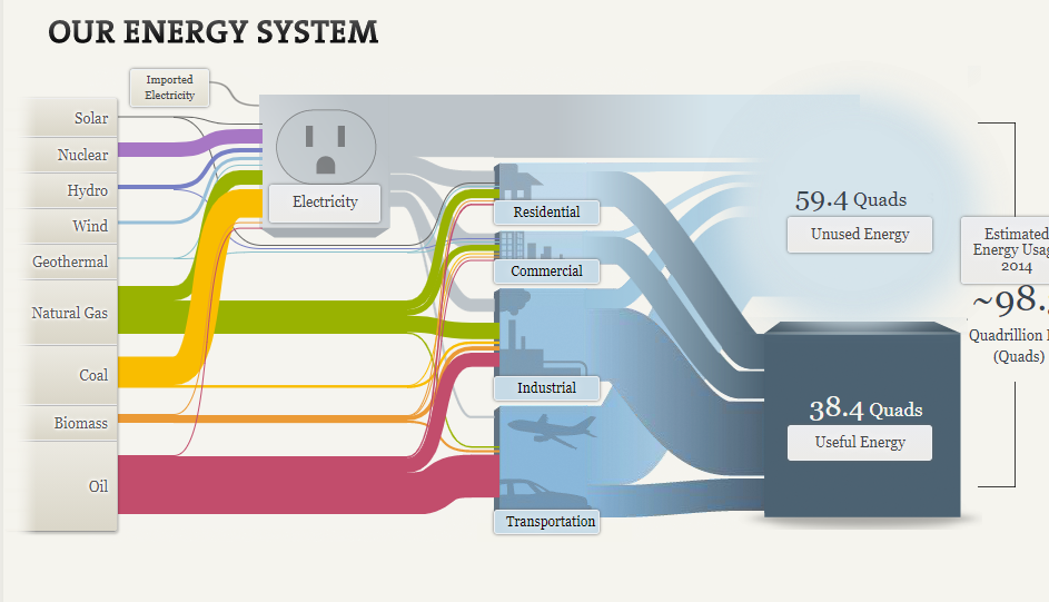
Energy consumption is a major issue in the United States that spans across multiple topics, from the oil industry’s environmental impact to the debate over alternative sources such as nuclear power and hydro dams. Yet, most Americans are largely unaware of how much energy gets consumed daily, focusing more on where the energy comes from.

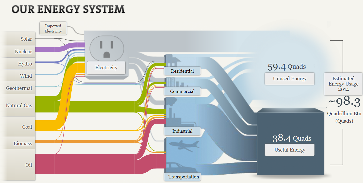
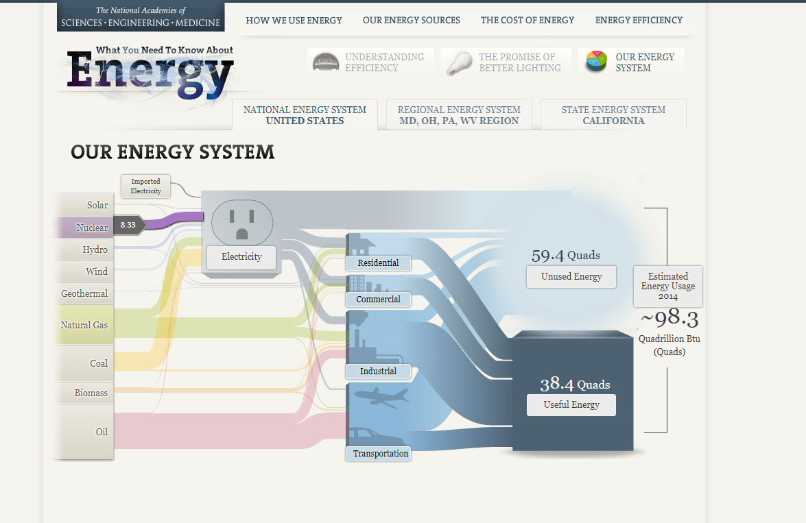
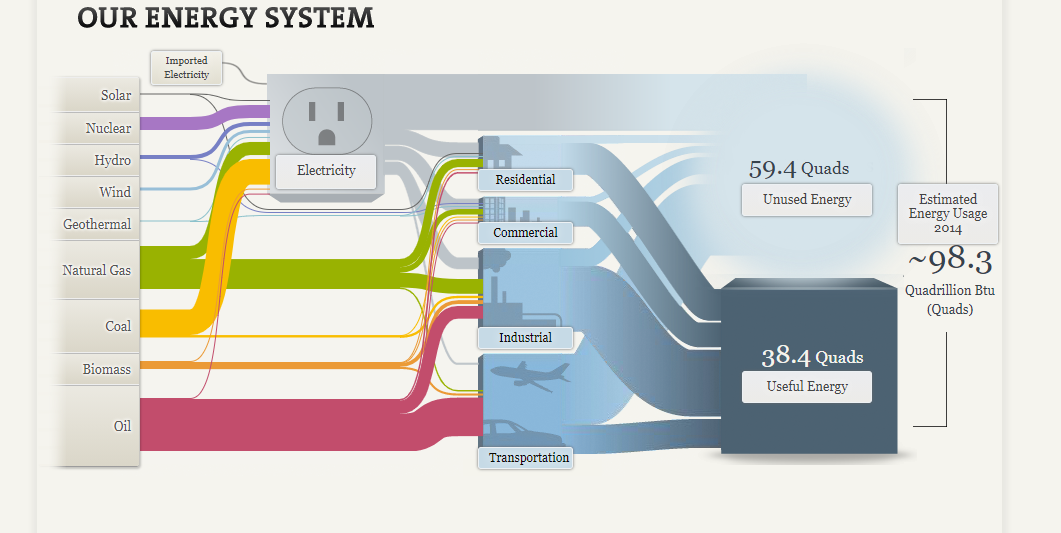
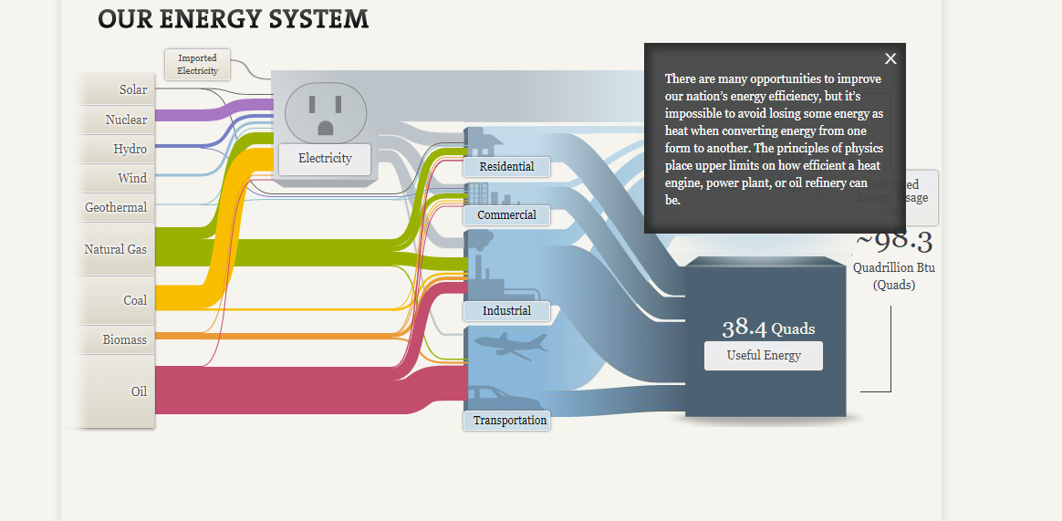
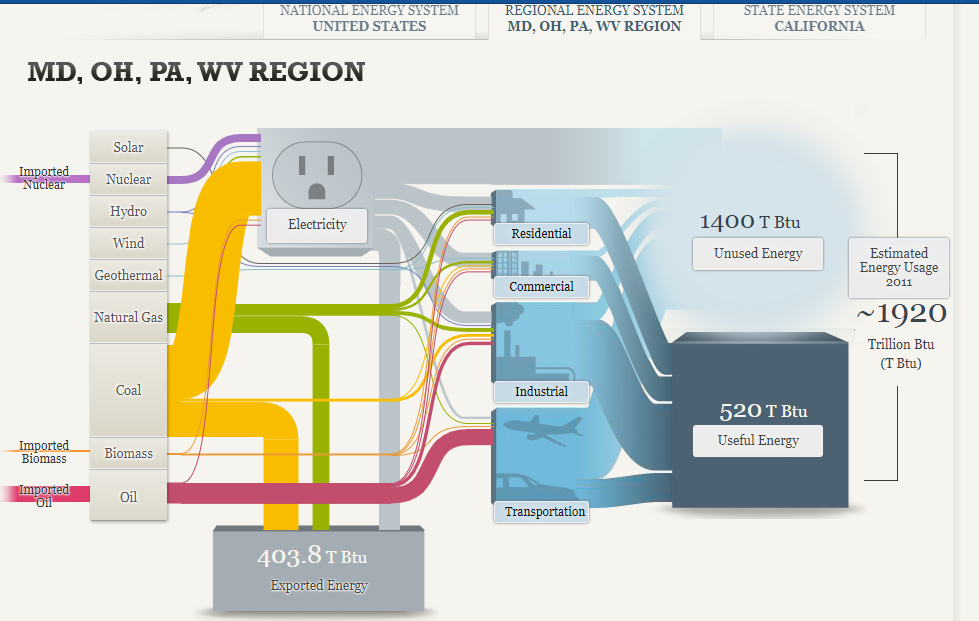
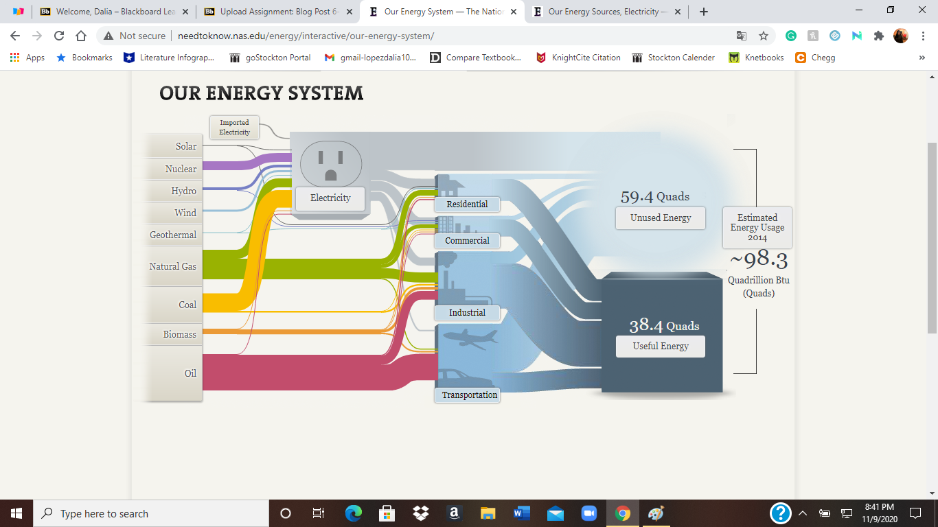
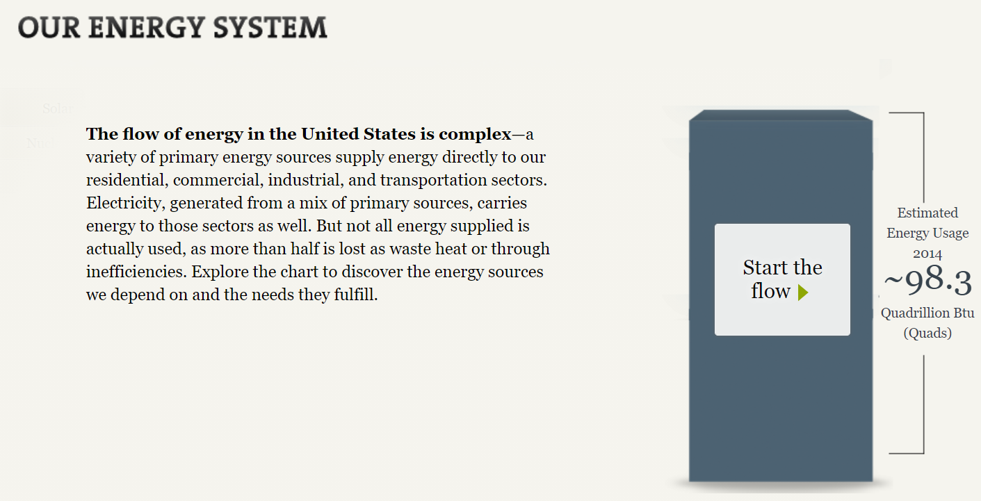
The National Academies of Science, Engineering, and Medicine compiled a Sankey chart depicting America’s energy usage in 2014. Much to my surprise, about 60 percent, or 59.4 quads, of generated energy went unused. Clicking on each point in the Sankey chart brings up a tooltip containing details about each source and how much energy gets used.

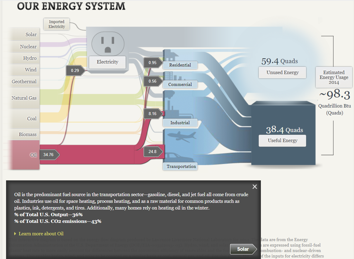
Unsurprisingly, petroleum products were the largest energy source in 2014, primarily used in industry and transportation. The second and third-largest energy sources were natural gas and coal, both of which were converted into electricity to power residential homes, commercial and industrial businesses.

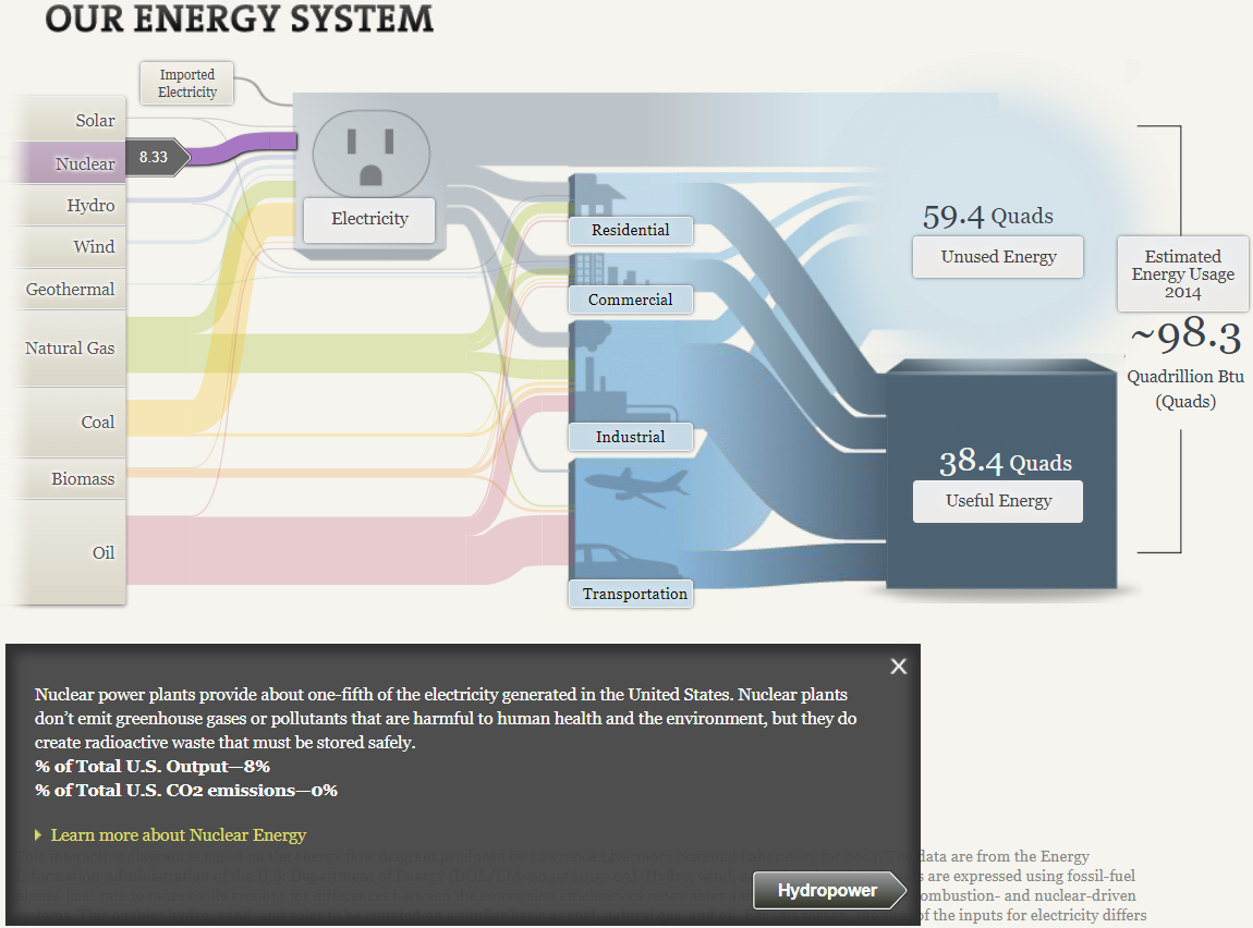
Nuclear energy is possibly the most controversial alternative energy source due to its implications in disaster events (Chernobyl in 1986, and Fukushima Daiichi in 2011) and the nuclear arms race. As the tooltip states, nuclear energy provided one-fifth of the nation’s electricity. While they don’t create any carbon emissions, radioactive waste from the power plants is still a health hazard. Additionally, opponents of nuclear power cite the potential for these power plants to be weaponized or targeted by terrorists if the health risks involved in handling radioactive materials aren’t enough to raise concern.

Categories
Sankey Diagrams

Sankey response

I like that I am able to interact with each element and get more information on that element. This is good for an audience that is being newly introduced to the topic. The chart has other versions focused on specific areas, which is most useful for those audience members. That was a good way to target specific people.

I’ve never paid attention to “lumens per watt” but I most likely will after reading this. Good use of icons and a quick comparison tool. This explains the difference between energy efficiency and brightness output.

A simple timeline with icons showing how electric lighting technologies have evolved over the years since its inception in 1879. I like this data narrative. It is clean, fast, and enlightening. I thought those bulbs created in the 1990s were invented in the early 2000s, for example.

This is a nice attention-grabbing graphic. The red adds to the loss effect of energy. The bold text could have been more descriptive or to the point.

This was a neat interactive tool that was included to see how energy efficiencies compared. I think that the author of this data story did a good job of allowing the audience to interact and become more engaged. Diving deep into car comparisons helps to pique the audience’s interest because a lot of the audience is probably drivers.

Categories
Sankey Diagrams

Our Energy System Visualized Through A Sankey

The National Academy of Sciences uses Sankey visualizations to explore our nation’s energy system. Although this type of visualization may be unfamiliar to many of us, Sankeys allow us to visualize flow when there are multiple inputs and outputs, which is why it is a perfect visualization to use when mapping out our nation’s complex energy system.

Based on the thickness of the various colored flow lines depicted in the picture above, you can easily see that oil, natural gas and coal are the nation’s leading sources of energy. The inputs (energy sources) then flow into various outputs (energy uses such as residential, commercial, industrial, transportation and electricity). We can see that the majority of oil is used for transportation purposes while coal is used for electricity. This visualization is also interactive. By clicking on some of the textboxes you can find more detailed explanations about that topic.

Clicking on “Unused Energy” brings up a text box with an explanation of why some of the energy we produce is lost.

Separate visualizations are also provided for a regional energy system (MD, OH, PA and WV) as well as visualization for California state’s energy system.

Sankey showing the energy system for MD, OH, PA, WV region. It is interesting to note that coal is the largest energy source for this region. Only a small amount of oil is produced in this region which is why the oil is imported.
Sankey showing the energy system for California. Coal and natural gas are the largest energy sources for the state of California while coal use is almost non-existent.

In conclusion, depicting the various energy systems in the United States through use of a Sankey visualization seems to be a great choice. Color coding the various inputs or energy sources allows the reader to quickly decipher which color belongs to which energy source. Since there is also a significant difference in oil, coal and natural gas usage compared to renewables such as solar, hydro, wind and geothermal, it was easy to recognize which sources contributed most towards our energy system and which contributed the least. Furthermore, the reader could easily see how each sector (residential, commercial, industrial, transportation) contributed to either useful or unused energy since these were depicted in starkly different colors.

Categories
data visualizations Sankey Diagrams

SANKEY

The National Academies of Sciences, Engineering, and Medicine dedicated an interactive website to Energy and “everything you need to know”. While browsing through the well-organized web page, I found a multitude of statistics, using different visualizations from big numbers to timelines and everything in between.

Here are a few examples of different visuals throughout the website.

I was pleasantly surprised by the amount of information found throughout each section and how well they put visuals to use. Not only did the visuals keep the website intriguing but made the information clear and easy to obtain. for example:

Interactive visualization link

This simple visualization draws a clear connection between each variable and shows a comparison to the amount of light each produces per watt of electricity. There is little room left for misunderstanding because the visual is clearly labeled and the description helps interpret the picture. I think using pictures of each type of light bulb was smart because if this was a graph and was labeled incandescent, CFL, and LED it could lead to confusion on which lightbulb is which.

Though I was for the most part impressed with the visuals and the way the information was presented, I did find a few things I would have changed.

for example: BIG NUMBERS

I personally think the wow factor in this statistic was hindered by the lack of emphasis on the numbers. I think they should have chosen a much bigger font to place the focus on US energy consumption.

Line graph:

I think this graph is confusing because incandescent’s line stays consistent it gives off the impression of a benchmark line. I think at a glance without acknowledging the giving information it looks like CFLs and LEDs are falling short of a benchmark.

Listed Statistics

Personally, this section is just a lot of words to get lost in, when reading about the reduction of energy use in refrigeration over the years. I think that using a visualization here would keep this page more interesting and keep readers from disengaging.

Overall, I found this website to be a great resource and very knowledgeable. The visualizations were, for the most part, extremely well done and appealing.

Categories
data visualizations Sankey Diagrams

Our Energy System

The Sankey visualization about our energy systems in America breaks down the percentages of different energy sources in varying states. Initially, it was confusing to read, specifically the image below, however the other tabs were quite interesting.

http://needtoknow.nas.edu/energy/interactive/central-east-us-energy-system/

This visual breaks up the different types of energy and shows where each one is used (residential, commercial, industrial, and transportation). The numbers (to the left) are a bit confusing to me because I’m not quite sure what they represent. With that said, I do enjoy how interactive this page is. Just by hovering over the different types of energies, the visual becomes a bit clearer. It was surprising to me that in 2011, 1920 Trillion Btu was the estimated energy usage. I wonder what these numbers would be like now, especially during quarantine.

How We Use Energy:

http://needtoknow.nas.edu/energy/energy-use/

This section of the website is very helpful as it gives some background of the topic. I specifically like the quizzes on the side of the page because they keep the reader engaged and interested. The statistics are also very interesting to read. I like how the reader can look more into a specific topic that interests them. For example, 28% of all energy in the United States is used to transportation.

At Home:

http://needtoknow.nas.edu/energy/interactive/understanding-efficiency/

One great feature of this website is that they break up energy usage into homes (including televisions, lightbulbs, and washing machines) and road life. The “At Home” section is very interesting and even allows the reader to turn that dial in the middle of the screen to view the specific number of energy used, coal burned, and CO2 vented.

In Conclusion..

This site is extremely interactive which is why it is so great. There are many great statistics and explanations of how energy is used. Another great feature is that the reader can dive in deeper on a particular category that intrigues them.

Categories
data visualizations Sankey Diagrams

Our Energy System

The Sankey visualization about our energy system in America was rather interesting by breaking down the percentages in the different energy sources that are used and by focusing on specific regions to give the reader is a better understanding. Below the Sankey diagram describes the regional energy region and the amount of energy sources it use in total. At first, it was difficult to understand what the numerals meant, but after studying it, it became a little clearer.

Coal is mostly used in this region for various purposes compared to the other sources.

On the Road: This is a breakdown on how much energy is lost before it reaches its original destination. The energy that is lost turns into toxic gas such as Carbon Dioxide. Interestingly, vehicles only use about 12% to 20% out of the 85.5% of energy for power while the rest is used as wasted heat.

Concern for the planet: Over the decades, lighting has been improved to save energy and help reduce pollution into the air. This visualization shows that much more needs to be done to save our planet. Since America burns a high percentage of Coal based on the Sankey diagrams, LED bulbs have been encouraged in many public places because it burns less Coal and it is cheaper.

Overall, the Sankey diagram is very interesting to use to describe data, but it is important that when using this type of diagram only the relevant information should be used to remove confusion and misunderstanding. As for our energy system, the data allowed the reader to understand just how much energy is wasted daily and the process that occurs to transport the energy to our homes, vehicles and jobs. With this, we should do our part by monitoring what we do with our electricity and try to save energy as best as we can.

Categories
Sankey Diagrams

Our Energy System

My first impression of the Sankey visualizations was that they were confusing. I just saw too many options to click on, I did not know where to start. After I started selecting more options on the National Energy System United States, I started to understand each click just lead to information about a certain topic. For example, when I clicked on Geothermal, I learned that high temperatures of geothermal fields conduct electricity. A small number of homes and use this energy for heating and cooling also.

I enjoyed the interactive visuals of comparing cars and the energies they produce. I got to choose the cars and distances I wanted to compare. It was an easy visual to follow. I liked how easy it was to understand the energies they produced. For example, I knew that driving lets out carbon dioxide, but I did not know it was measured by pounds. Which still sounds pretty odd to me. Overall the SUV used more energy than a sedan.

When I was looking at information on our transportation, a quiz, definitions, and hands-on activities pop up on the sides. The quizzes caught my attention. I thought it was a nice way to keep students interacting with the website. It made it less boring to just read paragraphs of information. I continued to finish the quiz and learned that ever since the beginning of the industrial revolution CO2 atmosphere concentrations have increased by 43%.