Categories
Data Sets Data Visualization and Art Pie charts

Pie Charts

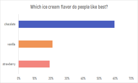
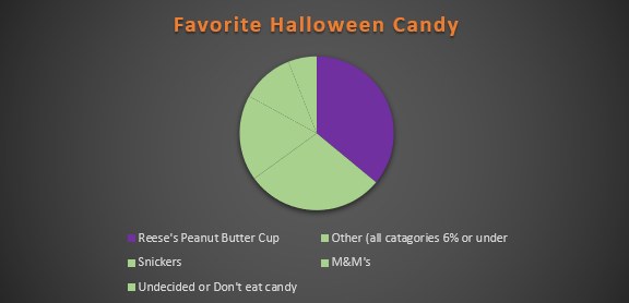
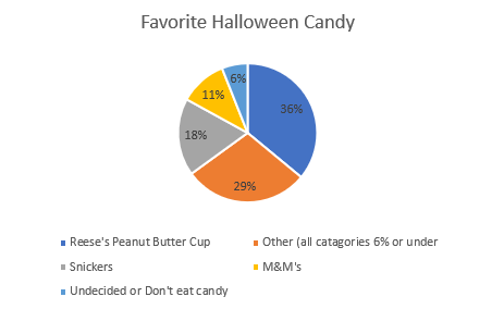
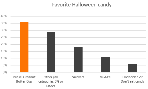
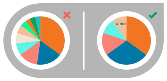
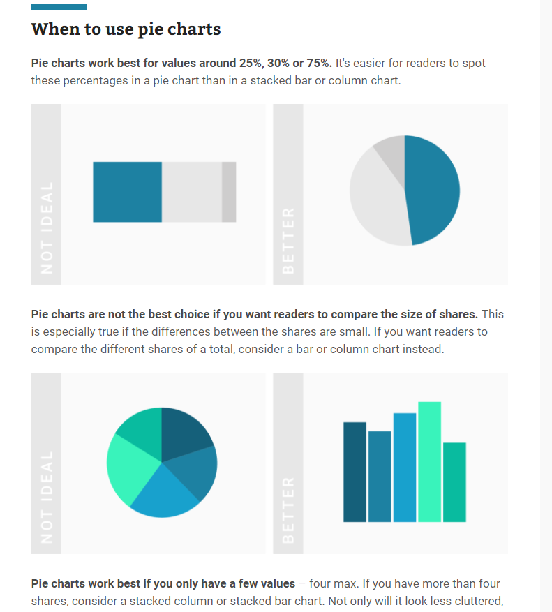
Pie charts are useful for depicting parts of a whole in a dataset. However, most people think that pie charts are a one-size-fits-all solution for data visualization, often making a visual mess of the data or telling a misleading story about its message.

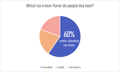
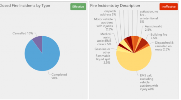
Recently, the Pew Research Center published a report about the value of online instruction in the wake of the ongoing COVID-19 pandemic. The majority of participants in one study covered in the report say that online instruction does not have the same value as in-person instruction.

Source: Pew Research Center

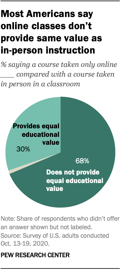
Looking at the pie chart above from a design perspective, the researchers used a darker shade of teal to depict the majority opinion. In comparison, the lighter shade shows the minority opinion. The pie slice that is greyed out represents the 2% of survey participants who did not answer or had no opinion.

Pie Charts Related to My Interests

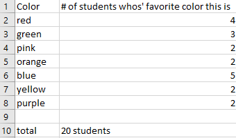
While looking for data that is better suited to a pie chart, I recall a census site created by a small group of Final Fantasy XIV Online players, XIV Census. Though the data shown on the site may not be up-to-date (only shows data collected as of April 2020), I did find a pie chart for Grand Company statistics. Hovering my mouse over each slice only shows the number of characters enlisted in each Grand Company, as well as players who have not progressed far enough into the game’s story to select a company. However, the information does not list the percentages, so I took it upon myself to properly graph the data.

Source: XIV Census

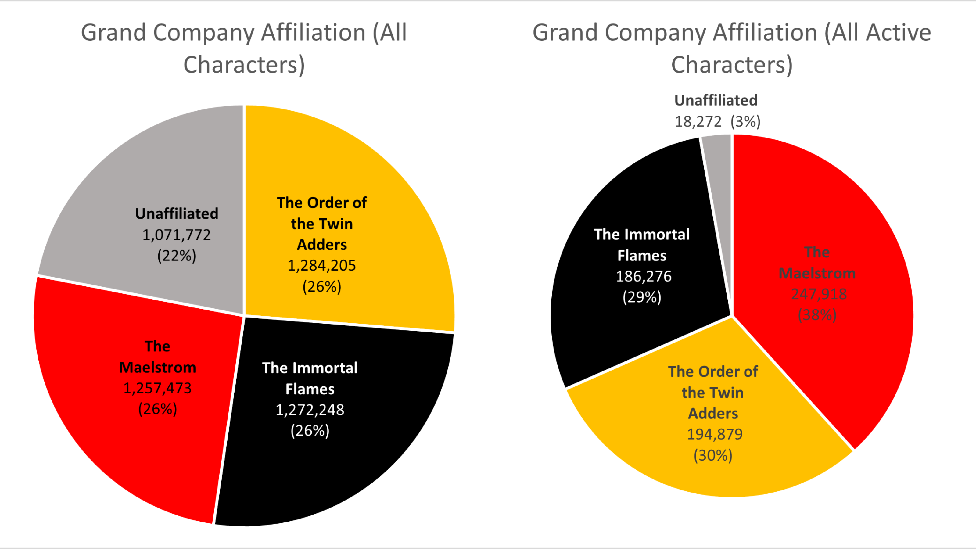
The chart on the left depicts Grand Company affiliation across all characters, while the chart on the right shows where all active characters are enlisted. Among all characters, the Company distribution seems fairly equal. Compared to the number of active players, however, it is evident that the Maelstrom and Order of the Twin Adder are the two most popular Grand Companies.

Categories
Pie charts

Pie Charts

I created a hypothetical restaurant named Villagio’s for my pie chart. We will be looking at how much each server is contributing to our restaurant’s sales for the month of October. We need to set a new sales goal based on this information. This data is best suited for a pie as each individual server is contributing to the total sales.

Total is calculated by using the AutoSum function for all of the first set of “Sales” Amount. Sales percentage is calculated by (Server: “Sales” / Total: “Sales”) and adding the % function to the quotient. The percentages will be our pie slices.
Green indicates the highest server. Blue indicates a server that has met $20,000+. Yellow indicates $17001-$19999. Red indicates below $17000-$15001. Gray indicates $15000 and below.

The sales goal for December will be $100,000. We expect Tom and Meg to be our biggest contributors. We will be pushing Sally, Robin, and Peter to produce higher sales for December. We will begin to provide a $200 gift card for the largest contributor to incentivize our workers. We may need to hire an additional server if our current servers do not feel that they can reasonably meet the sales goals.

Categories
Data Visualization and Art Pie charts

Pie Charts

Since people typically have a hard time differentiating angles, pie charts have a very limited use as a data visualization tool. But there are special cases in which a pie chart could help your data stand out. Pie charts are used to represent data as a whole so it is important to make sure your percentages add up to 100%. In order to make your pie chart as effective as possible, it is best to use them for visualizations that don’t need many slices so that the graph is as simple as possible. Pie charts can also be used to highlight one piece of data to make a statement which can be seen in the graph I created down below.

Pie charts are a great way to display simple survey results such as the one used to create the chart. The pie chart I created uses survey data from 104 participants to answer the question of which ice cream flavor is preferred by people. The results show that the majority of participants prefer chocolate ice cream over strawberry or vanilla. This information is highlighted in the pie chart to make the visualization effective. The audience can quickly pick up this information and answer the survey question easily. This data could also be presented in a bar graph such as the one down below. Although the horizontal bar graph is also easy to read and depicts the same story, the pie chart is the more effective chart in this case. It is minimalistic, straight to the point and contains less labels and text overall. The pie chart also compares the categories as a whole while a bar graph is not an effective method for that. More information on the usage and design of pie charts can be found here.

Categories
data visualizations Pie charts

Pie Charts

All over the media, pie charts can be seen to represent data in the form of a visualization. BUT WHY?…

A pie chart allows the readers to understand the data without needing the specific numbers. Pie charts, when used accurately, can display a pieces of information within a specific population (sample) so a reader can see, depending on the size of the shape, roughly how it compares to the rest of the data. A bar graph is great for comparing multiple populations, and a pie graph works better for comparing within a particular population or within a whole. Using a pie chart allows readers to envision the data as one piece and can help condense data that can be confusing. It focuses on how each piece compares to the population; they can be manipulated to focus specifically on aspect of the pie. Pie charts are great to reveal the results of a poll and can neatly display the information. For example, I used data from a poll I found from Monmouth University about Halloween candy.

from a sample of 1,161 people

In this particular chart, I wanted to hone in on how Reese’s compares to the whole sample set. It is easy to see that though it is not the whole chart it takes up a large portion of the candy poll.

from a sample of 1,161 people

In this chart, I wanted to place focus on each candy and it’s comparison to one another. Leaving it up to readers to pick and choose which candy and how they want to compare it.

Take a moment and compare the two charts above, both use the same data and both have emphasis on the same value. The only difference between the two is the way the information is presented, a bar graph shows us that Reese’s earned the highest amount of votes on the candy poll. The pie graph, however, emphasizes on how much out of the whole sample Reese’s possesses.

Tips for creating pie Charts…

-Make sure the percentages equal 100%, otherwise the chart with be misleading and confusing to read.

– Use visually appealing colors, and if your goal is to place emphasis on a specific value chose a bold color to stand out amongst the rest.

– Organize information, keep in mind the way humans naturally read in a circle; clockwise or counter-clockwise (not across or up and down) . you will want to make sure data goes in a descending order.

https://visage.co/data-visualization-101-pie-charts/

-Use smaller data sets to avoid overcrowding

https://visage.co/data-visualization-101-pie-charts/

Categories
Pie charts

Pie Charts

I believe one of the easiest ways to show how a pie chart should be used is to use “people’s favorites” of any topic. I provided a made-up survey of students and their favorite colors (out of 20 students). I plugged in the survey into excel, highlighted it, then inserted a pie chart with that information.

I thought something easy for the design of this pie chart was to right click on a section of the pie chart, then click on add data label, and lastly add data callout to have the number of and percentages labeled for each section.
This is the end result.

The website I provided explains what a pie chart is, the way to make a pie chart, how to get the percentages for each section of the data for the pie chart, and more.
https://www.mathsisfun.com/data/pie-charts.html

Categories
data visualizations Pie charts

The case for a Pie Charts

Pie charts are excellent for expressing proportions, especially those that have percentages. Pie charts tell a whole story but then divide it into smaller segments to better understand and visualize what the story is trying to portray. The best way to use pie charts is when expressing 2 to 6 different categories. A pie chart can be used to express the percentages of people with heart disease and those without, or people with BMW and those with Sudan. Pie Charts are most effective if labeled correctly, have few slices, and the colors show each slice with good contrast.

There are good Pie Charts, and there are poor quality pie charts.

There are also different types of Pie Charts to represent data, depending on the type of data and how someone wants their data to be displayed.

This pie chart is sliced into three sections to portion out the data. It gives the audience a visual of how big the percentage is.
This donut pie chart has a hole in the middle to separate the slices, which allow the audience to pull the slices apart and analyze it.
Why Don't People Vote? (UPDATE) - Sociological Images
The colors used in this pie chart represent the slices and their data clearly. The numbers are organized in a clockwise direction and are in order with the legend, making it easy to understand and read.
This is the same data as in the pie chart to the left. The data is best represented in a pie chart because with the pie chart, the slices give the audience a better visual of how many percentage or number.

These are some websites explaining how to effectively use pie charts and when it should be used:

Categories
Pie charts Uncategorized

Pie Charts

Pie charts are used to compare categorical data and when done right they are extremely effective. They compare parts to a whole and are visually easy to understand. Below I came up with a perfect case to use a pie chart.


Let’s pretend you have a basket of 20 total fruits. You have five different kinds of fruits: apples, oranges, bananas, peaches, and pears. You want to find out the percentages of each fruit. A pie chart would be perfect for this because it compares a part to the whole.

Pie Chart without data labels
Pie Chart with labels

I included chart one and chart two to show the difference between no data labels and displayed data labels. Notice how without the percentages it is still easy to decipher that bananas make up the largest percentage in the basket. While the data labels help, they are not always necessary.

In this example, the pie chart is the most effective choice. I could have used a bar graph, but when trying to find the percentages of each fruit, it is best to use a parts of the whole chart. It is clear that peaches make up the least amount of the basket and bananas occur the most.

In addition, pie charts should only have around 5 categories and all data should add up to 100. Too many categories can look overwhelming and too cluttered. If the information given is not a part of a whole, this will confuse the reader. Check out https://visage.co/data-visualization-101-pie-charts/

It can be confusing how to know when to use a bar chart or pie chart but when trying to show percentages, it is the most effective and sensible choice. A bar chart can work, however visually looking at a circle and different sections is a better representation of the data. The circle represents the whole, or 100% while the sections represent parts or percentages of that whole. Bar charts do not do this.

Below are some screenshots of a helpful website which explains when to use pie charts.

https://academy.datawrapper.de/article/127-what-to-consider-when-creating-a-pie-chart

To Sum It Up..

Pie charts are an extremely effective visualization that are used to find a percentage of a whole. The pie chart must equal 100 and are used for small amounts of categorical data. In the example shared, there were only five different fruits and the goal was to find the percentage of each fruit in the basket which is why this graph was the perfect visualization to use.

Categories
Color Scheme data visualizations Design Examples Pie charts

Comparing numbers!

Data visualizations can be very effective when comparing two or more numbers. They are a great way to showcase data and to convey a story through numbers. But conveying a story efficiently through data visualizations is not as simple as putting together a quick graph in Excel. There are many ways in which data visualizations can actually distract readers from the message or leave them feeling confused; when used properly they can be a powerful tool that can enhance your data. The video below illustrates how certain aspects of design such as color, size and orientation can enhance your data visualizations.

https://vimeo.com/29684853

While researching data visualizations comparing numbers, I came across two examples that stood out to me. This first visualization illustrates a poorly designed bar graph that has been overly labelled.

data visualization design 5

The graph to the left is distracting and there are several components that are fighting for the readers attention compared to the graph on the right that is simple and straight to the point. In this case, a horizontal bar graph which allows the reader to quickly read the information from left to right is a better choice than the vertical bar graph. Simplifying the graph by taking away the gridlines as well as some of the axis labels helps to reduce some of the clutter in the first graph.

The graph below is another visualization that stood out to me.

data visualization design 4

When creating charts or graphs, people tend to feel the need to distinguish each category with different colors (I know that this is definitely something I do as well). Comparing these two charts side by side, you can see how using different shades of a single color can be more effective than using 5 different colors to differentiate categories; keep in mind to make sure the shades are not too similar. Adding extra “design” elements to the chart is also unnecessary at times such as the black border around the pie graph and the pattern in the “mediocre” slice. By taking away some of these “chart junk” elements, the graph becomes more simplified and can be interpreted quickly and efficiently.