Think about seeing posters on a wall, are you more inclined to stop and read the one with just a paragraph of information or would you rather stop for a poster with bold lines, colors, images, and minimal wording? Most people will be drawn to the second poster because it engages us and attracts our eyes. This is why infographics are so popular, it gets the point across in a visually aesthetic way while effectively getting information to you in just a few words.
Infographics can be used for just about anything, what caught my attention is its use in our education system. Infographics can be used to help guide younger students with directions and instruction, especially students who don’t know how to read yet, it can give visual cues and help students recognize words. Infographics can also help students who are visual learners, which means they learn best by using their vision.
Since their inception in the late 1700’s, infographics have proven themselves to be invaluable tools for neatly visualizing data and presenting it to the public at large. These early graphics mainly focused on topics relating to business, such as with the case of the first recorded infographic which related wheat prices to labor wages, or geographic information. Some examples of these graphics can be found by following this link to Atlas Obscura. As the field of data visualization has grown and infographics have become more complex, encompassing a much wider variety of topics, several infographic archetypes have been created.
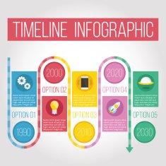
The Timeline
Timeline infographics are best used for displaying the evolution of a certain topic/data set over time.
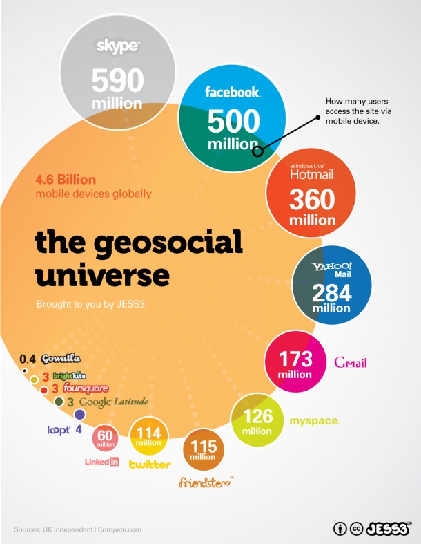
2. Data Visualizations
Data Visualizations are artistic ways of presenting a wide variety of data sets to an audience in such a way that they are easy to interact with, allowing the audience to better understand and remember the presented dat.
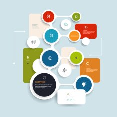
3. The Comparison
Comparison infographics are used to highlight similarities and differences between sets of data or particular topics, such as mountains in the example shown above.
4. The Geographic
Geographic infographic are focused on displaying data sets that can be related to geographic information, such as population densities or economic output of certain regions.
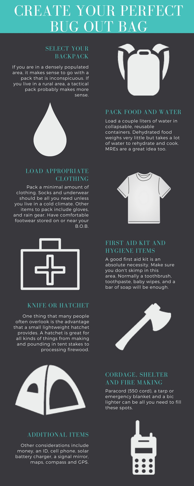
5. The List/Visualized Article
This type of infographic serves to summarize an otherwise lengthy article and distill its finer points into a list of short blurbs. Care must be taken to make sure that the important messages of the original source are properly translated into the graphic.
6. The Statistical
Statistical infographics serve to consolidate statistical data sets into a graphical image in much the same way as data visualizations. The key difference between the two is that statistical infographics are focused more on the presentation of hard numbers rather artistic designs. Anyone who has worked with data management programs like Excel should be familiar with the most basic of statistical infographics, such as pie charts and line graphs.
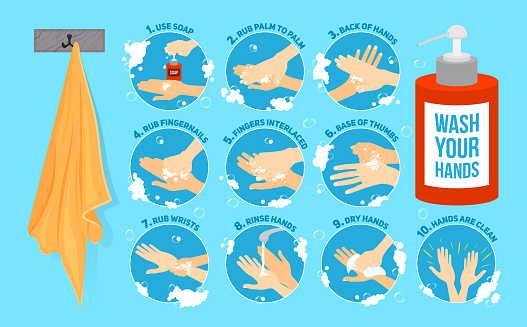
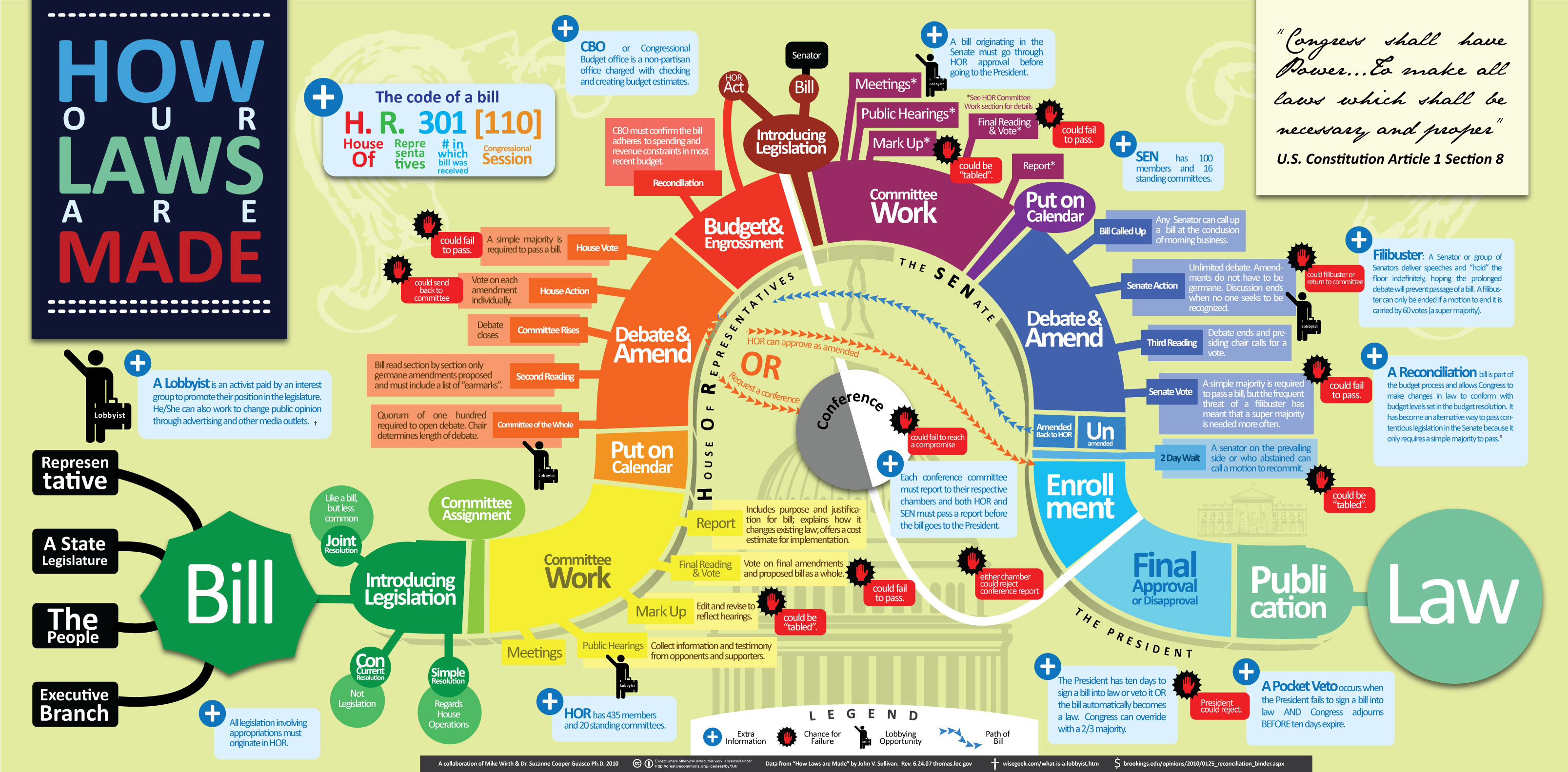
7. The Process
Process infographics display the order i which events tend to occur regarding a specific topic, such as with how laws are passed in the example given above. These graphics are separated from timelines due to the fact that the progression of time is not a necessity for the creation of a process infographic, as it relies only on the order of events and not on when the events occur.
Tools to Help Create Infographics
Creating organized and eye-catching infographics from scratch can be a difficult task. For this reason, I have put together a list of sites and resources that make creating infographics a breeze.
Canva.com – allows limited creation of infographics with a free account
Venngage.com – similar to Canva and Easely, but with a more limited scope for free student accounts
Adobe Spark – Spark allows full access to college students and provides a wide range of graphic styles and tools
These are just a few examples out there that greatly simplify the process of creating infographics. There are other sites that offer similar services, but these are usually limited in scope with a free account. In terms of generating simple charts and other quick data visualizations, Microsoft Excel and Google Sheets are the best choices available to you.
Interesting Data Sets
I am a Sustainability major who is concentrating in Energy, so I am very interested in all things related to energy efficiency and generation. I managed to pull together a few different sets of data relevant to the field of Sustainability which you can find below.
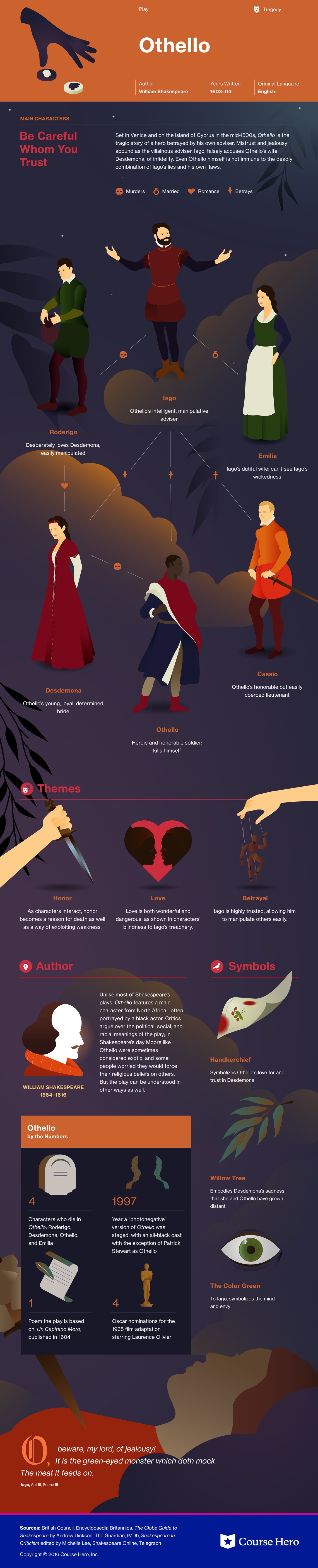
Course Hero is a website that provides students various study resources like study guides and textbooks, and their solutions. The one I am specifically going to talk about it their literature infographics. This resource helps students learn about a story’s characters, plot, themes, and more in a visual way. (I will insert an example they provide of a play named “Othello”). Depending on the type of story, the infographics have various information it will provide the reader with. They create colorful infographics with the theme of the story and draw out characters, shapes, and more to grab the reader’s attention. The website also goes into detail with what happens in the chapters, they describe the characters and how they change over time if you click “view study guide for this book”. I would recommend this resource for people who are struggling with understanding a book they are reading.
There are several very popular and well done data visuals that I find attractive and useful and I thought I would share
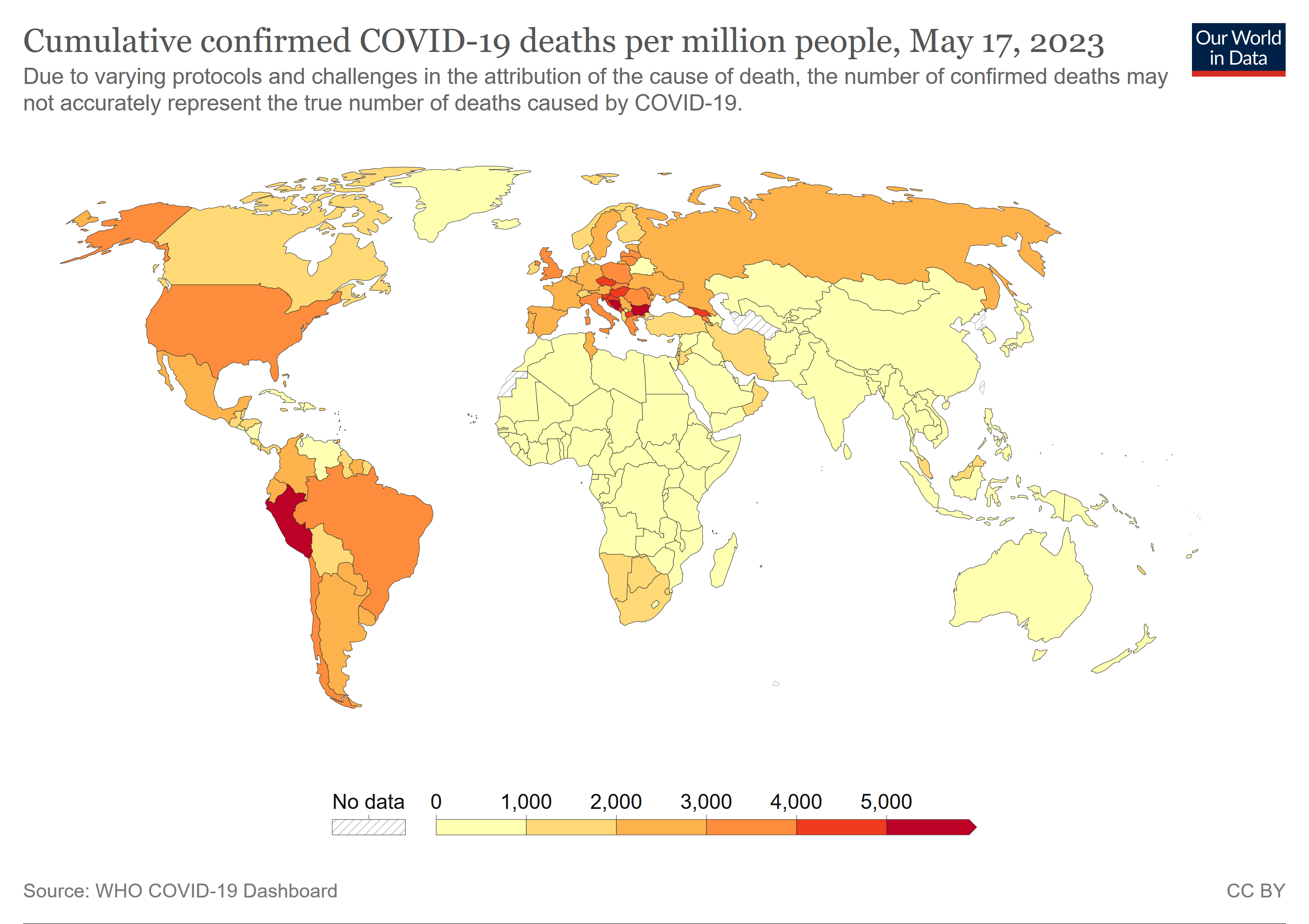
Covid-19 Spread Data such as the one put together by the John Hopkins University. Probably my favourite data set put together in the last decade. The visuals change with data, it’s attractive, and it almost tells a ‘story’ of the Covid-19 and it’s behaviour around the world
2. Plastic Waste data Set. Made by National Geographic. It is kinetic, interactive , stimulating, and, even though some of it is not that pretty, they do that on purpose to show just how gross you should feel about waste.
this data set that was put together no doubt too much more research, and imagination, and time to put together. It is very interactive and tells a story with the data.
Infographics are used by educators, researchers, students, and others looking to visually communicate with their audience. They are engaging visuals which come in many different shapes and sizes and are used daily in healthcare, classroom settings, etc. There are a number of guides and apps that can be used to effectively create the perfect infographic. Here’s a list of 5 great tools you can use today:
Canva Canva is a free graphic design and video app used by thousands to edit images and create infographics. With this app you can download infographics right from the app or you also have the ability to create them yourself. Canva also has over 60 million downloadable images as well as the ability to create team templates and hundreds of designs to choose from. Apple store rating: 4.9 stars
Piktochart Piktochart is a web based tool used to easily create infographics using ready to go templates. This is another free application and can be great for beginners who are just learning how to create infographics. Similar to Canva, you have the ability to collaborate with teams as well as integrate charts, photos, and icons.
Easel.ly Easel.ly is another web based application which comes with hundreds of free templates to create your own personalized infographic. With the ability to insert your own photos and artwork, the possibilities are endless. There is a huge range of charts, graphs, and images to choose from. Options such as timelines, reports, and even resumes are included in this free membership.
Cool Infographics: Effective Communication withData Visualization and Designby Randy Krum If you are looking for a book to read in your free time, this one by Randy Krum might be worth looking into. With a rating of 4 out of 5 stars on Amazon, Krum reviews the importance of infographics as well as beginner tips on how to create the most effective visualization. Ranging anywhere from $20-$35, this might be worth the purchase if you are looking to expand your knowledge on infographics. https://www.amazon.com/Cool-Infographics-Effective-Communication-Visualization/dp/1118582306
Video Guides- How to Make an Infographic in 5 Steps Video guides such as this one are free on Youtube and can be great for those who do not know where to start. This one by Venngage can be found on Youtube or on Venngage.com and is helpful for the audience in determining what should go into their infographic.
To Sum It Up..
Infographics are very useful in displaying data through a variety of different charts, graphs, images, and texts. They should be engaging and exciting and easily read. Thanks to technology and books, infographic templates, tips, and tricks are more accessible than every before. These tools listed above can help you whether you are a beginner and have little to no experience with creating infographics or even the advanced user who has plenty of experience.


