I am going to be showing examples of insightful data visualizations that compare numbers.
- The first one is from a website named datapine.
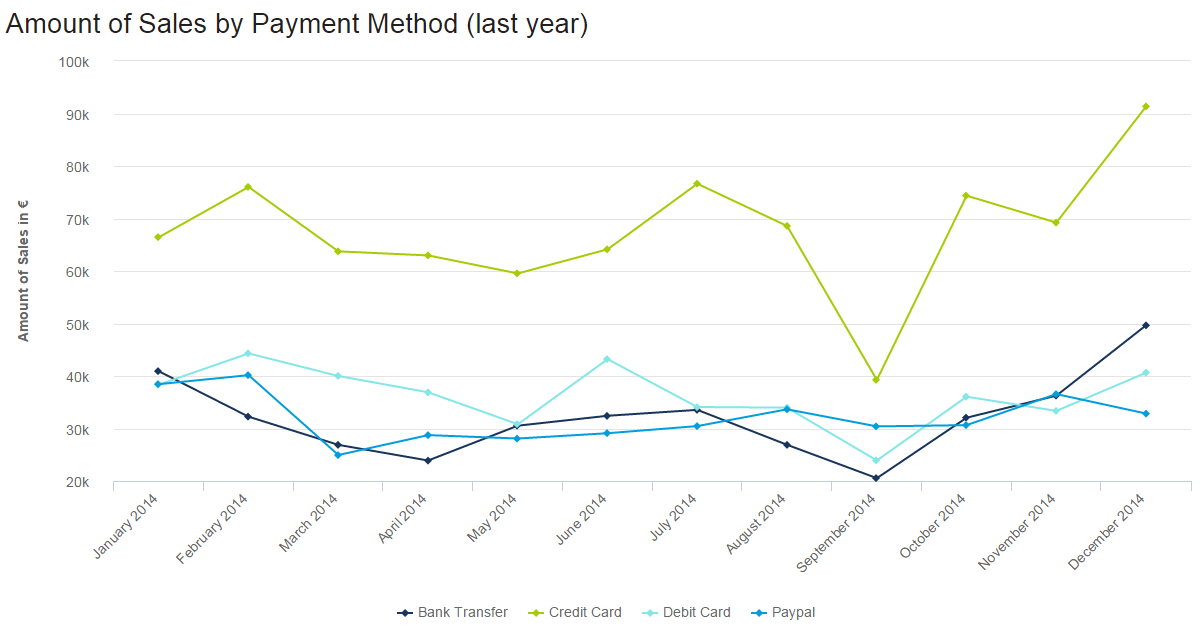
In this line graph, the number of how many sales were made by various payment methods is being shown, different months and years, and how they changed over time. The lowest was abut 20k being used by bank transfers. The highest was about 90k being used for credit card payments. For credit cards, September seems to go very low. With these numbers and information being presented we can take many guessed on why people only use certain payments a certain amount of times at a certain time in point.
2. The second example is from a website named venngage.

This website provided this infographic as an example of how companies highlight features and pursued buyers to buy certain products. They use the phone they want you to buy and compare it to one that has fewer features or different features than the newer one. Most of the info involves numbers, from screen size, cost of the phone to GB’s, and the weight of the phone.
3. Lastly, from the same website venngage.
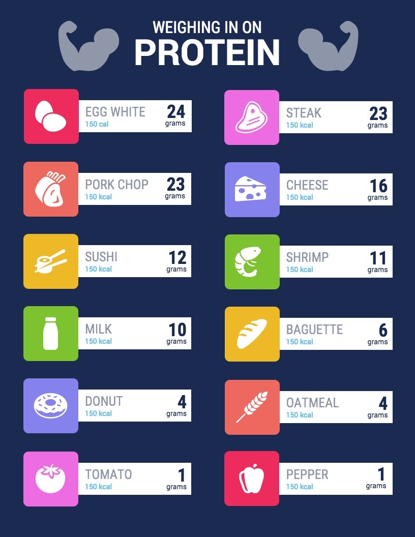
This is an example of an infographic comparing and contrasting the number of grams of protein certain foods have. They bolded those numbers because they were most important for people to see. This is an easy infographic to follow. You just look at the food item, then it tells you the number of calories (they vary) it contains and gives you the protein it contains in grams.