Here, I pulled information from the World Health Organization’s (WHO) daily COVID-19 database as of December 2, 2020.
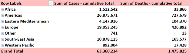
Here, I pulled information from the World Health Organization’s (WHO) daily COVID-19 database as of December 2, 2020.
The Lollipop chart seemed like a lot of special formatting from the beginning and I was pretty much right. It is just a bar graph that you edit to make it look better. As always, I spent way to long looking for data, but stumbled upon BTS pre-order sale numbers while I was taking a break on Twitter. It took a lot of time and it probably isn’t a type of graph I would use often, but the style is easier on the eyes that a bar graph, especially if there are a lot of bars.
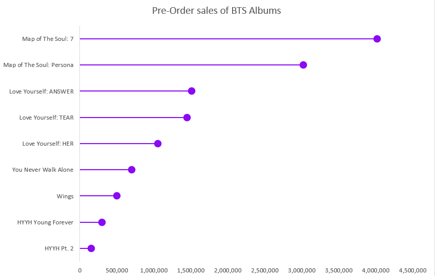
Like I said before, lollipop charts are best used when you have a lot of data to display, at least 20 different points, unlike my 9. It’s also saves on ink if someone would be printing this out to give to people or hand up. My biggest problem with this is that the circles aren’t an accurate representation of the number, the data point is located at the center of the dot and that makes it harder to read the true number. If you aren’t looking to be so precise with the visual and are looking to just show how the data points relate to each other, then using this graph is fine.
It is no secret that a majority of the United States thinks poorly of President Donald Trump, especially given his handling of the ongoing COVID-19 pandemic among other issues. But what do the nation’s overseas allies think of him? A Pew Research report published on September 15, 2020 details how the United States’ image waned on the global stage since Trump took office, and the numbers are damning.
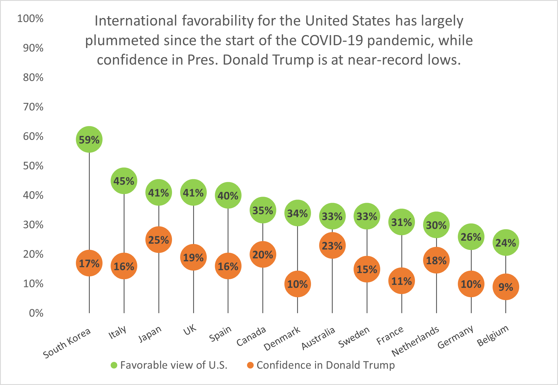
South Korea has the highest approval rating of the United States’ image out of thirteen nations surveyed, yet it holds little confidence in President Trump’s ability to lead the U.S. Fourteen points behind South Korea is Italy with a 45% approval rating, while Belgium holds the least favorable view of the United States and the lowest confidence in Trump.
Lollipop charts like this one are a visually-appealing alternative to column or bar charts because they cut down on the amount of space the chart ink takes up; instead, they focus on the data points themselves and showing how they rank among other categories.
Data visualizations can be very effective when comparing two or more numbers. They are a great way to showcase data and to convey a story through numbers. But conveying a story efficiently through data visualizations is not as simple as putting together a quick graph in Excel. There are many ways in which data visualizations can actually distract readers from the message or leave them feeling confused; when used properly they can be a powerful tool that can enhance your data. The video below illustrates how certain aspects of design such as color, size and orientation can enhance your data visualizations.
While researching data visualizations comparing numbers, I came across two examples that stood out to me. This first visualization illustrates a poorly designed bar graph that has been overly labelled.

The graph to the left is distracting and there are several components that are fighting for the readers attention compared to the graph on the right that is simple and straight to the point. In this case, a horizontal bar graph which allows the reader to quickly read the information from left to right is a better choice than the vertical bar graph. Simplifying the graph by taking away the gridlines as well as some of the axis labels helps to reduce some of the clutter in the first graph.
The graph below is another visualization that stood out to me.

When creating charts or graphs, people tend to feel the need to distinguish each category with different colors (I know that this is definitely something I do as well). Comparing these two charts side by side, you can see how using different shades of a single color can be more effective than using 5 different colors to differentiate categories; keep in mind to make sure the shades are not too similar. Adding extra “design” elements to the chart is also unnecessary at times such as the black border around the pie graph and the pattern in the “mediocre” slice. By taking away some of these “chart junk” elements, the graph becomes more simplified and can be interpreted quickly and efficiently.
A clean & concise visualization is critical for your audience’s understanding of what your selected topic may be. Without this, your audience is likely to struggle with the content presented to them as they will not grasp the important topics you had hoped they would. When designing a visual that involves comparing numbers, it is crucial that you only include what is most important for your topic at hand. This is because if you overload your visual with too much information, your audience will become overwhelmed and leave your presentation feeling more confused about the topic, and this is exactly what we should attempt to avoid.
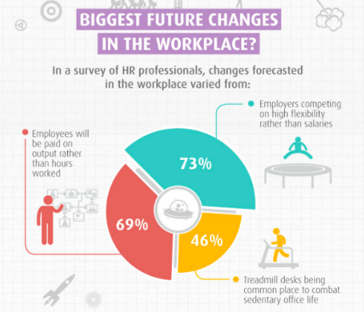
As you can see in the above visual, there is one main point being conveyed to the audience with three measured categories. The main point of this visual is to show what the future of workplaces may adapt to become. Each one of the three measured categories is given a specific color that all of its data is highlighted in. This does wonders for your audience’s understanding! This is because your audience can quickly identify that the red 69% of the doughnut is portraying that employees could be paid based on their performance rather than hours worked as commonly seen today. As you can see, this visual is very effective in communicating only the data it needs to and contains no extra information or frills that could grab the audience’s attention away from the main points.
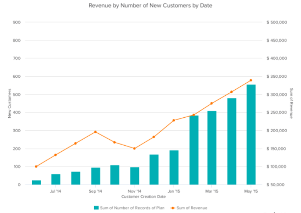
Seen above is a vertical bar-graph that depicts the revenue of new customers for a company over a specific time span. As seen in the legended below the x-axis, the blue vertical bars represent the number of new customers and the orange trend line represents the revenue generated from these new customers. With this visual we can clearly see that this company had a large uptake in new customers from before March of 2015 until May of 2015. We can also see that this company did not have nearly as many customers in September of 2014 but they still generated more income off of these customers then they did in November of 2014. This visual is very easy to understand upon first glance and does not leave room for your audience to have many questions about what this data is portraying. This is exactly what you should be aiming for when creating your own visuals comparing numbers.
Above is a short three minute video explaining exactly what data visualization is and why it is crucial in everyday life. This video highlights how a data visualization should be constructed and how these visualizations can benefit more than just the person that created them.
I am going to be showing examples of insightful data visualizations that compare numbers.
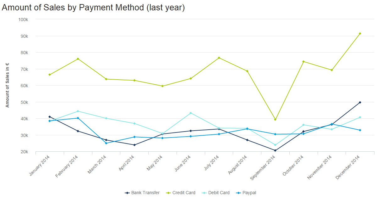
In this line graph, the number of how many sales were made by various payment methods is being shown, different months and years, and how they changed over time. The lowest was abut 20k being used by bank transfers. The highest was about 90k being used for credit card payments. For credit cards, September seems to go very low. With these numbers and information being presented we can take many guessed on why people only use certain payments a certain amount of times at a certain time in point.
2. The second example is from a website named venngage.

This website provided this infographic as an example of how companies highlight features and pursued buyers to buy certain products. They use the phone they want you to buy and compare it to one that has fewer features or different features than the newer one. Most of the info involves numbers, from screen size, cost of the phone to GB’s, and the weight of the phone.
3. Lastly, from the same website venngage.
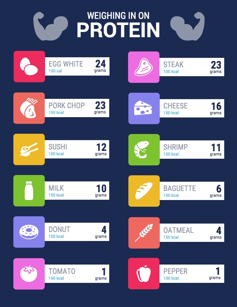
This is an example of an infographic comparing and contrasting the number of grams of protein certain foods have. They bolded those numbers because they were most important for people to see. This is an easy infographic to follow. You just look at the food item, then it tells you the number of calories (they vary) it contains and gives you the protein it contains in grams.
Data is everywhere. It’s been said ad nauseam, but advances in technology at scientific methodology have made it possible to collect and display data more efficiently. The major problem, however, is making sense of a set of data. Often, people ask, “What do these numbers mean,” especially when attempting to compare two or more numbers. Thankfully, data visualization makes it easier to comprehend the data and its message. The only problem is figuring out how to tell a story by comparing numbers using data visualization.
Prior to the emergence of the COVID-19 pandemic, I rarely pay attention to the political climate in the United States, opting instead to focus on my academics or escape to virtual worlds via computer gaming. Yet deep down, I’ve always wondered if others like me do pay attention to politics and other news topics, especially where a presidential election is concerned.
Pulling data from Google Trends, I went ahead to see how interested Americans have been in previous elections since the year 2000. However, the data only goes as far back as 2004, since Google implemented search interest trend analysis around that time.
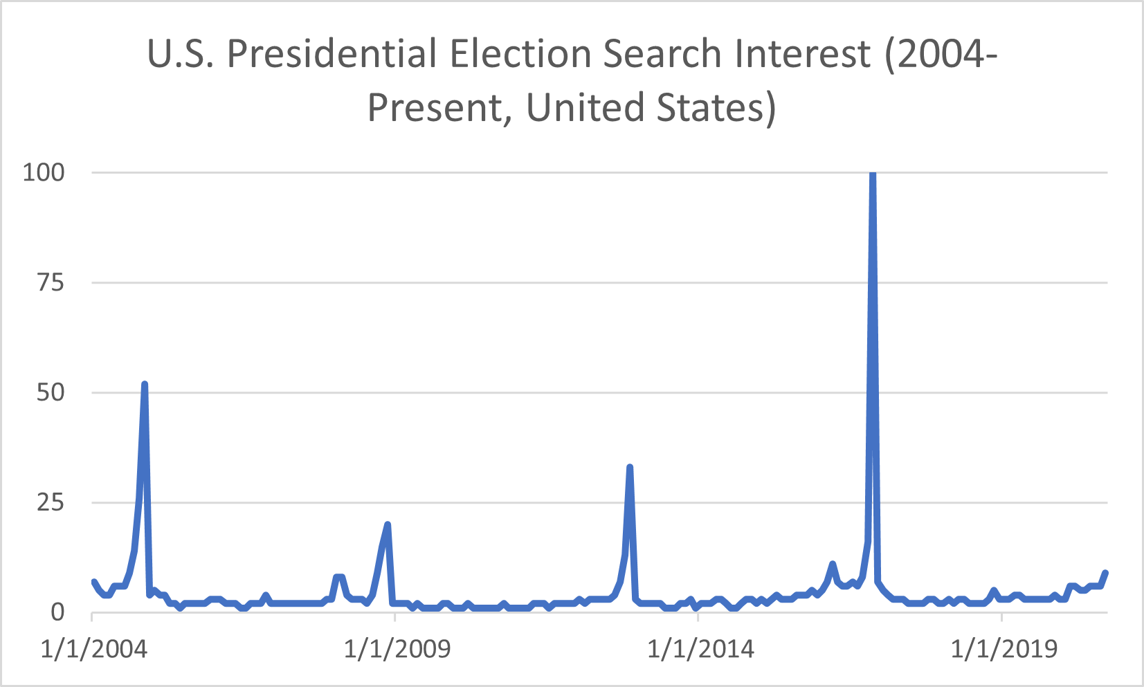
There are four significant peaks in search interest (shown in the chart above), and those spikes occurred in November of each general election year– 2004, 2008, 2012, and 2016– when the polls opened to the public on Election Day. In 2004, George W. Bush won his second term as President, though the search interest pales compared to 2016’s peak. That year, businessman Donald Trump ran for office and won the Electoral College vote to become the 45th president of the United States despite losing the popular vote to Hillary Clinton. Initially, in March of that year, Americans thought someone like him wouldn’t be able to secure the presidency. I recall seeing memes on the internet emerging around when he announced his candidacy but thought nothing else of it until he won the election. Based on the data from previous years, I can guess that search interest will spike again this year around Election Day. With issues such as COVID-19 and social unrest in the wake of George Floyd’s death at the hands of police officers, the search interest peak among U.S. voters will most likely dwarf that of 2016’s data.
When the search interest data is viewed another way, say on a map of the nation, it’s evident that some states had a stronger interest in election results than others.
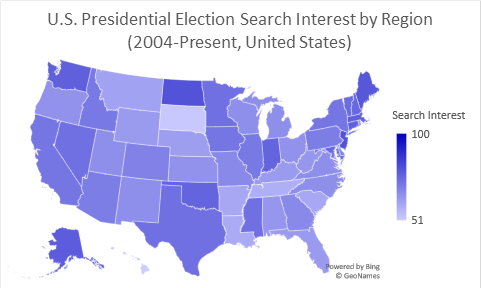
Some regions on the map, such as the District of Columbia and smaller states like New Jersey, do not have data labels tied to them due to graphing limitations in Excel. Still, Google Trends does show that the District of Columbia has the highest volume of interest when it comes to the presidential election. After that, New Jersey comes in second on a top-five comparison chart, followed by North Dakota, Maine, and Alaska.
The data provided by Google trends gives a general idea of how interested Americans are in general elections. But what do those numbers look like among demographics, and what do Americans look for in a candidate?
Moving forward, I decided to pay a visit to the Pew Research Center’s website, which holds a repository of data trends for this year’s presidential election. The topics covered range from election-related social movements to hot-button issues such as COVID-19 and police reform.
One issue that Donald Trump has made a fuss about for the past four years is voter fraud, but it seems that more Americans are paying attention to those claims, especially where fraud resulting in Trump’s re-election is concerned. President Trump has allegedly made moves to attempt to block mail-in voting, a move that health experts say is more pandemic-friendly than in-person voting. Political analysts believe that if Americans are encouraged to vote by mail, the results could spell the end of Donald Trump’s presidency. Moreover, there is media documentation of President Trump crying foul on mail-in voting as a means of committing voter fraud.
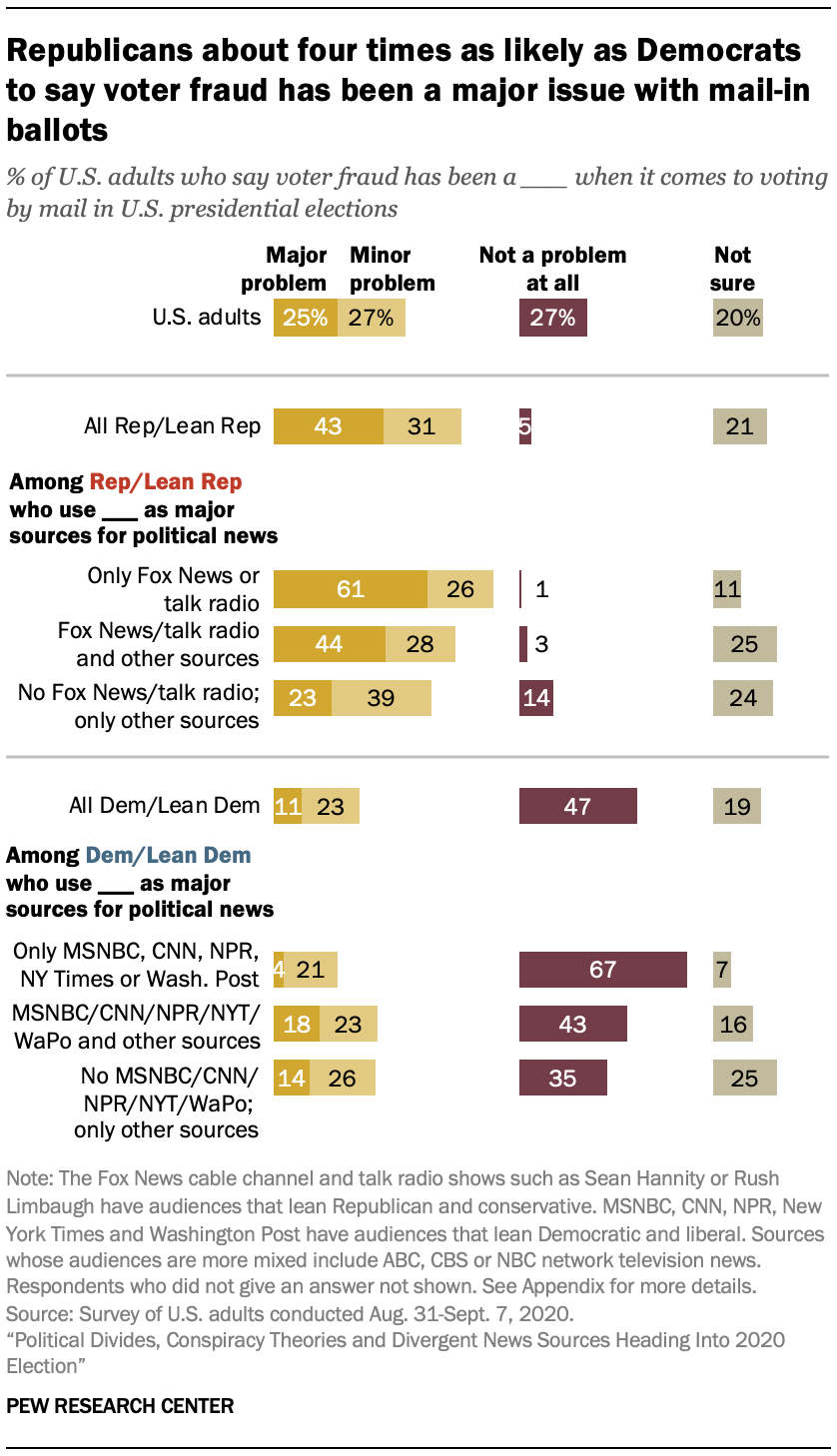
However, the Pew Research Center’s data shows that it’s mostly Republican voters who share President Trump’s sentiment about voter fraud. Democrats, on the other hand, do not seem to be concerned about the issue. Furthermore, the research shows that voter preference in news sources may influence political opinion. The disclaimer states that Republican voters tend to watch Fox News or listen to radio talk shows, while Democrats prefer to get their news from MSNBC and the New York Times.
Political divide based on news source is one matter facing the nation this election year, but influence from conspiracy theorists and foreign powers is quite another. Misinformation propagated by groups such as QAnon and Russian government-backed “troll farms” has led to confusion about the election, even paranoia, and cases of domestic terrorism.
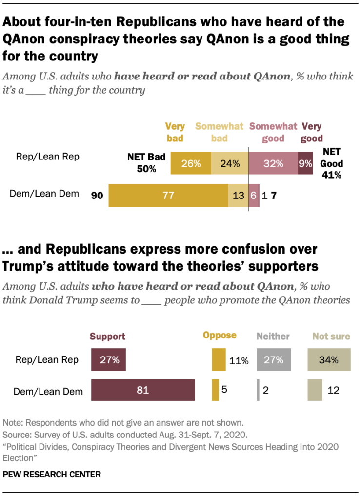
Roughly 47% of registered American voters have heard about QAnon. Among those who have heard o the conspiracy theory group, 40% of Republican-leaning voters believe that QAnon’s claims chalk up to being a good thing. On the other hand, 90% of Democratic-leaning voters believe that the misinformation QAnon spreads is bad for the country. Moreover, QAnon isn’t the only roadblock in getting clear-cut, unbiased information about the election. Since Donald Trump’s election, numerous reports have been published exposing negative influence on the United States’ affairs from global powers such as Russia. Many of those reports center on online “troll farms” funded and backed by the Kremlin. Their purpose is to flood social media sites such as Facebook with misleading information about Trump’s opponents in the hopes that their false claims would be shared by unsuspecting and uneducated users. Even worse, many Americans fear that hackers supported by foreign governments will alter the election results or create other forms of chaos that would impact the election.
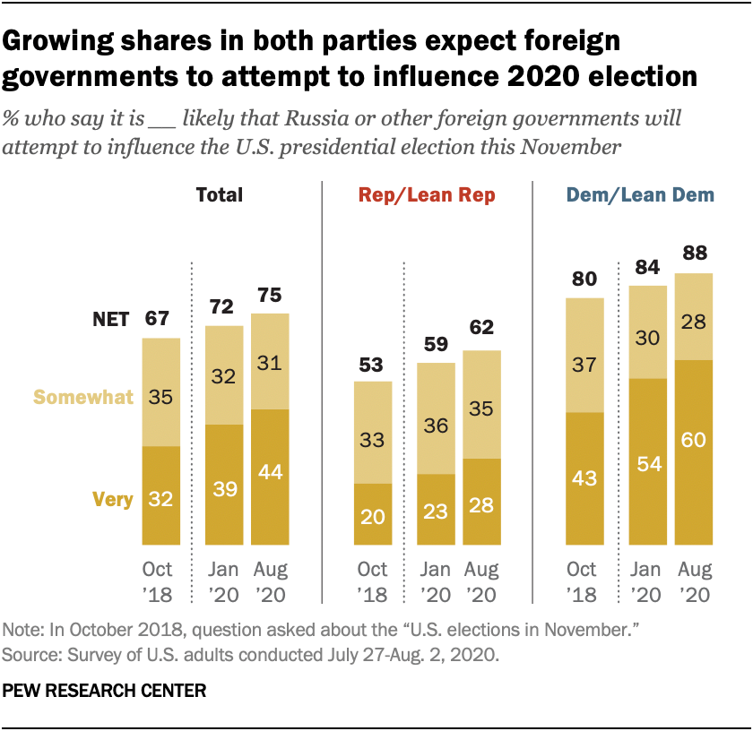
Two years ago, 67% of Americans in both parties believed that Russia would attempt to influence the U.S. elections in some capacity, with 50% of Republicans believing that Russia would interfere with the election compared to 80% of Democrats who expect it. The Pew Research Center asked the same question twice this year amid the COVID-19 pandemic, and the results show an increased concern in election interference by the Russians or other foreign countries. 75% of Americans reported in August that they are concerned that Russia would try to interfere with the election, likely in favor of Donald Trump; 62% of Republicans and 88% of Democrats said the chance of foreign interference occurring would be possible.
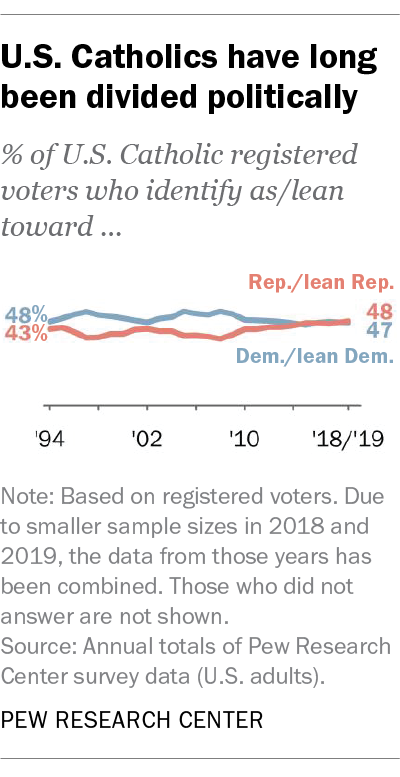
What surprised me the most was a report on Catholic voters. According to the Pew Research Center, Catholics in the United States are “split down the middle politically,” with 48% leaning toward Republican policy and 47% leaning toward the Democratic approach. Furthermore, Catholics are swing voters: in 2016, 52% of Catholics voted for Donald Trump versus 44% who voted for Hillary Clinton, while the percentage clocked in at 54% to 45% in favor of Barack Obama when he ran against John McCain in 2008.
As someone who grew up in a Catholic household that often voted Republican, I can attest to how my parents’ beliefs shaped mine, at least until I arrived at an age where I decided to forge my fate. Once I became a registered voter, I turned my back on voting Republican vs. Democrat, opting to support independent candidates despite not knowing anything about politics. That was the case until this year when COVID-19 took the world by surprise and changed everything. Still, I carried on and shut politics out of my mind, once more focusing on my studies and learning more about the virus. Then a report came out exposing Donald Trump for covering up the seriousness of the pandemic. I had a feeling he was downplaying the issue to keep the American public from panicking. Still, the fact that he made moves to politicize the plague for his benefit infuriated me to no end. It was then that I knew that he had to go, for the sake of the nation’s health.
Data visualization can help voters make informed decisions on candidates and national issues and reflect trends in voting patterns. It is especially apparent in the partisan divide between Republican and Democrat voters today, though it doesn’t have to be that way. Regardless of your political beliefs, it is imperative to know that every voice counts, including yours. Now more than ever, the fate of the United States rests in her people’s hands. Whether you choose to go in-person to the polls or submit your ballot by mail…
October 1st, 2020 by Erika Kacprzykowski
Each day, data is being collected all across the world. There are hundreds upon thousands of different topics such as psychology, healthcare, and consumer analysis, many of which are free to access. This can be extremely useful for future projects or if you are just looking to expand your knowledge on the comparison of these numbers. Today, I have listed a couple great examples of free datasets that can be used for any project as well as some websites to access even more datasets.
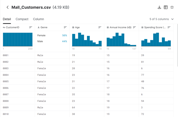
This free dataset focuses on the collection of people at the mall. This is not limited to one specific subject such as age but gender, annual income, spending score are all included. This would be a great dataset to use for the comparison of males and females. Potential projects are also listed here which can be extremely helpful for those wanting to create an infographic but maybe do not know where to start.
2. Heart Disease Dataset
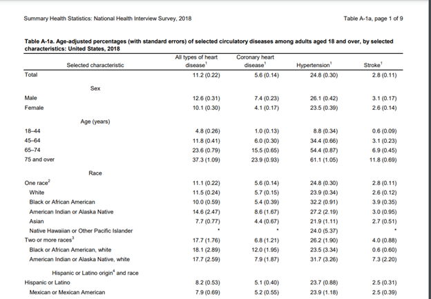
For those who are interested in anything related to health, the site listed above is a great resource for this topic. These include datasets relating to mortality, morbidity, and disease. All of which contain multiple pages of data collection.
3. Website: Piktochart Blog
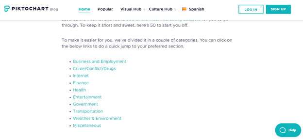
This is a great website that lists 50 different datasets that are mostly free to access. These categories include finance, internet, etc. (see picture above). With all of these options, you will be able to choose which one works best for you.
4. The World Bank
With the ability to search any topic you want, the possibilities are endless. The site also contains other features such as a Microdata Library, the ability to open a Data Catalog, Finances, Projects & Operations and more. This is another great website if you are looking to find more free datasets but maybe don’t know where to start.
Overall, there are thousands of datasets online. Some being free, while others requiring a subscription. However, with these free resources there are plenty of options to choose from. The ability to compare numbers of a particular topic whether this is gender, age, ethnicity, or countries is very important and useful in society. The possibilities and projects available are endless.
There are several very popular and well done data visuals that I find attractive and useful and I thought I would share
2. Plastic Waste data Set. Made by National Geographic. It is kinetic, interactive , stimulating, and, even though some of it is not that pretty, they do that on purpose to show just how gross you should feel about waste.

3. Sydney Morning Herald’s sexual violence infographic.

this data set that was put together no doubt too much more research, and imagination, and time to put together. It is very interactive and tells a story with the data.
Source: https://en.rockcontent.com/blog/data-visualization-examples/