Categories
benchmark data visualizations Design Diagrams

Benchmark Comparisons

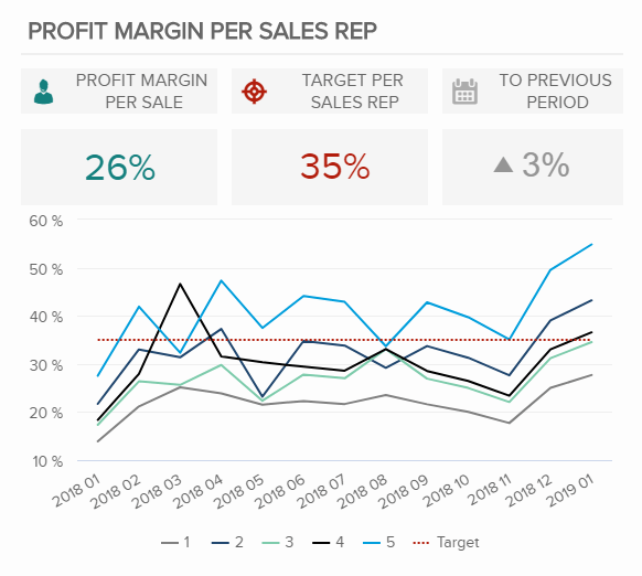
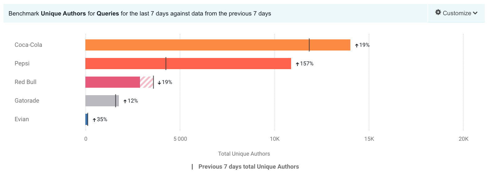
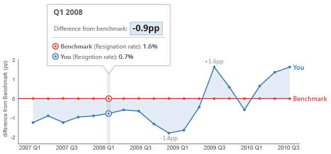
Adding a benchmark to your visualization can enhance the story to a reader. A visual target allows readers to easily determine whether or not a goal has been met. Benchmarks can be in the form of a line, indicator dots, overlapping bars or combo charts. Depending on the needs of your visual, the best way to display a benchmark will vary. Here are some examples of different visualizations using benchmarks.

This take on a bullet graph uses a a benchmark line to compare how well different brands are doing relative to the brand’s previous performance. I think the use of a patterned filler to show that a company is not performing as well is unique. Especially for this data set, with only one company underperforming, this benchmark stands out.

https://www.brandwatch.com/blog/introducing-benchmark-the-visualization-for-better-insights/

This graph features a line at 0 as the benchmark with another line showing how far off from the benchmark they are. With the benchmark at 0 you can easily see whether or not you are underperforming.

https://ux.stackexchange.com/questions/28749/data-visualization-what-should-be-the-baseline-you-or-the-comparator-seri

This graph displays the benchmark comparison as a simple dashed line.

https://www.datapine.com/kpi-examples-and-templates/sales

Categories
data visualizations Diagrams Infographics Visualization Tools

Course Hero

Course Hero is a website that provides students various study resources like study guides and textbooks, and their solutions. The one I am specifically going to talk about it their literature infographics. This resource helps students learn about a story’s characters, plot, themes, and more in a visual way. (I will insert an example they provide of a play named “Othello”). Depending on the type of story, the infographics have various information it will provide the reader with. They create colorful infographics with the theme of the story and draw out characters, shapes, and more to grab the reader’s attention. The website also goes into detail with what happens in the chapters, they describe the characters and how they change over time if you click “view study guide for this book”. I would recommend this resource for people who are struggling with understanding a book they are reading.

Othello infographic