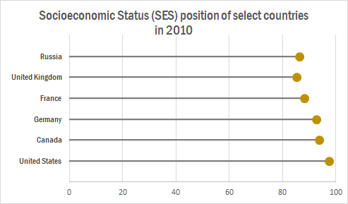
The lollipop chart is a variation of the traditional horizontal bar graph. It is used to rank categories, show trends over time or to compare categories. The lollipop chart eliminates most of the text show in a traditional horizontal bar graph, making it more approachable and minimalistic which allows readers to quickly gather information accurately.
The chart below shows a lollipop graph created in Excel. It displays the Socioeconomic Status rankings of 6 major countries in 2010. The graph has minimal information and therefore is easy to read. The reader can quickly learn that the United States has the highest SES ranking while the UK has the lowest.
This type of chart can be used with any data that can be represented by a standard bar or column chart. It is especially useful when you have a large amount of categories to represent, making a bar graph too cluttered. Lollipop graphs can also be vertical like the one shown below taken from Visualbi. A vertical lollipop graph allows you to add labels inside the lollipop to easily highlight values. To learn more about lollipop graphs and how to create them click here.
Adding a benchmark to your visualization can enhance the story to a reader. A visual target allows readers to easily determine whether or not a goal has been met. Benchmarks can be in the form of a line, indicator dots, overlapping bars or combo charts. Depending on the needs of your visual, the best way to display a benchmark will vary. Here are some examples of different visualizations using benchmarks.
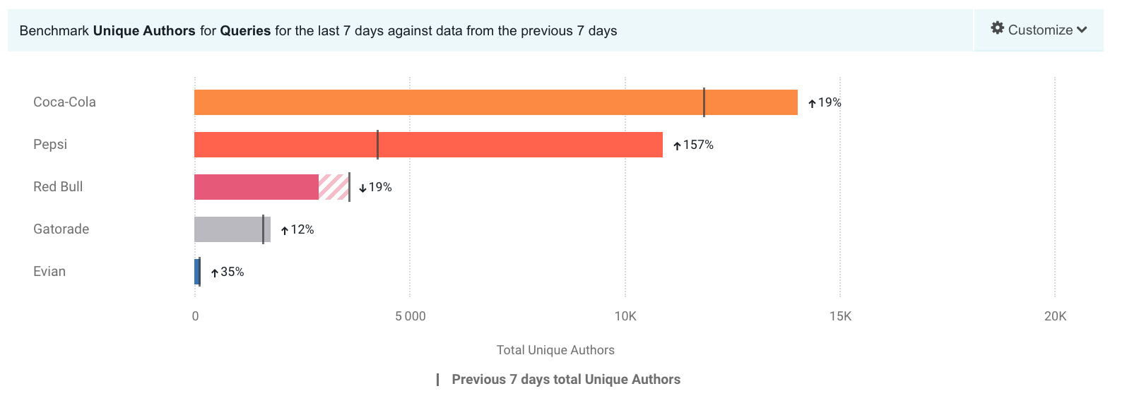
This take on a bullet graph uses a a benchmark line to compare how well different brands are doing relative to the brand’s previous performance. I think the use of a patterned filler to show that a company is not performing as well is unique. Especially for this data set, with only one company underperforming, this benchmark stands out.
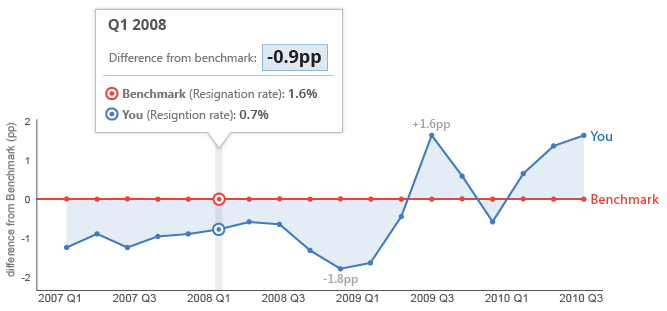
This graph features a line at 0 as the benchmark with another line showing how far off from the benchmark they are. With the benchmark at 0 you can easily see whether or not you are underperforming.
Data visualizations can be very effective when comparing two or more numbers. They are a great way to showcase data and to convey a story through numbers. But conveying a story efficiently through data visualizations is not as simple as putting together a quick graph in Excel. There are many ways in which data visualizations can actually distract readers from the message or leave them feeling confused; when used properly they can be a powerful tool that can enhance your data. The video below illustrates how certain aspects of design such as color, size and orientation can enhance your data visualizations.
https://vimeo.com/29684853
While researching data visualizations comparing numbers, I came across two examples that stood out to me. This first visualization illustrates a poorly designed bar graph that has been overly labelled.
The graph to the left is distracting and there are several components that are fighting for the readers attention compared to the graph on the right that is simple and straight to the point. In this case, a horizontal bar graph which allows the reader to quickly read the information from left to right is a better choice than the vertical bar graph. Simplifying the graph by taking away the gridlines as well as some of the axis labels helps to reduce some of the clutter in the first graph.
The graph below is another visualization that stood out to me.
When creating charts or graphs, people tend to feel the need to distinguish each category with different colors (I know that this is definitely something I do as well). Comparing these two charts side by side, you can see how using different shades of a single color can be more effective than using 5 different colors to differentiate categories; keep in mind to make sure the shades are not too similar. Adding extra “design” elements to the chart is also unnecessary at times such as the black border around the pie graph and the pattern in the “mediocre” slice. By taking away some of these “chart junk” elements, the graph becomes more simplified and can be interpreted quickly and efficiently.
When it comes to a person’s health, having the right data can make a world of difference. But sometimes it’s hard to make sense of the data when it isn’t condensed. What does it mean when the doctor says their patient’s blood pressure is X-over-Y? Will this medication do more harm than good? What should a patient to do reduce their risk factors?
This week, I paid a visit to Visualizing Health (VizHealth), a data visualization style guide specifically designed for communicating health data. Going into this project, my main concern was COVID-19, so I hoped that they had at least some content related to the coronavirus.
First Impressions
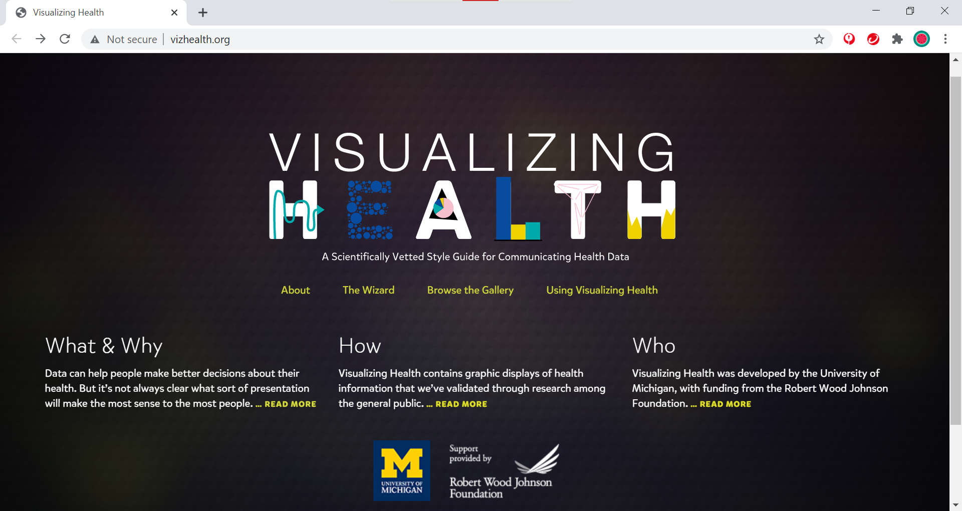
The home page for VizHealth.
When I arrived at the VizHealth home page, the first thing I noticed was the University of Michigan logo. I moved my mouse over it and the Robert Wood Johnson Foundation logo, but there were no links to either program. Other than that, the page itself had a simple design with a limited color palette and several key links.
About VizHealth
VizHealth results from a collaborative effort between the Robert Wood Johnson Foundation and the University of Michigan Center for Health Communications Research. Their goal is to better communicate data for a variety of health issues through numerous scientific studies. In turn, the VizHealth team hopes that the graphics they designed will provide inspiration to other health data visualization designers who want to tell a different story with their data.
At the top of the “About VizHealth” page, they include a brief video detailing their mission and methods:
At the core of the program is the data visualization wizard, where users answer a few questions to help them select the right graphic for what they want to convey to their audience. Then, there’s the visualization gallery, which contains a variety of graphics depicting different design concepts. Finally, VizHealth’s resources page includes a sample risk calculator and a short comic detailing two real-world applications of health visualization.
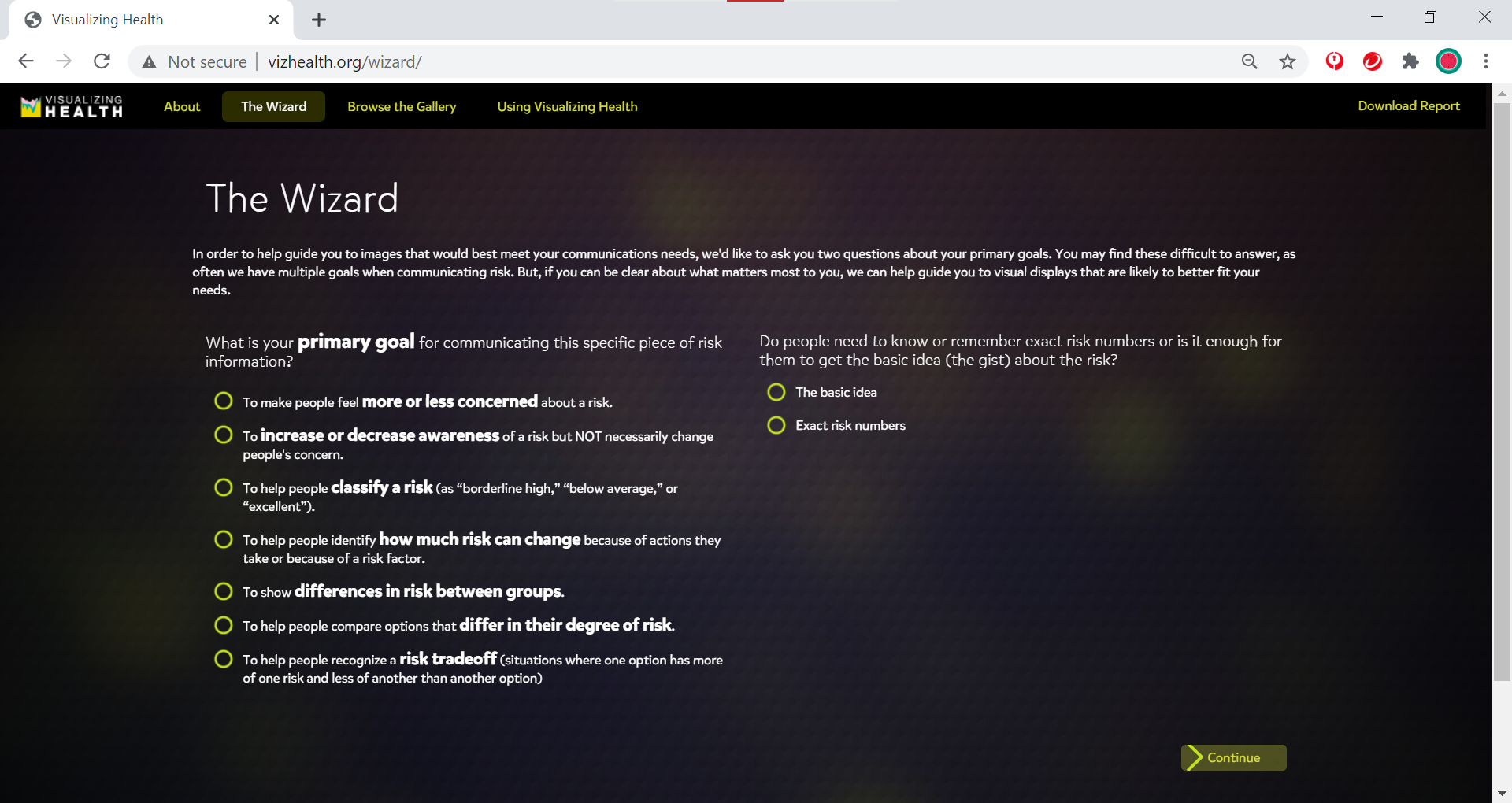
The Wizard (of VizHealth)
The first tool on the site is the Data Visualization wizard. Two questions greeted me when I opened the wizard: “What is your primary goal for communicating this specific piece of risk information?” and “Do people need to know or remember exact risk numbers or is it enough for them to get the basic idea (the gist) about the risk?”. Put in simpler terms, the wizard asked me for the purpose of my data and how much of said data I wish to convey to my audience.
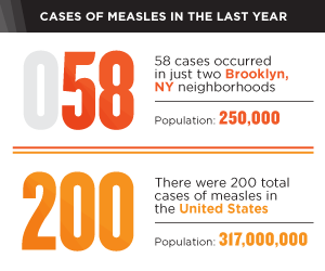
For the first question, the wizard gives explanation tooltips for each choice to help users decide what story they want to tell with their data. For example, the second option details risk awareness, and they use a measles outbreak as their source. They also ask the user to consider if they meant to tell a different story; clicking the second option in the tooltip redirects them to another choice. Once I’ve made my selection, the site brought me to a confirmation page where I can continue onto the visualization gallery (discussed below) or change my answers.
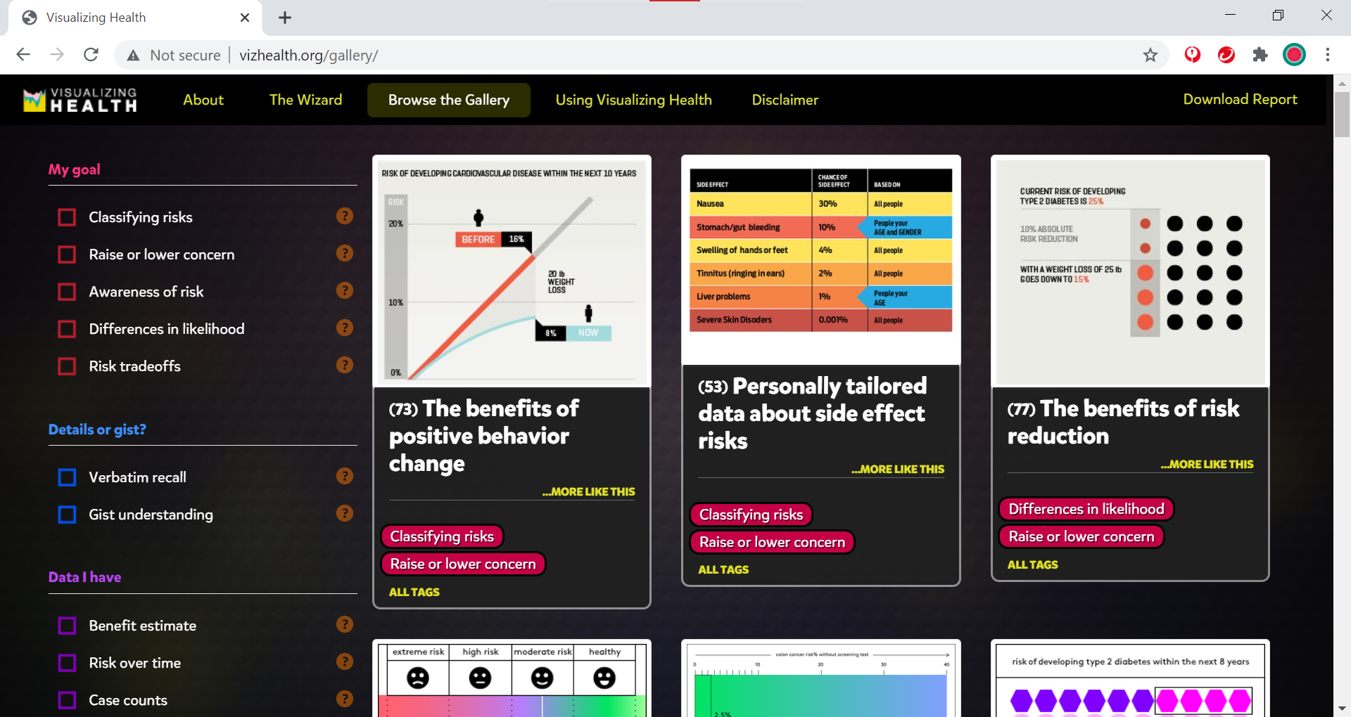
Visualization Gallery
VizHealth’s visualization gallery holds 54 pieces of data visualization examples for users to browse, filter, and examine. Immediately, I found myself checking off filters to sort through the examples provided, though I was somewhat disappointed when I saw that there was no option to display COVID-19-related visualizations.
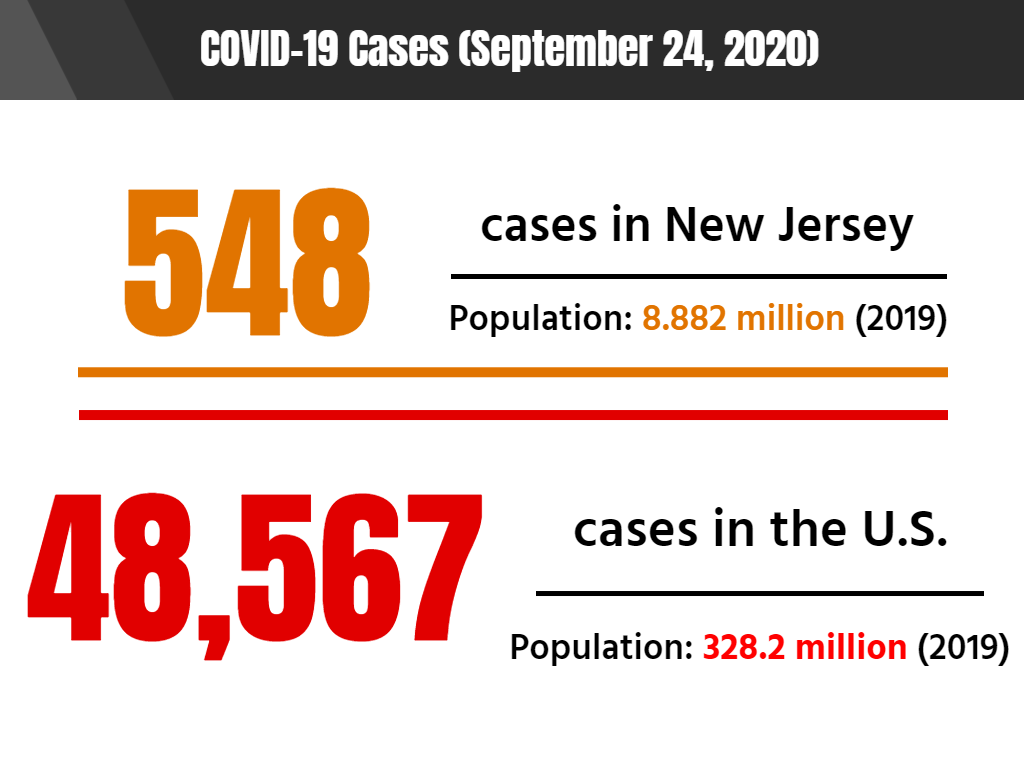
The design I chose pulled information from a 2014 measles statistic report. It compared annual measles cases reported from Brooklyn to nationwide measles cases.
Using this as a design template, I decided to pull monthly COVID-19 statistics for New Jersey and compared them to the national cases reported. As of September 24, COVID-19 cases are slightly increasing when compared to numbers from the previous month. One possible explanation for the increase could be attributed to Labor Day crowds and people disregarding CDC guidelines for social distancing and wearing masks.
This image is based on original research and designs from Visualizing Health, a collaborative project between the University of Michigan and the Robert Wood Johnson Foundation made publicly available via Creative Commons license. Our use of this image should not be considered an endorsement from Visualizing Health. For more information, visit www.vizhealth.org.
Resources from VizHealth
Finally, VizHealth provides a list of resources on how to use their content as well as some interactive tools. The first thing I saw was a comic depicting a diabetes researcher, Melanie, as a sort of data-visualization superhero with an illustrator fox sidekick. It was rather cheesy but it also showed how health visualization can help ordinary people better understand their risk factors.
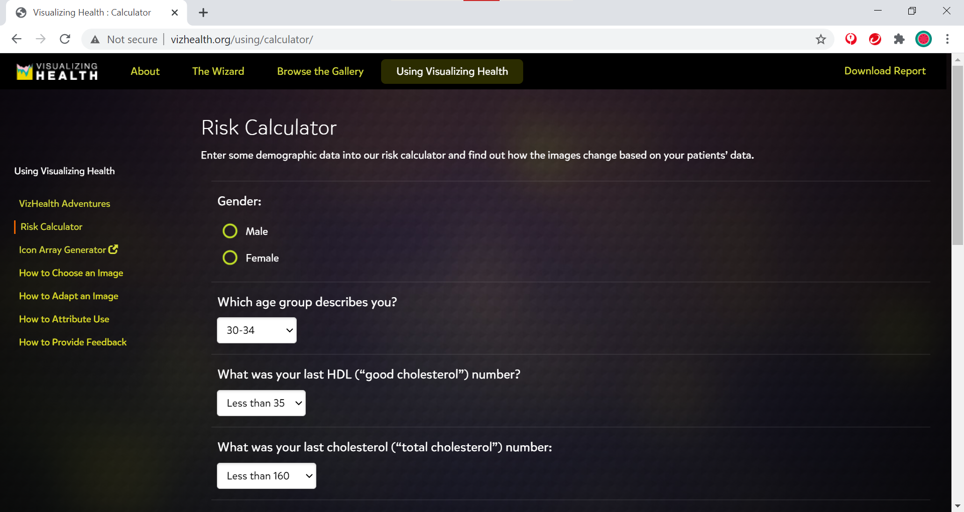
While on the subject of risk factors, VizHealth also has a risk factor calculator that users can interact with to determine what daily habits impact their health.
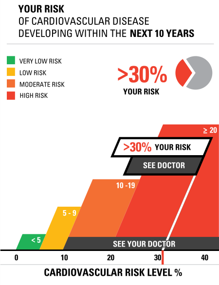
I had my father, a casual smoker at age 70, enter some answers into the calculator. He thought the design of the graphic was neat, but when I told him that it meant that he was 30% at risk of developing cardiovascular disease, he simply said to me, “Well, there’s a 70% chance I won’t get cardiovascular disease.” Needless to say, I insisted that he consult a doctor about his risk factors, specifically his smoking habits.
My father’s results from entering information into the VizHealth risk calculator.
VizHealth also provides a link to an icon array generator (depicted below) that users can interact with.
Conclusion
Looking around VizHealth and pulling inspiration from the visualizations provided was a fun activity, but I think the program can truly benefit from including more issues such as mental health and COVID-19. Even more so, it would also be interesting to see more interactive tools added to the site, like a free-to-use template generator. If there are any other health issues that arise, I’ll be sure to use VizHealth to learn more.